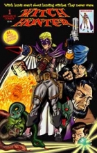
Witch Hunter

Witch Hunter

Staff: Vincent Ferrante, Scott & Victor Dominicis

Overview:

It rises above the preconceptions I had going in.

Review:

Wow, I seem to get into a lot of mythical beast hunter style comics this month. The last two were werewolf hunters and vampire hunters (Happy Halloween I guess). But that brings me to an interesting point point- we see this kind of thing a lot. I guess it goes back to characters like Professor Abraham Van Helsing and the like (lets be honest- it goes back WAY father but not in such a direct way). There is something very captivating about man conquering monsters. At it’s core it’s about man conquering himself and the fears that lurk in the dark. The tag line of this comic is, “Witch hunts aren’t about witches. They never were”. A powerful message and it sets the tone well for this comic.  So with that in mind I am hoping Witch Hunter #1 from Monarch Comics cast a spell on me!

The art isn’t professional grade, but that doesn’t mean it isn’t decent. Something I really appreciate is that the first half dozen pages of this comic have no dialogue. We are introduced by a piece of parchment that says a family is wanted for witchcraft then we are told the story entirely visually. Fantastic. Absolutely fantastic. I keep saying that comics are a visual medium and takes advantage of this. However, once this ends- we take flight 114 to exposition town USA. We got what happened, we didn’t need an explanation. It almost counteracts the beautiful introduction. Otherwise, the art direction is rather inspired. Some very creative designs that keep the reader guessing if the creatures you see are masks or actual otherworldly entities during a masquerade scene. Even when the comic goes farther into fancy, they retain the creative character designs and build a very strange world. I rather enjoyed the character designs in a madam’s house. It felt like something out of one of Gaiman’s Sandman comics (which are fantastic by the way, so that is high praise).

Something of note is that I really didn’t like the protagonist’s character design. His outfit feels really disjointed. It swings from superhero to fantasy witch hunter. I guess that is the point but they clash a lot. The color pallet just doesn’t match. The purple and white looks fantastic but the dark blues & browns of the rest of his costume are way more down to earth then the “high fantasy” aspects of his outfit. I wish they would go one way or another with this because the basic concept has some real potential to it. The random white eyebrows on the mask I both love and hate. It gives him a mischievous look (which fits him) but sometimes it gets in the way of the character emoting. It reminds me of those pictures where people have drawn eyebrows on dogs a little bit.

Lettering wise this comic is hit and miss. The initial parchment with some text on it was abysmally bad. The in panel dialogue is legible, but a bit hard to read on occasion (the character width was a bit thin). On page 13 we also get this weird interruption where they stuck the credits. It is very distracting and I can’t imagine why they didn’t just do a credits page near the front. Add to that the near illegible nature of them (the thin white characters get lost on the dark blue background) and it is just a jarring stab to the eyes. The last eye-gouger is the name of the next comic on page 38. It looked like someone vomited all over the font and they just decided to use the colors they found it in to make a gradient. Come on! You guys are better than that!

The dialogue isn’t bad. It has some genuine brilliant moments, (“…and bring some milk and chocolate chip cookies.” “Why? Does he need cookies to find my daughter?” “No, he just likes them.”) but then it falls into mediocrity with some very cliche lines. A lot of “witty” characters (Nightwing, Spiderman, the Robins, Gambit, etc) fall into this trap. They try to banter but it just falls flat when a line doesn’t work. It makes them seem like their quips are coming from a place of ignorance rather than intelligence.

The ambiguity of the nature of some characters is a strong point. We are given this fantastic world and we are never sure if we should be employing suspension of belief or not.  Are the witches evil? How about these random rich guys? Is witch hunters good or just in it for the money? It seems like no one has truly clean hands. Sometimes it seems like the comic doesn’t know, but I am giving it the benefit of the doubt that it will build upon this in future issues (I only review the 1st issue of comics).

So to recap, decent art, great use of that art, hit or miss lettering, inspired character design, lackluster protagonist design, dialogue that wavers between great and uninspired, and a story with some fun elements to it. I actually enjoyed this for the most part. I don’t know if “Witch hunts aren’t about witches. They never were” really describes this comic. It is totally about witches, magic, and their persecution. Hey, it’s free. Give it a read!

Metrics

Art: 7/10 (Decent art)

Lettering: 3/10 (Some narley fonts drag it down)

Plot: 6/10 (Decent with some good and bad points)

Novelty: 7/10 (A fun and creative world with inspired characters.)

Overall: 6/10

~Link to Product~

Zero Hunters

Zero Hunters

Staff: Jay Carvajal, Marc Borstel, Federico & Karina Lopizzo, and Carlos Razetto

Overview:

“Vampire” + “film noir” + “cop”. Follow that formula to the letter and you basically have everything in this comic.

Review:

So I’m once again on a vampire book. I’ve stated before that it’s a genre I’m not super fond of, but I’m excited to dig into it. Sometimes this genre surprises me, so let’s sink our fangs into Zero Hunters #1!

The first thing that grabs me is that this is a scifi and I’m a fan of the clean cut modern art style they use in this comic. The lettering is nothing shy of professional grade. There is excellent use of silhouettes (which fits with the tone quite well). Some of the character designs (particularly for some of the vampires) are quite cool, but others lack any real inspiration (including Garrick, the protagonist). This comic also makes great use of this color and takes advantage of the visual medium it uses. Both visuals and script skip happily across the pages of this free 34 page comic.

But I’m afraid that’s where the praise ends. The plot is very simplistic and exposition heavy, the art has a few slip ups (though is generally pretty solid), and the main character is forgettable. A few of the onomatopoeia bugged me as they didn’t exactly jive with the fantastic lettering.

A lot of the plot relies on film noir clichés and stock characters. You can see everything coming and nothing is really new or unique. It seems like someone threw a few darts as a board with ideas tapped to it and came up with “vampire”, “film noir” , “cop” comic. Near the end they get into this interesting plot point about how the protagonist and the antagonist are locked in eternal struggle across multiple lifetimes. A nice little twist, but it doesn’t save the comic.

Ultimately there is a lot of like about this comic but a lot of it falls by the wayside. The plot is cliché, but it has some saving elements. The art is good but it never really rises to the point where it’s noteworthy. The characters are blank slates, though at least they feel like people (through dialogue and action).

Metrics

Art: 7/10 (Decent art)

Lettering: 7/10 (Professional grade)

Plot: 3/10 (Nothing new)

Novelty: 3/10 (Generic)

Overall: 5/10

~Link to Product~

Wulfen

Wulfen Prologue: “Teeth”

Staff: Ed Doyle, Liam Kavanagh

Overview:

If werewolves are your thing, give it a read I suppose.

Review:

So today I’ll be sinking my fangs into a werewolf comic. The market is kind of saturated with vampire and steampunk stuff, but at least the werewolf thing came and went pretty quietly. Anyway, lets take a look at Wulfen Prologue: Teeth.

The art on this one isn’t shabby but it’s by no means approaching professional grade. It’s full color but lacks the consistency that comes practice. Sometimes the artwork it pretty decent but then it slips into laziness and it suffers a bit. It’s a shame because it really has the potential to be a very interesting art style. Maybe with a bit more refinement and attention to detail the artist behind this could be downright phenomenal.

The lettering bugs me a little. It’s not bad and it is legible but like with the art, sometimes it looks a bit sloppy. Letters getting close to the edge, things not centered correctly, a few obnoxious bright yellow narration boxes with black text that hurt my eyes a little. Oh and I’m not sure where to mention this so this is as good a point as any but their cover is 3-4 times larger than the other pages so it has the effect of shrinking the others by default (which is a technical issue so I won’t be factoring that into my rating).

Now the characters in the book are pretty one dimensional. We have Wulf, a werewolf hunting outcast werewolf due to the circumstances of his birth (replace “werewolf” with “vampire” and this sounds a little familiar…). The “villains” are generic and serve only as a sounding board for exposition and to demonstrate that Wulf is a badass. I mean he basically lays out all the broad strokes of his background to them while fighting them.

The plot takes a backseat, a wolf was captured because some hunters think it killed some kids. To be honest- I’m with the hunters by the end of this. They did their due diligence to check to make sure it was the one who killed the kids (fangs) and then Wulf comes bursting in and kicks the crap out of them. His rationale is kind of weak, (“Wolves only hunt for food!”*) and leave me kind of thinking that Wulf is an amoral jerk rather than some protector of the wild.

*From what I understand, this is more or less true but a-typical behaviors have been recorded in clusters of incidents. Heck, in 2013 alone at least 6 people were killed by non-rabid wolves.

A lot of the dialogue is excessively grim and contrived (“A mission … of death!”) and sometimes made me kind of cringe awkwardly reading it. I mean, I’ll give it credit- it jumped full on into the vibe it was going for. Despite this, it still feel a bit short like maybe the author’s heart was infatuated with the idea rather than earnestly understanding the premise he was getting into on a intimate level.

Ultimately I am not really impressed with this comic. It delivers what as promised, but only goes through the motion. It feels like the team is trying to mimic making a comic rather than write a story. Getting caught up too much in tropes of the medium (particularly when starting out) leave a comic feeling kind of unpolished. Hey, know what though? They are totally vibing on this comic and if werewolves are your thing- you could do a hell of a lot worse. Give it a read.

Metrics

Art: 5/10 (Decent. A bit sloppy at times but a lot of love.)

Lettering: 4/10 (Few missteps)

Plot: 4/10 (Coherant but exposition heavy)

Novelty: 2/10 (Blade want it’s premise back)

Overall: 3.75/10

~Link to Product~

Turtle Guitar

Turtle Guitar

Staff: Ben Powis

Overview:

Art in comic form.

Review:

So we have an odd little comic called “Turtle Guitar” here from Ben Powis. I don’t normally read descriptions until after but the lack of a preview image kind of concerned me so gave it a read. It tells us that this is a 6 page comic so I was a little hesitant starting off. Let’s see if we can shake that hesitation with Turtle Guitar!

So first off the cover struck me as odd. It was done in a very NOT comic style. There is a heavy use of stroke-as-texture with thick lines and a very dark color pallet. It looks like some bizarre patchwork wonderland that is very surreal. I’ll admit- this intrigued at first and it managed to continue that surreal art style effectively all the way through. It put this comic in one of those “comics as art” categories that I don’t get to use all that much.

This comic is all about the art, right down to the lettering. I love how Ben used a change in font color to illustrate the impact of certain words (like “parched” and “dying”). It completes the medium and effectively uses the visual aspects of this medium to its fullest extent. This is a letter of lover to lettering.

The narrative is mythological in nature, drawing a lot of influence from old world folk stories. In this context it doesn’t have to make a lot of sense on the logical level, but it does on the moral/philosophical level. Ben easily navigates around a simple but effective plot with the skill of a master while including the phrase “Turtle Guitar” (in its literal meaning) nonetheless.

If I had a gripe about it was that the plot was in fact very basic. That plays nice with the artistic direction the writer was going for, but it does seem a little nonsensical at times.
Saying that this comic utilized its visual elements to inform the reader would be a drastic understatement. So seamless is the integration of the visual aspects into the narrative elements that you don’t think twice about why a word is in light blue or why that little squibble is visually representing music. It takes risks but every one of them pays off and fits together seamlessly. In 8 pages (not 6) Ben Powis did more for the argument that comics are art than the big publishers have done in the last 5 years. It’s a downright shame that this as been up on DriveThruRPG since 2009 and holds a 3/5. This is a masterpiece you can download for free. Why would you skip it?

Metrics

Art: 9/10 (Industry redefining)

Lettering: 9/10 (Love letter to letters)

Plot: 5/10 (Simple but does its job)

Novelty: 8/10 (Something new.)

Overall: 7.75/10

~Link to Product~

Sky Pirates of Valendor

Sky Pirates of Valendor Issue #0

Staff: Everett Soares, Brian Brinlee, Michael W. Kellar, Jet Amago, and Cary Kelley


Overview:

It knows what it is and doesn’t apologize, going full tilt into the world it made.

Review:

So we’re setting sail on adventure with issue #0 of Sky Pirates of Valendor by Jolly Rogue Studios. I am surprised that I haven’t come across more steampunky pirate indy comics yet. That might be because, while I enjoy the aesthetic, I am a bit jaded due to the media saturation following the deluge of all things steampunk and pirates that has hit me in the last few years. It’s kind of like zombies or vampires- I’ve just seen too much. That doesn’t mean I didn’t buy tickets for Abney Park and rock the hell out a few months back, it just means I’m a little hands off on the genre at the moment. That won’t stop me from giving an earnest review as I buckle my swashes and check out Sky Pirates of Valendor #0!

The comic itself is grayscale and while the art isn’t professional grade, it’s not sloppy either. There is a lot to look at in terms of detail and one can even overlook the faults. A few times the expressions didn’t match what they were saying but overall it’s not a terrible attempt, particularly for an indy comic. This comic does something a lot of comics do and have the characters just seem to kind of pose randomly (even in small ways) but it adds to the style and doesn’t do much harm (Marvel is terrible with this…). The real issue is when you start looking at the background characters. They are really poorly drawn sometimes and it doesn’t do the love I feel in this comic justice. It’s painfully obvious who the characters are and who is about to be killed off screen. It’s like super Red Shirt syndrome. If they didn’t get an intro at the start, they are totally expendable.

They drop you headlong into a plot via the first few pages. They are a little heavy on the exposition (“this is so-and-so my 1st mate and the only man I can trust”, “this is my wife”, etc). I suppose they had to do something as it is a bit of an introductory comic (being issue #0 and free for free comic day 2013) but it comes off as a little heavy handed. I do like the more stock fantasy races just kind of thrown in there with bear people and They make no apologies for the strong fantasy roots they have and let their hair down in terms of what liberties they take with the setting. For example, we get some very scifi weaponry at times but the main character prances around with a saber for no other reason than he is a pirate. While this works and makes a very magic-tech setting, it does leave the reader wondering a bit. I guess what I am trying to say is, it works and it doesn’t work because they don’t tell us much.

The lettering is fine. I never had any issue with it. I like how they have a bit of their own flare with the delivery of the narration. It has a jagged edge on the bottom like it was torn out of the page of a journal. The lines delivered via it also read like they were from a journal so it works out spectacularly.

Speaking of the dialogue, it does come off a bit frilly at times. The captain seems to talk like a pirate and think in a much more esoteric manner. While sometimes this could be used to effectively make a more complex character (a frequent trick of Grant Morrison’s run on Batman) it just doesn’t jive and we don’t get enough in-character dialogue to make the connection to this character’s more introspective musings.

I can get behind something that knows what it is and what it is doing. To this comic’s credit it is a lot of fun. You get what you sign up for- swashbuckling elves, bears with shotguns, airships, pirate jargon and that is exactly what you get. Cut it, print it, we’re good here!

Metrics

Art: 5/10 (Not pro, not bad)

Lettering: 6/10 (Readable and some creative use)

Plot: 7/10 (It knew what it was doing and did it)

Novelty: 7/10 (Fun little setting)

Overall: 6.25/10

~Link to Product~

Phineus 36 Which Lich is Which?

Phineus 36 Which Lich is Which?

Staff: Barry Linck


Overview:

Not much here.

Review:

So I just downloaded a file named, “Phineus 36 Which Lich is Which?.PDF” and I have NO idea what I am about to get into. The summary on drivethru just says “Rotwang rises from the dead, with hilarious results!” and I have no idea what’s going on. Let’s get to reading then.

Getting into the book we see it was for free comic book day 2012 and is apparently the sequel to a comic done earlier (sort of).

The art starts off very good but a few sloppy spots show up. I don’t know if it is the minimalistic style (think kind of Genndy Tartakovsky does zombie) that causes little errors to stand out so much to me, but they do. However, that’s not to say whoever drew this black and white comic isn’t downright talented, it just feels like he drew it in one go. We get a lot of linework and it looks like the medium was simply inked paper over some sketch work. This comic has its fundamentals down cold though, no questions asked. Great use of perspective, posing, and framing make this stand out pretty solidly. Makes me want to see a comic where Barry puts his heart and soul into it (pun pun pun).

The lettering is decent (almost professional at times) but we get these occasional errors too. Nothing that makes it unable to be read, just like word breaks of short words, odd letter placement, etc.

The story is, as described, a continuation of something I haven’t read (this is why I normally read issue #1s when I do reviews). The dialogue leaves a lot to be desired. It feels like the author was trying a bit too hard to be edgy and/or modern and it just ends up reading like a lot of swears for no reason. The comic is too short to really develop anything beyond, “I was dead. I am alive? I have a necromantic orb in me! I am a litch! I made zombies”, but I can’t really detract anything for it NOT being coherent (just a little pointless I guess). I won’t rag on it too hard though, I did jump in in the middle of a plot (I assume). I’m not really sure where there was any humor. It felt like the exposition as to why a character was back to life. Heck, the cover was funnier than the comic. Maybe I’m missing something?

Overall I didn’t dislike it. There wasn’t a lot to like either (art was solid though). I’ll just toss this one on the “Failed too impressed but not their fault” pile. Hey, it’s free so give it a read!

Metrics

Art: 5/10 (A cut above the rest, few flaws dragged it down)

Lettering: 5/10 (Few missteps, professional overall.)

Plot: 4/10 (Can’t say it wasn’t cohesive?)

Novelty: 4/10 (I forgot it already)

Overall: 4.5/10

~Link to Product~

The Misadventures of Electrolyte and The Justice Purveyors

The Misadventures of Electrolyte and The Justice Purveyors

Staff: Patrick J. Reilly and Butch Mapa

Overview:

Go read it. Now. Stop what you are doing. Put down Batman and/or Superman and read this.

Review:

Alright, so there are times when I do this that I get really disheartened. But comics like RATO, C.U.P.I.D.S, and Slave all make it worth it. I go through so many bad ones that when I find a gem like The Misadventures of Electrolyte and The Justice Purveyors I get excited. And excited I am. This was a FANTASTIC comic that everyone deserves to read.

The art is top notch and at times even some DC/Marvel folks could take some pointers. The letting is the only place this comic is weak in and then that’s only at a few rare points (see the bottom of page 46 to see what I am talking about). That’s just a drop of water in the ocean though as this comic’s artistic investiture in the characters is wholehearted.

The real quick run down of this comic is that we are following a team of heroes with laughably bad powers who try to fit into a world where much better heroes exist. It sounds like a tired plot we’ve seen played for laughs a dozen times but these guys really hammer it home. The story has twists and turns galore, the characters are well written, the each feel unique, and the plot is engaging as well as coherent. I got a little Watchmen vibe from this comic, in a good way, and I really liked the protagonist. He almost lampshades the qualities of some other characters but the third act really hammers it home. There is a panel where all these heroes are just taking an elevator ride and “Age of Aquarius” starts playing. I stopped reading, put it on, and LAUGHED how well it fit.

It was totally an unadulterated FUN reading this comic. A lot of times I slosh through junk on my trek through the indy comic reject bin and I am wildly impressed with this book. It had smart dialogue, a lot of great twists, and I didn’t feel like I was painfully slogging through panels I didn’t want to read. Sorry for the short review but just go read it. You’ll get why I don’t want to spoil anything.


Metrics

Art: 9/10 (Marvel eat your heart out)

Lettering: 7/10 (Few missteps, professional overall.)

Plot: 8/10 (Smart dialogue and good characters.)

Novelty: 7/10 (Seems like a basic plot then BAM, twists.)

Overall: 7.75/10

~Link to Product~

High School Hijinks

High School Hijinks

Staff: Jer Alford, Willie Jimenez, Amanda Garman, Bar-1

Overview:

An earnest attempt by non-Japanese to do manga.

Review:

I am not really just what I’m reading. Once again, I’m a bit out of my typical wheelhouse, but I soldier on. The first page looked promising at first until I realized that the artwork in the background was stock art of a high school. Well… let’s not judge a comic by it’s cover and jump into “High School Hikinks”.

The first page here tells us there are three stories. Gaijin HI, Furry Ninja H.S., abd H.S. Sweethearts. I’m going to play a game and try to guess the plots of these before I read them based on the teaser panel. (lets see how I do). One is about a weird foreigner in a typically japanese high school who has a bizarre twist, the second on the list will have little to do with actual high school and more to do with ninja bunnies, and the third will be a rather emo one about two students falling in love.

The first comic, “High School Sweethearts” starts with a piece of artwork drawn on line paper and is by someone named Willie Jimenez Aka “Idest”? (Seriously, couldn’t tell what it said.)
The art style looks like someone tried to adopt the manga art style but had little to no formal training in art. The opening dialogue and scene was painful to read and watching the two main characters awkwardly pose while they talked was even more so. Lines like, “…but girls are watching me.” “Yea yea, quiet… here comes one now!” or “I’m sure you know me as Jessie. The coolest kid in school.” show a lack of understanding the fundamentals of writing. We know there is a girl. People don’t refer to girls as a gender, but the individual (It’s like having your dad walk up and your brother say, “There is a father”). And some of the reactions from teachers… it’s bizarre. We also get a very bizarre set of facial expressions in this comic where, even for a comic done in manga style, their reactions are totally overblown and at time inappropriate for the panel. I understand trying to portray sadness or loneliness but subtlety is the name of the game. In this comic we are beat over the head with it. The art in this comic suffers from a lack of understanding anatomy. Manga is stylized and this one is too, but proportions need to be maintained between panels and relative size should established early on and continued.

In short, it was a kind of a mess, the plot was a contrived romance between two high school students, and the art was poor. 1/1 in my predictions!

Mini-Metics

Art: 2/10

Lettering: 4/10

Plot: 1/10

Novelty: 1/10

Overall: 2/10

The second one is “Furry Ninja H.S”. (It’s a little weird that they are out of order). The first panel says that this is based on “Ben Dunn’s Ninja High School”. I had to look it up. Apparently it is a comic series I haven’t read so I am going to excuse some stuff on this comic as a result. Now, I’m not a huge furry fan, but I can get it. Different strokes for different folks and by the end of the first few pages this already looks a lot better the “High School Sweethearts”. I know well enough that this isn’t my area of interest, but the comic is cohesive, they don’t waste much time on exposition (something even professional comic writers have an issue with) and I can tell the characters by their introductions. Then we jump into some random robot fight without much explanation, but it fits with the tone of the comic (and I don’t know NHS so I assume it’s a “thing”). A crazy furry… ninja… alien… fight ensues (just roll with it) and then it descends into complete and wonderful chaos to the point that we need a 1 panel continuity reset after some bad pop culture references and a 4th wall break.
This one… well it gets a pass because it’s crazy. Art is half way decent, just shy of pro level, and is looks good even if it’s not my thing. (2/2!)

Mini-Metics

Art: 6/10

Lettering: 5/10

Plot: 4/10

Novelty: 3/10

Overall: 4.5/10

The third one starts off with a good ol’ fashion rustling of my Jimmies. This ones features some terrible lettering and the name “Gajin”. Even when played for parody, Japan’s zenophobia (stemming for it’s long isolationist period) is never something really that needs to be highlighted. I feel it’s somewhat akin to naming a comic, “Jiggaboo High School” in some respects. It’s a slightly derogatory term (ok Jiggaboo is a really offensive term… I just like the way the word parts sound) that gets used with an almost positive connotation.

Anyway, the comic has the footprints of someone who isn’t from Japan trying to write a story set in Japan in a Japanese style. It would be like if someone from Japan tried to remake Boy Meets World or the Little Rascals (Topanga would of course be a busty space alien ninja cat girl with a crush on the unassuming shy geek Cory who has a special power). I’m not saying that an American can’t write stories set in Japan but you need to write from a place you know- not try to imitate something you don’t. This results in a world that is neither here nor there. The dialogue is childish and formulaic, the characters are stock, and the plot is the plot from every harem anime you’ve ever seen. The art is a painful attempt to imitate drawing a style they were not trained to draw. (3/3!)

Mini-Metics

Art: 4/10

Lettering: 1/10

Plot: 3/10

Novelty: 1/10

Overall: 2.25/10

Also, the last page looks like Lisa Frank threw up all over a manga.

As a whole, this book was really schizophrenic. It had some decent parts (Oddly enough, “Furry Ninja H.S” wasn’t bad to my surprise) but the other two were straight up painful to read. It feels like some friends who liked anime got together with these “three really cool ideas” and tried their hand at making something they had no business making. The failure in tone, story, and character development permeates so many levels of these comics but it’s magically how they manage to make it cohesive. If this is your thing- go for it. You are going to like it either way. It really seemed like a lot of passion and effort went into this comic. They really are passionate about what they do and I salute the hell out of them for that… however, anyone reading this will be hard pressed to wipe the armature fingerprints off this one.

Metrics

Art: 4/10 (Varies but in favor of bad. B&W by the way)

Lettering: 3/10 (Decent in some, really bad in others)

Plot: 2/10 (Directionless)

Novelty: 1/10 (A lot of tired plots)

Overall: 2.75/10

~Link to Product~

Servant

Servant

Staff: Geoffrey Borgonia,  Gilbert Monsanto

Overview:

Inoffensive, but offensively inoffensive.

Review:

The art is…well… more poser 3D art (I see a lot of this on DriveThruComics). However, I will give more credit to this team. They don’t make the same mistake that every other comic I’ve reviewed with poser art has made. The scenes are full of characters and “things” rather than taking place in ghost towns where only the characters exist. My fingers keep freezing up as I try to type these words, but… I’m actually ok with them using poser art. Like this is how it SHOULD be used. I’m not saying I love it or that it really brings anything other than having visuals to the comic, but I don’t spontaneously vomit when I see it. It could probably benefit from some actual artwork (something hand drawn or digitally made) but it’s passable. They use dynamic poses, have decent compositions, and I do like that there was a bit of post processing on the images and that all the models are not the same base male/female model with a few characteristics switched up. The massive chest of the protagonist is a bit much, but they play that for laughs a few times so it doesn’t really detract. There is this weird effect where you can always see the ripped abs of the protagonist through his shirt and it looks like they are vacuum formed to him chest.

Gerry Alanguilan did a pinup of the main character and it is at the end of the PDF and… wow. It is downright gorgeous! It just stands in stark contrast to the rest of the artwork in this book. With THAT sort of artwork this book would have knock it out of the park rather than just being average. It seems like this book being “average” is a recurring thing with Servant #1.

Lettering is nothing special, but it fits the vibe of the comic and I can read it without having to zoom in. It gets close to the edge every now and again, but it doesn’t ever tread close to being “bad”. A few times letters were oddly clipped (see page 12, last speech balloon) but it never made it unreadable.

The dialogue is a bit cheeky, which is a nice turn. It does this thing where the narration comments on what is happening (“Oh look, that comic store is having a sale! I’ll have to go check that out later.”) and it is a little out of place at times. A few times the author uses * to describe what the acronyms being used mean and that would be fine but does three on the same page (so we have *, **, and *** all in 2 speech bubbles). It kind of broke the flow a bit.

Once we hit about page 10 we get introduced to the villains and oh boy does their dialogue get bad. We had some decent lines before that felt like we had a human narrator, but now we get the most chalky, dry, genetic, villain dialogue I’ve had to swallow in a while.

Issue #1, like a lot of the series I read, is an origin story (for new readers: I only review the 1st issue of comics). A lot of times I feel like I’m a bit too hard on the amount of exposition crammed into 1st issues, but then I remember comics like “Slave” and I feel secure in my knowledge that people can inform the reader without cramming exposition down our throat. In this one, it almost  lampshades other origin stories, but it feels a lot like a superman pastiche (last son of a dying world and all that) so it doesn’t gain any points for originality in that department. Then again, his name is even Gal Ang… which is totally not Kal El or anything close…

To be honest, it doesn’t jump out and grab me. The story is predictable and while sometimes that doesn’t detract from it (see Pacific Rim for example) this time it does. It’s a bland origin story about a guy who is a mash up of a few different origin stories that doesn’t really feel unique or interesting to me. Don’t get me wrong, nothing really is wrong with it, but nothing really jumps out. As a medium, storytelling doesn’t need to be sensationalist but it does need to convey something that we haven’t seen before. The morals are drawn from things like the most recent Superman, Batman, and Spiderman movies (you can becomes a symbol, serving a greater good, etc), the origin is all but borrowed, the main character is pretty genetic (geek, family values), and even the powers lack a creative “umph”.

A cool little thing this comic did that I would like to see more do is offer multiple forms for download. They had the standard .PDF (which I normally read), but they also had a Comic Book Reader and E-book format that people could take advantage of. That’s how you do it!

There is a lot to like here but most of that is just because it does the bare minimum to get by. It feels like this is the kind of comic that, if it were an employee, would be the sort of employee that goes to a 9-5 job and just clocks in and clocks out. There is nothing really special or unique about this comic other than not really being “bad”.

Hey, it’s free. Give it a read.

Metrics

Art: 5/10 (Decent. Bonus for Gerry Alanguilan’s pin up)

Lettering: 4/10 (Few errors. Good overall.)

Plot: 4/10 (Predictable but fine)

Novelty: 3/10 (Been done but not in this particular way. Bonus for extra file types)

Overall: 4/10

~Link to Product~

Spectrum

Spectrum

Staff: Draegon Grey and Alfonso Pinedo

Overview:

Big build up, big let down.

Review:

When the description provided for a comic starts with, “A new black superhero now endowed with special powers…” makes me cringe a little. I know every culture needs heroes they can identify with, but it kind of feels like that when your strongest foot forward is to appeal based on the race of the character… it’s kind of a weak start.

So the art. It’s strong, but not professional grade. It’s close and definitely seeks to be done in that style, but it doesn’t quite hit that level. They use a very bright color scheme and it gives it a bit of a closer. The lettering and onomatopoeia are in top form so nothing to complain about there.

The comic also comes with a little youtube video. It’s mostly done with low resolution stock images and tells about all the awards this comic won and praise it got. I don’t get why they don’t show off the artwork of the comic- it’s fairly good.

So far, so good. If it was all this well put together it would be a solid comic I’d be putting on my “Indy Comics Worth Your Time” list. But then we get to the story and dialogue…

The video claims that this was written by a master storyteller. If that’s the case, we need to reevaluate the metric by which we judge what a “master storyteller” is. The dialogue is filled with sloppy exposition (Unless everyone stands around declaring the start of a new semester out loud). The premise is a bit week. Boy struck by lightning and put into a coma for 15 years. Now he’s up and about (no mention about the detriments of being non-ambulatory for 15 years in the physical or mental realms…). This magical lightning bolt has given him ill-defined lightning powers.

The intro comic gives us a scene set in genetic-town high school (which is actually a college) with every tired trope and stock character in full attendance. By page 5 I could tell who the love interest was  the bully who gets beat up in a few pages, and the hero were going to be. Their introduction was about as subtle as a freight train going off the rails.

A comic that takes its time and introduces elements with a careful hand wouldn’t have come across so rushed and messy. Stop me if you’ve heard this one, “jerky bully picks on geeks and hits on female classmate while a shy outsider protagonist looks on”. I don’t feel like Ulysses (the protagonist) is a real person. I feel like he’s an amalgam of tropes the author liked. He doesn’t show anything akin to fear so his inevitable victory is lacking in impact. We don’t get to know who Ulysses is. He’s a blank slate. I’m sure he grows a personality in later comics, but right now all I know about him as a reader is he defends geeks from being beat up and got struck by lightning.

All and all I’m really disappointed in this comic. It was built up as this big, groundbreaking, comic but it was nothing but another genetic superhero comic. Also, this character seems a LOT like Static from the late-great Dwayne McDuffie (except Virgil had some personality). I hope the rest of the series is better than this one because the creative team seems to have a big vision for this character. I’d LOVE to see something more from this team, but I don’t think I was sufficiently impressed with this issue. Don’t take my word for it though. Give it a read. It’s free!

Metrics

Art: 7/10 (Just shy of pro grade)

Lettering: 8/10 (Wish more were like this)

Plot: 3/10 (Amounts to nothing but fluff)

Novelty: 1/10 (Been done before. In several ways.)

Overall: 4.75/10 (Art caries this book where the story fails)

~Link to Product~