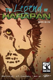
The Legend Of Harapan
Staff: JT Campbell
Overview:
It’s got a talking lion but it’s much cooler than Narnia.
Review:
Alright so today I’m looking at The Legend Of Harapan. Cover’s got a lion so that’s a good sign. Let’s jump on in.
The first thing that we are meet with in this comic is an eye-killing cursive note. I get that it was meant to look “hand written” (it even uses a vintage paper texture) and it fits with the style of the comic… but Christ I wish artists would stop using this particular set up. Mage – The Awakening’s sourcebook had this same issue- cursive is NOT easy to read. I mean this wasn’t even particularly keened cursive, but still- not a treat for the eyes. If it was just ONE page in the comic I think it could have been forgiven, but it keeps popping up.
However, once we get past those pages we are treated to a very unique and colorful art style and some very easy on the eyes text. One thing I’ll note here is that while the art seems rather simplistic (kind of like a kid’s illustrated book) but it is actually very well executed. It takes a lot of skill to give so much expression and life to simple creatures and there is no lack of detail here. There is a great use of dynamic posing here and the way they use panels is top notch (example: Page 13 has a rabbit jumping across two panels to indicate movement). They also have a good grasp of visual storytelling, allowing events to transpire without dialogue but still conveying understanding.
To be honest, I didn’t think I was going to get a story about talking lions when I opened this PDF- but I don’t think I was disappointed. It’s not some kind of furry thing (hey- if you like it, more power to you. Not my cup of tea though) so it didn’t bother me all that much. Kind of got the Narnia vibe from it instead. The story itself is pretty linear but it’s not insultingly so. You can kind of call what is going to happen (this is not an M. Night Shyamalan story) but I don’t know if this is a really an issue. I get the idea that this is kind of geared to a younger demographic? At the very least it’s not going to attract the same audience as like Sin City.
Overall it was a fun little read. It’s just over 30 pages and you don’t feel cheated on anything. It manages to set up a good little story and I think there is a lot of potential in the way this could play out. Definitely worth a read.