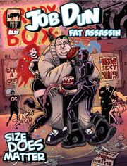
 Job Dun: Fat Assassin

Staff: Mark Hobby, Ben Michael Byrne, Noelle Criminova, Owen Watts, Dave Bolt-01 Evans
Overview:
A must-read story about a heavy-set assassin, some prostitutes, and evil space Mormons.
Review:
I’m gonna take a shot at Job Dun: Fat Assassin today by Spray Comics. Again, going in without much more than the cover and what the cover shows me. It’s DEFINITELY not a kid’s comic and we have a… well fat assassin. The water looks fine so I’m jumping in.
Art:
The art style kind of reminds me of some more recent Dick Tracy stuff, and in a good way. It’s got a very “cartoony” style with thick strokes and some hashing. The best thing I can compare it to are two segments from Heavy Metal (So Beautiful and So Dangerous with a bit of Harry Canyon in there for some fun sleaze). I also get a touch of like Jamie Hewlet (in a good way) and it mingles together to make something all it’s own.
There are some great and immediately memorable character designs and I had a lot of fun with them (love the “f@#k you up score” he gives weapons). I have a little test. After I’m done reading a comic I sit on it for a while. If I can remember the face of the main character- that’s good. If I can remember some of the secondary character’s- that’s better. But in this comic I could even recall some of the background characters pretty clearly.
Lettering / Layout:
The lettering and layout work. No issues there (and that means it is successful). The only real issue I had was that the digital copy I had was of a lower DPI that I would have exported it at- some of the smaller text was hard to read not because of font size but due to complication with compression (due to the export settings). In a physical print or trade this wouldn’t be an issue.
Writing / Story:
I legitimately like the humor in this comic. It’s kinda dark, though in a very self-aware way. Thus far I’ve not really run into many “humor comics” I’ve liked but this is an exception. Like it starts off with the various definitions of the word “Job” and “Dun” but in such a way as to make you think two or three times about the name “Job Dun”.
So the comic suffers a bit under the weight (pun pun pun) of it’s own universe a bit and the slang it uses. I could eventually figure everything out but it took a WHILE to figure things out. Even then Job Dun still kind waxes poetic in his own mind and it’s a little awkward. It gives his character to be sure but it’s a bit hard to follow at times.
The plot is a total whirlwind romp though the Job Dun universe. We’ve got fighters with bouncers at a brothel/strip club, dames who mess with Job’s head and hire him for job, evil space cultists, and a hell of a lot of fighting. It all mixes seamlessly and I enjoyed every second of it. It’s a very rich and unique setting and everything kind of fit together with a high degree of fluidity that I wished more comics had. It was scifi- but it’s own “kind” of scifi if you know what I mean.
Overall:
Overall, I had a bloody blast with this comic. I can’t wait to read more. I’m not normally this passionate about comics but it hit all my “buttons”. Memorable characters, a step outside the norm (well a giant leap), it was legitimately well-written, and didn’t hold anything back. The art was great, the universe better, and I can’t wait to see the next one. Definitely a must-read.