 Starve the Beast
Staff: Danny Homan and Sergio Vicencio
Overview:
A dark dystopian comic that sets up a good story to come.
Review:
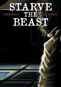
So today I am reading “Starve the Beast” by Danny Homan and Sergio Vicencio. I am going into this cold. The cover doesn’t do much for me, to be honest, it just has (what I assume will be) the protagonist with their back to the reader against a cityscape.
Art
The art style is very dark and drab with an abundance of detail. It almost feel like a neo noir with a touch of horror for some of that “ugliness” the art gives us. To be honest, this isn’t my preferred style of art. It’s very stroke heavy and some things are spot-on in terms of detail but other things just look weird. We even get some sloppier things farther away from the focal point of each panel and there is a little inconsistency between anatomy (relative or otherwise) on some panels. It’s kind of part of the style though so I can’t really harp on it too much.
One thing I will say though is that they artist really knows how to set up interesting perspectives and he uses it to great effect in this comic (see the 1st page for a good example- very dramatic). They also do a very interesting visual gimmick. When people are searching for things (visually) we get these little magnified “pop up” bubbles that have an X or a check mark on them to indicate if it is what they are looking for or not. It give the comic a very frantic sense and I really dug it.
Lettering/ Layout
They took some bold risks with the lettering and page layout. The panels are put together like a puzzle with oddly shaped pieces of varying sizes. It creates a chaotic look, which is what they were going for so- kudos. Outside the panels they have text and, after reading the comic, I still have no idea what it is supposed to be. On the first read through it confused the heck out of me. I think it might be internal dialogue from the main character but I’m not 100% on that.
The lettering is a bit chaotic, but this is intentional and well utilized to cultivate the aesthetic they are going for. It’s very dystopian and it fits with the art style and overall tone of the writing/story. There are a few places it’s hard to tell what’s going on (like who is talking) but once you kind of decipher who each of the unique text boxes belong to, it’s well executed.
Story
The dialogue is adult, telling a very dark tale about drugs, murder, violence and crime. This isn’t for kids and the plot is rather dense. I’d say “convoluted”, but it’s more nuanced and plays it close to the vest as it’s a mystery story. We are doled out information as we go along and by the end most things make sense. This is definitely a prologue because while it sets the stage, it doesn’t go too far down the rabbit hole. I had to read it a few times to get everything. Some terms don’t make sense until they are explained (and most of the explanation is given at the very end).
The characters didn’t do anything for me- and I feel like that’s due to a lack of characterization. I’m sure they develop as they grow, but I’m only reading Issue 0 so beyond the circumstances they find themselves in, I’m given very little to go on. The set-up is well and good but I wasn’t able to identify with any of the characters in a real deep way.
Overall
Now, you guys know my tastes. I am not a fan of dark comics so I am biased against this from the get-go. So, shoving that aside, yeah- it’s worth a read. It’s not the best comic of the year but you can find worse. It will take you at least 2 read throughs before you will understand everything. I get the need to preserve the mystery but in this medium it’s really important to give the reader some context upfront (particularly in an “Issue 0”). If it wasn’t my job to read through this at least once, I probably would have put it down a few pages in. Nothing really caught my attention until probably the last 5-10 pages when we started getting some information on the plot. I’m glad I read it all the way though- it was a good read and by the end I was interested to see what came next. Give it a read.