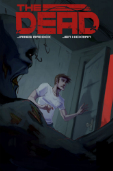
The Dead

The Dead

Staff: James Maddox, Jen Hickman

Overview:

Unexpected take on a common theme.

Review:

I have a comic today that the author promises me is “not about zombies“ (quite explicitly actually) despite being called “The Dead”. I was told it is about the afterlife, but in a way that would be unique and compelling. That being said, lets jump into The Dead.

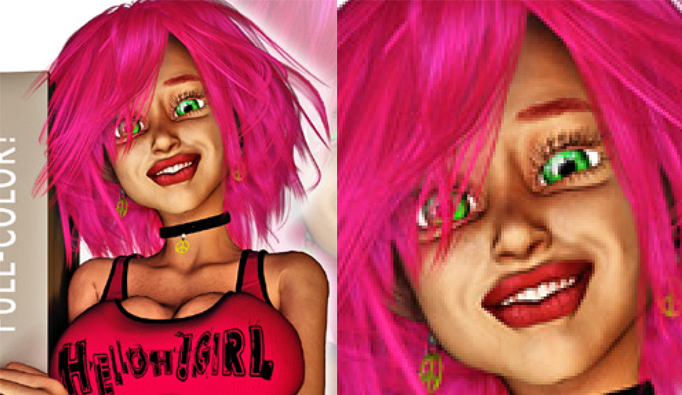
So the first thing that jumps out at me is the very grungy art style. I mean I expected grungy from a comic named “The Dead”, but it is quite well done. At times the scrappy line-work made me think it was messy (see the lack of apparent stroke on Sam’s pants on page 10 due to the black background), but it was clearly the look they were going for. A comprehension of how to effectively use perspective is demonstrated early on with a series of very nice dutch angles (I feel like I am watching Battlefield Earth or Thor). Combine the two artistic choices (angle and style) and you can almost convey the vibe of this comic. They craft a very uneasy, bizarre, world that faithfully recreates the feeling of a nightmare at times. There are some great character designs as well, with everyone being visually distinct and memorable. I like to play a game after I read a comic to see if I can mentally picture all of the characters and normally I can do pretty poorly. However this time I could pretty vividly remember just about all the characters visually (even if I couldn’t recall all of their names).

It should be noted that the lettering on this comic is top notch. The onomatopoeia is fantastic, something a lot of comics neglect. They transform the typography visually to mimic the sound (example: “Crash” might be broken up like a shattering window). I really wished more comics took the time to invest in their letting and onomatopoeia, it’s the single thing that separates the novices from the pros. I don’t mean to say “amateurs can’t have good typography” or “the barrier for entry to becoming a pro is outstanding lettering” but in 99% of the really bad comics I read they have really bad lettering as well. It’s kind of the litmus test for pro vs joe in my book and this one really shows off some really stellar work.

Plot wise I think they are following dream logic. While it works, but there is not much “meat” to it. This is more a comic that is meant to invoke a feeling. It’s very piecemeal and kind of stitched together the the begining, but again that is what they were going for I suspect. A lot of dialogue kind of picks up in medias res quite, and while it is effective in invoking that dream logic kind of jumpiness, it does get distracting if you are reading this, even in one go. I can only imagine putting this down and picking it up and trying to remember what the heck is going on. The same goes for transitions; we get a lot of the comic equivalent of jump cuts.

That brings me to a weak point of this comic. While the comic is engaging, it doesn’t seem to “go” anywhere. Near the end we get a bit of plot development with a “bottle game” (with a fun infographic) and a kind of teaser of things to come, but otherwise it feels very aimless. The direction of the plot seems very suited for a video game from the 90s and will no doubt result in some very amusing “high adventure” style storylines but it didn’t engage me like I expected it would.

To be honest, it was a fun little vacation but it didn’t grab me hard enough to really keep me there permanently. Like I like the world and it is a very seductive world, but I was lacking that “draw” that keeps me there. It might be the detached view the story takes but it never really sealed the deal for me. There is this bit about collecting objects to learn more about The House but the comic itself even says they are just doing it to pass the time. I’m sure there is a bigger plot out there somewhere but dangling a little bit of bait about the nature of something so inherently bizarre doesn’t really do anything for me. Like we have a shattered norm (if you are a Joseph Campbell fan, they are in the “special world”) and as a reader I don’t know the relative value of this danger. If they are in the afterlife or whatnot, what does death even mean? If the information is valuable but unreliable, as it is mentioned that it is often speculative, why risk life and limb (if life has a value)? I feel like the comic could have done a bit more to establish us in the world and explain things a little more before just saying “tune in next week”.

Overall, I liked it. Very unique setting penned by a very novel hand, great artwork, and there was some serious investiture into the establishment of the aesthetic of the comic. I was given issues 1-3 to read but I only read issue #1 (as per my guidelines). It’s worth a read if only for the art and setting.

That is not to say it is a bad comic, far from it, so give it a read!

Metrics

Art: 6/10 (Scrappy but fitting)

Lettering: 8/10 (Outstanding)

Plot: 4/10 (Fun vacation, not to stay)

Novelty: 8/10 (Unique world, fun premise)

Overall: 6.5/10

Link to Product

Top 5 Best and Worst of 2013

Alright gang, so every critic out there seems to be doing “Best of 2013” and “Worst of 2013” lists so I figured I’d toss my hat in the ring. I’ve only been doing this for about 4 or 5 months and I am not restricting my candidates by year they were produced, more year I reviewed them. Also, for those folks who are keeping track at home, please disregard my metrics and the like- I am going for what I enjoyed and turned my stomach the most at. The lists will be top 5s.

Worst of 2013

Honorable Mentions: iHero, Screw Phillips, Surreal Murder Mysteries, Division M

5. Pink Pandas

This comic’s disconnect between audience and tone is staggering.

Clearly written by someone who doesn’t understand his source material. Ultimately it was harmless though.

4. HellOhGirl

The face of the sex doll with photo-realistic skin and a pink wig will remain in my nightmares for years to come and lets not talk about the half-naked cyclops or that hellish TV announcer. The reason it’s not lower on this list is because despite its faults it had some half way decent attempts at humor even if they fell flat. At least there was some passion behind it.

3. Pentavis Chronicles: Unearthing Project

You’ll notice a lot of these comics I grade down have poser art. I don’t think it can’t be used to make a good comic but I do think 90% of the comic I read that use it are downright terrible. I don’t know if it is a lack of investiture with their source or that it is the lowest common denominator when it comes to art, but it is almost always terrible. Anyway Pentavis has the distinction of having the worst lettering of 2013 (with some nasty eye biting yellow text). Couple that with some straight up terrifying poser expressions and rushed aimless plot and you’ve got yourself a recipe for disaster.

2. Kinesis

Kinesis is the epitome of this poser art low/no budget production style indie comic that I see plaguing the internet. I’ll call them “armchair comics” because it almost comes across as a non-professional who REALLY LIKES comics and has some odd idea in their head that festers until they muster up the bare minimum of effort to tell us a story. I mean it is clear that the writer was really excited about making the comic and now is probably telling people that he is a “comic writer (but it’s no big deal)”. Yeah, by technical definition- he wrote a comic. But honestly, this is as much a comic as a flipbook is a movie. Sorry if I’m being so hard on this but it is really a problem with the indie industry. With the floodgates open to anyone who can put together some semblance of art and lettering able to produce a comic, it means we are going to get bad comics. However, every time we get something without a driving purpose, forethought, and a mind for what the audience will think about a comic and someone reads it- it lowers the perceived value of comics (indie or otherwise).

Kinesis gives us a juvenile plot, horrific art, a lack of understanding of the visual aspect of the medium, and so much more. It seems like someone just recorded two 4-year old boy playing together with their toys and made a comic with nightmare-fuel art.

1. Female Force: Nancy Reagan

It’s a Blue Water Productions “comic-mill” style comic that someone crapped out after reading the wikipedia page on Nancy Reagan. This is the kind of comic someone might give you as a kid as some kind of an “educational gift” that would make you cry and ask for some bad Rob Liefeld artwork instead. I get the intention that this would be some kind of “inspiration” to women, but it is so soulless and unfocused in terms of its story that I was going to list this at #2 but I couldn’t bring myself to say Kinesis was worse than it. At least someone actually wanted to make Kinesis.

Best of 2013

Honorable Mentions: Gonzo, Trip, Average Jo, C.U.P.I.D.S, One-Man, Slave

5. Crunch: Revenge

Ok so there were a lot of comics who scored higher than Crunch but I couldn’t bring myself not to include this little gem on the list. It reminds me of the better parts of Venture Brothers and all the pulpy action bits were just too much fun to ignore.

4. Turtle Guitar

Art meets comics in a way we haven’t seen very often. This is more a visual exploration of a theme and vibe more than a story and I loved it. It was nutty, different, and deserves the #4 spot.

3. Fates Abound

Fates Abound really caught me out of no where. I went in with really low expectations and it had to battle uphill though some of the first chapter but once it hit its stride in the 3rd act of the first issue I was hooked. It had such a wonderfully bizarre and twisted premise that I couldn’t help but fall in love with it. While the first act could have been handled better, it was almost required to play out the way it did for it to come to that kind of conclusion. I like an underdog so #3 is where you find this one.

2. Exit Generation

It was a really hard choice between Exit Generation and Fates Abound for the #2 slot. While Fates Abound probably had a more solid premise and twist- Exit Generation was pint for pound a stronger all around comic. It was unbelievably well structured, had a very expressive and fitting art style, human characters, an off-kilter sense of humor that manifests itself wonderfully in the 3rd act, and painstaking effort put into the personalization of the characters via contextual clues. Just goes to show that a lot of attention to detail and planning goes a long way!

1.The Misadventures of Electrolyte and The Justice Purveyors

I hate generic superhero premises, I hate pastiches, I hate parody for parody’s sake, and despite all this I loved Electrolyte. It was made up of all the trends I hate about indie comics but… it worked. It worked and rocked out loud. Any of these top 3 comics could have been my favorite for 2013 but Electrolyte engaged us with such conviction and bravado that I couldn’t help but laugh hysterically as I read it. It goes to show that even when the ingredients SHOULD produce a terrible result in the hands of a master they can make something amazing. The art and lettering were top notch and I got to know all the characters very well. A few of the twists are predictable but they almost make fun of it. I don’t think Electrolyte will ever get a blockbuster movie made about it but I do think that you should give it a read.

In an unrelated note, they sent me a signed copy of their comic! I am so proud of it!

In an unrelated note, they sent me a signed copy of their comic! I am so proud of it!

Conclusion

This year I got to read a whole host of indie comics from stunningly bad to wonderful and I wouldn’t have skipped a single one. I laughed my way through the worst of them and reveled in the slime when it was dumped on me. I’ve been sought out by publishers, rank #2 in google for “Indie Comic Reviews” (Just behind Comics Alliance!), became a featured reviewer for DriveThruComics, and started to write for C42 as well. It’s been a good year and I can’t WAIT to see what happens for this site in 2014! My goal is to have 100 reviews by this time next year.

Anyway, Happy Holidays!

-Scotty G

HellOhGirl

124179-thumb140HellOhGirl

Staff: Jeremy Key, Opan

Overview:

Worst comic I’ve ever reviewed. Period.

Review:

Holy jesus. So I started off with this one by looking at the cover. This is what stared back at me.

holy jesus

I don’t normally do adult stuff so I’ll spare you all the details, but I am going to review this trainwreck because… I don’t know. Maybe I’m a masochist or something.

So the first page starts with a page from this girl’s diary. Lord almighty I can’t read a word of it at normal magnification but let’s not pick on such trivial things when there are so many juicy tidbits to select. This page is written with as much grace as a three year old having a seizure. Let’s look at an excerpt,
“I hang with Finx. He’s kewl. He’s from back home too. We are buds until he farts, Then is when we war and fight over normal stuff like food, the toilet.”
Shakespeare, you have been surpassed. This is the kind of stuff I couldn’t make up if I tried.

Oh yeah, and there is a talking rat who has every “proper British” cliche, pulling words, phrases, and sayings from every era of its history. It wouldn’t be so bad except that they are misused sometimes and the protagonist is made to seem “stupider” because she doesn’t get what he is saying.

So even the spelling and grammar mistakes, which are QUITE numerous, pale in comparison to the kind of bizarre bizarre meta panhandling that occurs. Mind you this is Issue #1. In the middle of a exposition  (I can’t find a stronger word to indicate that every word of every speech bubble is exposition for like 3 pages) scene the main character starts talking about how many fans the Six Source Studios DevinatArt page has and how many fan emails they get and… wow (also I checked, the have like a dozen watchers and their FB page has like 5 likes). I don’t know if I can continue this review. It’s… wow. This is honestly the worst comic I have ever read. Ok Scotty, you can do this, soldier on. Flip to the next page…

hellspawn
Oh god. Why have you forsaken me? What hellish influence has driven the studio who made this comic to include an image like this? Oh lord. Anyway after that nightmarish non-sequitur scene we continue our schizophrenic plot in which Hellyssa is set up on a blind date… and is wearing a pair of joke-shop glasses and nose for some reason. (… do I have to continue to review this? *Searches contract* Fine.) she is set up on a date. But after that- time for a half naked fat cyclops because WHY NOT!

Oh and I’ll list my grievances with this comic in no particular logical order because the comic did away with logic long ago. “C”. You can use a “C” author. “Kewl” or “Krazy” is not kewl to do 15 times. It was kind of ok in the diary entry where we had an unreliable narrator… god why am I applying any iota of thought to this. Anyway, it ends with a… big surprise here… non-resolution (and not even a cliche cliffhanger?) and and ad.
Dear artist. Boobs don’t work that way. (Also, hi bender)


Otherwise it is surprisingly good for a 3D piece. It doesn’t suffer with the issue of lack of clutter or background characters that other comics that use this art style have. The models were surprisingly consistent (except for that news anchor whose face will haunt my nightmares).

They have this odd fascination with the main character who kind of looks like an aged hooker with breast implants and have the mistaken idea that she is some kind of sex symbol or something. The texture for her skin just looks grody and wrinkled. I don’t find her attractive, she is really just kind of terrifying, hardcore uncanny valley stuff going on. I mean if you look at the last page you can see how freakishly large her hands are? Maybe someone thinks she is attractive but to me she looks like they stretched hyper realistic skin over a blow up sex doll and put a pink wig on it.

Also, what is with the adult rating? Other than the half naked cyclops and her comically large boobs- why did this get an adult rating? Like I can see that maybe this could be seen in some super conservative country as “adult” but I totally expected this to be some raunchy sex fantasy. I’m really glad it didn’t though. I did NOT want to see granny sex doll bumping uglies with a half naked cyclops. 

Metrics

Art: 3/10 (Quality 3d with some nightmarish uncanny valley)

Lettering: 4/10 (A few mistakes but overall good)

Plot: 0/10 (Kill me now.)

Novelty: 0/10 (Boobs and pink hair are novel right?)

Overall: 1.75/10

Link to Product

Exit Generation

Exit Generation

Staff:

Writer: Sam Read
Artist: Caio Oliveira
Colourist: Ruth Redmond
Letters and production: Colin Bell
Cover: Ramon Villalobos
Editor: Adam P. Knave

Overview:

Fantastic art, engaging premise, and John Woo flicks.

Review:

So I got an email this morning asking me to review this from the writer. It’s a punky scifi story with a lot of heart. I normally sigh when I hear “this is my first real attempt at a comic” (See Legacy) . Lets see if this one fares any better as

Visually this comic is a lot of fun. There is a very distinct palpable punk vibe to the artstyle that kind of reminds me of an amalgam of Genndy Tartakovsky’s TV work and Jamie Hewlett’s early stuff (There is a thick stroke, a lot of pop culture references, etc). A mastery of expression, form, perspective, visual focus and anatomy are on display in this comic. I was actually approached to review this so I know this is the first real work of this team and I am going to remove my cap here and give them a salute- well done mates. There is a very unique artistic style that you instantly fall in love with that meshes with the tone so well that it is seamless. I wish half the mainstream comics had this level of investiture in their artistic aspects (I’m looking at you DC with your ).

In terms of lettering the first page gives us a bit of an eyesore. It is this tiny, spidery, thin text over a black and white background for the copyright and it makes it unbelievably hard to read. The text IN the comic though is actually professional grade with some very nice use of the occasional onomatopoeia.

The plot is told through very apparent context clues we pick up visually with minimal text. For example, we get text that tells us “United states declares martial law” and we get some soldiers next to a sign that displayed the population and graffiti that says “Full Like everywhere else”. They also interweave the very personal story of a family affected by the events in the plot so we can both get a first person view of it and an almost retrospective historical view of it. The introduction takes 9 or 10 pages and then drops us into the real story. I’d normally chastise the writer for dumping exposition on us, but it was woven in with the personal stories so well that it felt like legitimate plot and provided us with a tangible emotional connection with one of the characters. It didn’t feel like “LORE” dropped on us like a heavy book, rather it was more like an introduction to a character.

The characters are human and real with quirks and tastes. For example, I love how much the gifts the protagonist’s parents get him reveal about him. It is so expressive of who he is and what he likes that it tells us more in one scene about him than most characters get in an entire comic. I got a very Goichi Suda (Aka: Suda51, Aka: The guy who made Killer7, No More Heroes, Lollipop Chainsaw, etc) vibe from it. There were a LOT of pop culture references that informed us of the kind of media our protagonist was consuming.

The dialogue is well written with only a few stale lines, but most come off as charming rather than dry. Once we get the ruleians (no spoilers) on the scene, the dialogue gets hilarious. Their speech patterns add food related phrases (delectable, succulent, delicious, etc) at creepily inappropriate times. I mean it was a bit ham handed (pun pun pun) but it was played for laughs and actually results in a pretty decent zinger at the end.

The postscript is worth a read as well (even if thin white text on a black background hurts my eyes a bit). It talks about what my site is all about- getting away from the big two.

In conclusion- stellar work. A lot of passion, a lot of fun, great visuals, and a premise that will keep you coming back. A lot of this comic feels really engaging even though it is talking about day-to-day things (interspliced with “big” things)  it feels very action pact. Can’t wait to get my hands on the next one. Check the link below for a free 4 page preview.


Metrics

Art: 9/10 (When I say Genndy Tartakovsky meets Jamie Hewlett I mean it)

Lettering: 6/10 (Pro grade)

Plot: 6/10 (Engaging and human)

Novelty: 8/10 (It’s new and well thought out.)

Overall: 7.25/10

Link to Product

Link to Sample

Legacy

Legacy

Staff: Andrew Lorenz and Mike Campeau

Overview:

Generic superhero in genetic tights

Review:

There is something weird going on with the art. Most times it is downright solid, but sometimes it shifts style (in the same panel) and looks like it was drawn by two different people. A good example of this is on page 4 where it looks like the thug’s head is drawn in a different style than his chest. It should also be noted that some of this looks like the reused all or some of certain art pieces. Again on page 4, look at the position of the thug’s head and arm, then compare it to the panel on the top of the page. There is also this weird reliance of really amateur level gradients on things (particularly noticeable on what I assume is paper or trash blowing in the wind?) over what is otherwise really solid line work. We also have a very visually clean city for an environment that is apparently slipping into the hands of crime and heading towards total collapse. I see this a lot with people who don’t pay as much attention to the background and the kind of world they are portraying. There is a very bright background with a lot of primary colors, something that kind of clashes with the urban aesthetic they talk about in the next. This could also be a lack of detail on the artists part.

The lettering is not up to par either. I hate to be rough on this stuff, but we have some seriously decent lettering with some big bobos when it comes to the placement of text (See page 9) in the dialogue balloons. The lettering on the intro is not the same quality as in the comic and really is distractingly bad (maybe a center align or something?). However, otherwise it is very solid.

The dialogue is lifted from every golden age comic ever that serve more to explain the scene then to explore the characters. For example we had line where a criminal say, “He’s got Shane!”. This does very little to educate us, the reader, to the nature of either the hero who has apprehended Shane. It doesn’t even explore Shane’s character and only gives us a vague insight into the other two mooks who say “Forget him, lets go!”. In a lot of my reviews I bring up that comics are a visual medium (at least in part) and you don’t always have to have dialogue for a scene to work. In this case, I think a lot of these scenes would have worked a great deal better if they dialogue had been left off. For example, imagine if the hero has ripped the top of a car and we got the panicked faces of the thugs and as they flee we see him grab one. The emotion on the faces of the characters (which is well done) could have had time to shine and carry the scene, but instead we get trite dialogue.

Overall this seems like a failure of concept. This is a decent art team but it feels like someone had a “really cool idea for a hero” (who is, in truth, rather generic) and paid an artist to illustrate it. It lacks that je ne sais quoi that a well thought out comic concept that has real potential has. The setting is one step from Gotham and Paragon is somewhere between Superman and Captain America. I HATE to simplify it like that, but that’s the vibe I get. Like someone, a very passionate fan, wrote this comic as a love letter to his favorite tropes. And I’ll give him credit- he mimicked them well. However, mimicking and effectively implementing them are two very different things. It just doesn’t feel unique or novel at all. It’s just a different rehashing of the basics wearing it’s factory printed tights.

The postscript is a very good read actually. It tells you the name of the characters and some of the background on the comic’s development. It seems like a lot of passion went into this comic and it looks like there is a longer term goal in mind because we are told there is 130 issues so don’t write this comic off on my review of it. This is potentially a very strong series and I am just reviewing the “trailer” here. Then again, I wish we’d got some of that in the first issue. If it didn’t grab me it might be lacking in something.

Something else I liked in the postscript is that our dear author talks about not talking but doing something. This is a HUGE issue that I see in the indie industry. Everyone thinks is really easy to make a comic and their idea is the best one out there. These guys, including this team, bite and claw their way up. It is a massive undertaking that takes talented people months (if not years) of hard work. Sure they are “indie” but hot-damn if that doesn’t make it all the more impressive.

Metrics

Art: 4/10 (Not pro, some weird elements)

Lettering: 4/10 (Good with a few small missteps)

Plot: 3/10 (Genetic with trite dialogue)

Novelty: 2/10 (Nothing new under the sun)

Overall: 3.5/10

Link to Product

Lei Li- The Rage of the Tiger

Lei Li- The Rage of the Tiger

Staff: Ertito Montana (Based on Kuang Ni’s work)

Overview:

Not much to say- good visual comic.

Review:

So this book is based on the famous wuxia writer Kuang Ni’s work (I am assuming the One-Armed swordsman) and is kind of a love-letter to his style of writing. I actually just got off a wuxia/wushu kick myself so reviewing this comic will be a blast for me. That being said, let’s jump into “Lei Li- The Rage of the Tiger”.

Visually this is one of the most interesting comics I’ve read in a while. It’s a very minimalist, almost cartoony style done entirely with lineart. While the plot is a bit lite, I get the it is not the point of the comic. It’s really about the artistic direction and the stylized. Overall it’s only about 13 pages of actual comic and there is very little dialogue (which works in its favor). When there is dialogue the lettering is legible and the onomatopoeia are in the same style as the art.

If I had a criticism, it would be that the plot is a little convoluted and I often mistook characters for each other. The plot aspect is because they are doing a continuing story and I feel like you’d need to read them all together to understand what’s going on (and that’s part of the fun). It’s also a little short for a comic so if that bugs you… shame on you- it’s FREE.

I’m sorry for a short review this time but there isn’t a lot to critique here. There is some wonderful, highly stylized art, the start of a very traditional wuxia story, and it was a lot of fun to read. And it’s free! Give it a shot!

Metrics

Art: 7/10 (Stylized artwork )

Lettering: 5/10 (Decent)

Plot: 3/10 (Not much revealed and a tricky to understand without context)

Novelty: 5/10 (Innovative artstyle, fun idea)

Overall: 5/10

Link to Product

Gonzo

Gonzo

Staff: Garry Mac, Jim Devlin, Colin Bell, Kev Harper, Iain Laurie

Overview:

Hunter S. Thompson would be proud of this bizarre comics that staggers under the weight of its own premise.

Review:

This comic starts off with a man looking through a vagina-like portal at the universe from outside of time and space. Yeah. It’s going to be one of those comics. WIthout further ado, let’s plunge into Gonzo!

The art is professional level. There are a rare few instances I’d say it could be improved a bit, but ultimately they are not too bad. There are no major missteps and they use a very “scifi” color pallet that meshes well with the clean aesthetic it strives towards. I’ve got a very Fantastic Four vibe from this comic and that’s not a bad thing. I got a bit lost in the beginning of the comic, constant lighting shifts and changes in character proportions made me think there were two crews in two areas or something. I had to re-read it to understand what was going on. Later in a series, this might be a forgivable slip up- but in issue one? (Example: See bottom of page 11 vs bottom of page 9). However, once we get into space (and beyond) there are some truly bizarre creations and fully take advantage of the setting.

Plotwise we have a lot going on. A lot of names, characters, and concepts are thrown at us all at once. Some comics handle this really well, but Gonzo had a rough lift off. By about page 13, I started getting a bit more comfortable and I was able to use some context clues to decipher what was going on. I kind of got that they were going for that kind of frantic chaos at the start of the comic, but with the occasional random nonsequitur quotes at the top of some of the pages and the series’s jargon being tossed around so frequently (“What is pullspace?” I kept asking myself) I felt like a lot could have been done with a simple footnote or two to alleviate this. And the comic has a LOT of jargon. Tertiarists, pullspace, quanta, novak, etc. which didn’t help things.

The comic’s post script basically says it is a meta-contextual view of the universe to explore broad themes and the first three comics will be non stop. Judging this only on the first comic- I am straight confused and I don’t think that it is my fault. We get a LOT thrown at us and very little of it is literally explained. We are given clues or suggestions as to what certain things are, but we are never told outright. Clues build on clues and if you had one misconception, you are lost.  I’m sure there are a lot of really big ideas and they will elaborate a great deal on them in the next few issues, but it really just doesn’t come across super clear to me now. That’s not to say you shouldn’t read this comic, you totally should. It both benefits and suffers under the weight of its own premise and I had to read it two or three times just to decipher it. It has a really bizarre core concept that won’t resonate with a lot of people. This is a very intellectually focused comic and it took a few re-reads to figure out what is going on. Sometimes they have characters speak with their words out of order and while it is a very nice, novel, touch, it does make it a tad hard to read.

I’ll credit this comic with being very brave in tackling such large themes and I’m looking forward to future comics in this series. Judging by its own merits it’s solid work, if not a bit out there. But come on… it’s called “Gonzo”, like the outlandish, journalistic style pioneered by Hunter S Thompson. It’s gotta be leading up to something good! Anyway, give it a read. It’s worth your time but I’d suggest waiting until the first two or three are out.

Metrics

Art: 6/10 (Pro grade with some minor issues)

Lettering: 6/10 (Pro grade)

Plot: 3/10 (Sloppy delivery)

Novelty: 7/10 (Awesome and very BIG plot)

Overall: 5.5/10

Link to Product

Trip

Trip

Staff: Kelly Matten and Waker farrell

Overview:

I got a contact high from this hit AND miss comic.

Review:

So I’ve got an interesting indie comic to review today. It’s called “Trip” and I was warned that it’s written from a female perspective, alternating authors depending on perspective, and features extensive drug use. So, let’s drop some acid and trip into Trip!

So the art is really hit or miss. Some panels it is spot on and sometimes it looks like it was rushed. When it is good, it’s a very interesting stylized approach that lends itself to the tone and theme of the comic quite well. And since there are two artists on this, I feel like I should point out that it is not one artist who is worse than the other. It is more a few rough patches scattered throughout the comic (example: Page 3 and the top right part of page 4 as compared to page 7 or 7). Sometimes the navigation from panel to panel is a little odd and hard to follow.

The lettering was a bit off at some point. The font wasn’t quite sharp enough to give a reader a totally legible experience. An example of this is on page 4 of the comic. A character says, “There’s the liquor; gotta get out of myself”, but the r gets lots and it appears to read, “There’s the liquon”. It also gets a little small sometimes and the resolution on the comic prevents a reader from zooming in to really get much of an improvement. We lose the edge of dialogue balloons due to an inconsistency in whether they have a stroke around them or not . In addition, there are a few capitalization errors and minor grammar errors, but all and all it’s a good effort.

The dialogue is riddled with a lot of slang terms that the uninitiated might find jarring. Occasional linguistic drifts occur and almost seem to hang in the hair for a while. However, it fits with the trippy “burner” vibe that one of the characters exudes. That is to say, it is hard to read but that’s intentional as far as I can tell. There is a lot for the reader to identify with. We’ve all had a party where you got dragged along and just want to go because but can’t because someone else is having a good time. Plotwise I get a kind of Alice in Wonderland vibe. Like complete with the trippy imagery and invitations to a bizarre drug trip. In fact, if I had to pick a single word to describe this comic, it’s “trippy” (I guess that they picked the right title, eh?).

Now let me get to the meat of this comic. About page 12 we get our big jumping off point. This is one of the best representations of a drug trip I’ve seen translated to a visual medium. While the artist are far from professional level- they push themselves and come up with some amazing visuals. Every time we get tossed into that trippy world, everything is dripping with creativity. If the entire comic had this level of visual creativity- it would be a vast improvement. Now since comics are not exclusively a visual medium, we have some great dialogue that firsts perfectly with the visuals. The onomatopoeias used are fantastic and fit the vibe perfectly (check out page 28).

The subject matter touches on a very touchy subject in our society. It explores the reaction to psychedelic drugs in a positive light and uses it as a tool for discovery of the characters. I think it’s effectively done and is pretty risky gamble. It could have easily fell apart and been a bad trip (pardon the pun) but they save it from the fire. One thing I enjoyed was the realistic and holistic approach that the authors use to build the relationship between the two protagonists characters.

The plot, unlike your typical run-of-the-mill indie comic, isn’t concerned with progressing some bloated over the top “epic” story. It’s about two women finding themselves and reflecting on their life. While there is plot progression near the end, that’s not the point. This is a comic focused on character development and exploration of themes over telling a linear story per se. This might turn readers off to it, but I thought it was a successful application of comics as a medium.

Overall, I like the creative intention behind the comic but I was a bit disappointed at the rocky execution. Sometimes this was Grade-A indie comic but other times some sporadic rough spots cause a jarring disconnect. It’s certainly one I’ll recommend you read. It has a brave and creative take on a taboo subject matter despite its pitfalls.

Metrics

Art: 3/10 (A few good pieces, but a lot of rough stuff)

Lettering: 3/10 (Sloppy and inconsistent)

Plot: 6/10 (An exploration rather then a story.)

Novelty: 8/10 (Trippy and boundary pushing)

Overall: 5/10

Link to Product

Average Jo

122094-tumb140Average Jo

Staff: John Pross, Derek Adnams, Julius Abrera, Bryan Maganaye, and Brandon Bullock

Overview:

Solid story, awesome artwork.

Review:

So today’s main dish is Average Jo by Hound Comics. It’s got a slick cover and an “adult” warning on it so what could possibly bad about it? Well, let’s find out!

I mentioned this a while back in my Spectrum review; if a comic’s description starts off by telling us the race of our protagonist- it seems to absorb a lot of the focus on the comic. Average Jo starts off by saying, “Meet Jo Hamilton. Jo is a Filipino-American police officer in the city of Eden…” To be honest- unless this comic is going to be deeply entrenched in the cultural plight of Filipino-Americans, leave that out of it. (I am waiting for the day a non-Neo Nazi comic starts off saying, “Bob Smith is a Caucasian-American police officer in New York City.”) This is a tiny little pet peeve of mine that I’ve spent enough time of this review of a solid comic on so…

Let me jump into the art section of the review by saying, “DAMMMN”. Now reclaim a bit of my professionalism (*cough cough*) I’ll explain why I think this is one of the most gorgeously drawn comics I’ve recently seen. It blends realism and traditional american comic art conventions perfectly. Angels are used well, anatomy is consistent and realistic, the outfits are imaginative (kind of gives me a bit of the “New 52” vibe- in a good way), and they don’t skip on the background. I can’t overstate how important that is, a lot of good comics have stunningly bad backgrounds (I’m looking at you Marvel and DC).

The dialogue is smartly written and have a very professional ring to it. A lot of indie comics have this tendency to overload us with exposition right off the bat and we’re smothered in dry lines by page 3 or 4. I got a LITTLE background (in snippets) during the first two pages. It didn’t require a block of text- I got it through dialogue and demonstration. I like that we get to see a lot of our protagonist’s home life and get to really empathize with him as a person.

At first I didn’t even notice the lettering, which to me makes me squee with joy. Lettering SHOULD be easy to read and not the main focus of the story. They do a bang up job of some very professional lettering and it pays off in a unicycle flowing comic.

One thing I’ll say detracts from this comic a bit of the subject matter. We have “supers” running around cities and a legal act that protects them and… yadda yadda yadda. Sorry to say but this is a really tired concept. We get it from the perspective of a mundane cop which is kind of unique but it feels like 1/2 the other indie comics in the superhero genre I’ve read. Off the top of my head, just the ones I’ve personally reviewed, I can think of: iHero, The Misadventures of Electrolyte and The Justice Purveyors, True North (somewhat), and Division M. In fact, it reminds me a lot of Division M (though much better written and executed) with that entry level cop vs superhuman sort of thing going on. It’s not to say this is a bad comic, it is just a song that has been played one too many times on the radio.

Overall this is solid comic. One of the most well rounded endeavors I’ve come across recently. It has a very human element in what could easily have descended into mediocrity. With a deft hand its crafted and bolstered by some solid artwork. Give it a read!

Metrics

Art: 8/10 (Pro level)

Lettering: 6/10 (As it should be)

Plot: 5/10 (Very human characters, good dialogue)

Novelty: 4/10 (Been done before)

Overall: 5.75/10

Link to Product

iHero

iHero

Staff: Luke J Halsall, Graeme Kennedy, and Gary Chudleigh

Overview:

iSquandered the premise.

Review:

So today I’ve got a comic to review called “iHero” from Obscure Reference Comics. Now I’m not an Apple guy. I think they are proprietary garbage if you ask me… but hey- you’re here for comic reviews right? Lets review that instead 😉

Right off the bat I dislike the cover. Maybe it’s all the comics I grew up with, but this is so divorced from the traditional that it bugs me. We have the title “iHero” in a traditional san serif font and a picture of a iPad with a few “superpower apps” on it. It looks really uninspired to be honest and the artifacting in the top right of the image really doesn’t do this comic’s otherwise decent artstyle justice. The credits page are also done in the same fashion, trying to mimic the layout of a mobile device but coming across like someone was messing around with Adobe Illustrator.

The art is a decent attempt, blinding more of a cartoonish style with comic forms. The use of strokes is nice but sometimes the inexperience of the artist (maybe rush?) shows though. While nothing is “bad”, nothing is good either and it is a far cry from the big leagues. A good understanding of dynamic motion is really shown however and I’d love to see some work from this artist in a few years. On a related note, the letting is legible and even the onomatopoeia are decent. I think they left a speech bubble blank on page 13, but otherwise it is a solid job.

So the plot has me on both sides of the fence. The comic is about an iPod like device that gives you superpowers. The product is called “iHero” and was developed by a guy who looked like Steve Jobs… but isn’t. I understand that they can’t call it “Apple”… but it really detracts from it. There is a very heavy “real world consequences for superpowers” feel to this comic, but we have everything BUT the real world. It is like talking about a burger place in a story but calling it “McSonalds” so they don’t get sued. It seems like there always air quotes around every mention of something “non-Apple” related and it is really distracting (A pear logo with a bite taken out of it, etc).

The plot is very quickly rushed through, like a speed run of some video game. We are told of events, sometimes in single panels, and I don’t feel like a reader doesn’t have enough time to develop any sort of investment in the elements of the story. iHero released, we see some fun uses of it, then it is banned right and left, and we see the bad stuff happening with it. At first I thought some of the early stuff was a parody and we were going to get a zoom out to see that it was a commercial they were considering or whatnot. We have some really dark things happen (A girl freezes her boyfriend’s junk off in retribution of him sleeping with someone else) but it comes across like it’s a joke or funny, and it might have been but then two pages later it is banned and it is implied that people are fearful of this because of the stuff. It is like it can’t decide if it wants to be funny or serious and doesn’t have the substance to convey the complexities necessary to manage that sort of dynamic due to the breakneck pace it rushes through stuff in.

A lot of these situations could be a good 3-4 pages worth of material that could allow us to get invested in the characters and thus the outcome. Imagine if we got to MEET the guy who was teleporting around so he could sleep with his mistress? If we learned about who he was, his personality traits, his rationale for doing it, and the context it occurred within maybe the ending could have a real punch- but instead we get 6 panels of it and are not sure if we should laugh or feel bad for him.

There are a few stock superheroes that you can tell are either parodies or pastiches. We have characters similar to superman, supergirl, and batman joining “not-Steve Jobs” on a superhero team (reminiscent of the Justice League or perhaps Avengers) to combat people misusing the iHero. In a world like this- it seems like a really missed opportunity to develop some really unique characters.

While this comic starts off with a potentially really interesting premise- it is squandered on mediocre fair. The whole comic seems really one note; “What if an Apple product gave you superpowers?”. If that excites you- read this and laugh at the iPod jokes. If not, I am remiss to recommend it.

Metrics

Art: 4/10 (Decent but not pro level)

Lettering: 5/10 (Legible)

Plot: 2/10 (Rushed and exposition heavy)

Novelty: 4/10 (Squandered)

Overall: 3.25/10