Cluster@#k

Cluster@#k

Staff: Jon Parrish, Diego Toro, Kote Carvajal, Nic J Shaw, Steven Forbes

Overview:

A fun little paranormal detective piece

Review:

Alright so we are jumping into Cluster@#k. No I didn’t censor that. It is legitimately the title (and I can dig it). I know I just did another Alterna comic (Billy the Pyro) but it is a different team and that’s really why I don’t do the same publisher twice.

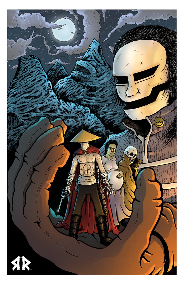
So onto art. It’s a full cover with a more modern artstyle. There are some manga influences but only about as much as would be present in a lot of modern American comics. Cover is dynamic and exciting showing exactly what is going to be in the book. The characters are visually distinct, their design reflects their personality, and are (at the very least) well drawn. Anatomy remains consistent from page to page, proportions are not all wonky, and the artist has a good grasp on the utilization of angles. Seriously- the tell-tale sign of a good artist is a mastery of anatomy, facial expressions, dynamic poses, and the use of a variety of angels (love the low angle ones).

There is not much to say about the lettering. It’s solid and I can read it- exactly how it should be. They have some nice use of off-panel dialogue boxes and only on a few occasions was I confused about who was saying what (they were easy to figure out).

Plot-wise we are just kind of dropped in in media res style. We get bits and pieces as we go and I can’t really decide if it was done really well or just kind of bumbled into being cohesive. That being said, we get a few panels of pure exposition but you kind of have to in a first issue so I’m not docking it any points for that. About a quarter of the way in, it just kind of jumps off the deep end though. It goes from kind of standard adventurer/private eye/pulp fare to a more fantasy thing. Talking hobo-murdering goats, demon fusing guys, genetic abominations, and a bit of DBZ style combat. I… am not really sure how to react. It just kind of comes out of left field. Like WHAM and I don’t know that when the stars stopped floating around my head I was really ok with it. A clusterfuck indeed.

It sets you up one way then kinda does a switch-a-roo on you. After a few more pages it kind of works into a new groove and I didn’t hate the new direction. It turns out this is kind of a paranormal investigator piece with a government agency involved. The dialogue is well written, the character’s personalities inform their language and word choice, and it’s overall pretty enjoyable. I didn’t notice any major or minor errors in spelling or grammar so that’s a plus.

Overall, I’m actually fond of this one. While it doesn’t break any super new ground, it does so in a fun little way. I can see some fun plot potential down the road and the dialogue kept me reading while the art sold me initially. You could do worse with a paranormal detective story. Give it a read.

Metrics

Art: 6/10 (Solid)

Lettering: 5/10 (Does what it should well.)

Plot: 6/10 (Not bad. Liked the dialogue.)

Novelty: 3/10 (Not a super new premise)

Overall: 5/10

Link to Shop

Billy the Pyro

Billy the Pyro

Staff: Brad Burdick Fabian Cobos

Overview:

SO pretty but SO predictable

Review:

So tight off the bat the lettering bothers me. At the default zoom setting you’d have to be a hawk to read the text on the page it is so small. After zooming in a few times I can still read it but the first text we encounter is still comparatively small to the rest of the page. The keening and line spacing could also have been spaced a bit more. Right now it feels very cramped and relegated to a much smaller portion of the page than it should be (it’s tiny) judging by the large amount of free space in the comic (though that could be strictly a compositional thing). Not to mention that the narration has this small font on a yellow-orange background. This does get better as the comic goes on and I’m probably just nitpicking here.
The art style is as polished and professional as any big name publisher with special attention being given to scene composition. One thing of note is that they really do a fantastic job of populating the background in every scene. You’ll notice that some comics will provide a great deal of detail in the background of one location and basically just leave the background blank (or maybe have some vague texture or whatnot) but this one does a good job of composing an interesting scene that is evenly populated. Also of note is that the artist does a great job with subtle expressions, something not always well-executed with an art style like this.
So I got a confession. I didn’t like Catcher in the Rye. I just thought it was a boring book about a kid who was way too full of himself and a I didn’t really like a few hundred pages of someone complaining in my ear. I only bring it up because 10 pages in and that’s all I’ve heard thus far. The main character is troubled and his life sucks. It’s a familiar tune (“Second verse, same as the first!”) and while it’s well-written here, it does seem a bit overplayed. As soon as the 2nd part of the comic’s plot hit, I could tell where it was going and the rest fell into place like a familiar puzzle. It’s a real pity, they set the story up competently and the writer clearly is very good at writing identifiable characters but the premise has just been played out a dozen times before. It’s kind of got Legacy syndrome. The basic story of “kid’s life sucks, he’s a misanthrope, he gains powers, he doesn’t understand/can’t control them” has been done to death (Rogue from the X-Men comes to mind but I can probably think of a dozen more).
In conclusion, this is a BEAUTIFUL comic (check out the last few pages if you don’t see it in the first few) that has a great writer attached but a totally overdone premise ruins what could otherwise have been a masterpiece. I think you should check it out if superhero/villian comics are your thing but don’t expect much intrigue.
PS: Did I mention it was REALLY pretty?

Metrics

Art: 9/10 (Marvel. Hire this artist.)

Lettering: 4/10 (Some issues early on but it recovers and has solid lettering later)

Plot: 5/10 (Decent characterization but stale plot )

Novelty: 2/10 (You were the chosen one! It was said that you would destroy the Sith, not join them!)

Overall: 5/10

Link to Product

Return to Rander

Return to Rander

Staff: Tony Sedani

Overview:

A very creative little comic that stumbles now and again but gets up and keeps fighting.

Review:

Hey guys, today I am looking at Return to Rander by Tony Sedani. Looks like a samurai western judging by the cover (and I love me some samurai and westerns) so I’m going to jump in feet first!

The first note I’ll make here is that there is some really stellar character designs in this comic. A lot of creativity went into them and it shows. However, in terms of overall artistic prowess it’s definitely not professional grade. It’s not distracting or even outright bad, it’s just that some of the shots have some perspective disagreement and issues with consistency (in terms of quality and anatomy). Again, not BAD art but it didn’t knock my socks off either. There are a few instances where they chance the page size, but not enough to be a double-spread. It makes it a little hard to read with standard PDF readers.

In terms of lettering the dialogue balloons are outstanding. I feel like maybe they left a little too much empty space around the actual text, but it’s better to leave too much rather than make it all crammed in there. A center diamond layout for the text’s distribution could probably have given this comic a more professional look in a few places but it’s legible and not distracting- and that’s the important part of a comic’s lettering.

Dialogue-wise this comic has it’s ups and downs. There are some fun lines (“Why do you have to be so cryptic?” “Talking skulls are always cryptic…”) but overall it is some pretty stock dialogue. Sometimes it seems like they are just espousing characterization rather than natural language in the same way someone might do an exposition dump. I am happy to say that we are not given a steaming pile of exposition at any one point in this comic and the natural build of the plot is a point in its favor.

Unfortunately the overall plot is a bit derivative and, while we get some promising early glimmers, the characters are pretty generic. A heroic protagonist with no memory has been done to death and a protection racket on a inn where the hero helps out for little-to-no reason? Stop me if you’ve heard this one before. There seems to be a bigger plot at play so judging it on the merits of the first issue is probably not the best idea. I see the first sparks of a really solid plot and I’d be interested to see where it goes.

Overall, this is a very creative comic with a good mind behind it. It has it’s weak points, primarily when the writer relies on stock tropes rather than taking risks, but really shine when they go for their own style. If I had to draw a parallel, it’s in the same vein as Avatar: The Last Airbender or even Samurai Jack when it is at it’s not on that level. Ultimately, I’d recommend you pick up this book and see where it goes. I only review the first issue of comics but if I had to guess there is a much bigger story at play and it will get tantalizingly good in a few issues. Give it a read!

Metrics

Art: 4/10 (Rough, but with creative character designs)

Lettering: 5/10 (Decent)

Plot: 3/10 (Kind of plane, but looks like a bigger plot is starting)

Novelty: 6/10 (Interesting setting and )

Overall: 4.5/10

Link to Product