Theodicy

Theodicy

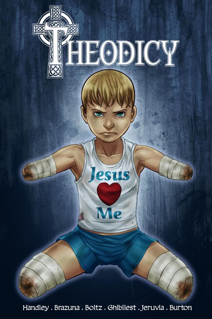
Staff: Chad Handley, Fernando Brazuna, Ryan Boltz, Minan Ghibliest, Kel Nuttall

Overview:

A heavy handed comic about Jesus themed superheroes in cartel-run Mexico that is way better than how I am describing it.

Review:

Next on the agenda is “Theodicy”. You can actually follow along with this review HERE. I was promised blasphemy and, in honor of the holiday encroaching on Thanksgiving- I’m all for it (Seriously? Why is there Christmas music in the middle of November).

In terms of lettering, we have a few times when the letters could be larger but it’s all legible so no complaints here.
The art isn’t bad but it’s not professional either. It’s about 75% of the way to being professional but there are still some odd expressions and odd rendering of the contours of human faces (sometimes really flat, sometimes really detailed). Some of the rendering of the clothes they wear are draw in a fashion that doesn’t reflect the nature of the material (leather jackets seem to work just like cotton does) and there is some minor continuity errors artistically.

To say the plot is heavy handed is a grievous understatement. The good guys are TOO good and the bad guys are puppy-kickingly evil. It’s about a subtle as an episode of blue clues. Exposition is pretty doled out by the spoonful on page 6 but even with that generous helping of plot details I am still left awestruck by the randomly unexplained man with giant black wings that no one seems to notice/care. The names of the characters on the pinups are all very generic (seriously… the Chinese dude is named “Wushu” and the other one is “Wuxia”?)

Despite all the flaws of this comic… yeah I liked it. It has charm and personality. The religious aspect of comics like this which normally kind of bothers me… didn’t. I dug these priests and after I saw the pin ups I was like, “Holy shit*! Super-priests in cartel run Mexico dishing out the hurt to Evil McEvilson? Sign me up!” It’s just rough and dark enough to take the “sunday school” aspect out of it and almost parody that sort of “Jesus is my best friend!” comic. I REALLY hope they go farther with that and the preview of issue #2 really showed that they are. Call me crazy but I’m interested.
*Pun pun pun


Metrics

Art: 4/10 (Not bad, not good)

Lettering: 5/10 (Average)

Plot: 3/10 (Issue #1 is slow and the writing is a little heavy handed but it has character and a good set up for the future)

Novelty: 8/10 (I dig the premise!)

Overall: 5/10

Link to Product

Pirouette

Pirouette

Staff: Mark Miller, Carlos Granda

Overview:

A high quality indie dark comic about abusive clowns

Review:

Ok so today I will be looking at Mark Miller’s comic “Pirouette”. It’s got some crazy circus stuff on the cover and some decent art so let’s follow this rabbit hole to wonderland and see where we end up! (Reader note: This is an excessively graphic comic and if you are squeamish don’t read it).


The art is terribly dark but it fits with the theme and the paneling really furthers that tone. That being said, the art is fantastic, rivaling some of the best work I’ve seen in the industry. There is exquisite details and the artist really knows how to stick to his chosen color pallet. Each character is visually distinct and memorable. Of note, is that this comic has a really high production value. Someone REALLY dug this comic so my hat (or maybe mask?) is off to publisher Black Mask for their superb quality and care.


Something I always like is good typography and page 1 we have some very interesting use of lettering. It comes in the form of a retro “headline” style display (where many bulbs are used to form letters) that spells the comic’s name and has a few burnt out and smoking bulbs at the end. This sets up the comic to draw a lot from circus mystique and have a darker undertone. I gotta say, I absolutely hate the full page spread panels on this comic. It really ruins the flow and sometimes I really wished they’d relegated certain parts to smaller panels (even the establishing shots). I love the choice of lettering, it’s very expressive while still being legible. Sometimes it makes the text (particularly on e-readers) look very very small and difficult to read.


The tone is very dark and the plot is equally so. In the very broad strokes, it’s about a young female clown who has a rough life in the circus and we get to see all the pain she suffers. The characters are memorable, if only visually, and you kind of see everything coming. Nothing that is going to blow your mind but as far as stories go, it is a very human one. The writer has a great grasp of tone and metaphor but sometimes is a little too on the head. The dialogue is well written and intertwines a lot of colloquialisms well. Again, a few stick out as odd or out of place but on the whole they work well. They do passable on the humor aspect but it really feels like this comic’s strength comes from it’s believable (if not decidedly dark) characters. The plot of the first issue didn’t really do anything for me and the hook at the end kind of made me shrug. It does seem like it is going somewhere but not somewhere I am really, personally, interested in.


Overall, it’s a comic that is exactly what you see on the label. It is a dark comic about circus life and if that’s your cup of tea (read the comic…that’s a funny joke) you will enjoy it. Comes for the art and stay for the elephant poop and clowns.

Metrics

Art: 7/10 (Damn good)

Lettering: 5/10 (Does some interesting things but has a few minor errors.)

Plot: 2/10 (Kind of left me bored… and this is a comic with abusive clowns!)

Novelty: 3/10 (Nothing new under the sun)

Overall: 4.25/10

Link to Product