The Lightbearer

The Lightbringer

Staff: Kyle Simon, Jamie Me, Blake Wilkie, and Gleidson Ribeiro

Overview:

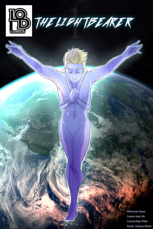
Next up is “The Lightbearer” by LOD Comics. It’s got a beautiful cover, it’s got something to do with the antichrist (I try not to read much in the way of summaries), and I’m ready to jump in with both feet!


 Art:

So the artist is a detailed, realistic, style. It’s professional grade but not in the style of the standard “big two” comic companies (which isn’t good or bad)- it’s beautiful and well done. Couldn’t ask for better. This is some hand drawn goodness. It gets downright artistic (like, hang “I’d hang this on my wall” level good) and even a bit abstract (in a good way) once we get into it. I don’t know how well someone of a more traditional ilk could have handled this. It’s tonally appropriate, well done, and compliments the tone. There are some WICKED COOL character designs and they use their visuals appropriately to further the story. They have some great dynamic posing, the perspective is great (some *ahem* nice use of shadows too), and the penciler clearly had an idea for scene composition. (Bonus note: check out some of the cameos on page 15)

There are a few oddities (page 6 has some weird quality issue across the guy’s waist, the light on earth stick out too much and seem to be above the clouds, some weird expressions like on page 11) but they are a drop in an ocean of good quality.


Layout:

The lettering is fine, which is the best praise you can give lettering. It should be unobtrusive, legible, and used only when needed. Full marks for that. There is some fantastic use of panel transitions here. Like… best I’ve seen in an independent comic. They are downright inspired (see page 4 if you have any doubts). It’s also worth mentioning that they make good use of it throughout the entire book!


Writing / Story:

A good comic writer knows when to write and when to let the visuals speak for themselves. Damn- they nailed this. Some of my favorite works are dialogue light and this don’t disappoint. The premise is simple, mysterious, and moves at a solid pace. I was engaged the entire way though, and am totally looking forward to the inevitably awesome smackdown that’s going to happen in issue #2.


Overall:

Overall- this is a must buy. It’s solid, fun, wonderful, and bizarre. I have absolutely no idea where this rollercoaster will end but I want to go along for the ride. They got the right writer and the right art team for this. Seriously- give this a look!


Metrics:

Art: 9/10 [Solid, hand-drawn, goodness. 1 or 2 minor hiccups]

Lettering/Layout: 8/10 [Lettering is legible. Layout is awesome.]

Plot: 7/10 [Can’t wait for #2]

Novelty: 7/10 [This is some weird, bizarre, fun, stuff.]

Overall: 7.75/10

Buy it Now!

Mirai

Mirai

Staff: Hamish Downie and Kaho Takamura

Overview:

So I’m looking at Mirai today. This is a straight up manga style comic by Hamish Downie and Kaho Takamura. It’s not my usual fare for this site (though I’ve read my fair share of manga) but I’ll give anything a shot once.

Art:

The art is professional grade for manga-style artwork. It’s black and white but that doesn’t detract from this too much. The character designs are fun. There is an odd use of materials or textures that sometimes seems really out of place (see the plane’s nose cone on page 3 for an example- and yes I get it’s supposed to be made of an odd material).


Layout:

One thing I’ll notes is that the compression on this comic is terrible. There is a lot of artifacting on the pages. I’ll also note that it appears that some of the art assets, particularly the dialogue balloons seem copy/pasted as they are (pixel to pixel) identical. This was also clearly written in Japanese first then translated to english for a second printing. That’s fine but it brings up some odd text placement/flow in the dialogue balloons at time as they are clearly trying to fit English words into balloons sized for the Japanese text. This means there are times when the text needs to be made significantly larger or smaller than it should be (or would have been for an English release) at times. This, in addition to the artifacting, makes it really hard to read (see bottom left of page 5). I had to keep zooming in and out to read it.


Writing / Story:

The plot is a little weird and, I’ve read weird plots before, but I’ll admit I had to go back and re-read a few pages to understand what’s going on. I still am only like 75% sure I got it all and I’ve reviewed like 70+ indie comics. I think a lot of it is due to the transitions and pacing. The transitions are very jumpy and not a lot of explanations are given (see end of page 9 to start of page 10) or establishing information given. The pacing is very odd- we get a lot of time devoted to some scenes and altogether skip over others (like the trip back to Japan).

The same can be said of characterization. We are told a lot of things, rather than shown (see page 12 for a rather blunt example). At one point a character fights like hell to return to Japan from a trip to Australia but then we have a tiny panel where she is scolded for trying to go to Australia.

There are lots of plot elements thrown at us that don’t really get fleshed out. We have a relatively realistic world but then we are introduced to planes “made of rice crackers, fueled by sun-flower oil, and love”, a subplot about a grandmother, a not-well-explored line about a mouse who the protagonist saved, a plot about an Empress that literally only fills half a page, something about winning a Karuta tournament, a robotic cat, and then shrinking. Like the first half was able for a reader to follow but then we just get into some rather dramatic lack of cohesion. It’s like the writer started out with a plot then realized they were running out of pages and just kind of starting throwing random things out to get all of it into issue #1 for some reason. If it was all one thing (“plants as technology”, “an exploration on the implications of life-like robots”, “environmentalism taken to an illogical extreme”, “magic garments”, etc) it has the potential to be a decent premise… but it seems like everything was just kind of tossed in the blender and nothing is explored. At all. Like, that list I did earlier? You literally have about as much information as the reader does about them. They are just kind of shown, as things.

The whole thing is just kind of a mish-mash that probably made sense to the author and might be better explored in subsequent issues but this was just a painful read. What they need to figure out a bit more solidly is pacing and tone. It might have behoved the author to start with the introduction to the Japanese cast (see page 10) and then, though flashbacks (even if it wasn’t in the first issue) explore the protagonist’s background.


Overall:

So, a lot of people will probably be willing to give this a higher rating than I will because the art is very pretty, the characters adorable, and it’s an English manga. I grade art and writing separately. If you imagine this comic with poor art- it’d be a trainwreck of a plot. I really dislike giving poor scores, particularly to passion projects, but this one is one to skip.

Metrics:

Art: 7/10 [Better than average.]

Lettering/Layout: 1/10 [Artifacting, text issues, reused assets.]

Plot: 1/10 [This is a mess.]

Novelty: 3/10 [Lots of ideas. None of them explored.]

Overall: 3/10

Link to Patreon

Mi Sweethart

Reviewed by JustKay

Overview

Badass super agent in her jammies kicking people in the face and letting out her dog, which is also a human… but still totally a dog.

6424Review

Hey you kooky comic readers, thanks for joining me this week when we take a look at ‘Mi Sweethart’ by well I’d love to tell you but the fact is the creator didn’t put their name on it or the name of the artist. I don’t even know if they are in fact the same person. I’d love to give them credit but seriously, ya making it kind of hard on me to do so.

(PS – after using our all mighty Google overlord the author of the comic is Sam Head, however I’m keeping my opening because WHY WOULDN’T YOU PUT YOUR NAME ON THE THING YOU SUBMITTED TO A REVIEWER~)

Writing

So its not so strong on its plot, this issue is more then likely just being used to introduce the main character and set up for bigger things in the series. Not a ton of things get explained and you have alot of fact, names, organizations, etc all thrown at you with gloss over details or more often no details. There is a clear story line in this issue straight from the beginning that sets to reinforce the universe they are trying to create for the series. Points there as that is a very hard thing to do.

Ugh~ I freaking love Mi~. Now don’t get me wrong the character is by no means perfect, in fact at this point she comes off as a little one dimensional. BUT she is a female super agent/spy who isn’t 1) male gazed to the point of being ineffective at her job, 2) innocent or obtuse, 3) clearly just there to be rescued. Mi is a badass, swearing, vulgar woman who drops dirty lines about blow jobs after taking a sword to the face. I really hope the creator takes the time to add depth to her character in the following issues because otherwise they are going to shoot themselves in the foot hard.

Art6e7b38a2f1e60355b794dd89b86a47d3._SX176_QL80_TTD_

The style and the story go really well together. Although I am a bit disappointed that the quality of the style we see on the issue’s cover isn’t the quality we get inside the comic. The creator picked a great style for the story but its execution ended up rather muddled and rushed looking. So the inconsistency of quality through out the issue is a little jarring and definitely knocks you out of trying to be absorbed by the story.

Lettering is nicely broken up into easily read chunks since the motto of the creator seems to be show don’t tell. Something I talked about in the writing section that I ~love~ seeing comic creators do. If I wanted to just read pages of text I’d literally pick up one of the dozens and dozens of books I have pilled up from recent book store trips. Only two things to pick on when it came to the lettering: the broken record one of it being in the standard default comic font, and that at times the bubble and the lettering seemed a little blurred like maybe that layer in the PDF has been tweaked.

Novelty

I know there are probably tons of super agent ultra spy comics out there, just as I know that I could drown in the number of super hero comics. But there is something about this comic series thus far that leads me to be excited to see where its going. The why they set up the casual nature of the agency she works for, her reputation, and some of the superbly ludicrous claims that turn out to be true. All of it creates this space where the absurdity of Saturday morning cartoons meets the vulgarity and brutality of Archer.

CsOlnUbWIAAN3fZOverall

Not a bad comic actually. From the title I was actually expecting either a romance or a play off of a certain Italian plumber whose name I’ve been assured the use of is well outside our budget. The art style really lends itself to the sometimes off color brash story and characters. Still not quite sure they cleared enough stuff up for the reader before cutting off for the next issue, but I will admit that they are leaving a bit of a hook to come back and read Issue #2. I’d definitely add it to my list of downloadable comics to keep an eye on for updates.

Metric Breakdown

Art: 7/10 [Unique style, quality inconsistencies]

Lettering: 6/10 [standard fare, sometimes reads blurry]

Writing: 7/10 [Plot built universe, great potential for Mi]

Novelty: 7/10 [Nice mix of absurd and vulgarity]

Overall: 6.75/10

A More Colorful Review – Paper Girls

Reviewed by JustKay

PaperGirls_Vol01-1Overview

A bizarre tale of weirdness laced with strange from beginning to end. Also they definitely have way too many undelivered newspapers to be keeping their jobs after this.

Review

Join me today while we take a look over Paper Girls: written by Brian K Vaughan, art by Cliff Chiang. Its going to be a bit of a weird ride so hang in there with me while dive right into it.

Writing

To be honest I’m not entirely sure what I just read. Was it enjoyable, I think. Was it rememberable, sort of. More then anything its a very strange drawn out tale that leaves you utterly confused. I’m not sure it was entirely by design. I just read a whole volume of the stuff and I’m not even sure what’s going on. Its like a bit of jumbled writing was created in hopes of creating a compelling story line but they forgot that you need to explain or show things to your reader so they can become invested in it. As things stand I could walk away from the story right now and not be too upset with not finding out what happens.

As 12 year old girls go they aren’t believable. They read more as seniors in high school if Paper-Girls-2-Headeranything. Especially who I guess they are trying to paint as the protector of the group. What 12 year old girl smokes cigarettes, is accused of being a loan shark rolling people, and decides having gun is the best course of action? So for characters they get docked on this one. The way the girls act, respond, and talk vastly differs from what they are trying to portray them as. But it does add to the extremely bizarre vibe of the whole series.

Art

The art is nicely done, though the character’s faces do tend to lose definition sometimes to the point of being creepy. The simple colored backgrounds when focusing on characters though lends itself very well to the story telling. Some of the panel choices though seem off. Why would I want to either crane my neck side ways or hold my comic like some playboy magazine to be able to tell what’s going on?

tumblr_nvvfqhRlVz1smnk5ao6_500Lettering is again the standard font for comics, but they somehow get a little bit more intonation out of it with the text bubbles themselves then I’ve seen previous series do. Good on them for figuring out how to make that font a little bit more bearable. I hope in the future maybe they decide to jump from the standard font to bring a little bit more life into their characters and the story.

Diversity

It has an all female lead assemble cast which is a cool thing to see. They are all young girls, which while cool to see in a comic, is questionable since they act more like adults in a sometimes vulgar way I wouldn’t want a little kid exposed to. The cast does include diverse races and ethnicity though so points there.

Overall

Probably a story you’ll have to read a few times just to really nail what the hell is actually happening in it. It feels like you are just kind of getting thrown into things without really building any connection to the characters or any understand of the universe. But I think the main cast is feeling a bit like that as well. Hopefully we will see a little more structure from the series as it progresses to make it more approachable to readers.

Metric Breakdown

Art: 7/10 [Good style, missing details]

Lettering: 6/10 [standard fare]

Writing: 6/10 [What did I even just read]

Diversity: 6/10 [Gender and ethnicity check]

Overall: 6.25/10