Beauty in Chaos: GalaXafreaks Park Vibes

GalaXafreaks Park Vibes

Comic by Andrew Pawley

Psychedelic Cruise
galaxafreaks-park-vibes

GalaXafreaks Park Vibes is a psychedelic cruise with good feeling and satisfying ride. The weak hooks make the ride a little bumpy, but not any less fun. There’s definitely room for more of this guy.

Art

The art is absolutely fantastic and downright psychedelic. It’s a high-intensity palette with plenty of hot colors and high contrast moments. Each panel is so full of energy, even the dialogue follows suit. Most of the characters speak with bubbles that pop out like stickers on a poster, but many of them have their own artistic choices. This art works well in the comic just as well as it would on a poster. There isn’t a spot in the comic that breaks the artistic mold. From start to finish, it sticks to its premise.

Comprehensibility

The writing is as psychedelic as the art with heavy influences from the hippie age. It’s not always the easiest to read, but it fits the style and carries the story forward. If nothing more, it really lets one in on the characters’ personalities. The writing takes a few wide turns. Bouncing from one end of the spectrum to the another, but buckles down and brings all together after introductions are met.

One character has an exclamation point as a part of his name, and even the overall style of the comic doesn’t really make up for how awkward it feels at times. It took a couple read-overs to recognize it wasn’t the end of a sentence. Introductions are met quick, characters are named up front and their personalities are ever-present. Mystery doesn’t move this story, but a nice cliffhanger at the end drives a want for more.

Cohesion

Great art, good writing, and a handful of simple characters drive the story. It can feel a bit hard to keep up with when the comic is bouncing between worlds, but that doesn’t detract from the comic in any monumental way. Without digging too deep, it’s easy to brisk through the panels. This one’s worth reading for something quick and beautiful that leaves a nice desire for more. The amount of direction in the art as a whole brings the entire piece together.

I want posters of this one; make more!

A More Colorful Review – BashBack

Overview

When the world decides to beat down on the Queer community, the Queer community punches back. In this series full of violence, sex, language, and angry queers you better watch who you decide is worth a beating because they just might punch back.

Reviewtumblr_nejv76iCfG1qg4b06o1_500

This week we will be looking at Issue #0 of BashBack. A comic about a Queer Mafia written by Lawrence Gullo and Kelsey Hercs, with art from Fyodor Pavlov. This is an indie comic in the purest sense so if you’d like to get your hands on a copy after the review you can by their tumblr as they have recently done a Kickstarter to do the first physical prints of their comic.

Writing

The plot of the story is very much about showing and possible bleeding off some of the anger the Queer community has. When you are constantly attacked, degraded, and disregarded for who you are its really hard not to be pissed off and wanting to do something. In this series the writers focus that into a story about the Queer community protecting and providing for their own even if it means going outside of the law to do it. They are a Queer Mafia, a buffer between the hate groups and their people. It is really a very compelling story even if some of it comes off as extreme I believe that fits write in with the writers point for the series. All of the story elements pull you further into the world and you feel the justification, and perhaps the justice, behind the characters actions.

Screenshot 2016-05-26 14.54.17Man does this series have alot of characters! And its only Issue #0. Now while not all of them get fleshed out in this issue you get enough a feel for them both through the art, and their interactions with the main players of this issue to really make me believe there is alot there the writers can explore in future issues. Heck even what I consider to be the 5 characters this issue put in the spotlight already have alot of background and identity baked right into them. The way the talk, they manner they go about protecting people, their interactions with each other all of it serves to make you feel like these are fully realized people. Really interested to see how they make this work for them down the line.

Art

In contrast to the brightly down cover they’ve opted for purely black and white art inside. Which seems very strange at first but makes sense. They are trying to invoke that gritty feel that was achieved by other media left in black and white. The series is reaching back into the media knowledge of mafia and trying to put that to use to help us slide into the story line. Considering its all in black in white it is rather beautifully done, they don’t lose details because of it. Their characters are all still distinguishable and come with their own unique details that stay consistent through out. So of the club scenes or those with a lot of background art do seem to meld together because of this choice though.

The lettering feels a bit like maybe they left that for last in the production pipeline. Bash-Back-John-Doran-Beating-660x1001
Spelling mistakes, places where the lettering goes outside of the speech bubbles making it hard to read, and weird ordering of those speech bubbles make a few parts way more confusing then they would have been. For the most part that’s really the only things that added confusion to this series for me. They even used a very generic font throughout it that while readable didn’t really feel like it fit in the universe they were building. I think they very much need to polish and buckle down on lettering for their issues moving forward.

Diversity

This series does a great job with this. A large portion of the queer spectrum is represented, multiple races are shown in the forefront, and body types vary. With this only being Issue #0 of the series I very much look forward to seeing how they keep up this pace moving forward. The main character is dealing with being trans in a world that is actively hostile against him, but seems to hold his own after finally finding a ‘family’ that accepts him. I really hope they take the time to explore all of the potential pressure points the queer community has that they have seem to set up for in this first issue.

Overall

I think this will be a really interesting series to keep an eye on. They’ve set themselves up with a fantastic cast of characters, a really interesting universe, and a foe of bigotry that could take an endless number of shapes without having the story lines become boring and repetitive. I do think there is room for improvement and polish with the lettering and probably even with maintaining details in larger scenes. But this series really does kick the major leaguers in the balls with its daring.

Metric Breakdown

Art: 7/10 [Lends itself to story, so details lost]

Lettering: 5/10 [Spelling errors, outside bubbles]

Writing: 8/10 [Huge character cast, lots of potential]

Diversity: 8.5/10 [Great show so far, lets see what they do with it]

Overall: 7.13/10

Spoiler Free Iron Fist Review

Iron Fist share much of it’s DNA with the Daredevil series. They could be brothers or maybe cousins but Daredevil was the one that went to college and got a job that it worked hard to make pay off. Iron Fist is the one who saw how well Daredevil did and tried to follow in its footsteps without understanding the finer points.

the-last-dragon-bannerWhat it wanted to be was a 80’s kung fu movie like the Last Dragon, Big Trouble in Little China, or even like 90s action movies that were not as gritty like Only the Strong, Die Hard (I know it was ’88), or even Iron Monkey. What it ends up being is like a b-grade action 90s action movie, ironically, like the original daredevil (when you see the chick with the spider stuff, try not to imagine her in a bad 90s flick).
At it’s best, and that’s near the end of the series (a trend with a lot of the Netflix series), it’s a fun series about Danny and Connie running around New York, one with a glowing fist and the other with a katana, fighting a bunch of thugs in suits. When it remembers to be about mystic kung fu bullshit, it borders on being great. However, and I suspect this is either a directorial issue or budget constraints, we don’t get much of that (sorry). The series doesn’t follow the ethos of “show, don’t tell”. Rather than get a single scene of teenage Danny running around the streets of K’un-lun we have to hear Danny telling us about the stew some monk made. I can count on 1 hands the number of scenes we had even NEAR K’un-lun. This kind of brings me to the meat of the problem with Iron Fist- the Meachums and their talking.
(MINOR Spoilers in the following paragraph. Nothing past the first episode.)
The Meachums, as you find out in the first episode, are the Rand family’s best buddies and also kind of co-founded/co-ran Rand Industries. Skipping past all the spoilers- they are boring. They should have been, at best, a B-plot. They add some depth to Danny and his background but, overall, I actually got bored a few times with them. I get Danny isn’t the brightest bulb in the pack (I’ll get to that later) but, and this isn’t a spoiler, just about every time Danny trusts the Meachums they screw him over. Like… habitually. Like, it’s their religion or something to mess with Danny- even in his childhood- and he is like oblivious to this. They are literally in the plot only to cause problems for Danny that he is only tangentially involved with. Now, I only bring this up because there is WAY MORE INTERESTING STUFF HAPPENING and they use the Meachum stuff as very badly disguised padding.
(Minor spoilers end)

Now, the guy who plays Ward Meachum, Tom Pelphrey, owns every damn scene he is in. Guy came up as a soap opera actor and just kills it. He chews the scenery at every opportunity he gets but his plot really has no weight or connection to superhero stuff. Hell, David Wenham who plays another Meachum also kills it. They both easily outclass Finn Jones and Jessica Henwick, which is ok because they are decent in their own right.
Let’s talk about the elephant in the room. I’ve heard the cries of “Danny Rand should have been Asian!”. No, he shouldn’t have. This is a story deeply set in New York, centers on a lot of big business white guys, and the fact that he’s the perfectly expected poster boy for a fortune 500 company (what you’d expect) works for him. White dude doing Kung Fu is half the story in this case. One thing I was thinking, while watching it was, “I… dunno. Might have been a bit racist to recast the ethnicity of the only martial arts superhero thus far as asian.” Now, if they had- it would have been fine. They did it with Colleen Wing (Well she was… kind of part Asian) and nothing exploded. Wouldn’t have ruined anything, they could write around it, and (as I’ve expressed above) this series didn’t dig deep enough that the change would have ‘ruined it’. (Related note: Know who’s killing it in a role that I’d normally assume would be cast as a white dude? Daniel Wu in Into the Badlands. Go watch that.)

Image result for Colleen Wing daughters of the dragon
There ARE high points. Jessica Henwick as Colleen Wing is a fun character who adds a lot of credence to the series that wouldn’t have been there if she hadn’t. They did a solid job on tackling childhood trauma and the visual representation/narrative impact was well applied. Some people didn’t dig the fight scenes- I really did. They don’t have a lot of spinning backflips and focus a lot more on quick parries, competent countering, joint manipulation, and even some great scenes of groundwork (which you never see!). When it remembers to be about kung fu antics- it’s awesome. Monks and meditation, spiritual new age woo, guards that are oddly armed with martial arts weapons, grand duels- it’s a lot of fun.

Finn Jones- you did a passable job. Unfortunately you were not who we expected. Krysten Ritter was a tour de force, Mike Colter brought the material to life in a sophisticated by quiet way, and Charlie Cox was probably better than we expected. Finn… was ok. This series needed a guy who lived and breathed martial arts. They got a guy who STARTED his training for the show. Not a guy who was in love with it and then happened to be cast. Go rewatch the old Green Hornet show- Bruce Lee was on display in every fight scene he had (I mean… it was campy stuff but he was clearly in love with it). Finn Jones… well he looks good with his shirt off and seems to “get” the slow stuff like tai chi and meditative poses. He’s not a natural and it shows. As an actor- he does ok. He never really hits home but they could have made a worse casting choice.
Overall, this series suffers by comparison. It’s a SOLID show. Please, if you take anything away from this, take that. It’s a show worth watching but when you imagine what it COULD have been and when you compare it to the other Netflix Series? It’s a let down. So? B+. I’d watch it again (and will with my wife) and I’m looking forward to see Danny back in the Defenders. He’ll be a good balance to the others and there were a lot of good plot points that will set up the Defenders series this fall (expected).


ScottyG’s Verdict?

7/10- give it a watch

A More Colorful Review – Bitch Planet

Overview

Women just destroying people in a violent place in preparation for a violent game. They might be locked up on a whole ‘nother planet but these ladies are fixing to throw down and put the hurt on ya. Welcome to Bitch Planet.

download

Review

Up next on the docket is Book 1 of Bitch Planet! (Kind of feels like it always needs an exclamation point afterwards) Written by Kelly Sue Deconnick and art by Valentine De Landro. Lets dive right into this girl gangs in space royale.

Writing

I actually really like the way they went about story telling with this series. You are very much being set up for something bigger down the line and are given hints about it every step of the way. Also the fact that you can pay to have your wife sent there just because you wanted to marry your mistress is so majorly f’ed up. But it perfectly sets up your expectations of the universe. Everything in it is so backwards. Truthfully it reads like the most extremely violent version of the Hunger Games you could possible get in space. Its a really fun read and seemed to go by pretty quick so I would recommend just buying the books rather then individual issues as you are really going to want enough at once to sink your teeth into.Penelope

Who is presented as the main character seems pretty interesting. She is definitely not telling us everything about why she is or what her motives are which makes her enticing. The other members of the cast have different hooks for your interest as well though we don’t get to find out alot about most of them. So far we really only know the full background on one of them. Hopefully they’ll use that to their advantage in future issues to give themselves alot of material to play with. I do think that they try to keep what’s going on so mysterious that alot of the other cast comes off as a bit stiff and cardboard cut out like.

Art

The art for the issues is this strange mix of fake 1950’s era fake ad pages and a highly stylized color focused brand. Its not something that I would want to see a ton in comics at all. But it really kind of drags the reader into the mindset of how weird, out of sync, and bizarre this world really is. When people who are brightly colored and heavily outlined are talking about paying to have their wife killed it sends a message to the reader that its just how the world is. An everyday accepted part of it.

TBP3he style becomes even more pronounced anytime we actually see scene on Bitch Planet, giving it an even great atmosphere of this alien place. It actually kind of reminds me of what alot of the movies from the 80’s and 90’s though 2020 would look like. Huge electronic screens indoctrinating people, manipulation of the populace through violence. Its all very well contrasted and I believe adds an extra element to things for the reader.

But of course once again they use the standard comic font for their lettering. Its something that while an industry base line gets very tiring to see all the time. The standard font is easy to read and follow yes, but its really hard to convey how your characters are talking and emphasizing things with it. They are essentially crippling themselves on an element they could have used to pull the reader in even more.

Diversity

Diverse body types? Check. An almost entirely female cast of characters? Check. Diverse ethnicity and race? Check. And while technically it has a lady/lady pair I’m not counting it because it was used in a “we let the guard watch for benefits” way. Probably not the best use of that, at all. But I will give them points for keeping int he prison theme at least.

Overall

This is a very violent look at ourselves as a society. What pitfalls we could run head long into if we gave up certain things, accepted the way things are. It is a very bleak, violent, and eye opening look at a future of a bunch of women who are pissed off enough to do something about it. Reading this series actually turned out to be very cathartic for me especially after all of the political mess happening. Hopefully you’ll let the art and the scary possibilities drag you into it for a little bit to come out the other end ready to fight.

Metric Breakdown

Art: 9/10 [Really did the universe justice]

Lettering: 6/10 [Same font, readable at least]

Writing: 8/10 [Really enjoyed it, loved the characters]

Diversity: 7/10 [Got some right, fell flat hard on queer rep]

Overall: 7.5/10

Beauty in Chaos: Cleave

Cleave

Comic by Fletch Helle
Davide Pozzoni, Ken Reynolds, and DC Alonso

Crows know

Cleave is an unexpected twist to a predictable story. That feeling that happens when calling out to a friend in the distance who turns out to be a stranger, but then just turns Cleaveout to be another cool friend.

Art

Fletch found a solid ally. The art in Cleave sticks with the pace of the comic. The color palette is a bit drab, but chosen well. The palette itself expands and shrinks as does the ebb and flow of the comic. Reading through, an Easter egg will poke out. Then another. One thing leads to another before realizing the whole comic has these details and quips that bring it together. It’s worth looking back to appreciate and find ’em all.

Comprehensibility

The comic itself is well interconnected. An explanation of how smart crows are leads into the mundane life of Erik. Which turns into the not-so-mundane life of Erik. Not once does one feel lost reading through these pages. Each character has a name and personality, and even through their transitions, they stay faithful to their identities.

Almost everything makes sense, but then a few things don’t. Like, how come these two characters were affected, but not this one? The color palette brightens up at the end, but doesn’t make a lot of sense why; and who’s the guy with the glasses and tie?

Cohesion

This comic is super fun. Everything connects back to itself. While not immediately evident, it feels good to look back through the pages and find those connections. Little details start poking out that weren’t there before, and the whole thing comes to a cohesive existence. There’s a bit of a cliffhanger at the end, but it’s just kind of there. Sure, there’s a want to know who the guy is, but not because he’s interesting. Rather, he just kind of popped up out of nowhere. Looking back through the pages, there’s just nothing relating back to him, and it’s troublesome. More details will probably show up in the second issue. Sooner than later when supporting Fletch through his Patreon.

I love this comic,
but who’s the guy with the glasses and tie?

All Winner Society

19543_142036bAll Winner Society

Staff: Rodney Lockett, Joe DeSantos, Lawrenz Lano

Overview:

Generic characters, doing generic things, spouting generic lines, for generic reasons.

Review:

So today I got my teeth on the “All Winners Society” by Iron Gate Comics. I like superhero stories and I dig team ups. So the name of this comic reminded me of All-Winners Squad, an obscure comic team made in the late 40s so I figured I’d give it a read. The cover looks schlocky and a little low budget so I’m expecting great and/or terrible things from this one so I’m going in excited for one of those two.

Art:

So let’s get this out of the way- the art is on the low end. It’s decent enough, but the graphic design work on this comic is just downright terrible. The cover has difference clouds rendered by Photoshop for the background, the names of characters are hard to read over stuff, generic fonts are used, and everything looks like it was laid out by a 1st year graphic design student. I don’t normally comment on coloring in particular but they just decided to slap one color on characters and add shading via their lines. Not a single use of complex colors is in this comic and they make liberal use of high contrast primaries- which is just ugly looking. Heck- on page 9 they just have a character who is entirely colored one color (and later color them more complexly).

I’m also not entirely convinced some of these images were not just traced. The poses seem stilted, expressions awkward, and nothing seems to cohesively bind a scene together. And that’s unfortunate- because some panels are much better set up. This comic is obviously a throwback to golden age comics but it’s really not picking from the best parts of it. I don’t think the low-budget art was a “design choice” but a matter forced on them. There are issues with perspective (page 12 is a good example), with consistent proportions, backgrounds, the sequence of actions, and a whole host of other things. Most of the character designs are clearly just pastiches of other mainstream characters or just uninspired. I really went into this comic expecting good things but it was just a nightmare.
The lettering is as bad as the artwork. It’s cramped, small-texted, and shoved right up against the edges. You’d think the letterer had never heard of smallcaps for their text layout and every dialogue balloon is laid out using the rounded corner shape creator from Illustrator.

Writing / Story:

Our setup is as generic as the artwork. We get a hefty dump of exposition dropped on us on the first page. It is 1944, the NAZIs have time travel, it is being testing, team has to stop them. The dialogue is painful, most spoken dialogue is expolistional, you can predict every action, the attempts at character development are superficial, and it all just falls flat.

The problem with a team-up book is that you don’t get a chance to connect with characters. You have over a dozen characters running around with little or no  introduction (mostly the latter). They are generic characters, doing generic things, spouting generic lines, for generic reasons. It lacks any sense of subtlety or complexity- even by Golden Aged standards .

The overall plot is really just one big fight scene- the generic good guys vs the generic bad guys. (We don’t know WHY one group is evil. Just that they decided it was) That might have been interesting but we don’t know (and are not told) what the character’s powers are thus we have no idea of the stakes. If one character can take bullets to the chest (like we see on page 13), should we be scared when someone else is shot at? Hell- by the end of it I wasn’t even sure who was on what team. The scenes just flip between timelines with no heads up and with so many characters you just met- you just have to try to keep track of who is doing what to who is what timeline. Sometimes they remember to mark it (see page 4 and 20) but other times they just skip it entirely (like why wasn’t it on page 7 during the establishing shot of the “modern” team. Only learned the date on page 23) It’s a total mess.
I will note that it was a nice touch to see some characters from other publishers (changed enough for legal reasons) on page 21. Always a fan of Black Terror for some reason. Not sure it adds much here- it’s a bizarre choice to have a “Ga! I know that guy! He is supposed to be Cat Man!” moment during a somber scene. Kind of a tonal disconnect.

Overall:

The end of this comic notes that “This project started out as a bunch of strangers playing Cities of Heroes and having a common interest in golden age heroes.” and that REALLY shows. It’s a super-generic slugfest with characters we have no emotional attachment to that someone REALLY wanted to make. This comic suffers from the all too common “generic hero comic” syndrome. They think putting together the same tropes that they see in superhero comics makes it a good comic and it always lacks it. At least superhero comics like iHero TRY to do something new (even if they totally fail at doing it). Now I’ve reviewed comics that use this premise and have a lot of fun with it. One of my favorite comics like this was The Misadventures of Electrolyte and The Justice Purveyors and you can DO the campy pulp-era aesthetic well, even if your art isn’t outstanding (see Crunch: Revenge) so long as you know what you are doing. This is an amature effort- a novice playing with concepts they’ve seen rather than inherently understand. The creative process has to generate these tropes- the tropes should not dictate the creative process.

Metrics:

Art: 3/10 [Not good.]

Lettering: 4/10 [Legible.]

Plot: 2/10 [Generic, uninteresting, slugfest.]

Novelty: 1/10 [Everything is generic.]

Overall: 2.25/10

Link to Product

A More Colorful Review – Kim & Kim

Reviewed by JustKay

Overview

Ladies kicking major butt, space chases and adventures, weird villains, shape shifting octopuses. What else do you need?

3504977

Review

Next on the docket for the ‘A More Colorful Review’ column is “Kim & Kim” written by Magdalene Visaggio, art by Eva Cabrera, published by Black Mask Studios. Now that I’ve settled you in lets jump right into the good stuff.

Writing

To say the writing and plot is a little disjointed and jarring would be an understatement. Its definitely unique, action packed and fast paced but it comes across more like a hyper kid with a fully realized story that they dropped into a blender. There are micro stories within an over arching plot that also has its own little off shoot arches. The quality of writing is pretty up there as far as fleshed out characters, fully realized motivations, and a real handle on this ridiculously expansive universe (technically multiverses and multi-dimensions) . But I feel like it was put together in a drug induced state as I made my way through it.

kim-kim-1-11
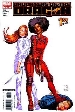
Our two main characters are freaking awesome though, despite the short comings of the story telling. One packs what I guess is the series’ version of an AK-47 and the other bashes people with fists and an electric guitar. Not only that but we even see how fleshed out each of them are throughout the shit storm that is the plot of Issues #1-4. They are both out on their own trying to make it without the support of their family for various reasons, both stemming from not fitting the mold their parents want them to. These two are rich and deep if you pay attention to the small things that are said and shown. So much potential for so many amazing moments as long as the action cyclone doesn’t obscure it all.

Art

The art style for the series very much fits the zany insane things that tends to happen. It lends itself very well to the story and brings to life the ridiculous situations these two end up in without coming off as super cartoony. My biggest complaint is that at least in my print edition some of the pages came off as very slightly distorted in that sense that they blew up a smaller image of the page to fit a standard A4 size. The shading and highlighting is a little funky in that they don’t actually seem to add any depth to the pictures, otherwise the color is gorgeous.

Lettering is definitely professional and I appreciate the little touch of adding intonation to what the characters are saying by bolding the words that they are putting emphasis on. It adds a whole lot more sass and sarcasm then you realize until its presented to you. This creates an even more filled out sense of the characters as well as they all have their own way of speaking that isn’t forced to be shown through some visual butchering of a dialect. Still it is in that most basic of comic book fonts that you find everywhere but I guess tried and true works sometimes.

Diversitykimandkim01_15_rgb-01-600x928

**NOTE THIS SECTION CONTAINS AT LEAST ONE SPOILER**

I mean this comic series hits alot of high points as far as diversity. The main and sub characters are almost 50/50 split on white to POC, one sub character is gay while one main character is Bi, the other man character is trans. It talks about platonic relationships without sex but doesn’t hide that its alright to want and talk about those things as well. The only dig I can really see against the series is that everyone seems to be the same body type. That kind of standard ‘every story character ever is fit’ universe with the only exception being background characters and the occasional villain.

Overall

If you love interesting characters, zaney action packed adventure, and whirlwind stories then you’ll love this series. The art and lettering work well to help convey and move the story along while providing you with extra insight into the characters themselves. And the writer uses the artist’s ability to tell a crazy story, that while sometimes hard to follow, is a fun read none the less.

Metric Breakdown

Art: 7/10 [Lends itself to story, some blurred mishaps]

Lettering: 8/10 [Shows intonation, well done]

Writing: 7/10 [Enjoyable, but confusing at times]

Diversity: 8/10 [Awesome rep, lacking body types]

Overall: 7.5/10