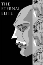
Project Savior

Project Savior

Staff: Craig Johnson

Overview:

Today we’ve got another artist/author creation in the form of Project Saviour #1. It comes to use from Craig Johnson who is credited for story, art, colourist, and letting. I often say that these combos don’t lend themselves to a great comic but I’m looking to be proven wrong! I’m going in blind so I’ll be as surprised as you are!


 Art:

The art is this weird blend of beautiful and amateur. It shows that one can do a lot with a little and I actually kind of dig the attempt. It’s not like jumping off the page at me but I enjoyed it for the most part. Some pages are worse than others (see page 8 vs page 13) and that really hurts; it shows a lack of care in some places where it should be.


Layout:

Font is fine though a more careful hand in terms of text layout within the boxes could have helped. It clips the edge of the dialogue balloons a lot and a more practiced layout artist could have helped them nipped that in the bud. They should also look into the diamond format for text; it helps it fit better into dialogue balloons and would have helped with the high number of hyphenated work-breaks.


Writing / Story:

The dialogue is pretentious as all get out but it fits with the dark tone. It sounds like they took a page from Frank Miller but not in the good way (though there is very little Frank Miller I like). It’s all about being tortured with terrible purpose and the like but we don’t get much in the way of relatability or comprehension. It’s basically just one big brody fight with a bit of broody backstory wedged in the center of it. It’s REALLY not my thing; its supposed to be “dark and gritty” and that’s about all it gets across; it’s dark and gritty to the point of near parody and doesn’t have the substance to back it up. It commits the “say, don’t show” sin pretty hard; we are TOLD the villain is literally on par with Hitler but the most we see is that he blows up a building and corrupts a cop. A more deft hand could have give them a more effective establishment but don’t get any meat on the bone we are thrown. We don’t even get the protagonist’s name and we get a little bit of their backstory but nothing on what their powers are, what their personality is, or anything like that. I don’t know, it feels empty where it should be full and full where it should be empty.


Overall:

I honestly didn’t like this. I don’t know why people keep sending me dark and gritty comics, it’s right there on my submissions guidelines, “Dark/gritty comics don’t excite me.” Even putting this aside this was a bit of a painful read. The visuals were fine and matched the dialogue but it was just so “edgy for the sake of being edgy” it fell totally flat for me. I dunno, if it’s your thing give it a read but otherwise it’s a pretty forgettable comic.


Metrics:

Art: 4/10 [Visuals were good but amateur]

Lettering/Layout: 5/10 [Minor lettering issues but readable]

Plot: 2/10 [Not much happened. At least I understood it.]

Novelty: 1/10 [Drab, gritty, dark mush]

Overall: 3/10

Buy it Now!

The Eternal Elite

The Eternal Elite

Staff: Melchizedek Todd

Overview:

So first up this season we’ve got “The Eternal Elite” from Weapon Press. Seems like the author is also the artist and, if I’m being honest, that normally gives me pause. Sure there are a few talented author/artists out there but they are rare indeed. It typically comes when an artist tries to write or a writer teaches themselves art so they can skip paying an artist. Let’s dive into The Eternal Elite #1 and see if Weapon Press can beat the odds!


 Art:

So… remember what I said about artist/authors? Yeah… this seems like that. While they definitely had some skill and some panels are better than others; this is not a professional piece. It’s a greyscale comic with decent linework in some places but others just kind of look sloppy. For example, on page 3 of the comic we have some rather amateurish art of 3 characters watching a fight while the characters fighting actually look decent. There are a few issues with shading, proportions, texture (a lot of it is just blurred effect brushes or just forgetting like on page 9 or switching it mid page like on 11), and keeping consistent proportions, etc that crop up pretty regularly.

The fact that we see some beautiful stuff in here is really a shame because when it is contrasted with some lower quality stuff it stands out all the more. Like page 7 has some beautiful examples of dynamic posing but when taken as a whole it looks off. There is also this kind of stylistic disconnect. Page 7 is a great example of this too: you see a very “clean” style with some of the poses but the top row of panels, middle row, and bottom row all seem stylistically very different (like, same artist, but exploring different techniques). This makes it very hard to keep track of things like on page 8 we have Sau, the protagonist, drawn very differently on two panels (bottom left and bottom right) and it took me a beat to figure out they were the same person (since the characters look so non-human).

I’ve definitely seen worse but this isn’t winning any awards.

Now, more than half way through, we get another story with MUCH better art. If this entire book was just this style it’d get a solid 8/10 but we get some much worse art at the start. A mixed bag doesn’t make it better- just drags it down by comparison.


Layout:

I always say a hallmark of a good comic is good lettering and layout and… yeah. It’s serviceable. That being said, “serviceable” and unobtrusive is the term you want to have to describe your comic. The font could use a little more spacing (between letters and between lines) but that’s minor gripe.

What is NOT a minor grip is page 15. Ouch. Really? That is some painful text, a grainy image behind it, and the author forgot a period in their first ellipsis. That’s just sloppy.

They make good use of their panels and even get creative. Sometimes they arbitrarily restrain/clip art in panels but I’m not going to judge them too harshly for that.


Writing / Story:

So the first like third of this comic is just a fight/training scene and nothing really gets going until like page 8/25. When it does get going it’s a story about angels and… well a lot of it is about training. It covers some stuff about the war between the angels and satan. It sets up a kind of order of elite angels

Seriously, if this comic talked about training anymore I’d think I was watching a bad episode of DBZ. We get a big exposition bomb about half way in that just drags on and feels like “block text” in a video game; the kind you want to skip. A lot of this could have been summed up more conversationally or shown through action or, better yet, tossed in a recap paragraph at the start of the comic. Seriously- this is a medium that thrives on its combination of sequential visuals and literary communication; having paragraph length speech bubbles with a bust-shot of a character’s head with little or no background isn’t a proper use of this medium. At one point it just gives up and give us some journal entries… which I’d like except this is a visual AND literary medium; more text bombs don’t make things better. Come on dude, I really want to like this; USE YOUR MEDIUM!

The writing, overall, is competent but we still get some headscratchers; lines like (and this is a full sentence with it’s actually punctuation), “Who or what to fight I joked.” It’s grammatical errors like this that make it a little hard to read. There are at least 2 instance of the author trying to use an ellipsis, and only giving us 2 periods. This book really needed an editor or at least another editing pass or two.

The second story in this book is a painful read. Like I get that it’s trying to show a tortured soul but it just comes across as being rather emo or “edgy for the sake of edgy”. It comes off very trite and is more “scripture porn” than an actually meaningful story. I’m not entirely sure if this second character is supposed to be Sau from the first one but, though I’m fairly sure it’s not (unless they changed its design again). Not much happens here except for a fight and a warrior bemoaning their existence. At least they used the visual and literary mediums together in this and we get some pretty artwork.


Overall:

So the last pages reveal that this is a Christian comic. I had my guesses but I judged it entirely as a comic (and wrote most of this review, in note form, before seeing that). I’ve given good and bad reviews to Christian comics but… yeah, this isn’t a great one. It gets a little heavy-handed at the end. Part of me wonders if there were different artists and/or writers on this but they just didn’t get credited. It’s either that or this was just one of the most schizophrenic artist/writers ever.

This is a hard one for me. It’s got moments of brilliance but MAN does it fall apart. We get the exposition dump and mismatched art in the 1st story and the emo diatribe in the second. This sucks because the 1st had an interesting setup (if a little over explained) and the 2nd has awesome artwork.

I can’t recommend this one but, if you dig it, more power to you.


Metrics:

Art: 3/10 [2nd part has awesome art, 1st is a mixed bag]

Lettering/Layout: 7/10 [Lettering is legible. Layout is solid.]

Plot: 4/10 [A decent premise but is implemented poorly]

Novelty: 5/10 [Angels vs devils but pretty standard. Unique, if not confusing character designs]

Overall: 4.75/10

Get It Now For Free!

The Lightbearer

The Lightbringer

Staff: Kyle Simon, Jamie Me, Blake Wilkie, and Gleidson Ribeiro

Overview:

Next up is “The Lightbearer” by LOD Comics. It’s got a beautiful cover, it’s got something to do with the antichrist (I try not to read much in the way of summaries), and I’m ready to jump in with both feet!


 Art:

So the artist is a detailed, realistic, style. It’s professional grade but not in the style of the standard “big two” comic companies (which isn’t good or bad)- it’s beautiful and well done. Couldn’t ask for better. This is some hand drawn goodness. It gets downright artistic (like, hang “I’d hang this on my wall” level good) and even a bit abstract (in a good way) once we get into it. I don’t know how well someone of a more traditional ilk could have handled this. It’s tonally appropriate, well done, and compliments the tone. There are some WICKED COOL character designs and they use their visuals appropriately to further the story. They have some great dynamic posing, the perspective is great (some *ahem* nice use of shadows too), and the penciler clearly had an idea for scene composition. (Bonus note: check out some of the cameos on page 15)

There are a few oddities (page 6 has some weird quality issue across the guy’s waist, the light on earth stick out too much and seem to be above the clouds, some weird expressions like on page 11) but they are a drop in an ocean of good quality.


Layout:

The lettering is fine, which is the best praise you can give lettering. It should be unobtrusive, legible, and used only when needed. Full marks for that. There is some fantastic use of panel transitions here. Like… best I’ve seen in an independent comic. They are downright inspired (see page 4 if you have any doubts). It’s also worth mentioning that they make good use of it throughout the entire book!


Writing / Story:

A good comic writer knows when to write and when to let the visuals speak for themselves. Damn- they nailed this. Some of my favorite works are dialogue light and this don’t disappoint. The premise is simple, mysterious, and moves at a solid pace. I was engaged the entire way though, and am totally looking forward to the inevitably awesome smackdown that’s going to happen in issue #2.


Overall:

Overall- this is a must buy. It’s solid, fun, wonderful, and bizarre. I have absolutely no idea where this rollercoaster will end but I want to go along for the ride. They got the right writer and the right art team for this. Seriously- give this a look!


Metrics:

Art: 9/10 [Solid, hand-drawn, goodness. 1 or 2 minor hiccups]

Lettering/Layout: 8/10 [Lettering is legible. Layout is awesome.]

Plot: 7/10 [Can’t wait for #2]

Novelty: 7/10 [This is some weird, bizarre, fun, stuff.]

Overall: 7.75/10

Buy it Now!

Mirai

Mirai

Staff: Hamish Downie and Kaho Takamura

Overview:

So I’m looking at Mirai today. This is a straight up manga style comic by Hamish Downie and Kaho Takamura. It’s not my usual fare for this site (though I’ve read my fair share of manga) but I’ll give anything a shot once.

Art:

The art is professional grade for manga-style artwork. It’s black and white but that doesn’t detract from this too much. The character designs are fun. There is an odd use of materials or textures that sometimes seems really out of place (see the plane’s nose cone on page 3 for an example- and yes I get it’s supposed to be made of an odd material).


Layout:

One thing I’ll notes is that the compression on this comic is terrible. There is a lot of artifacting on the pages. I’ll also note that it appears that some of the art assets, particularly the dialogue balloons seem copy/pasted as they are (pixel to pixel) identical. This was also clearly written in Japanese first then translated to english for a second printing. That’s fine but it brings up some odd text placement/flow in the dialogue balloons at time as they are clearly trying to fit English words into balloons sized for the Japanese text. This means there are times when the text needs to be made significantly larger or smaller than it should be (or would have been for an English release) at times. This, in addition to the artifacting, makes it really hard to read (see bottom left of page 5). I had to keep zooming in and out to read it.


Writing / Story:

The plot is a little weird and, I’ve read weird plots before, but I’ll admit I had to go back and re-read a few pages to understand what’s going on. I still am only like 75% sure I got it all and I’ve reviewed like 70+ indie comics. I think a lot of it is due to the transitions and pacing. The transitions are very jumpy and not a lot of explanations are given (see end of page 9 to start of page 10) or establishing information given. The pacing is very odd- we get a lot of time devoted to some scenes and altogether skip over others (like the trip back to Japan).

The same can be said of characterization. We are told a lot of things, rather than shown (see page 12 for a rather blunt example). At one point a character fights like hell to return to Japan from a trip to Australia but then we have a tiny panel where she is scolded for trying to go to Australia.

There are lots of plot elements thrown at us that don’t really get fleshed out. We have a relatively realistic world but then we are introduced to planes “made of rice crackers, fueled by sun-flower oil, and love”, a subplot about a grandmother, a not-well-explored line about a mouse who the protagonist saved, a plot about an Empress that literally only fills half a page, something about winning a Karuta tournament, a robotic cat, and then shrinking. Like the first half was able for a reader to follow but then we just get into some rather dramatic lack of cohesion. It’s like the writer started out with a plot then realized they were running out of pages and just kind of starting throwing random things out to get all of it into issue #1 for some reason. If it was all one thing (“plants as technology”, “an exploration on the implications of life-like robots”, “environmentalism taken to an illogical extreme”, “magic garments”, etc) it has the potential to be a decent premise… but it seems like everything was just kind of tossed in the blender and nothing is explored. At all. Like, that list I did earlier? You literally have about as much information as the reader does about them. They are just kind of shown, as things.

The whole thing is just kind of a mish-mash that probably made sense to the author and might be better explored in subsequent issues but this was just a painful read. What they need to figure out a bit more solidly is pacing and tone. It might have behoved the author to start with the introduction to the Japanese cast (see page 10) and then, though flashbacks (even if it wasn’t in the first issue) explore the protagonist’s background.


Overall:

So, a lot of people will probably be willing to give this a higher rating than I will because the art is very pretty, the characters adorable, and it’s an English manga. I grade art and writing separately. If you imagine this comic with poor art- it’d be a trainwreck of a plot. I really dislike giving poor scores, particularly to passion projects, but this one is one to skip.

Metrics:

Art: 7/10 [Better than average.]

Lettering/Layout: 1/10 [Artifacting, text issues, reused assets.]

Plot: 1/10 [This is a mess.]

Novelty: 3/10 [Lots of ideas. None of them explored.]

Overall: 3/10

Link to Patreon

Nothing Man #1

Nothing Man

Staff: N.S Kane, John Rhodes, Steve Sprayson, Abbey Smith, Victor Munson, Acacia Munson

Overview:

A fairly generic superhero comic with a glimmer promise still to come.

Review:

Hey guys, ScottyG here with another review. Today I’ll be looking at Nothing Man #1 by Scattered Comics. As you guys know I’m big on superhero comics and I frequently see superhero comics devolve into mimicry rather than originality and I’m hoping this one avoids that trope So, let’s jump on in.


Art:

The art’s solid. While the character designs are a little generic but there is a lot of detail in the panels. This comic is full color which is kind of cool to see on something like this. I don’t know if I’d call this the best art I’ve ever seen, but it does it’s job and effectively conveys the story visually. Later in the comic, we get introduced to some more interestingly designed characters and some of them have very unique designs but off the bat the initial characters we are introduced to are fairly generic. I did like some of the risks they took, particularly with the fire crossing panel boundaries to visually convey that they are linked and, simultaneously, that the fire is engulfing. There are some minor anatomical discrepancies on characters on pages but I’ve seen worse; you never get characters confused visually.

The lettering is decent but in a few places ends up squeezing the dialogue a few times either by placement or simply not making large enough boxes. This isn’t a major faux pas and is largely just something a critic who pours over dozens of comics would pick up.


Writing / Story:

The dialogue in this book is mostly expositional rather than exploratory; that is to say that it doesn’t really do much for the story, just restates what is being communicated to us visually. If you took it away, you could still understand what was going on. This is a good example of a strong visual narrative in a comic and, at the same time, shows a distinct lack of utilization for the literary aspects of the comic. Creators often forget that comics are a hybrid medium- that the literary and visual aspects need to be in tandem rather than simply supportive.

A side note: the narration bugs me. It comes off as rather pretentious and amounts to really kind of a superficial statement. It also starts off as retrospective narration and ends up kind of switching to scene relevant dialogue at times.

The story itself is pretty generic and cliche. It’s about a Fabio-haired dude who wakes up in the forest with no memory and super powers while being chased by the military. However, the setting shows signs of promise. The later parts of this issue establish a kind of fun paradigm between humans and superpowered individuals. Essentially that supervillians run have taken over and now run Paradise City after a clash between a legendary hero and them. It’s a fun kind of totalitarian set up where we are introduced to some, sure to be relevant later on, creatively designed villains.


Overall:

Overall, it just barely escapes being that a super generic comic that I hate. On the one hand, it falls into a lot of traps that small publisher independent superhero comics often do (relying too much on the reader’s existing knowledge of superhero tropes, trying to do the big publisher thing with a large line up, etc) but on the other hand it actually tries a few new things. I don’t think this will be the number one, top selling, most engaging, industry-redefining, superhero comic run of the ages- but I think you could do a lot worse (actually… I’ve seen that many times so I KNOW it can be a lot worse).


Metrics:

Art: 7/10 [Pro level]

Lettering: 5/10 [Decent]

Plot: 4/10 [Mostly expositional dialogue]

Novelty: 5/10 [Reliant on cliches, except near the end]

Overall: 5.25/10

Link to Buy

Grand Opening

Grand Opening

Staff: Jensen Rong and Hojin Chung

Overview:

Trippy, wonderful, adult humor.

Review:

So today I’m looking at Grand Opening by Jensen Rong and Hojin Chung. It’s got a bit of adult humor so skip it if you have virginal sensabilities. Now- I don’t want to spoil the pure, weird, joy you’ll get from this comic so I’m going to encourage you to go and read it before even reading the review. If you want a mini review, “It’s good and damn funny- go read it.”. However, if you need more- let’s jump on in.

Art:

The art is very simplistic and clean with a distinctly eastern vibe. It’s great for the concept and looks solid throughout. Now keep in mind that “simple” doesn’t mean “bad” or “unskilled”. In fact, I’d argue that a clear, clean, concise art style is harder to pull off than a more freehand style and this owns it’s style the entire way though. If it has a weakness the lettering is a little over-simplistic and raw, even for this comic’s art style. Sometimes you can also kind of see the “seams” of the comic showing (a repeated use of a digital brush here, an awkward pose there) but unless you are really a critic you’ll just roll with it.


Writing / Story:

So this comic made me laugh on the first page. That’s the hallmark of good writing if there ever was one. It’s basically the reason that I reviewed this comic rather than the 15+ other comics I’ve got stacked up in the review queue. Grand Opening has a very fun, twisted, sense of humor and it goes all out with this. It’s equate it to like Adventure Time or maybe something that belongs on Adult Swim and that’s pretty high praise. Honestly- if there was no art to this I’d still have read this. Good writing transcends medium and I wish people would understand that. The art in this augments the strong writing and illustrates what’s going on. It’s a great use of the visual medium, using dialogue when required and skipping it when actions would visually complete the scene. I’d give you a breakdown of the plot but it’s very trippy and out there- half the fun is the absurd journey it takes you on and telling you what happens would spoil it.


Overall:

I know this is a short review… but it’s a damn good comic. I often have far more to say about turds than I do about diamonds and make no mistake- this comic was an absolute joy. I’ve read LOTS of bad humor comics and was starting to believe that this medium wasn’t as conducive to humor. However- this one has opened my eyes and shown me the light. Can’t wait to get my hands on the next one- this is required reading.


Metrics:

Art: 8/10 [Pro level]

Lettering: 5/10 [Decent]

Plot: 9/10 [You’ll laugh your butt off]

Novelty: 9/10 [Insanity. Just insanity.]

Overall: 7.75/10

Link to Buy

All Winner Society

19543_142036bAll Winner Society

Staff: Rodney Lockett, Joe DeSantos, Lawrenz Lano

Overview:

Generic characters, doing generic things, spouting generic lines, for generic reasons.

Review:

So today I got my teeth on the “All Winners Society” by Iron Gate Comics. I like superhero stories and I dig team ups. So the name of this comic reminded me of All-Winners Squad, an obscure comic team made in the late 40s so I figured I’d give it a read. The cover looks schlocky and a little low budget so I’m expecting great and/or terrible things from this one so I’m going in excited for one of those two.

Art:

So let’s get this out of the way- the art is on the low end. It’s decent enough, but the graphic design work on this comic is just downright terrible. The cover has difference clouds rendered by Photoshop for the background, the names of characters are hard to read over stuff, generic fonts are used, and everything looks like it was laid out by a 1st year graphic design student. I don’t normally comment on coloring in particular but they just decided to slap one color on characters and add shading via their lines. Not a single use of complex colors is in this comic and they make liberal use of high contrast primaries- which is just ugly looking. Heck- on page 9 they just have a character who is entirely colored one color (and later color them more complexly).

I’m also not entirely convinced some of these images were not just traced. The poses seem stilted, expressions awkward, and nothing seems to cohesively bind a scene together. And that’s unfortunate- because some panels are much better set up. This comic is obviously a throwback to golden age comics but it’s really not picking from the best parts of it. I don’t think the low-budget art was a “design choice” but a matter forced on them. There are issues with perspective (page 12 is a good example), with consistent proportions, backgrounds, the sequence of actions, and a whole host of other things. Most of the character designs are clearly just pastiches of other mainstream characters or just uninspired. I really went into this comic expecting good things but it was just a nightmare.
The lettering is as bad as the artwork. It’s cramped, small-texted, and shoved right up against the edges. You’d think the letterer had never heard of smallcaps for their text layout and every dialogue balloon is laid out using the rounded corner shape creator from Illustrator.

Writing / Story:

Our setup is as generic as the artwork. We get a hefty dump of exposition dropped on us on the first page. It is 1944, the NAZIs have time travel, it is being testing, team has to stop them. The dialogue is painful, most spoken dialogue is expolistional, you can predict every action, the attempts at character development are superficial, and it all just falls flat.

The problem with a team-up book is that you don’t get a chance to connect with characters. You have over a dozen characters running around with little or no  introduction (mostly the latter). They are generic characters, doing generic things, spouting generic lines, for generic reasons. It lacks any sense of subtlety or complexity- even by Golden Aged standards .

The overall plot is really just one big fight scene- the generic good guys vs the generic bad guys. (We don’t know WHY one group is evil. Just that they decided it was) That might have been interesting but we don’t know (and are not told) what the character’s powers are thus we have no idea of the stakes. If one character can take bullets to the chest (like we see on page 13), should we be scared when someone else is shot at? Hell- by the end of it I wasn’t even sure who was on what team. The scenes just flip between timelines with no heads up and with so many characters you just met- you just have to try to keep track of who is doing what to who is what timeline. Sometimes they remember to mark it (see page 4 and 20) but other times they just skip it entirely (like why wasn’t it on page 7 during the establishing shot of the “modern” team. Only learned the date on page 23) It’s a total mess.
I will note that it was a nice touch to see some characters from other publishers (changed enough for legal reasons) on page 21. Always a fan of Black Terror for some reason. Not sure it adds much here- it’s a bizarre choice to have a “Ga! I know that guy! He is supposed to be Cat Man!” moment during a somber scene. Kind of a tonal disconnect.

Overall:

The end of this comic notes that “This project started out as a bunch of strangers playing Cities of Heroes and having a common interest in golden age heroes.” and that REALLY shows. It’s a super-generic slugfest with characters we have no emotional attachment to that someone REALLY wanted to make. This comic suffers from the all too common “generic hero comic” syndrome. They think putting together the same tropes that they see in superhero comics makes it a good comic and it always lacks it. At least superhero comics like iHero TRY to do something new (even if they totally fail at doing it). Now I’ve reviewed comics that use this premise and have a lot of fun with it. One of my favorite comics like this was The Misadventures of Electrolyte and The Justice Purveyors and you can DO the campy pulp-era aesthetic well, even if your art isn’t outstanding (see Crunch: Revenge) so long as you know what you are doing. This is an amature effort- a novice playing with concepts they’ve seen rather than inherently understand. The creative process has to generate these tropes- the tropes should not dictate the creative process.

Metrics:

Art: 3/10 [Not good.]

Lettering: 4/10 [Legible.]

Plot: 2/10 [Generic, uninteresting, slugfest.]

Novelty: 1/10 [Everything is generic.]

Overall: 2.25/10

Link to Product

The Ultimate Alliance

The Ultimate Alliance

Staff: Joey Haas and Megan Rosa

Overview:

I got to use the line, “The writing reminds me of a fart joke.” in this review.

Review:

Ever sit around with your friend and make stupid jokes that only you find funny but laugh yourself silly over? That’s pretty much what we’ve got today- except someone took the time and effort to draw it out as a comic. Love it or hate it- it’ll be an interesting ride. So strap in kiddies we are jumping into “The Ultimate Alliance” by JH Publishing.

Art:

So let’s get this out of the way- this art could have been drawn by a talented 7 year old. It’s not good and I get the idea that it’s not trying to be good. This is a fun passion project and I can’t give them shit over the fact that they are not professional artists. Hell- I don’t know if having professional quality art would have improved it. If anything it kind of accents the kind of low-budget schlock-comic ascetic. Intentional or not, it kind of works. It almost approaches the level of being “so bad it’s good” but I can’t bestow that moniker to it because I’m only like 75% sure that’s really what they were going for.


One thing of note for this is that, while the artwork is not great- I’m never confused about what is going on. It’s simple, gets the point across, and ties into the written aspect of the comic. Sure the artist might have a boiling hatred for the art of correct perspective, proportions, and consistency but at least I knew what the hell was going on. Some comics, particularly more artsy ones, often have dark and confusing scenes in them.


It’s a full color comic and it’s light and cartoony and the lettering matches. The dialogue boxes are rough squares with vibrant stock colors behind them. While it never gets to the point where it’s hard to read it’s not exactly stellar. However, see the above paragraph for my thoughts on the quality of artistic elements of this comic.


Writing / Story:

The writing reminds me of a fart joke. Everyone considers it really crude, laughs in their head about it, but is too polite to laugh out loud. Is it good? Not really. Is it entertaining? Sure, why not. I mean we’ve all got that stupid idea bounding around our head that when you tell your friend about it they laugh. Does that mean it should go into a comic for widestream consumption? Probably not. The comic is filled with in-jokes you probably won’t get, simplistic (even crude) humor, and a complete detachment from the expectations you have about a good comic. It kind of reminds me of those little golden-age humor comics that were basically all about slapstick humor and bawdy jokes.  I’ll admit- I chuckled once or twice but I wouldn’t call it ‘good’ per se.


I will give it some points however. It does some things right that a lot of indie comics don’t. Obviously there is the tone- a lot of indie superhero comics straddle the line between wanting to be serious and wanting to make fun of comics. When that happens it kind of ends up in this weird middle ground where it’s not funny and it’s not really serious either. This comic commits the to “screw it- let’s just make bad puns and fly around in an ox-copter” end of the spectrum and I can respect that. However clumsily it does it, it also does something kind of brilliant with its pacing. It takes a few pages to set up the characters (in their civilian identity) than just does straight up “information” page on them once they become their alter egos. It works better than you’d think. I mean they are one note characters, but at least they introduce them right. None of this “EXPOSITION DUMP” that a lot of indie hero comics are so fond of putting in their comics. Short, sweet, and to the point- even if handled like a mad ape.


Overall:

Ultimately this is a weird, very personally motivated, in-joke of a humor comic. It’s one of those things that I couldn’t avoid reviewing- it brings me back to my roots. I LIKE to review comics with bad elements to them and shout about the good parts. This one was a perfect fit. It is REALLY dumb and has pretty solidly bad art but it was clearly a labor of love and it knew what it wanted to be. I’m not going to recommend it or give it high praise but, you know what, it’s better than you’ll think it is when you look at the first page.


Metrics:

Art: 2/10 [Let’s say it’s not great]

Lettering: 4/10 [I mean it’s legible.]

Plot: 5/10 [Honestly? Not bad for humor comic.]

Novelty: 6/10 [It’s half in jokes but at least it tried]

Overall: 4.25/10

Link to Website

The Dredger

dredger-coverThe Dredger

Staff: Jeremy Wilfinger, Crizam Zamora, Natalia Marques

Overview:

The Dredger is a well-written, well-illustrated, clearly-loved, comic that fails to excite with its premise.

Review:

Hey guys, ready for the next round of reviews? We’ve got two new writers (Kayla and Thomas) coming on board soon at Indie Comic Review (in addition to yours truly) so get excited for that! Anyway today we’ve got “The Dredger” so let’s jump on in!

Art:

Art looks downright professional grade, but not on like the “high art” end of the spectrum. Looks like a typical comics circa 2000-2010 in terms of style. A brighter palette and while things are not perfect- they are a cut above the rest. There are some really nice little bits of details that bring the world to life. This is particularly true when you see some of Ben’s photographs near the end and it’s a really solid use of the visual medium of comics.

Lettering, the hallmark of a professional comic, is on point. I could see a handful of instances where the text was probably too close to the edge of the balloons but only a critic would notice such things (see the lower right panel of page 25 for an example).

Writing / Story:

Linguistically I don’t know if heavy accents were the right choice. On the one hand they do add to the notion of diverse people thrown together into a common situation but, on the other hand, it makes it a little hard to read sometimes. There were a few well delivered lines that made me chuckle, which is a sign that the writer knows what they were doing.

In terms of plot it’s an authoritarian future where a weaponized virus has been released into a major population center. I gotta say- I get where they are going with a comic like this but… it’s honestly kind of boring. Like I kept finding myself waiting for the “big reveal” and it never came. It was kind of a let down. We have some really big build up and decent writing for what amounts to a “the government is kinda evil” story. I was getting a bit of a 28 days later vibe from it towards the middle but the premise just didn’t grab me. Maybe it picks up and evolves into something more interesting later but right now? I don’t think I’d read issue two to find out what it was.

Overall:

Ultimately this is a well-written, well-illustrated, clearly-loved, comic that was written as a message (see the Frederick Douglass quote up front if you somehow missed it). However, it fails to excite. It is one of those slow build comics that never really builds to anything groundbreaking. Now, never every comic needs to be high-octane action packed into every panel (I’ve liked some slow) but this one just kind of never gets anywhere. Sure things happens and the story progresses but I didn’t feel engaged by the premise. Like I said- it’s got all the right ingredients other than the premises’ engagement to me personally- so give it a read. Maybe it’ll have a profound impact on you.

Metrics:

Art: 7/10 [Pro level]

Lettering: 6/10 [Decent]

Plot: 5/10 [Solid dialogue]

Novelty: 3/10 [Just didn’t grab me at all.]

Overall: 5.25/10

Link to Website

Adamant

7df7888f16cbde1ceca544dc734da085-_sx360_ql80_ttd_Adamant

Staff: Mike Exner III, D.C. Stuelpner, Ian Waryanto, Josh Jensen, Micah Myers

Overview:

A beautiful, hilarious, superhero comic that does it all right.

Review:

The next course on our indie comic buffet is “Adamant”, a comic from Loophole Comics. The author described it to me as his love letter to the superhero comics he grew up with as a kid. Cover caught my eye- real bizarre and had some interesting color choice so I’m going to give it a read.

Art:

First things first the art top notch art- seriously best in the business. Something that didn’t sit super well with me off the bat was that there was an artist listed for page 1-7 and an entirely separate one listed for 8-20. I wasn’t really sure what to make of that but seems hinky at first. After reading it however- it’s apparent why they did this and it’s actually pretty clever. I only bring this up because it means I have to review the art twice.

The first 7 pages or so are they very stylized, thick-stroked, cartoonish, style that bring to mind some Disney stuff. Post page 8 we have a more 80s influenced comic style that keeps a similar color pallet. Both are just beautiful. This is straight up some of the best artwork I’ve come across as of late and that’ saying something. Very polished and a very good use of color across the entire thing. I wish the big publisher would put this much love into their products.

Other than that, the lettering is a little weird- the dialogue balloons are fine but some of the font choices for the narration/information boxes are a little weird. The robot dialogue font is a little hard to read at times. Overall it was readable and did it’s job.

Writing / Story:

So- this review contains a minor spoiler (it’s kind of the premise) so you’ve been warned. A few pages in the main character, a superhero named Adamant, gets thrown through time into the future (hence the artist switch). It goes from a very super-cheesy, stock, campy, superhero story (complete with a monocled evil genius villain) to a comedy set in the future. It’s kind of great and I absolutely love it. The campy hero is faced with lingo and situations commonplace in the future but it’s world he’s comically lost in. I laughed more than once reading it and I think Pogo is bloody hilarious (he’s a frog man who has all sorts of froggy lingo- kind of genius). The plot is accented nicely with some great line delivery, courtesy of a skilled writer.

Overall:

Overall… I liked it. It’s a great little comic, introduced a lot of the good stuff and has some great art. It’s a fun revitalization of a golden age character and EXACTLY the sort of thing the public domain was intended for. The comic can be a little slow at time and I’m still not sold on the main character’s boy scout personality (to the point even superman would call him too altruistic and clean) but it’s damn well worth a read!

Metrics:

Art: 10/10 [Best in the business- TWICE]

Lettering: 4/10 [Decent with a few minor missteps]

Plot: 7/10 [Damn good. Great dialogue/premise.]

Novelty: 7/10 [Uses cliches to make a very new and interesting plot.]

Overall: 7/10

Link to Product