 Noir City
Staff: Cody Walker, Richard alerius, Allen Byrns
Overview:
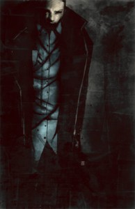
Well… it IS a Noir Comic. Crazy art style.
Review:
Today we’ve got Noir City and it’s a, you guessed it, noir style murder mystery. So grab your snub nosed pistols, trenchcoats, and fedoras because we’re going to jump headlong into this one!
Truly wonderful and bizarre art style. Looks like a grunge texture was applied as the background on each page. This comic’s artwork is hyper stylized. Sometimes we get scratchy stick figures (when appropriate) and other times we get some goddamn beautiful artwork. Don’t take any part of this to mean that the art is anything but top notch. The use of textures is innovative as they switch up to fit the panel and even the pencil stroke borders around the panels plays to the overall aesthetic. Another cool little thing of note is that the color palette shifts between “then” and “now” rather than just some other little trick. The artist also has a great grasp of the basics (anatomy, composition, dynamic motion, etc) and that really helps what would otherwise be a graphic design nightmare. The only bad side I can see is that the artist didn’t draw all the pieces I think. There are some stock images or something (example: the car and door on the spread on page 5 of the PDF, the lips on page 10, etc). It’s a real shame but I’m not 100% sure it wasn’t intentional.
One thing I will note is that the text is a bit blurry and rather small for the panel size. Even zooming in it is still very hard to read as a result of the font choice and the rasterization issues. It was a real pain in the butt and I had to zoom in pretty close to make it out.
The text, when I could read it, was excessively grim and dower. Then again, with the super-dark color pallet, the deformed art style, and a title like Noir City- what else could I possibly expect? I think detect a bit of a Frank Miller fan as some of the dialogue has his fingerprints all over it (most notable Batman Year One, The Dark Knight Returns, and Sin City). The thing is though, and I’m going to be the biggest comic hipster here, but it seems like this style has been done to death and it almost seems derivative. The writing in this comic never really clicked with me for some reason.
The plot was fun. It was the typical set up, down on his luck man finds himself thrown into a mystery he didn’t want or ask to be in. We get some hints about his past but ultimately we are left with more questions than answers by the end of it. I don’t know if that’s bad characterization or good mystery writing (if I had to guess- the latter). The story is very tight and it seems like it’s going somewhere.
Overall I was a big fan of the art but I don’t know if I really cared for the writing style (glum almost the point of parody), or the lettering made this a really hard read. It’s somewhere between a good comic and a better mystery novel but I don’t know if it makes a smooth transition to the medium. Anyway, check it out!
