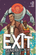
Exit Generation

Exit Generation

Staff:

Writer: Sam Read
Artist: Caio Oliveira
Colourist: Ruth Redmond
Letters and production: Colin Bell
Cover: Ramon Villalobos
Editor: Adam P. Knave

Overview:

Fantastic art, engaging premise, and John Woo flicks.

Review:

So I got an email this morning asking me to review this from the writer. It’s a punky scifi story with a lot of heart. I normally sigh when I hear “this is my first real attempt at a comic” (See Legacy) . Lets see if this one fares any better as

Visually this comic is a lot of fun. There is a very distinct palpable punk vibe to the artstyle that kind of reminds me of an amalgam of Genndy Tartakovsky’s TV work and Jamie Hewlett’s early stuff (There is a thick stroke, a lot of pop culture references, etc). A mastery of expression, form, perspective, visual focus and anatomy are on display in this comic. I was actually approached to review this so I know this is the first real work of this team and I am going to remove my cap here and give them a salute- well done mates. There is a very unique artistic style that you instantly fall in love with that meshes with the tone so well that it is seamless. I wish half the mainstream comics had this level of investiture in their artistic aspects (I’m looking at you DC with your ).

In terms of lettering the first page gives us a bit of an eyesore. It is this tiny, spidery, thin text over a black and white background for the copyright and it makes it unbelievably hard to read. The text IN the comic though is actually professional grade with some very nice use of the occasional onomatopoeia.

The plot is told through very apparent context clues we pick up visually with minimal text. For example, we get text that tells us “United states declares martial law” and we get some soldiers next to a sign that displayed the population and graffiti that says “Full Like everywhere else”. They also interweave the very personal story of a family affected by the events in the plot so we can both get a first person view of it and an almost retrospective historical view of it. The introduction takes 9 or 10 pages and then drops us into the real story. I’d normally chastise the writer for dumping exposition on us, but it was woven in with the personal stories so well that it felt like legitimate plot and provided us with a tangible emotional connection with one of the characters. It didn’t feel like “LORE” dropped on us like a heavy book, rather it was more like an introduction to a character.

The characters are human and real with quirks and tastes. For example, I love how much the gifts the protagonist’s parents get him reveal about him. It is so expressive of who he is and what he likes that it tells us more in one scene about him than most characters get in an entire comic. I got a very Goichi Suda (Aka: Suda51, Aka: The guy who made Killer7, No More Heroes, Lollipop Chainsaw, etc) vibe from it. There were a LOT of pop culture references that informed us of the kind of media our protagonist was consuming.

The dialogue is well written with only a few stale lines, but most come off as charming rather than dry. Once we get the ruleians (no spoilers) on the scene, the dialogue gets hilarious. Their speech patterns add food related phrases (delectable, succulent, delicious, etc) at creepily inappropriate times. I mean it was a bit ham handed (pun pun pun) but it was played for laughs and actually results in a pretty decent zinger at the end.

The postscript is worth a read as well (even if thin white text on a black background hurts my eyes a bit). It talks about what my site is all about- getting away from the big two.

In conclusion- stellar work. A lot of passion, a lot of fun, great visuals, and a premise that will keep you coming back. A lot of this comic feels really engaging even though it is talking about day-to-day things (interspliced with “big” things)  it feels very action pact. Can’t wait to get my hands on the next one. Check the link below for a free 4 page preview.


Metrics

Art: 9/10 (When I say Genndy Tartakovsky meets Jamie Hewlett I mean it)

Lettering: 6/10 (Pro grade)

Plot: 6/10 (Engaging and human)

Novelty: 8/10 (It’s new and well thought out.)

Overall: 7.25/10

Link to Product

Link to Sample

Legacy

Legacy

Staff: Andrew Lorenz and Mike Campeau

Overview:

Generic superhero in genetic tights

Review:

There is something weird going on with the art. Most times it is downright solid, but sometimes it shifts style (in the same panel) and looks like it was drawn by two different people. A good example of this is on page 4 where it looks like the thug’s head is drawn in a different style than his chest. It should also be noted that some of this looks like the reused all or some of certain art pieces. Again on page 4, look at the position of the thug’s head and arm, then compare it to the panel on the top of the page. There is also this weird reliance of really amateur level gradients on things (particularly noticeable on what I assume is paper or trash blowing in the wind?) over what is otherwise really solid line work. We also have a very visually clean city for an environment that is apparently slipping into the hands of crime and heading towards total collapse. I see this a lot with people who don’t pay as much attention to the background and the kind of world they are portraying. There is a very bright background with a lot of primary colors, something that kind of clashes with the urban aesthetic they talk about in the next. This could also be a lack of detail on the artists part.

The lettering is not up to par either. I hate to be rough on this stuff, but we have some seriously decent lettering with some big bobos when it comes to the placement of text (See page 9) in the dialogue balloons. The lettering on the intro is not the same quality as in the comic and really is distractingly bad (maybe a center align or something?). However, otherwise it is very solid.

The dialogue is lifted from every golden age comic ever that serve more to explain the scene then to explore the characters. For example we had line where a criminal say, “He’s got Shane!”. This does very little to educate us, the reader, to the nature of either the hero who has apprehended Shane. It doesn’t even explore Shane’s character and only gives us a vague insight into the other two mooks who say “Forget him, lets go!”. In a lot of my reviews I bring up that comics are a visual medium (at least in part) and you don’t always have to have dialogue for a scene to work. In this case, I think a lot of these scenes would have worked a great deal better if they dialogue had been left off. For example, imagine if the hero has ripped the top of a car and we got the panicked faces of the thugs and as they flee we see him grab one. The emotion on the faces of the characters (which is well done) could have had time to shine and carry the scene, but instead we get trite dialogue.

Overall this seems like a failure of concept. This is a decent art team but it feels like someone had a “really cool idea for a hero” (who is, in truth, rather generic) and paid an artist to illustrate it. It lacks that je ne sais quoi that a well thought out comic concept that has real potential has. The setting is one step from Gotham and Paragon is somewhere between Superman and Captain America. I HATE to simplify it like that, but that’s the vibe I get. Like someone, a very passionate fan, wrote this comic as a love letter to his favorite tropes. And I’ll give him credit- he mimicked them well. However, mimicking and effectively implementing them are two very different things. It just doesn’t feel unique or novel at all. It’s just a different rehashing of the basics wearing it’s factory printed tights.

The postscript is a very good read actually. It tells you the name of the characters and some of the background on the comic’s development. It seems like a lot of passion went into this comic and it looks like there is a longer term goal in mind because we are told there is 130 issues so don’t write this comic off on my review of it. This is potentially a very strong series and I am just reviewing the “trailer” here. Then again, I wish we’d got some of that in the first issue. If it didn’t grab me it might be lacking in something.

Something else I liked in the postscript is that our dear author talks about not talking but doing something. This is a HUGE issue that I see in the indie industry. Everyone thinks is really easy to make a comic and their idea is the best one out there. These guys, including this team, bite and claw their way up. It is a massive undertaking that takes talented people months (if not years) of hard work. Sure they are “indie” but hot-damn if that doesn’t make it all the more impressive.

Metrics

Art: 4/10 (Not pro, some weird elements)

Lettering: 4/10 (Good with a few small missteps)

Plot: 3/10 (Genetic with trite dialogue)

Novelty: 2/10 (Nothing new under the sun)

Overall: 3.5/10

Link to Product

Lei Li- The Rage of the Tiger

Lei Li- The Rage of the Tiger

Staff: Ertito Montana (Based on Kuang Ni’s work)

Overview:

Not much to say- good visual comic.

Review:

So this book is based on the famous wuxia writer Kuang Ni’s work (I am assuming the One-Armed swordsman) and is kind of a love-letter to his style of writing. I actually just got off a wuxia/wushu kick myself so reviewing this comic will be a blast for me. That being said, let’s jump into “Lei Li- The Rage of the Tiger”.

Visually this is one of the most interesting comics I’ve read in a while. It’s a very minimalist, almost cartoony style done entirely with lineart. While the plot is a bit lite, I get the it is not the point of the comic. It’s really about the artistic direction and the stylized. Overall it’s only about 13 pages of actual comic and there is very little dialogue (which works in its favor). When there is dialogue the lettering is legible and the onomatopoeia are in the same style as the art.

If I had a criticism, it would be that the plot is a little convoluted and I often mistook characters for each other. The plot aspect is because they are doing a continuing story and I feel like you’d need to read them all together to understand what’s going on (and that’s part of the fun). It’s also a little short for a comic so if that bugs you… shame on you- it’s FREE.

I’m sorry for a short review this time but there isn’t a lot to critique here. There is some wonderful, highly stylized art, the start of a very traditional wuxia story, and it was a lot of fun to read. And it’s free! Give it a shot!

Metrics

Art: 7/10 (Stylized artwork )

Lettering: 5/10 (Decent)

Plot: 3/10 (Not much revealed and a tricky to understand without context)

Novelty: 5/10 (Innovative artstyle, fun idea)

Overall: 5/10

Link to Product

Gonzo

Gonzo

Staff: Garry Mac, Jim Devlin, Colin Bell, Kev Harper, Iain Laurie

Overview:

Hunter S. Thompson would be proud of this bizarre comics that staggers under the weight of its own premise.

Review:

This comic starts off with a man looking through a vagina-like portal at the universe from outside of time and space. Yeah. It’s going to be one of those comics. WIthout further ado, let’s plunge into Gonzo!

The art is professional level. There are a rare few instances I’d say it could be improved a bit, but ultimately they are not too bad. There are no major missteps and they use a very “scifi” color pallet that meshes well with the clean aesthetic it strives towards. I’ve got a very Fantastic Four vibe from this comic and that’s not a bad thing. I got a bit lost in the beginning of the comic, constant lighting shifts and changes in character proportions made me think there were two crews in two areas or something. I had to re-read it to understand what was going on. Later in a series, this might be a forgivable slip up- but in issue one? (Example: See bottom of page 11 vs bottom of page 9). However, once we get into space (and beyond) there are some truly bizarre creations and fully take advantage of the setting.

Plotwise we have a lot going on. A lot of names, characters, and concepts are thrown at us all at once. Some comics handle this really well, but Gonzo had a rough lift off. By about page 13, I started getting a bit more comfortable and I was able to use some context clues to decipher what was going on. I kind of got that they were going for that kind of frantic chaos at the start of the comic, but with the occasional random nonsequitur quotes at the top of some of the pages and the series’s jargon being tossed around so frequently (“What is pullspace?” I kept asking myself) I felt like a lot could have been done with a simple footnote or two to alleviate this. And the comic has a LOT of jargon. Tertiarists, pullspace, quanta, novak, etc. which didn’t help things.

The comic’s post script basically says it is a meta-contextual view of the universe to explore broad themes and the first three comics will be non stop. Judging this only on the first comic- I am straight confused and I don’t think that it is my fault. We get a LOT thrown at us and very little of it is literally explained. We are given clues or suggestions as to what certain things are, but we are never told outright. Clues build on clues and if you had one misconception, you are lost.  I’m sure there are a lot of really big ideas and they will elaborate a great deal on them in the next few issues, but it really just doesn’t come across super clear to me now. That’s not to say you shouldn’t read this comic, you totally should. It both benefits and suffers under the weight of its own premise and I had to read it two or three times just to decipher it. It has a really bizarre core concept that won’t resonate with a lot of people. This is a very intellectually focused comic and it took a few re-reads to figure out what is going on. Sometimes they have characters speak with their words out of order and while it is a very nice, novel, touch, it does make it a tad hard to read.

I’ll credit this comic with being very brave in tackling such large themes and I’m looking forward to future comics in this series. Judging by its own merits it’s solid work, if not a bit out there. But come on… it’s called “Gonzo”, like the outlandish, journalistic style pioneered by Hunter S Thompson. It’s gotta be leading up to something good! Anyway, give it a read. It’s worth your time but I’d suggest waiting until the first two or three are out.

Metrics

Art: 6/10 (Pro grade with some minor issues)

Lettering: 6/10 (Pro grade)

Plot: 3/10 (Sloppy delivery)

Novelty: 7/10 (Awesome and very BIG plot)

Overall: 5.5/10

Link to Product

Trip

Trip

Staff: Kelly Matten and Waker farrell

Overview:

I got a contact high from this hit AND miss comic.

Review:

So I’ve got an interesting indie comic to review today. It’s called “Trip” and I was warned that it’s written from a female perspective, alternating authors depending on perspective, and features extensive drug use. So, let’s drop some acid and trip into Trip!

So the art is really hit or miss. Some panels it is spot on and sometimes it looks like it was rushed. When it is good, it’s a very interesting stylized approach that lends itself to the tone and theme of the comic quite well. And since there are two artists on this, I feel like I should point out that it is not one artist who is worse than the other. It is more a few rough patches scattered throughout the comic (example: Page 3 and the top right part of page 4 as compared to page 7 or 7). Sometimes the navigation from panel to panel is a little odd and hard to follow.

The lettering was a bit off at some point. The font wasn’t quite sharp enough to give a reader a totally legible experience. An example of this is on page 4 of the comic. A character says, “There’s the liquor; gotta get out of myself”, but the r gets lots and it appears to read, “There’s the liquon”. It also gets a little small sometimes and the resolution on the comic prevents a reader from zooming in to really get much of an improvement. We lose the edge of dialogue balloons due to an inconsistency in whether they have a stroke around them or not . In addition, there are a few capitalization errors and minor grammar errors, but all and all it’s a good effort.

The dialogue is riddled with a lot of slang terms that the uninitiated might find jarring. Occasional linguistic drifts occur and almost seem to hang in the hair for a while. However, it fits with the trippy “burner” vibe that one of the characters exudes. That is to say, it is hard to read but that’s intentional as far as I can tell. There is a lot for the reader to identify with. We’ve all had a party where you got dragged along and just want to go because but can’t because someone else is having a good time. Plotwise I get a kind of Alice in Wonderland vibe. Like complete with the trippy imagery and invitations to a bizarre drug trip. In fact, if I had to pick a single word to describe this comic, it’s “trippy” (I guess that they picked the right title, eh?).

Now let me get to the meat of this comic. About page 12 we get our big jumping off point. This is one of the best representations of a drug trip I’ve seen translated to a visual medium. While the artist are far from professional level- they push themselves and come up with some amazing visuals. Every time we get tossed into that trippy world, everything is dripping with creativity. If the entire comic had this level of visual creativity- it would be a vast improvement. Now since comics are not exclusively a visual medium, we have some great dialogue that firsts perfectly with the visuals. The onomatopoeias used are fantastic and fit the vibe perfectly (check out page 28).

The subject matter touches on a very touchy subject in our society. It explores the reaction to psychedelic drugs in a positive light and uses it as a tool for discovery of the characters. I think it’s effectively done and is pretty risky gamble. It could have easily fell apart and been a bad trip (pardon the pun) but they save it from the fire. One thing I enjoyed was the realistic and holistic approach that the authors use to build the relationship between the two protagonists characters.

The plot, unlike your typical run-of-the-mill indie comic, isn’t concerned with progressing some bloated over the top “epic” story. It’s about two women finding themselves and reflecting on their life. While there is plot progression near the end, that’s not the point. This is a comic focused on character development and exploration of themes over telling a linear story per se. This might turn readers off to it, but I thought it was a successful application of comics as a medium.

Overall, I like the creative intention behind the comic but I was a bit disappointed at the rocky execution. Sometimes this was Grade-A indie comic but other times some sporadic rough spots cause a jarring disconnect. It’s certainly one I’ll recommend you read. It has a brave and creative take on a taboo subject matter despite its pitfalls.

Metrics

Art: 3/10 (A few good pieces, but a lot of rough stuff)

Lettering: 3/10 (Sloppy and inconsistent)

Plot: 6/10 (An exploration rather then a story.)

Novelty: 8/10 (Trippy and boundary pushing)

Overall: 5/10

Link to Product

Average Jo

122094-tumb140Average Jo

Staff: John Pross, Derek Adnams, Julius Abrera, Bryan Maganaye, and Brandon Bullock

Overview:

Solid story, awesome artwork.

Review:

So today’s main dish is Average Jo by Hound Comics. It’s got a slick cover and an “adult” warning on it so what could possibly bad about it? Well, let’s find out!

I mentioned this a while back in my Spectrum review; if a comic’s description starts off by telling us the race of our protagonist- it seems to absorb a lot of the focus on the comic. Average Jo starts off by saying, “Meet Jo Hamilton. Jo is a Filipino-American police officer in the city of Eden…” To be honest- unless this comic is going to be deeply entrenched in the cultural plight of Filipino-Americans, leave that out of it. (I am waiting for the day a non-Neo Nazi comic starts off saying, “Bob Smith is a Caucasian-American police officer in New York City.”) This is a tiny little pet peeve of mine that I’ve spent enough time of this review of a solid comic on so…

Let me jump into the art section of the review by saying, “DAMMMN”. Now reclaim a bit of my professionalism (*cough cough*) I’ll explain why I think this is one of the most gorgeously drawn comics I’ve recently seen. It blends realism and traditional american comic art conventions perfectly. Angels are used well, anatomy is consistent and realistic, the outfits are imaginative (kind of gives me a bit of the “New 52” vibe- in a good way), and they don’t skip on the background. I can’t overstate how important that is, a lot of good comics have stunningly bad backgrounds (I’m looking at you Marvel and DC).

The dialogue is smartly written and have a very professional ring to it. A lot of indie comics have this tendency to overload us with exposition right off the bat and we’re smothered in dry lines by page 3 or 4. I got a LITTLE background (in snippets) during the first two pages. It didn’t require a block of text- I got it through dialogue and demonstration. I like that we get to see a lot of our protagonist’s home life and get to really empathize with him as a person.

At first I didn’t even notice the lettering, which to me makes me squee with joy. Lettering SHOULD be easy to read and not the main focus of the story. They do a bang up job of some very professional lettering and it pays off in a unicycle flowing comic.

One thing I’ll say detracts from this comic a bit of the subject matter. We have “supers” running around cities and a legal act that protects them and… yadda yadda yadda. Sorry to say but this is a really tired concept. We get it from the perspective of a mundane cop which is kind of unique but it feels like 1/2 the other indie comics in the superhero genre I’ve read. Off the top of my head, just the ones I’ve personally reviewed, I can think of: iHero, The Misadventures of Electrolyte and The Justice Purveyors, True North (somewhat), and Division M. In fact, it reminds me a lot of Division M (though much better written and executed) with that entry level cop vs superhuman sort of thing going on. It’s not to say this is a bad comic, it is just a song that has been played one too many times on the radio.

Overall this is solid comic. One of the most well rounded endeavors I’ve come across recently. It has a very human element in what could easily have descended into mediocrity. With a deft hand its crafted and bolstered by some solid artwork. Give it a read!

Metrics

Art: 8/10 (Pro level)

Lettering: 6/10 (As it should be)

Plot: 5/10 (Very human characters, good dialogue)

Novelty: 4/10 (Been done before)

Overall: 5.75/10

Link to Product

iHero

iHero

Staff: Luke J Halsall, Graeme Kennedy, and Gary Chudleigh

Overview:

iSquandered the premise.

Review:

So today I’ve got a comic to review called “iHero” from Obscure Reference Comics. Now I’m not an Apple guy. I think they are proprietary garbage if you ask me… but hey- you’re here for comic reviews right? Lets review that instead 😉

Right off the bat I dislike the cover. Maybe it’s all the comics I grew up with, but this is so divorced from the traditional that it bugs me. We have the title “iHero” in a traditional san serif font and a picture of a iPad with a few “superpower apps” on it. It looks really uninspired to be honest and the artifacting in the top right of the image really doesn’t do this comic’s otherwise decent artstyle justice. The credits page are also done in the same fashion, trying to mimic the layout of a mobile device but coming across like someone was messing around with Adobe Illustrator.

The art is a decent attempt, blinding more of a cartoonish style with comic forms. The use of strokes is nice but sometimes the inexperience of the artist (maybe rush?) shows though. While nothing is “bad”, nothing is good either and it is a far cry from the big leagues. A good understanding of dynamic motion is really shown however and I’d love to see some work from this artist in a few years. On a related note, the letting is legible and even the onomatopoeia are decent. I think they left a speech bubble blank on page 13, but otherwise it is a solid job.

So the plot has me on both sides of the fence. The comic is about an iPod like device that gives you superpowers. The product is called “iHero” and was developed by a guy who looked like Steve Jobs… but isn’t. I understand that they can’t call it “Apple”… but it really detracts from it. There is a very heavy “real world consequences for superpowers” feel to this comic, but we have everything BUT the real world. It is like talking about a burger place in a story but calling it “McSonalds” so they don’t get sued. It seems like there always air quotes around every mention of something “non-Apple” related and it is really distracting (A pear logo with a bite taken out of it, etc).

The plot is very quickly rushed through, like a speed run of some video game. We are told of events, sometimes in single panels, and I don’t feel like a reader doesn’t have enough time to develop any sort of investment in the elements of the story. iHero released, we see some fun uses of it, then it is banned right and left, and we see the bad stuff happening with it. At first I thought some of the early stuff was a parody and we were going to get a zoom out to see that it was a commercial they were considering or whatnot. We have some really dark things happen (A girl freezes her boyfriend’s junk off in retribution of him sleeping with someone else) but it comes across like it’s a joke or funny, and it might have been but then two pages later it is banned and it is implied that people are fearful of this because of the stuff. It is like it can’t decide if it wants to be funny or serious and doesn’t have the substance to convey the complexities necessary to manage that sort of dynamic due to the breakneck pace it rushes through stuff in.

A lot of these situations could be a good 3-4 pages worth of material that could allow us to get invested in the characters and thus the outcome. Imagine if we got to MEET the guy who was teleporting around so he could sleep with his mistress? If we learned about who he was, his personality traits, his rationale for doing it, and the context it occurred within maybe the ending could have a real punch- but instead we get 6 panels of it and are not sure if we should laugh or feel bad for him.

There are a few stock superheroes that you can tell are either parodies or pastiches. We have characters similar to superman, supergirl, and batman joining “not-Steve Jobs” on a superhero team (reminiscent of the Justice League or perhaps Avengers) to combat people misusing the iHero. In a world like this- it seems like a really missed opportunity to develop some really unique characters.

While this comic starts off with a potentially really interesting premise- it is squandered on mediocre fair. The whole comic seems really one note; “What if an Apple product gave you superpowers?”. If that excites you- read this and laugh at the iPod jokes. If not, I am remiss to recommend it.

Metrics

Art: 4/10 (Decent but not pro level)

Lettering: 5/10 (Legible)

Plot: 2/10 (Rushed and exposition heavy)

Novelty: 4/10 (Squandered)

Overall: 3.25/10

Fates Abound

Fates Abound

Staff: Lee S Dresner and Juan Chavarriga

Overview:

An intriguing and novel premise.

Review:

So today’s main course is Fates Abound by Lee S Dresner and Juan Chavarriga. This one is a doozy so read all the way through the review. There are a few missed steps, but in the end it’s worth the wait.

The first thing that hits me is the rush set up of the first two pages. We get some very knee jerk plot points on the first few pages. We are introduced to our protagonist, he breaks up with his GF, and he immediately makes the decision to move to the “ghetto”. I kind of find it odd to simple refer to a place as a ghetto. I mean normally you’d call it something like, “the 4th street projects” or something. In this case, we are only told he moved to “ghetto”.

The comic itself then kind of winds us though some world building, but again it feels almost like it is out of place. I don’t really get a sense of the plot by page 7 and it feels like we are just watching the protagonist’s day to day routine. That is not to say it can’t be done well, but it totally kills the pacing. On my first read though I got bored. Yeah there were some cool visuals but the plot didn’t grab me… because there was no plot. There was just a guy going about his daily routine. No end goal, no challenge to overcome, no direction.

The comic picks up during chapter 3 (where we get some hints about the plot) and really gets into full swing by chapter 4. It takes a while to pick up, but ultimately it starts to tackle some complex issues so the build up chapters are understandable. I don’t know if they were handled in the best way, but I can see why they were there.

We dive into some pretty deep quantum mechanics that the layman won’t get. While this is being explained, we get hit with a wall of text (seriously- some of the largest dialogue balloons I’ve seen… check out page 22). The concept is very interesting (involving the many worlds theory and the potential multiple outcomes to exist until viewed by an observer, which forces the existence of one reality or another). This is a super unique premise that deserves to be in a much more wide stream medium then this (not that this is a bad one). We get a great one line summary of the premise of this comic on page 33

The dialogue feels a bit stale sometimes. We get these expository lines (“Congratulations… You’re one of the youngest people to earn a PHD in the field of quantum mechanics.”) that don’t feel like they’d come out of the mouth of a person. Comics, being a visual medium, don’t always require heavy exposition. For example, a simple picture of a younger looking man next to an older looking man with a diploma in quantum mechanics would inform the reader just as much without being as expositional. However, when we get a bit of a back and forth between characters we have some really solid writing. Quips and narrative directed line delivery shine here. We get some characterization via speech, and I felt I could identify with the characters. A few clumsy lines or fragments slip in (“your not much older than me but…”) which seems rather expositional, but despite a few missed brushstrokes, the overall painting turns out pretty well.

The art and character design overall is strong and lends itself a great deal to the world this comic is trying to make. This comic makes great use of contrast and value, doing it entirely in black and white but making it feel like there is color. The dark pallet that the use for the most part really speaks to the cyberpunk soul this comic has. However, everything changes on page 24 (in a good way). We get some very eerie, bizarre, but full color art. The style and color pallet remind me of Picasso’s Blue Period and the net result is straight up FANTASTIC. We swing from a very down to earth drull pallet to this explosive insanity for a few vivid pages and then are brought crashing back down like the character is. Excellent direction on the part of the creators here.

Lastly, lets look at the lettering. The typography of this comic varies. The dialogue bubbles work and the text is very slick and readable. However, the in-art text was clearly done with some sort of very basic program. (Example: See page 4-5). It is a little distracting and doesn’t do the rest of the art justice. However, this misstep it is far and few between.

So let’s filter out a reality here where this gets a good review (trust me, the ones where it doesn’t are potentially fewer than the ones where it gets a good one). The story takes a while to pick up and this is definitely an effort by someone who hasn’t worked in comics before. However, the heart of the comic is really something else. Despite some novice mistakes, this is a real diamond in the rough. Give this team time to grow and we could see something astounding. I love the unique premise, the kind of themes it has the balls to tackle, and the way it dives into it feet first. I keep shoveling though shitty indie comics in hopes of finding a gem like this. My hats off to the creators.

For those looking to get into the comic industry, Lee writes an excellent little afterwards regarding the path he had to take to bring this comic to life. It’s a must read for any newbie and it shows the kind of trailblazing he had to do to bring this to a completed state.

Overall, I’m looking forward to reading the next chapters when they come out. Give this bizarre gem a read- you won’t be disappointed.

Metrics

Art: 6/10 (Stylized with a twist at one point)

Lettering: 5/10 (Lot of good, a little bad)

Plot: 8/10 (Wavers but gets to a great conclusion)

Novelty: 10/10 (Read this for the premise. It’s crazy.)

Overall: 7.25/10

~Link to Product~

Imperials

Imperials

Staff: Liam Kavanagh, Stuart Perrins, Paul Moore, Stuart Patrick

 Overview:

So British you can use the hardcopy as a tea bag.

 Review:

So today I’m looking at Imperials from Red Leaf comics. This comes at me from across the pond (aren’t digital comics wonderful?). from the UK division of Red Leaf. So lets dive into Imperials #1!

…and it’s a super British comic. Not sure what I expected, but yeah, this comic is so British I swear I saw the Union Jack stitched into the protagonist’s underwear. This comic is split into two short stories so I’ll be doing two reviews of each section because they differ pretty heavily.

Lettering is really hit or miss. The introduction page is very difficult to read due to a choice to put a black text over a black and white sketch of a man in power armor. After that little misstep, the comic’s lettering gets a facelift and is near professional grade. Then it switches back to terrible when the comics does some robotic dialogue. The glaring red they use at time really clashes with the rest of an otherwise good lettering job.

The second story has typical lettering and ultimately is pretty solid. Not reinventing the wheel, but good.

Something weird about the art is that every character in the background in the first story seems to be expressing some extreme emotion. I guess that is kind of a counter to the way most comics put laughly little detail into background characters. Then again the expressions on all of these characters seem to be exaggerated. It’s not good or bad, simply a stylistic choice. The costume designs don’t really do anything for me

Otherwise the art in the first story is not typically the style you see in an everyday superhero comic. There is a lot of crosshatching being done and use of pure black backgrounds. The art style seems a bit like a political cartoon you might see in the New Yorker or something. There are some very awkward posing at times but for the most part it’s pretty well done.

The second comic has much better art in my opinion. It takes a much more minimalist approach to the way it’s drawn and even though there is a little less detail, it’s a lot of fun to look at. It seems to have a hint of asian influence to the artstyle, which makes it a very compelling mix of styles.

The plot of the first story is pretty straightforward fair. Supervillain robots attack Parliament, a hero attempts to stop them and gets back up from another one. I wish I could elaborate, but this is really just a lot of exposition. It’s a decent read so don’t skip it, but I’d suggest that you read it only with the intention of reading two or three of them back to back to get some momentum going.

The second story is a much smaller scale story that seemed to go by a bit faster. Though it wasn’t as dense or plot heavy, I enjoyed it a bit more. It was smaller in scope but deeper on characterization. Not every panel serves to progress some big story, it relies on facial expressions and action rather than dialogue. Hats off to you on that.

Overall it’s an odd mix. The first story really lost me in it’s heavy plot, iffy costume choices, and paint-by-numbers feel. It was definitely painted in the colors of the UK flag but it was still pretty generic superhero fare. The second story is the saving grace. It’s a street level story about a cop, robot, and a superhero. A lot of fun to read.

So give it a read. It’s only 99 cents (USD) and it’s 23 pages. It’s a nice little collaboration between some UK (and Canadian) writers and artist.

God save the Queen and all that 😉

 Metrics

Art: 4/10 (Decent but mixed)

Lettering: 4/10 (Lot of good, a little bad)

Plot: 3/10 (It does the pulpy action bit well. I liked it.)

Novelty: 5/10 (New art style, new cast of writers, etc)

Overall: 4/10

~Link to Product~

Crunch: Revenge

Crunch: Revenge

Staff: Kevin Hill

 Overview:

Pulpy action goodness.

 Review:

So opening up this comic I realize that it is actually the third comic in a set rather than the first (which I normally review) but I was quickly drawn in by the fun quirky style it had. So despite this not normally being the typical review I do, let jump into Crunch: Revenge!

So launching right into it, the art is awesome. It’s got this quirky 80s metal/punk aesthetic going on with some more modern tweaks. I got to say, despite it not being professional grade, it’s damn good and has a style all its own. The lines are crisp, the anatomy (however distended) is generally consistent, the artist displays an understanding of dynamic poses that allow his characters to be as expressive in pose as dialogue (very important for a visual medium), and the displays of motion are fluid and informative. Special not should be given to the perspective some of these shots are drawn from. If this was a movie I’d be giving the director of photography a high five for his excellent work. There are a few awkward facial expressions and poses, but all and all it’s a lot of fun.

The lettering could use some work. Some times I couldn’t tell who was speaking due to the placement of the speech bubbles but I could sus it out generally after looking at it for a moment. A lot of time the lettering is pretty close to the edge of the bubble and that can be a little distracting. They should probably stick to their typically lettering or have the artist draw headline text rather than switching to some other font, it just looks sloppy (see page 8).

The plot is nothing new and that kind of disappoints me a bit. However, when I look at the genre it is going for (pulpy action stuff) I can’t really blame it. Pulp thrives on the known and shines in the execution of said existing story elements and in that context this story gets high marks. In the same way the dialogue is hokey but I can’t tell if that is intentional (al Venture Brothers style) or accidental. Either way it works. I mean we have a vertically challenged main character named “Crunch Crakerton”, how serious can you get with the dialogue?

Overall Crunch: Revenge is a party. It’s a pulpy action comic that doesn’t shy in the face of being as hokey and chock full of anachronisms as possible; in fact it revels in it. I mean the hulky hero has his shirt torn off by page 12 after bantering back and forth with an ex-lover turned villain. You can’t do something like that without going headlong into it. If you half-ass it, it would come off as either a bad parody or knock off of something greater. In this case, Crunch not only jumps in feet first, but it does so wearing it’s puply-action colored speedo.

Metrics

Art: 6/10 (Not publisher grade but very fun)

Lettering: 3/10 (Slip ups and issues)

Plot: 6/10 (It does the pulpy action bit well. I liked it.)

Novelty: 3/10 (Nothing new, but keeps it fresh enough)

Overall: 4.5/10

~Link to Product~