Marvel’s Agents of S.H.I.E.L.D: Face My Enemy (Continuity Nods)

So I was watching Marvel’s Agents of S.H.I.E.L.D tonight and I saw Agent May’s phone’s “Recent Call” list. It had a list of calls and I looked into a few of them and they had some interesting little in jokes/nods to old SHIELD characters! Check it out!

Agents of Shield

  • J. Larner: James Larner is an MI-6 operative. Link
  • Agent 60: Agent 60 is double agent working for shield from way back in the golden age. Link
  • Nat: There are a lot of possibilities here but is possibly “Death Head Scott” (Aka: Nat Scott) who was an old school mad scientist criminal. Link
  • Lt. Stone: This is probably Lt. Marcus Stone from a comic series called “Code: Blue”. Link
  • Burk: No idea on this one.
  • S. Johnson: Couldn’t find anything on this one either. Possibly a reference to a few Marvel comic artist or even to Nick Fury Jr. who goes by the name “Marcus Johnson”.
  • M. Huff: There was a SHIELD agent named “Margaret Huff”. She was Nick Fury’s personal secretary. Link
  • Bell: This could be a joke reference to the series  Executive Producer Jeffrey Bell. Could also be one of a few Marvel characters who have bell in their name like Eva Bell (Tempus)
  • Woo: Jimmy Woo is an agent of SHIELD. Link
  • Lt. Crouch: No idea on this one.

If you guys have any idea on the ones I didn’t know anything about, please comment!

Jackdaw

Jackdaw

Staff: Kelly Shane, Brian Barr

Overview:

Watchmen, but for Batman.. and way better than even that sounds.

Review:

So today’s review is of Jackdaw issue #1. As per normal, I go in knowing next to nothing but if the cover is any indication- I’m already interested in it because the second page has a Beatles quote for the title of this issue (“Into the Light of the Dark Black Night”) and who doesn’t love “Blackbird”?. For those who don’t know a “jackdaw” is a bird in the crow family so the fitting title makes me smile a bit. Anyway, lets jump into Jackdaw #1!

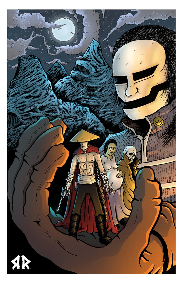
Right off the bat the art is something you’ll have to get use to. It’s done in very dark pencils with and has a very sketchy style. The anatomy of the characters and scene composition is well done, playing a lot with lights and darks, but there are some clear issues. I hesitate to call them such because of the “style” but it looks like this went from sketch to linework and then someone just kind of stopped before they inked it so there are lots of little like blemishes and imperfections. Whatever I say though- at the end of the day I LOVE the art for some reason. I normally HATE dark comics (having read a lot of them) but this just looks downright cool. I don’t know if it is the very “real world” style the characters are rendered in or the sketchy tone and use of white space but… I just love it. Now, if it wasn’t for that layout….

So I need to talk about the layout. It’s nowhere near as professional as it could be. They have white strips on either side of some pages, the lettering totally clashes with the style of the page, and it all looks very amateurish. The lettering stands out like a sore thumb, being rendered in crisp vector (or a solid raster program) with the rest of the comic contrastingly in that sketchy dark pencil style. They clash violently in a visual sense and it is really distracted. Add to that the way the words are crammed into the scene like the artist forgot to leave room for the dialogue boxes and the small amount of border-space on the text itself and you have a very messy comic. Sometimes the black boxes use for internal narration get lost on the dark pencils (see page 26) and it all could use a good formatting guy.  It really WANT this comic to have fantastic layout! It makes it seem like an idea half executed! If the art style had been crisp and clean the vector lettering would have worked! Conversely if we had some awesome, built in, hand-lettered, dialogue boxes we’d have a very dark and moody visual set up!

Alright, so back to the good stuff. Can I gush for a second about how much I love the character designs? Jackdaw is clearly cut for the batman line of dark pulpy heroes (and my frequent readers will recall my affection for pulp) and I can really dig the points of inspiration that inform the reader visually of who he is. He has the dark brooding cape, the impassive white eyes, the heavy belt with tools on it, and the plague doctor mask. We have his sidekick (though she dislikes the term) Thresher and she has a bit of the “robin” aspect to her- talking about how she is used as a distraction. Some of the dialogue reminds me of the “good soldier” line from Dark Knight Returns and it’s not so far off in tone (though without the Frank Miller brand of madness). I get a very nightwing vibe from her (particularly the Young Justice version).

If you see a pattern here it’s not by accident. It really feels like the author wished they could just write their own Elseworlds batman story but couldn’t afford to get in with DC. It’s a bit of an elephant in the room. Like we have campy stand-ins for the Adam West batman series and it all feels like a pastiche. The writing is good and it gives is a good way to easily identify/make assumptions about the setting but it really undercuts the entire comic when you get down to it. As much as I like the comic at time it feels really cheap- like there is nothing new coming my way and it’s just a love-letter to the batman franchise. We even have a Harley Quinn & (mentioned) Joker rip-off. The realization grew on me, like it took 2/3rds of the comic to really get bad and part of me still wants to like it. It feels very much like what Watchmen did for superheroes- put them in the real world and have them work out their problems in a very raw way… except with just the batman universe. Part of me REALLY likes that and part of me thinks it’s REALLY in bad taste.

Dialogue wise we have a few good ones. It’s very “raw” dialogue (“My ball sac contracted just watching. But less about my scrotum and more about this secret weapon.”) and I can dig the tone. It involves a lot of modern ways fans interact with the comic medium (various TV shows, movies, message boards, websites, YouTube, etc) and it’s all done really well. The pacing doesn’t follow a three act structure or anything (then again episodic media, comics in particular, rarely does) but has a lot of great vignettes strung together. I don’t know if the plot really resolves itself or gives us bait for issue #2 but… damn. It’s still well written and I’d love to get my hands on issue #2.


Alright so overall, despite the flaws and things I bitched and moaned about… I friggen love this comic. I really do. Maybe it’s because it is such a love letter to batman or because it does such a good job of putting superheroes in the real world. This comic has all the things I profess to hate in indie comics: generic superheroes, obvious pastiches, cliche dialogue, etc… but god does it work. It just goes to show that if you have a good writer anything is possible. Seriously, this is the indie version of Watchmen. If you are reading some dime-a-dozen New 52 or Marvel Next comic, put it down for a month and read a single issue of this. There is so much more heart in this one issue than in a decade’s worth of schlock of those sort of comics.


Metrics

Art: 7/10 (Drawn intentionally rough, but it makes a mood and works so well.)

Lettering: 3/10 (Sloppy)

Plot: 9/10 (A character focused tour de force and commentary on our age)

Novelty: 5/10 (Watchmen, but with Batman and social media)

Overall: 6/10

Link to Product

Link to Website

Super

Super

Staff: Joshua Crowther, Bruno Chiroleu, Matteo Baldrighi, Chas Pangburn, Steven Forbes

Overview:

A complex comic with good art.

Review:

So armed only with a blurb (“What happens when a superhero tries to solve a real world crisis? With no super villains is the world already saved?”) I am going to jump into “Super”. I gotta say, I am concerned with a name like “Super” and that premise it is going to fall into that trap of doing the same kind “generic” superhero comic I end up reviewing a lot. However, I hope it will blow my mind and not fall into those traps.

So, out of the gate Super has beautiful artwork. Full color, beautiful use of perspective and gradient, and lettering that it top notch. A lot of comics can be done in color or in black and white with little difference to the overall quality. However, Super goes the extra mile and really utilizes color to it’s fullest. For example, there is a panel where a man is lit on fire and while he is drawn with lights and darks (and color) the fire itself has a different color stroke and the whole scene’s color pallet is select to illustrate the scene. Beautiful! Just beautiful. A super minor (very technical) gripe is that there are a few panels where the artwork crossed into the bleed a bit (example: Page 14).

While we are on the visuals, the lettering deserves a special kind of thumbs up. The dialogue boxes help inform the reader of the style of communication and visually communicate it well (the shape/style of radio communication is visually represented by a special kind of dialogue box for example). However, there are a few missteps. Sometimes the arrangement of the dialogue boxes are done in such a way that you don’t know which comes first and which comes next. You can normally figure it out, but it’s a pain on occasion that  requires a few re-reads. Let’s be clear however, the lettering is solid and that’s just a drop in the bucket.

Some of the dialogue is well written but other times it feels like it’s just forcing itself to sound contemporary and relevant- a rehash of the common sentiments of most Americans of the younger generation. While I applaud the topic of the discussions, I don’t know if it was particularly well written. There are some pastiches of relevant themes that might as well have just been called out by name. To be honest? I got really boring. Like if this was new information or a unique situation informing the reader of some setting-specific information it would have been interesting. However, if I had wanted a recap of the Iraq war I could have just read Wikipedia. The comic also bounces around chronologically a lot and it’s a little hard to follow, but I get why they do it.

Now on the story. It’s very concerned with being topical and relevant. I can’t really decide if I hate it or love it and as a reviewer- I don’t know if that’s a good thing. On one hand it’s got a LOT of potential and the main character has a lot of room he can grow into. I get the feeling that this is not one of those series that shows its colors in the first issue and I am going to have to hold judgement on it as a whole until it has done it’s full run. Make no mistake- if pulled off right this is going to be a hell of a good comic. However, as a self-contained first issue I am going to strongly recommend it. If not for the art, for the potentially great story that seems to be coming. My concerns over it being a “generic” superhero comic were allayed. It uses it more as a way to question the relationship between the relationship of moral responsibility and power (both on a geo-political and personal scale). The faults are that it’s depressing and preachy. If it keeps this up- I it’s going to get really old really fast. If we have some sort of apotheosis sometimes soon (or at least a glance at what that could entail) it could really save the series from it’s own potential downfall.

So yeah, overall- I recommend it. It’s a complex look into some geo-political stuff and if that is your bag give it a read. If not, it is probably not for you.


Metrics

Art: 9/10 (Better than the big boys)

Lettering: 7/10 (Solidly above average)

Plot: 5/10 (Has potential to be really good or really bad.)

Novelty: 6/10 (I don’t know if it’s new, but it’s at least not derivative)

Overall: 6.75/10

Link to Kickstarter for Issue #2

Rant: How to Pitch a Small Indie Comic Reviewer

So let’s talk about something that happens with this site a lot: PR outreach. I’d say ICR gets hits up 3-5 times a week. Mostly it’s by people who have read another review on the site and want me to do a review for them. I am very happy to reply but unfortunately I can’t review every comic that comes my way. The proper way to reach out to reviewer is just to shoot them a quick little email. Something like:

“Hey ScottyG,

I just wanted to hit you up and see if you wanted to review my comic about super-powered crabs called, “Capt. Crabs”. Loved your review on [insert comic] and I’ve read [author’s name]’s work a bunch before.

Thanks!

Author’s Name”


Quick, personal (shows that he has at least read the site), informal, and doesn’t spoil anything. A reviewer knows you are looking to get reviewed and that you are probably reaching out to a lot of reviewers. They also know you probably didn’t have time to read every post from every one of those reviewers- but showing a little insight is always appreciated.

The wrong way to go about it is to blast a small personal review site like ICR with a generic PR/marketing blast. Something like:

“FOR IMMEDIATE RELEASE

Author WILLIAM SHAKESPEARE teams up with artist LEONARDO DA VINCI on the new title CAPTAIN JUSTICE AMERICAN. The comic focuses on BRUCE KENT and tells his origin as a billionaire farmer until his family was killed by an exploding planet. Now he fights crime as CAPTAIN JUSTICE AMERICAN with his sidekick BILLY THE KID. He tragically must kill his love interest/arch nemesis MISS DASTARDLY LADY who he learned is evil at the end of this FIRST ISSUE!

We will send you a comic and expect it reviewed sometime in the next two weeks. Please include a link to http://www.CAPTAINJUSTICEAMERICAN.com and make sure to review the first three issue we are sending you.

Thank You,

Bill Shakespeare”


Or something like…


“Hi! I am currently trying to promote a Kickstarter project for this generic superhero comics! What would happen if bunnies had magic powers and could talk in the real world!”


Both really don’t lend themselves well to being reviewed. They are impersonal, show no vested interest in the relationship they are establishing, sometimes outright spoil the comic for the reviewer, and place a lot of restrictions on them. Our review schedules are overbooked as it is, don’t give us a reason to discount you. I mean, you have to know your audience. If it’s some mega-syndicated comic/entertainment/game review site- yeah a PR blast works well but on a small indie review blog- personal works best.


I mean I even have the line, “Please don’t blast me with generic press releases… it is so impersonal. I’ll just make fun of you.” right above my contact form and I STILL get PR blasts all the time (FB is the worst!).


The indie comic community is pretty small one and blasting a bunch of folks with a press release or something super impersonal is a great way to make sure no one reviews your comic. We want to help though and we want to read good indie comics! This is the part of the sector where the magic happens! So just approach reviews right and we’ll be your best friends in the industry as you launch your comic.


Sorry for the rant folks. A lot of review requests come in and are really impersonal and demanding. It is just not the right way to go.


UnDead End

UnDead End

Staff: J Wright

Overview:

Great characterization and art but lacking in the story department.

Review:

So zombie comics are never really my thing. I should say that before I get too far into this one (UnDead End). I feel our media is supersaturated with the comic and I never really got bit by the fad. Sure Walking Dead is fun and Shawn of the Dead is probably in my top 50 favorite movies but the whole genre as a whole has kind of worn thin on me. So I’ll be reviewing this one in an objective fashion to try to keep from relying on that.

First off the art is downright gorgeous. It’s the right blend of gonzo, realistic, detailed, and colorful that it really stands out. The cover doesn’t do much to allay my fears that this will fall into the “generic zombie” format however. Three teen to twenty somethings (a girl, a good looking guy, and a fat guy with glasses) looking concerned as zombies surround them. Composition wise it’s pretty cool and I dig the almost Scooby-Doo Show/ Scott Pilgrim style backdrop and punky logo. Very telling. I also want to point out that the art on this is DETAILED. A lot of artists kind of leave  background characters to the wayside but the cover features about a dozen zombies and they are all in dynamic poses with a lot of detail put in.

As we get further into the comic, the facial expressions really sell it and they continue the punky art style from the cover. The whole thing is rendered in very vibrant color and it combines to make a cohesive aesthetic. They do a great job at illustrating motion and I alway feel engaged- even in the slower scenes thanks to their use of exaggerated motion.

The lettering is spot on, even when I zoom in the font remains clear and legible. I know it’s a small thing but it always separates the bad comics from the good. Like the character designs, dialogue, color pallet, and cover, the font fits right in and is an asset rather than a detriment.

The characters are immediately identifiable and relatable. The dialogue is very real world and I can dig the depth and complexity they put into even a pizza delivery guy. A lot of times it’s not about how “awesome” your character is but how human they are. Having a guy worry about a birthmark and whine about being sick and not wanting to go to work is far more compelling than the normal run-of-the-mill “tragic” backstory I see week after week.

So while the characters are well developed it seemed like they kind of forgot to bring along a plot. Like I really like the characters and almost wish they were in a more interesting story. Each scene, as soon as you read the first few lines, kind of know where it is going. Yeah, the dialogue is enjoyable but it has all been done before and feel really derivative.

Overall this is a really well written comic with beautiful art that falls victim to it’s premise. It’s genetic and doesn’t exactly explore new territory. Geeky under-achieving nerd dude finds himself, his fat friend, and a love interest stuck in the middle of a zombie outbreak (stop me if you’ve heard this one before…) However, don’t let that stop you from checking it out. The artwork and dialogue really make this a standout and if nothing else read it for that. This was a pretty solid comic, to the point where I think maybe I should give the zombie genre another shot!


Metrics

Art: 8/10 (Damn good)

Lettering: 6/10 (Exactly what was need)

Plot: 5/10 (Very predictable but saved by some good characterization)

Novelty: 2/10 (If you’ve read one zombie story you’ve read this one.)

Overall: 5.25/10

Link to Product

Cluster@#k

Cluster@#k

Staff: Jon Parrish, Diego Toro, Kote Carvajal, Nic J Shaw, Steven Forbes

Overview:

A fun little paranormal detective piece

Review:

Alright so we are jumping into Cluster@#k. No I didn’t censor that. It is legitimately the title (and I can dig it). I know I just did another Alterna comic (Billy the Pyro) but it is a different team and that’s really why I don’t do the same publisher twice.

So onto art. It’s a full cover with a more modern artstyle. There are some manga influences but only about as much as would be present in a lot of modern American comics. Cover is dynamic and exciting showing exactly what is going to be in the book. The characters are visually distinct, their design reflects their personality, and are (at the very least) well drawn. Anatomy remains consistent from page to page, proportions are not all wonky, and the artist has a good grasp on the utilization of angles. Seriously- the tell-tale sign of a good artist is a mastery of anatomy, facial expressions, dynamic poses, and the use of a variety of angels (love the low angle ones).

There is not much to say about the lettering. It’s solid and I can read it- exactly how it should be. They have some nice use of off-panel dialogue boxes and only on a few occasions was I confused about who was saying what (they were easy to figure out).

Plot-wise we are just kind of dropped in in media res style. We get bits and pieces as we go and I can’t really decide if it was done really well or just kind of bumbled into being cohesive. That being said, we get a few panels of pure exposition but you kind of have to in a first issue so I’m not docking it any points for that. About a quarter of the way in, it just kind of jumps off the deep end though. It goes from kind of standard adventurer/private eye/pulp fare to a more fantasy thing. Talking hobo-murdering goats, demon fusing guys, genetic abominations, and a bit of DBZ style combat. I… am not really sure how to react. It just kind of comes out of left field. Like WHAM and I don’t know that when the stars stopped floating around my head I was really ok with it. A clusterfuck indeed.

It sets you up one way then kinda does a switch-a-roo on you. After a few more pages it kind of works into a new groove and I didn’t hate the new direction. It turns out this is kind of a paranormal investigator piece with a government agency involved. The dialogue is well written, the character’s personalities inform their language and word choice, and it’s overall pretty enjoyable. I didn’t notice any major or minor errors in spelling or grammar so that’s a plus.

Overall, I’m actually fond of this one. While it doesn’t break any super new ground, it does so in a fun little way. I can see some fun plot potential down the road and the dialogue kept me reading while the art sold me initially. You could do worse with a paranormal detective story. Give it a read.

Metrics

Art: 6/10 (Solid)

Lettering: 5/10 (Does what it should well.)

Plot: 6/10 (Not bad. Liked the dialogue.)

Novelty: 3/10 (Not a super new premise)

Overall: 5/10

Link to Shop

Billy the Pyro

Billy the Pyro

Staff: Brad Burdick Fabian Cobos

Overview:

SO pretty but SO predictable

Review:

So tight off the bat the lettering bothers me. At the default zoom setting you’d have to be a hawk to read the text on the page it is so small. After zooming in a few times I can still read it but the first text we encounter is still comparatively small to the rest of the page. The keening and line spacing could also have been spaced a bit more. Right now it feels very cramped and relegated to a much smaller portion of the page than it should be (it’s tiny) judging by the large amount of free space in the comic (though that could be strictly a compositional thing). Not to mention that the narration has this small font on a yellow-orange background. This does get better as the comic goes on and I’m probably just nitpicking here.
The art style is as polished and professional as any big name publisher with special attention being given to scene composition. One thing of note is that they really do a fantastic job of populating the background in every scene. You’ll notice that some comics will provide a great deal of detail in the background of one location and basically just leave the background blank (or maybe have some vague texture or whatnot) but this one does a good job of composing an interesting scene that is evenly populated. Also of note is that the artist does a great job with subtle expressions, something not always well-executed with an art style like this.
So I got a confession. I didn’t like Catcher in the Rye. I just thought it was a boring book about a kid who was way too full of himself and a I didn’t really like a few hundred pages of someone complaining in my ear. I only bring it up because 10 pages in and that’s all I’ve heard thus far. The main character is troubled and his life sucks. It’s a familiar tune (“Second verse, same as the first!”) and while it’s well-written here, it does seem a bit overplayed. As soon as the 2nd part of the comic’s plot hit, I could tell where it was going and the rest fell into place like a familiar puzzle. It’s a real pity, they set the story up competently and the writer clearly is very good at writing identifiable characters but the premise has just been played out a dozen times before. It’s kind of got Legacy syndrome. The basic story of “kid’s life sucks, he’s a misanthrope, he gains powers, he doesn’t understand/can’t control them” has been done to death (Rogue from the X-Men comes to mind but I can probably think of a dozen more).
In conclusion, this is a BEAUTIFUL comic (check out the last few pages if you don’t see it in the first few) that has a great writer attached but a totally overdone premise ruins what could otherwise have been a masterpiece. I think you should check it out if superhero/villian comics are your thing but don’t expect much intrigue.
PS: Did I mention it was REALLY pretty?

Metrics

Art: 9/10 (Marvel. Hire this artist.)

Lettering: 4/10 (Some issues early on but it recovers and has solid lettering later)

Plot: 5/10 (Decent characterization but stale plot )

Novelty: 2/10 (You were the chosen one! It was said that you would destroy the Sith, not join them!)

Overall: 5/10

Link to Product

Return to Rander

Return to Rander

Staff: Tony Sedani

Overview:

A very creative little comic that stumbles now and again but gets up and keeps fighting.

Review:

Hey guys, today I am looking at Return to Rander by Tony Sedani. Looks like a samurai western judging by the cover (and I love me some samurai and westerns) so I’m going to jump in feet first!

The first note I’ll make here is that there is some really stellar character designs in this comic. A lot of creativity went into them and it shows. However, in terms of overall artistic prowess it’s definitely not professional grade. It’s not distracting or even outright bad, it’s just that some of the shots have some perspective disagreement and issues with consistency (in terms of quality and anatomy). Again, not BAD art but it didn’t knock my socks off either. There are a few instances where they chance the page size, but not enough to be a double-spread. It makes it a little hard to read with standard PDF readers.

In terms of lettering the dialogue balloons are outstanding. I feel like maybe they left a little too much empty space around the actual text, but it’s better to leave too much rather than make it all crammed in there. A center diamond layout for the text’s distribution could probably have given this comic a more professional look in a few places but it’s legible and not distracting- and that’s the important part of a comic’s lettering.

Dialogue-wise this comic has it’s ups and downs. There are some fun lines (“Why do you have to be so cryptic?” “Talking skulls are always cryptic…”) but overall it is some pretty stock dialogue. Sometimes it seems like they are just espousing characterization rather than natural language in the same way someone might do an exposition dump. I am happy to say that we are not given a steaming pile of exposition at any one point in this comic and the natural build of the plot is a point in its favor.

Unfortunately the overall plot is a bit derivative and, while we get some promising early glimmers, the characters are pretty generic. A heroic protagonist with no memory has been done to death and a protection racket on a inn where the hero helps out for little-to-no reason? Stop me if you’ve heard this one before. There seems to be a bigger plot at play so judging it on the merits of the first issue is probably not the best idea. I see the first sparks of a really solid plot and I’d be interested to see where it goes.

Overall, this is a very creative comic with a good mind behind it. It has it’s weak points, primarily when the writer relies on stock tropes rather than taking risks, but really shine when they go for their own style. If I had to draw a parallel, it’s in the same vein as Avatar: The Last Airbender or even Samurai Jack when it is at it’s not on that level. Ultimately, I’d recommend you pick up this book and see where it goes. I only review the first issue of comics but if I had to guess there is a much bigger story at play and it will get tantalizingly good in a few issues. Give it a read!

Metrics

Art: 4/10 (Rough, but with creative character designs)

Lettering: 5/10 (Decent)

Plot: 3/10 (Kind of plane, but looks like a bigger plot is starting)

Novelty: 6/10 (Interesting setting and )

Overall: 4.5/10

Link to Product

Orision

Orision

Staff: Bradley Golden, Ugur Sertcelik, Chris Allen

Overview:

If you like the horror genre, you’re gonna love this.

Review:

Alright so today I’ve got “Orision” from Second Sight Comics on the chopping block. The comic was split into multiple parts but I will only be reviewing part 1 today (as per my site’s guidelines). Just looking at the cover I can tell I’m in for an artistic treat so let’s get to it shall we? (As a forewarning to anyone downloading this, it’s a bit graphic and I wouldn’t recommend it to anyone who gets squeamish.)

Art

So the art of this comic is downright beautiful. It’s done in a stylized black and white (well… kinda grayscale) but it uses this contrast effectively. I couldn’t help but imagine that they thought about going for color but decided to stick with B&W for the sake of a cohesive aesthetic. If there is one thing that detracts from the overall quality of the art it’s some very “extreme” expressions. It can kind of be forgiven in this medium as you need to be overly expressive sometimes in place of a more subtle gesture that you could get away in a moving media (like film). Still, some were a little overly exaggerated but that’s just a nit-pick.

There is some great use a perspective (especially some dutch angles with visually directive onomatopoeia) and some of the poses we get could only be from someone with a mastery of the fundamentals of anatomy. Now this isn’t a comic drawn in the traditional american superhero style so don’t go in expecting that and there is nothing wrong with not doing that style- just be aware of it.

Lettering

The lettering sol solid, pretty standard, legible stuff. Don’t be confused- when I say that it’s high praise. I keep talking about how lettering you don’t remember for anything bad is the best kind of lettering there is. Lettering should just be intrusive enough to get your attention and not enough to be distracting. They do a solid job here. No complaints.

Story

So the story is a pretty straightforward affair. High in the snowy mountains an expedition is attacked by a [SPOILER] and the characters fight for their life. It kind of plays out like a horror movie and it’s a lot of fun to read. The visuals back it up very nicely and it is well paced. One of the shortcomings, something inherent to the horror genre in general, is that we don’t get a lot of characterization. There is only so much we can get out of screams and death but it does come up a little short in that department. The same goes for the lore and background. I mean I wasn’t expecting the first issue of a series to explain everything to me but it does come off as a little sparse in terms of what we know other than, “Oh my god a monster! Run!”. This isn’t Shakespeare but I don’t know if it needed to be.

Overall

So this comic left a good taste in my mouth overall. Yeah it was a quick monster/horror romp in the snowy mountains, but by God if it wasn’t a fun little ride! The visceral artstyle carried it and some of the panels straight up blew my mind in terms of the detail that was put into them. If you are a horror fan- this is probably something you won’t want to miss. If you are not a fan of the genre, you’ll probably be pretty “meh” on the whole thing. Give it a read!


Metrics

Art: 6/10 (Really solid work)

Lettering: 5/10 (No major issues)

Plot: 4/10 (Well paced but nothing breaks the mold)

Novelty: 5/10 (New art style and creative monster design)

Overall: 5/10

Link to Comic

Resistor

Resistor

Staff: Wes Allen

Overview:

A well done, but ultimately forgettable, political drama

Review:

So I got hit up about a month back to read Resistor and I’m going to give it a review today! I’m not a big fan of political dramas but this one has some pretty cool real world parallels. Anyway, let’s dive right into it!

Art

Cover is cool kind of “iPad” style color scheme. The interior art is very different than the cover but isn’t bad by any stretch. It’s certainly not “big publisher professional”, but it has it’s own charms. A lot of the scenes are well composed visually and the artistic style tends to favor a very crowded approach to composition (which works well). There is a weird stylistic thing with the way artists depict jaws in this one, but I am gonna give it a pass because it seems intentional and part of the comic’s visual style rather than an error.

Lettering

The text can be very hard to read at times. The credits page had a hard-on-the-eyes font and the first page’s “hooray” were transparent over a complex background (without a dialogue box). I guess this is the style they were going for, but it comes out very jumbled and difficult to read. Elsewhere the text is legible but is made small in some panels and larger in others. When it gets small, it gets very tricky to read and I had to blow it up a bit with a digital zoom to read it. On page 13 we have this wall-o-text that comes from a radio that could have probably have been condensed by making it more succinct. There is also this disconnect between font written in and the drawn background. Sometimes the perspective/shadow doesn’t match up because it was added after (on signs for example).

Story

One thing that bothers me is that it takes this comic 10 pages to get into the story. We are given exposition in the form of a political rally before we get to a single line a dialogue from a character. We don’t seem to have a “main story” going by half way though the comic and it does feel a bit like a comic that has a good story to tell but doesn’t give you enough of a unified perspective to allow you to identify with any particular character. I mean we get that this political party is bad and that life sucks under its rule but I don’t empathize with any of the characters. It’s such a fragmented story that I can’t seem to really pin down what it’s about on a narrative level. By the end of it there is a larger story taking place but not enough in this issue to grab me in the mean time.

Overall

Overall, it’s a nice attempt but fails to deliver on anything more than a basic level. It’s not a bad comic but it’s not one that will stand out in my mind as a highlight of the year or anything. Maybe if the narrative direction was a bit more focused or the plot point more succinct it could have made for a good first issue.


Metrics

Art: 4/10 (Good but not pro quality)

Lettering: 3/10 (Some good, some pretty bad)

Plot: 4/10 (A few good notes but unfocused)

Novelty: 5/10 (How many political drama comics do you see?)

Overall: 4/10

Link to Product