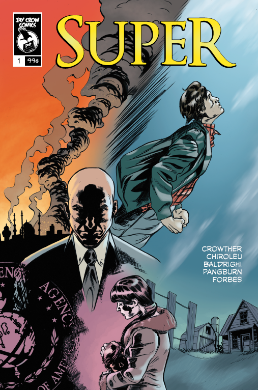
Super
Staff: Joshua Crowther, Bruno Chiroleu, Matteo Baldrighi, Chas Pangburn, Steven Forbes
Overview:
A complex comic with good art.
Review:
So armed only with a blurb (“What happens when a superhero tries to solve a real world crisis? With no super villains is the world already saved?”) I am going to jump into “Super”. I gotta say, I am concerned with a name like “Super” and that premise it is going to fall into that trap of doing the same kind “generic” superhero comic I end up reviewing a lot. However, I hope it will blow my mind and not fall into those traps.
So, out of the gate Super has beautiful artwork. Full color, beautiful use of perspective and gradient, and lettering that it top notch. A lot of comics can be done in color or in black and white with little difference to the overall quality. However, Super goes the extra mile and really utilizes color to it’s fullest. For example, there is a panel where a man is lit on fire and while he is drawn with lights and darks (and color) the fire itself has a different color stroke and the whole scene’s color pallet is select to illustrate the scene. Beautiful! Just beautiful. A super minor (very technical) gripe is that there are a few panels where the artwork crossed into the bleed a bit (example: Page 14).
While we are on the visuals, the lettering deserves a special kind of thumbs up. The dialogue boxes help inform the reader of the style of communication and visually communicate it well (the shape/style of radio communication is visually represented by a special kind of dialogue box for example). However, there are a few missteps. Sometimes the arrangement of the dialogue boxes are done in such a way that you don’t know which comes first and which comes next. You can normally figure it out, but it’s a pain on occasion that requires a few re-reads. Let’s be clear however, the lettering is solid and that’s just a drop in the bucket.
Some of the dialogue is well written but other times it feels like it’s just forcing itself to sound contemporary and relevant- a rehash of the common sentiments of most Americans of the younger generation. While I applaud the topic of the discussions, I don’t know if it was particularly well written. There are some pastiches of relevant themes that might as well have just been called out by name. To be honest? I got really boring. Like if this was new information or a unique situation informing the reader of some setting-specific information it would have been interesting. However, if I had wanted a recap of the Iraq war I could have just read Wikipedia. The comic also bounces around chronologically a lot and it’s a little hard to follow, but I get why they do it.
Now on the story. It’s very concerned with being topical and relevant. I can’t really decide if I hate it or love it and as a reviewer- I don’t know if that’s a good thing. On one hand it’s got a LOT of potential and the main character has a lot of room he can grow into. I get the feeling that this is not one of those series that shows its colors in the first issue and I am going to have to hold judgement on it as a whole until it has done it’s full run. Make no mistake- if pulled off right this is going to be a hell of a good comic. However, as a self-contained first issue I am going to strongly recommend it. If not for the art, for the potentially great story that seems to be coming. My concerns over it being a “generic” superhero comic were allayed. It uses it more as a way to question the relationship between the relationship of moral responsibility and power (both on a geo-political and personal scale). The faults are that it’s depressing and preachy. If it keeps this up- I it’s going to get really old really fast. If we have some sort of apotheosis sometimes soon (or at least a glance at what that could entail) it could really save the series from it’s own potential downfall.
So yeah, overall- I recommend it. It’s a complex look into some geo-political stuff and if that is your bag give it a read. If not, it is probably not for you.
