Allwënn: Soul & Sword

Allwënn: Soul & Sword

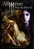
Staff: Jesús B. Vilches and Javier Charro

Overview:

It’s gothy and emo but it has amazing art and prose.

Review:

Alright next on my post-hangover 2014 review binge is Allwënn: Soul & Sword. It’s the preview for an upcoming comic series and it is hella free so that’s a plus right there (no excuse as to why you can’t “buy” it right?) Again, as per normal I didn’t read anything on this one prior to jumping in so let’s see how it did!

…only I totally did read up on it and there was this YouTube video the creators did so I watched that before reading the comic. The tone I got from it was that of an anime series that takes itself way too seriously and tries to be “dark”. So consider this section a kind of mini review of the comic’s promo video. The intro text was very… weak. It was a bunch of emo vague statements over some cool music than a montage of artwork from the comic. Honestly, it conveyed tone but did not interest me. The art alone got me invested but the weak and vague statements didn’t tell me anything about what this book I would be buying would be about. Something about how the narrator (who is unknown to us) “was there” when a sword was baptized in “her” name and when he tried to kill himself.

(Sigh) I really hope this comic’s story explains or I am gonna be ripped. Anyway, on to the comic!

So first off this is not so much a comic as a true “graphic novel”. I don’t mean in the “serious comic” sort of way, but in the layout of the comic. It is a series of pages with dialogue over them with art in the background. Sometimes there is no art and just a stony black background.

The art of this comic is beyond captivating. It fits the tone, it expresses emotion, it backs the dialogue, etc. In fact this book is nothing if not artistic and I say that because every visual aspect of this comic was design from the perspective of an artistic mindset. When there is art- it is a choice to do so that makes the story stronger, when there is no art- there is a aesthetic reason behind it, and the type of art (linework, full body, etc) it is all back by a solid rationale that I can understand. The background are beautiful too. Even when just a blackish stone texture it feeds that visual tone the comic is striving for. It feels a bit like a Conan story set in a high fantasy setting visually. Kind of remind me of Skyrim’s take on fantasy and I am impressed to the nth degree.

After I finished this review I read another and it talks about how there are a few reused pieces in the comic but ultimately I find this acceptable. When they use the picture more than once, the first time we see only part of it and as the story unfolds, we see more of it.

I’m sorry to say that the plot is just straight up “emo”. As a reviewer, I like to use better words than “emo” but it’s the most fitting one I can think of. The protagonist acts like he is going to kill himself every night by holding a dagger to his chest but stops and is always seeking his own death. Really? REALLY! That is the plot you are going for with art as goddam GORGEOUS as this? That is the tone you are going to use for a graphic novel laid out as well as this with as much love as was so clearly put into this? We get to hear the goth kids from South Park’s backstory for their D&D character? Ugg. Kill me now… except don’t. I don’t want to be as emo as this comic’s premise.

The premise, as far as we are really told is that this a half elf half dwarf guy loves this girl… a lot. Like a lot a lot (we are told about it on just about every page) and since he couldn’t have her he went 120% emo and started seeking his own death by doing stupid stuff like trying to kill 20 people at once. Of course since he is the protagonist- he can’t die and keeps on going around repeating his suicidal quest.

The writing itself is solid. No grammar mistakes, no odd word choices, and overall is brilliant. You have to get past all the gothy-emo stuff that is just laid on so thick and heavy it hurts at times. It reads more like poetry or limerick than story and you have to read between the lines quite frequently. The writing style reminds me of a Homeric epic at times while at others I find little snippets of The Bard in there. There is a particularly vivid love scene that we get one (tasteful) picture of but are then given a powerfully moving bit of prose that would make even a salty maiden blush.

One thing that kind of bugs me, but I can totally see why they did it, is that they tell this story in such short fragments. It jumps around every four or five pages and I am unable to follow any one trail for more than a moment before the graphic novel jumps to something completely different. It was really hard to get through the first few “chapters” (which are only a few pages long) but around the midpoint it started to all click. There is an overall narrative that begins to take shape but since the story is not told chronologically for the most part it is a tough read.

All and all this is one of those graphic novels you don’t want to miss. It’s a rare gem with greater prose and artistic direction that is second to none. The premise they chose is really dark and a little overplayed but the team that made this is wildly passionate about it and dives head first.

Metrics

Art: 9/10 (If this art was a woman, I’d put a ring on it)

Lettering: 5/10 (Nothing groundbreaking but always legible)

Plot: 4/10 (They were a little heavy on the emo but great on the prose)

Novelty: 7/10 (A crazy attempt at a true “graphic novel” with solid art direction)

Overall: 6.25/10

Link to Product

Spying with Lana: Sweet Nothings

Spying with Lana: Sweet Nothings

Staff: Sean Harrington

Overview:

A surprisingly smartly written 18+ indie comic with some quality issues.

Review:

Oh good another 18+ comic. Today I’ll be spying on Spying With Lana: Sweet Nothings.
I’m pretty sure I’ll regret it, but hey- I give everything a chance.

Straight up, the art is good. For one we have a pretty realistic comic and the artist/writer (Sean Harrington) has a very good grasp of anatomy, even if it is the anatomy of a porn star. I gotta say though, when every shot of every character is kind of centered on their massive tits… it’s not really something that screams “awesome artistic direction” in my mind. Then again, this is an 18+ comic. There is also this really odd disconnect between the character’s skin, the lineart, and the backgrounds.Like on page 7 (page 1 of the actual comic) the skin of the man yelling is drawn hyper realistic, the stroke is done with some rough tool, the suit he is wearing is another texture all together, and the background is non-existant. I have this weird suspicious that this guy is tracing stuff or just ripping pictures. Like the wall on the bottom of page 8 is from Google, but the panel above that is drawn. It’s SO weird. Like sometimes it is clearly drawn and sometimes it is clearly not. And when it is drawn there is this odd “manga” style that gets introduced every now and again that is another divergence from the art style. Maybe it is his style? Maybe it is some kind of artistic shortcut? I don’t know. Either way the meshing between all these styles really creates a very inconsistent tone.

The typography is not so good and a lot of care was taken in it. There is a minor rasterization/compression issue on the text (possibly on the whole comic) but that’s not much to complain about.

Ironically, I am going to say the story was actually pretty engaging. Like I went into this assuming we’d get a “pizza delivery” class porno story… but yeah, I was wrong. I sold it short. The basic premise is that a sexy spy tricks three people into giving up their components to a secret invention they were meant to be protecting. I mean there are tits every page or two and some sexy time, but… yeah. Decent. There was some clever line delivery, I actually got a few chuckled out of it and the characterization was pretty solid. If it wasn’t for the tits being shoved in my face every like 30 sec it would have been a solid normal comic, but it has the 18+ label to be honest it would have detracted from the humor. The excessive sex and titts actually kind of play to the kind of humor the comic is looking to portray.

So then there is this weird shift in quality on page 20. Rather than being drawn or use stock images we get a random low quality 3D image as the exterior of a house with some text that is either super compressed or low quality is superimposed over it. Really? I gave you credit for some solid art early on in this review, don’t make me regret it.

Anyway, in conclusion this is a smartly written 18+ comic that really is bogged down due to some poor choices. The artistic disconnect in styles is disconcerting, the compression issues are glaring, and the whole thing could have benefited from a serious upgrade. Otherwise, the writing was good, the plot was engaging, the characterizations were strong. Maybe I prejudged an 18+ indie comic but hey- I’m game to review anything and give it a fair chance.

Metrics

Art: 2/10 (Weird clashing art styles. Generally good. Quality issues.)

Lettering: 4/10 (Solid with compression issues.)

Plot: 6/10 (Actually pretty solid.)

Novelty: 5/10 (A new story to me… and tits?)

Overall: 4.25/10

Link to Product

The Dead

The Dead

Staff: James Maddox, Jen Hickman

Overview:

Unexpected take on a common theme.

Review:

I have a comic today that the author promises me is “not about zombies“ (quite explicitly actually) despite being called “The Dead”. I was told it is about the afterlife, but in a way that would be unique and compelling. That being said, lets jump into The Dead.

So the first thing that jumps out at me is the very grungy art style. I mean I expected grungy from a comic named “The Dead”, but it is quite well done. At times the scrappy line-work made me think it was messy (see the lack of apparent stroke on Sam’s pants on page 10 due to the black background), but it was clearly the look they were going for. A comprehension of how to effectively use perspective is demonstrated early on with a series of very nice dutch angles (I feel like I am watching Battlefield Earth or Thor). Combine the two artistic choices (angle and style) and you can almost convey the vibe of this comic. They craft a very uneasy, bizarre, world that faithfully recreates the feeling of a nightmare at times. There are some great character designs as well, with everyone being visually distinct and memorable. I like to play a game after I read a comic to see if I can mentally picture all of the characters and normally I can do pretty poorly. However this time I could pretty vividly remember just about all the characters visually (even if I couldn’t recall all of their names).

It should be noted that the lettering on this comic is top notch. The onomatopoeia is fantastic, something a lot of comics neglect. They transform the typography visually to mimic the sound (example: “Crash” might be broken up like a shattering window). I really wished more comics took the time to invest in their letting and onomatopoeia, it’s the single thing that separates the novices from the pros. I don’t mean to say “amateurs can’t have good typography” or “the barrier for entry to becoming a pro is outstanding lettering” but in 99% of the really bad comics I read they have really bad lettering as well. It’s kind of the litmus test for pro vs joe in my book and this one really shows off some really stellar work.

Plot wise I think they are following dream logic. While it works, but there is not much “meat” to it. This is more a comic that is meant to invoke a feeling. It’s very piecemeal and kind of stitched together the the begining, but again that is what they were going for I suspect. A lot of dialogue kind of picks up in medias res quite, and while it is effective in invoking that dream logic kind of jumpiness, it does get distracting if you are reading this, even in one go. I can only imagine putting this down and picking it up and trying to remember what the heck is going on. The same goes for transitions; we get a lot of the comic equivalent of jump cuts.

That brings me to a weak point of this comic. While the comic is engaging, it doesn’t seem to “go” anywhere. Near the end we get a bit of plot development with a “bottle game” (with a fun infographic) and a kind of teaser of things to come, but otherwise it feels very aimless. The direction of the plot seems very suited for a video game from the 90s and will no doubt result in some very amusing “high adventure” style storylines but it didn’t engage me like I expected it would.

To be honest, it was a fun little vacation but it didn’t grab me hard enough to really keep me there permanently. Like I like the world and it is a very seductive world, but I was lacking that “draw” that keeps me there. It might be the detached view the story takes but it never really sealed the deal for me. There is this bit about collecting objects to learn more about The House but the comic itself even says they are just doing it to pass the time. I’m sure there is a bigger plot out there somewhere but dangling a little bit of bait about the nature of something so inherently bizarre doesn’t really do anything for me. Like we have a shattered norm (if you are a Joseph Campbell fan, they are in the “special world”) and as a reader I don’t know the relative value of this danger. If they are in the afterlife or whatnot, what does death even mean? If the information is valuable but unreliable, as it is mentioned that it is often speculative, why risk life and limb (if life has a value)? I feel like the comic could have done a bit more to establish us in the world and explain things a little more before just saying “tune in next week”.

Overall, I liked it. Very unique setting penned by a very novel hand, great artwork, and there was some serious investiture into the establishment of the aesthetic of the comic. I was given issues 1-3 to read but I only read issue #1 (as per my guidelines). It’s worth a read if only for the art and setting.

That is not to say it is a bad comic, far from it, so give it a read!

Metrics

Art: 6/10 (Scrappy but fitting)

Lettering: 8/10 (Outstanding)

Plot: 4/10 (Fun vacation, not to stay)

Novelty: 8/10 (Unique world, fun premise)

Overall: 6.5/10

Link to Product

HellOhGirl

124179-thumb140HellOhGirl

Staff: Jeremy Key, Opan

Overview:

Worst comic I’ve ever reviewed. Period.

Review:

Holy jesus. So I started off with this one by looking at the cover. This is what stared back at me.

holy jesus

I don’t normally do adult stuff so I’ll spare you all the details, but I am going to review this trainwreck because… I don’t know. Maybe I’m a masochist or something.

So the first page starts with a page from this girl’s diary. Lord almighty I can’t read a word of it at normal magnification but let’s not pick on such trivial things when there are so many juicy tidbits to select. This page is written with as much grace as a three year old having a seizure. Let’s look at an excerpt,
“I hang with Finx. He’s kewl. He’s from back home too. We are buds until he farts, Then is when we war and fight over normal stuff like food, the toilet.”
Shakespeare, you have been surpassed. This is the kind of stuff I couldn’t make up if I tried.

Oh yeah, and there is a talking rat who has every “proper British” cliche, pulling words, phrases, and sayings from every era of its history. It wouldn’t be so bad except that they are misused sometimes and the protagonist is made to seem “stupider” because she doesn’t get what he is saying.

So even the spelling and grammar mistakes, which are QUITE numerous, pale in comparison to the kind of bizarre bizarre meta panhandling that occurs. Mind you this is Issue #1. In the middle of a exposition  (I can’t find a stronger word to indicate that every word of every speech bubble is exposition for like 3 pages) scene the main character starts talking about how many fans the Six Source Studios DevinatArt page has and how many fan emails they get and… wow (also I checked, the have like a dozen watchers and their FB page has like 5 likes). I don’t know if I can continue this review. It’s… wow. This is honestly the worst comic I have ever read. Ok Scotty, you can do this, soldier on. Flip to the next page…

hellspawn
Oh god. Why have you forsaken me? What hellish influence has driven the studio who made this comic to include an image like this? Oh lord. Anyway after that nightmarish non-sequitur scene we continue our schizophrenic plot in which Hellyssa is set up on a blind date… and is wearing a pair of joke-shop glasses and nose for some reason. (… do I have to continue to review this? *Searches contract* Fine.) she is set up on a date. But after that- time for a half naked fat cyclops because WHY NOT!

Oh and I’ll list my grievances with this comic in no particular logical order because the comic did away with logic long ago. “C”. You can use a “C” author. “Kewl” or “Krazy” is not kewl to do 15 times. It was kind of ok in the diary entry where we had an unreliable narrator… god why am I applying any iota of thought to this. Anyway, it ends with a… big surprise here… non-resolution (and not even a cliche cliffhanger?) and and ad.
Dear artist. Boobs don’t work that way. (Also, hi bender)


Otherwise it is surprisingly good for a 3D piece. It doesn’t suffer with the issue of lack of clutter or background characters that other comics that use this art style have. The models were surprisingly consistent (except for that news anchor whose face will haunt my nightmares).

They have this odd fascination with the main character who kind of looks like an aged hooker with breast implants and have the mistaken idea that she is some kind of sex symbol or something. The texture for her skin just looks grody and wrinkled. I don’t find her attractive, she is really just kind of terrifying, hardcore uncanny valley stuff going on. I mean if you look at the last page you can see how freakishly large her hands are? Maybe someone thinks she is attractive but to me she looks like they stretched hyper realistic skin over a blow up sex doll and put a pink wig on it.

Also, what is with the adult rating? Other than the half naked cyclops and her comically large boobs- why did this get an adult rating? Like I can see that maybe this could be seen in some super conservative country as “adult” but I totally expected this to be some raunchy sex fantasy. I’m really glad it didn’t though. I did NOT want to see granny sex doll bumping uglies with a half naked cyclops. 

Metrics

Art: 3/10 (Quality 3d with some nightmarish uncanny valley)

Lettering: 4/10 (A few mistakes but overall good)

Plot: 0/10 (Kill me now.)

Novelty: 0/10 (Boobs and pink hair are novel right?)

Overall: 1.75/10

Link to Product

Exit Generation

Exit Generation

Staff:

Writer: Sam Read
Artist: Caio Oliveira
Colourist: Ruth Redmond
Letters and production: Colin Bell
Cover: Ramon Villalobos
Editor: Adam P. Knave

Overview:

Fantastic art, engaging premise, and John Woo flicks.

Review:

So I got an email this morning asking me to review this from the writer. It’s a punky scifi story with a lot of heart. I normally sigh when I hear “this is my first real attempt at a comic” (See Legacy) . Lets see if this one fares any better as

Visually this comic is a lot of fun. There is a very distinct palpable punk vibe to the artstyle that kind of reminds me of an amalgam of Genndy Tartakovsky’s TV work and Jamie Hewlett’s early stuff (There is a thick stroke, a lot of pop culture references, etc). A mastery of expression, form, perspective, visual focus and anatomy are on display in this comic. I was actually approached to review this so I know this is the first real work of this team and I am going to remove my cap here and give them a salute- well done mates. There is a very unique artistic style that you instantly fall in love with that meshes with the tone so well that it is seamless. I wish half the mainstream comics had this level of investiture in their artistic aspects (I’m looking at you DC with your ).

In terms of lettering the first page gives us a bit of an eyesore. It is this tiny, spidery, thin text over a black and white background for the copyright and it makes it unbelievably hard to read. The text IN the comic though is actually professional grade with some very nice use of the occasional onomatopoeia.

The plot is told through very apparent context clues we pick up visually with minimal text. For example, we get text that tells us “United states declares martial law” and we get some soldiers next to a sign that displayed the population and graffiti that says “Full Like everywhere else”. They also interweave the very personal story of a family affected by the events in the plot so we can both get a first person view of it and an almost retrospective historical view of it. The introduction takes 9 or 10 pages and then drops us into the real story. I’d normally chastise the writer for dumping exposition on us, but it was woven in with the personal stories so well that it felt like legitimate plot and provided us with a tangible emotional connection with one of the characters. It didn’t feel like “LORE” dropped on us like a heavy book, rather it was more like an introduction to a character.

The characters are human and real with quirks and tastes. For example, I love how much the gifts the protagonist’s parents get him reveal about him. It is so expressive of who he is and what he likes that it tells us more in one scene about him than most characters get in an entire comic. I got a very Goichi Suda (Aka: Suda51, Aka: The guy who made Killer7, No More Heroes, Lollipop Chainsaw, etc) vibe from it. There were a LOT of pop culture references that informed us of the kind of media our protagonist was consuming.

The dialogue is well written with only a few stale lines, but most come off as charming rather than dry. Once we get the ruleians (no spoilers) on the scene, the dialogue gets hilarious. Their speech patterns add food related phrases (delectable, succulent, delicious, etc) at creepily inappropriate times. I mean it was a bit ham handed (pun pun pun) but it was played for laughs and actually results in a pretty decent zinger at the end.

The postscript is worth a read as well (even if thin white text on a black background hurts my eyes a bit). It talks about what my site is all about- getting away from the big two.

In conclusion- stellar work. A lot of passion, a lot of fun, great visuals, and a premise that will keep you coming back. A lot of this comic feels really engaging even though it is talking about day-to-day things (interspliced with “big” things)  it feels very action pact. Can’t wait to get my hands on the next one. Check the link below for a free 4 page preview.


Metrics

Art: 9/10 (When I say Genndy Tartakovsky meets Jamie Hewlett I mean it)

Lettering: 6/10 (Pro grade)

Plot: 6/10 (Engaging and human)

Novelty: 8/10 (It’s new and well thought out.)

Overall: 7.25/10

Link to Product

Link to Sample

Legacy

Legacy

Staff: Andrew Lorenz and Mike Campeau

Overview:

Generic superhero in genetic tights

Review:

There is something weird going on with the art. Most times it is downright solid, but sometimes it shifts style (in the same panel) and looks like it was drawn by two different people. A good example of this is on page 4 where it looks like the thug’s head is drawn in a different style than his chest. It should also be noted that some of this looks like the reused all or some of certain art pieces. Again on page 4, look at the position of the thug’s head and arm, then compare it to the panel on the top of the page. There is also this weird reliance of really amateur level gradients on things (particularly noticeable on what I assume is paper or trash blowing in the wind?) over what is otherwise really solid line work. We also have a very visually clean city for an environment that is apparently slipping into the hands of crime and heading towards total collapse. I see this a lot with people who don’t pay as much attention to the background and the kind of world they are portraying. There is a very bright background with a lot of primary colors, something that kind of clashes with the urban aesthetic they talk about in the next. This could also be a lack of detail on the artists part.

The lettering is not up to par either. I hate to be rough on this stuff, but we have some seriously decent lettering with some big bobos when it comes to the placement of text (See page 9) in the dialogue balloons. The lettering on the intro is not the same quality as in the comic and really is distractingly bad (maybe a center align or something?). However, otherwise it is very solid.

The dialogue is lifted from every golden age comic ever that serve more to explain the scene then to explore the characters. For example we had line where a criminal say, “He’s got Shane!”. This does very little to educate us, the reader, to the nature of either the hero who has apprehended Shane. It doesn’t even explore Shane’s character and only gives us a vague insight into the other two mooks who say “Forget him, lets go!”. In a lot of my reviews I bring up that comics are a visual medium (at least in part) and you don’t always have to have dialogue for a scene to work. In this case, I think a lot of these scenes would have worked a great deal better if they dialogue had been left off. For example, imagine if the hero has ripped the top of a car and we got the panicked faces of the thugs and as they flee we see him grab one. The emotion on the faces of the characters (which is well done) could have had time to shine and carry the scene, but instead we get trite dialogue.

Overall this seems like a failure of concept. This is a decent art team but it feels like someone had a “really cool idea for a hero” (who is, in truth, rather generic) and paid an artist to illustrate it. It lacks that je ne sais quoi that a well thought out comic concept that has real potential has. The setting is one step from Gotham and Paragon is somewhere between Superman and Captain America. I HATE to simplify it like that, but that’s the vibe I get. Like someone, a very passionate fan, wrote this comic as a love letter to his favorite tropes. And I’ll give him credit- he mimicked them well. However, mimicking and effectively implementing them are two very different things. It just doesn’t feel unique or novel at all. It’s just a different rehashing of the basics wearing it’s factory printed tights.

The postscript is a very good read actually. It tells you the name of the characters and some of the background on the comic’s development. It seems like a lot of passion went into this comic and it looks like there is a longer term goal in mind because we are told there is 130 issues so don’t write this comic off on my review of it. This is potentially a very strong series and I am just reviewing the “trailer” here. Then again, I wish we’d got some of that in the first issue. If it didn’t grab me it might be lacking in something.

Something else I liked in the postscript is that our dear author talks about not talking but doing something. This is a HUGE issue that I see in the indie industry. Everyone thinks is really easy to make a comic and their idea is the best one out there. These guys, including this team, bite and claw their way up. It is a massive undertaking that takes talented people months (if not years) of hard work. Sure they are “indie” but hot-damn if that doesn’t make it all the more impressive.

Metrics

Art: 4/10 (Not pro, some weird elements)

Lettering: 4/10 (Good with a few small missteps)

Plot: 3/10 (Genetic with trite dialogue)

Novelty: 2/10 (Nothing new under the sun)

Overall: 3.5/10

Link to Product

Lei Li- The Rage of the Tiger

Lei Li- The Rage of the Tiger

Staff: Ertito Montana (Based on Kuang Ni’s work)

Overview:

Not much to say- good visual comic.

Review:

So this book is based on the famous wuxia writer Kuang Ni’s work (I am assuming the One-Armed swordsman) and is kind of a love-letter to his style of writing. I actually just got off a wuxia/wushu kick myself so reviewing this comic will be a blast for me. That being said, let’s jump into “Lei Li- The Rage of the Tiger”.

Visually this is one of the most interesting comics I’ve read in a while. It’s a very minimalist, almost cartoony style done entirely with lineart. While the plot is a bit lite, I get the it is not the point of the comic. It’s really about the artistic direction and the stylized. Overall it’s only about 13 pages of actual comic and there is very little dialogue (which works in its favor). When there is dialogue the lettering is legible and the onomatopoeia are in the same style as the art.

If I had a criticism, it would be that the plot is a little convoluted and I often mistook characters for each other. The plot aspect is because they are doing a continuing story and I feel like you’d need to read them all together to understand what’s going on (and that’s part of the fun). It’s also a little short for a comic so if that bugs you… shame on you- it’s FREE.

I’m sorry for a short review this time but there isn’t a lot to critique here. There is some wonderful, highly stylized art, the start of a very traditional wuxia story, and it was a lot of fun to read. And it’s free! Give it a shot!

Metrics

Art: 7/10 (Stylized artwork )

Lettering: 5/10 (Decent)

Plot: 3/10 (Not much revealed and a tricky to understand without context)

Novelty: 5/10 (Innovative artstyle, fun idea)

Overall: 5/10

Link to Product

Gonzo

Gonzo

Staff: Garry Mac, Jim Devlin, Colin Bell, Kev Harper, Iain Laurie

Overview:

Hunter S. Thompson would be proud of this bizarre comics that staggers under the weight of its own premise.

Review:

This comic starts off with a man looking through a vagina-like portal at the universe from outside of time and space. Yeah. It’s going to be one of those comics. WIthout further ado, let’s plunge into Gonzo!

The art is professional level. There are a rare few instances I’d say it could be improved a bit, but ultimately they are not too bad. There are no major missteps and they use a very “scifi” color pallet that meshes well with the clean aesthetic it strives towards. I’ve got a very Fantastic Four vibe from this comic and that’s not a bad thing. I got a bit lost in the beginning of the comic, constant lighting shifts and changes in character proportions made me think there were two crews in two areas or something. I had to re-read it to understand what was going on. Later in a series, this might be a forgivable slip up- but in issue one? (Example: See bottom of page 11 vs bottom of page 9). However, once we get into space (and beyond) there are some truly bizarre creations and fully take advantage of the setting.

Plotwise we have a lot going on. A lot of names, characters, and concepts are thrown at us all at once. Some comics handle this really well, but Gonzo had a rough lift off. By about page 13, I started getting a bit more comfortable and I was able to use some context clues to decipher what was going on. I kind of got that they were going for that kind of frantic chaos at the start of the comic, but with the occasional random nonsequitur quotes at the top of some of the pages and the series’s jargon being tossed around so frequently (“What is pullspace?” I kept asking myself) I felt like a lot could have been done with a simple footnote or two to alleviate this. And the comic has a LOT of jargon. Tertiarists, pullspace, quanta, novak, etc. which didn’t help things.

The comic’s post script basically says it is a meta-contextual view of the universe to explore broad themes and the first three comics will be non stop. Judging this only on the first comic- I am straight confused and I don’t think that it is my fault. We get a LOT thrown at us and very little of it is literally explained. We are given clues or suggestions as to what certain things are, but we are never told outright. Clues build on clues and if you had one misconception, you are lost.  I’m sure there are a lot of really big ideas and they will elaborate a great deal on them in the next few issues, but it really just doesn’t come across super clear to me now. That’s not to say you shouldn’t read this comic, you totally should. It both benefits and suffers under the weight of its own premise and I had to read it two or three times just to decipher it. It has a really bizarre core concept that won’t resonate with a lot of people. This is a very intellectually focused comic and it took a few re-reads to figure out what is going on. Sometimes they have characters speak with their words out of order and while it is a very nice, novel, touch, it does make it a tad hard to read.

I’ll credit this comic with being very brave in tackling such large themes and I’m looking forward to future comics in this series. Judging by its own merits it’s solid work, if not a bit out there. But come on… it’s called “Gonzo”, like the outlandish, journalistic style pioneered by Hunter S Thompson. It’s gotta be leading up to something good! Anyway, give it a read. It’s worth your time but I’d suggest waiting until the first two or three are out.

Metrics

Art: 6/10 (Pro grade with some minor issues)

Lettering: 6/10 (Pro grade)

Plot: 3/10 (Sloppy delivery)

Novelty: 7/10 (Awesome and very BIG plot)

Overall: 5.5/10

Link to Product

Trip

Trip

Staff: Kelly Matten and Waker farrell

Overview:

I got a contact high from this hit AND miss comic.

Review:

So I’ve got an interesting indie comic to review today. It’s called “Trip” and I was warned that it’s written from a female perspective, alternating authors depending on perspective, and features extensive drug use. So, let’s drop some acid and trip into Trip!

So the art is really hit or miss. Some panels it is spot on and sometimes it looks like it was rushed. When it is good, it’s a very interesting stylized approach that lends itself to the tone and theme of the comic quite well. And since there are two artists on this, I feel like I should point out that it is not one artist who is worse than the other. It is more a few rough patches scattered throughout the comic (example: Page 3 and the top right part of page 4 as compared to page 7 or 7). Sometimes the navigation from panel to panel is a little odd and hard to follow.

The lettering was a bit off at some point. The font wasn’t quite sharp enough to give a reader a totally legible experience. An example of this is on page 4 of the comic. A character says, “There’s the liquor; gotta get out of myself”, but the r gets lots and it appears to read, “There’s the liquon”. It also gets a little small sometimes and the resolution on the comic prevents a reader from zooming in to really get much of an improvement. We lose the edge of dialogue balloons due to an inconsistency in whether they have a stroke around them or not . In addition, there are a few capitalization errors and minor grammar errors, but all and all it’s a good effort.

The dialogue is riddled with a lot of slang terms that the uninitiated might find jarring. Occasional linguistic drifts occur and almost seem to hang in the hair for a while. However, it fits with the trippy “burner” vibe that one of the characters exudes. That is to say, it is hard to read but that’s intentional as far as I can tell. There is a lot for the reader to identify with. We’ve all had a party where you got dragged along and just want to go because but can’t because someone else is having a good time. Plotwise I get a kind of Alice in Wonderland vibe. Like complete with the trippy imagery and invitations to a bizarre drug trip. In fact, if I had to pick a single word to describe this comic, it’s “trippy” (I guess that they picked the right title, eh?).

Now let me get to the meat of this comic. About page 12 we get our big jumping off point. This is one of the best representations of a drug trip I’ve seen translated to a visual medium. While the artist are far from professional level- they push themselves and come up with some amazing visuals. Every time we get tossed into that trippy world, everything is dripping with creativity. If the entire comic had this level of visual creativity- it would be a vast improvement. Now since comics are not exclusively a visual medium, we have some great dialogue that firsts perfectly with the visuals. The onomatopoeias used are fantastic and fit the vibe perfectly (check out page 28).

The subject matter touches on a very touchy subject in our society. It explores the reaction to psychedelic drugs in a positive light and uses it as a tool for discovery of the characters. I think it’s effectively done and is pretty risky gamble. It could have easily fell apart and been a bad trip (pardon the pun) but they save it from the fire. One thing I enjoyed was the realistic and holistic approach that the authors use to build the relationship between the two protagonists characters.

The plot, unlike your typical run-of-the-mill indie comic, isn’t concerned with progressing some bloated over the top “epic” story. It’s about two women finding themselves and reflecting on their life. While there is plot progression near the end, that’s not the point. This is a comic focused on character development and exploration of themes over telling a linear story per se. This might turn readers off to it, but I thought it was a successful application of comics as a medium.

Overall, I like the creative intention behind the comic but I was a bit disappointed at the rocky execution. Sometimes this was Grade-A indie comic but other times some sporadic rough spots cause a jarring disconnect. It’s certainly one I’ll recommend you read. It has a brave and creative take on a taboo subject matter despite its pitfalls.

Metrics

Art: 3/10 (A few good pieces, but a lot of rough stuff)

Lettering: 3/10 (Sloppy and inconsistent)

Plot: 6/10 (An exploration rather then a story.)

Novelty: 8/10 (Trippy and boundary pushing)

Overall: 5/10

Link to Product

Average Jo

122094-tumb140Average Jo

Staff: John Pross, Derek Adnams, Julius Abrera, Bryan Maganaye, and Brandon Bullock

Overview:

Solid story, awesome artwork.

Review:

So today’s main dish is Average Jo by Hound Comics. It’s got a slick cover and an “adult” warning on it so what could possibly bad about it? Well, let’s find out!

I mentioned this a while back in my Spectrum review; if a comic’s description starts off by telling us the race of our protagonist- it seems to absorb a lot of the focus on the comic. Average Jo starts off by saying, “Meet Jo Hamilton. Jo is a Filipino-American police officer in the city of Eden…” To be honest- unless this comic is going to be deeply entrenched in the cultural plight of Filipino-Americans, leave that out of it. (I am waiting for the day a non-Neo Nazi comic starts off saying, “Bob Smith is a Caucasian-American police officer in New York City.”) This is a tiny little pet peeve of mine that I’ve spent enough time of this review of a solid comic on so…

Let me jump into the art section of the review by saying, “DAMMMN”. Now reclaim a bit of my professionalism (*cough cough*) I’ll explain why I think this is one of the most gorgeously drawn comics I’ve recently seen. It blends realism and traditional american comic art conventions perfectly. Angels are used well, anatomy is consistent and realistic, the outfits are imaginative (kind of gives me a bit of the “New 52” vibe- in a good way), and they don’t skip on the background. I can’t overstate how important that is, a lot of good comics have stunningly bad backgrounds (I’m looking at you Marvel and DC).

The dialogue is smartly written and have a very professional ring to it. A lot of indie comics have this tendency to overload us with exposition right off the bat and we’re smothered in dry lines by page 3 or 4. I got a LITTLE background (in snippets) during the first two pages. It didn’t require a block of text- I got it through dialogue and demonstration. I like that we get to see a lot of our protagonist’s home life and get to really empathize with him as a person.

At first I didn’t even notice the lettering, which to me makes me squee with joy. Lettering SHOULD be easy to read and not the main focus of the story. They do a bang up job of some very professional lettering and it pays off in a unicycle flowing comic.

One thing I’ll say detracts from this comic a bit of the subject matter. We have “supers” running around cities and a legal act that protects them and… yadda yadda yadda. Sorry to say but this is a really tired concept. We get it from the perspective of a mundane cop which is kind of unique but it feels like 1/2 the other indie comics in the superhero genre I’ve read. Off the top of my head, just the ones I’ve personally reviewed, I can think of: iHero, The Misadventures of Electrolyte and The Justice Purveyors, True North (somewhat), and Division M. In fact, it reminds me a lot of Division M (though much better written and executed) with that entry level cop vs superhuman sort of thing going on. It’s not to say this is a bad comic, it is just a song that has been played one too many times on the radio.

Overall this is solid comic. One of the most well rounded endeavors I’ve come across recently. It has a very human element in what could easily have descended into mediocrity. With a deft hand its crafted and bolstered by some solid artwork. Give it a read!

Metrics

Art: 8/10 (Pro level)

Lettering: 6/10 (As it should be)

Plot: 5/10 (Very human characters, good dialogue)

Novelty: 4/10 (Been done before)

Overall: 5.75/10

Link to Product