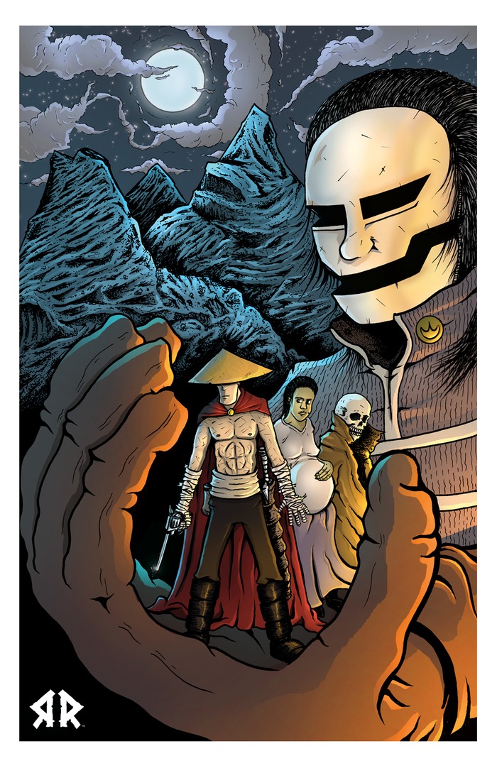
Super Inc., Villain’s Edition
Staff: Aghori Shaivite
Overview:
A comic that tries to be a mafia story and a super villain story and fails at both.
Review:
This is a long one so I am going to break it down by chapter. To start with we get a very nice, succinct, flavorful intro that established the developer’s intent and the world in which the character’s live.
As it jumps into chapter 1, I am not sure if we are getting some sort of meta-humor or if this is an established “thing” in the universe of the comic. A villain is asking for space in a comic anthology from a woman. Now they keep having these references to issue #1 in the comic, which I was assured I wouldn’t have had to read. 10 pages in and I still feel lost. I have no idea what is going on. Best I can figure, this super villain is bugging some staff member at a comic company to be included in an issue. The chapter ends and I’ve still got no idea what that was all about. Was it a meta-gag? Was it a in-universe comic company and it has something to do with these “saints of death” the forward tells us about?
Overall the art isn’t outright bad but it doesn’t rise high enough to be called “good”. While the biology, proportions, and expressions are well enough, each panel seems to have one or two really odd/creepy errors in it. Like on page 7 one of the panels has this woman with creepy, lipless, teeth (only in that panel) and then the eyes of other characters seem to be drawn differently on occasion.
Chapter 1 wasn’t my cup of tea I guess. Oh well, let’s read chapter 2.
The second chapter has a different art style that I actually like. It kind of has that art deco/Andy Warhol/retro look to it and that’s something I can really dig. It’s up there with some of my favorite comic art that I’ve reviewed. It’s a night and day difference from the first chapter’s sloppy art style but it makes me wonder why they didn’t just use this style in the first place. I can follow this story and it does live up to the mobster-esque theme and inspiration promised in the forward. It does kind of begin and end rather quickly and is really a contextless vignette which kind of detracts from the overall appeal of it but it showcased some fantastic art direction so I suppose it served its purpose.
Chapter 3 against switches art styles on us to a more American comic book art style, though with some oddly flat tones. It looks like the artist is like 75-90% of the way to doing good art but there are still some awkward lines and stock poses that don’t really lend themselves to the scene compositions. It feels like this is an artist attempting to mimic a style he/she doesn’t draw all the time or at least is fresh off the boat with that style. For all the crap I just gave it though, it’s pretty solid. The use of dutch and high angle shots is excellently used and even the speed lines work to the comic’s advantage.
Chapter 4 goes back to a style with similar quality to that of chapter 1 (if not worse) and it’s a real sharp contrast in quality. After seeing the excellent art in chapter 2 and the great use of angels in chapter 3, this stuff is forced upon us again? What’s wrong? Could the production company not afford to pay a decent artist to do the entire thing? I think one of the biggest issue with the comic is the inconsistent tone and art style that is REALLY distracting.
Chapter 4 has this awkward issue that a lot of modern indie artists have. They don’t draw the backgrounds really. They draw the character and the background separate. This leads to an almost “cutout” feel to the comic and subtly screws with perspective (the characters and the backgrounds don’t always mix well). For a good example of this we can look at page 33. The nurse and doctor look like they are blood deflated sex dolls! Like 2 dimensional cardboard cutouts tossed against the inside of a textured cube. The artist uses the SAME texture over and over for backgrounds and just changes the color. As a reader I can’t help but notice it and it really doesn’t look very professional.
Anyway, back to the plot of chapter 4. I am totally lost as to what is going on even a few pages in. I don’t know who Simon is and why I should care about him or what he has to do with Dom from the last chapter (as this is basically “chapter 3, part 2” according to the title). It takes a few pages for the reader to get back to the guy who’s name is in the title and it was a little disruptive to the narrative flow I felt. It basically talks about how they resurrected a drug lord as a supervillain.
Chapter 5 again switches artists (I wish they would stick with one good one…) and we get some decent artwork. Not groundbreaking, but when compared to the rest of the comic it’s one of the better drawn chapters. There is this odd tonal shift from Martin Scorsese-esque drug drama with realistic characters to campy super-villain stuff and it doesn’t pass smoothly. It’s a rocky road and it isn’t handled well. We have a character, Dom, who goes from dressing like a legitimate human being with some street smarts to a underwear on the outside supervillain who says “aarrrg”. Oh yeah, he’s vaguely “pirate” themed because… reasons. His love interest says “oh he liked the jolly roger flag” and thus- he’s pirate themed. Wow. Talk about a jolting transition. I almost wish this comic was just about the drug conflict and not some knock off version of the superfriend’s “Legion of Super-Villains”. Then they give legitimate drug pushers and street thugs super villain names and it goes over right as rain? Kill me now. This comic had promise of being a good one. Why!?
Chapter 6’s art style is akin to the style in chapter 5 (definitely a different artist though). The plot revolves around the attack on a compound where Dom gets his revenge. We see his love interest again here and… god… she just looks so camp-tastic as well. I can’t get over that. There were some serious missteps in the character design department here. I feel like this comic went from the shootout scene in Godfather to the monarch’s lair from Venture Brothers really fast.
Chapter 7 (the epilogue) probably has the worst art in the entire comic and introduces a new character that teases at the next comic. I’m going to leave it at that and just remember the good parts of this comic.
Ok so now that the recap is out of the way let’s look at things in broader strokes:
God there was some awful font choices in this comic. The forward was fine but then you get to this page with a map of “the world states” and it’s a wonder I can discern what anything says. It is not easy on the eyes and is a major pain in the butt to read. Most of the time it’s fine but when they try to get fancy, it just doesn’t work (See “The Origin of Cap. Death”). There are a few times when the letters get pretty close to the edge of the dialogue balloons but I don’t think I can remember any time where it made it particularly hard to read. The lettering would have flowed better if whoever was doing the lettering took advantage of doing a diamond pattern with their text rather than a left align. Some of the shout balloons look like they were just quickly made with a pen tool and don’t have that professional edge to them. The onomatopoeia varies from chapter to chapter but it’s pretty phoned in. An onomatopoeia should be text that visually indicated the sound (an echo should trail off, a whisper can be ghastly in color and transparent). Overall, this comic could probably benefit from a legitimate letterer.
On a technical level, I’ll point out in hat whoever did the layout/formatting had some technical issues. The pages are centered on the page over a black background with the page number to the bottom right of the bottom most panel. However, sometimes the white background has the page number as well, has “CapNDeath” written on it, and sometimes nothing at all. It’s like the clipping varies from page to page and chapter to chapter. It is kind of distracting.
Overall this is a busy, squandered, comic. It keeps shifting artists which makes it rather difficult to really settle on a tone and what starts out as something that has promise ends up being thrown to the campy wolves. If it had been one or the other, this comic would not just have been good but great. Instead we have a hodge podge of maffia themes and characters thrown in with campy super villains and the result is a soupy tasteless mess.
Metrics
Art: 3/10 (While a few chapters had good art, the average overall is poor)
Ch1: 2/10, Ch2: 9/10, Ch3: 5/10, Ch4: /10, Ch5: 5/10, Ch6: 5/10, Ch7: 1/10
Lettering: 3/10 (Some poor font choices and layout issues present a very unprofessional comic)
Plot: 4/10 (YOU WERE THE CHOSEN ONE! It was said that you would destroy the cliches, not join them! Bring balance to Comics, not leave it in darkness!)
Novelty: 5/10 (Know what? It’s never been done before. It fell flat but at least you tried.)
Overall: 3.75/10
Link to Product
 Pirouette