High School Hijinks

High School Hijinks

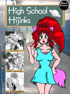
Staff: Jer Alford, Willie Jimenez, Amanda Garman, Bar-1

Overview:

An earnest attempt by non-Japanese to do manga.

Review:

I am not really just what I’m reading. Once again, I’m a bit out of my typical wheelhouse, but I soldier on. The first page looked promising at first until I realized that the artwork in the background was stock art of a high school. Well… let’s not judge a comic by it’s cover and jump into “High School Hikinks”.

The first page here tells us there are three stories. Gaijin HI, Furry Ninja H.S., abd H.S. Sweethearts. I’m going to play a game and try to guess the plots of these before I read them based on the teaser panel. (lets see how I do). One is about a weird foreigner in a typically japanese high school who has a bizarre twist, the second on the list will have little to do with actual high school and more to do with ninja bunnies, and the third will be a rather emo one about two students falling in love.

The first comic, “High School Sweethearts” starts with a piece of artwork drawn on line paper and is by someone named Willie Jimenez Aka “Idest”? (Seriously, couldn’t tell what it said.)
The art style looks like someone tried to adopt the manga art style but had little to no formal training in art. The opening dialogue and scene was painful to read and watching the two main characters awkwardly pose while they talked was even more so. Lines like, “…but girls are watching me.” “Yea yea, quiet… here comes one now!” or “I’m sure you know me as Jessie. The coolest kid in school.” show a lack of understanding the fundamentals of writing. We know there is a girl. People don’t refer to girls as a gender, but the individual (It’s like having your dad walk up and your brother say, “There is a father”). And some of the reactions from teachers… it’s bizarre. We also get a very bizarre set of facial expressions in this comic where, even for a comic done in manga style, their reactions are totally overblown and at time inappropriate for the panel. I understand trying to portray sadness or loneliness but subtlety is the name of the game. In this comic we are beat over the head with it. The art in this comic suffers from a lack of understanding anatomy. Manga is stylized and this one is too, but proportions need to be maintained between panels and relative size should established early on and continued.

In short, it was a kind of a mess, the plot was a contrived romance between two high school students, and the art was poor. 1/1 in my predictions!

Mini-Metics

Art: 2/10

Lettering: 4/10

Plot: 1/10

Novelty: 1/10

Overall: 2/10

The second one is “Furry Ninja H.S”. (It’s a little weird that they are out of order). The first panel says that this is based on “Ben Dunn’s Ninja High School”. I had to look it up. Apparently it is a comic series I haven’t read so I am going to excuse some stuff on this comic as a result. Now, I’m not a huge furry fan, but I can get it. Different strokes for different folks and by the end of the first few pages this already looks a lot better the “High School Sweethearts”. I know well enough that this isn’t my area of interest, but the comic is cohesive, they don’t waste much time on exposition (something even professional comic writers have an issue with) and I can tell the characters by their introductions. Then we jump into some random robot fight without much explanation, but it fits with the tone of the comic (and I don’t know NHS so I assume it’s a “thing”). A crazy furry… ninja… alien… fight ensues (just roll with it) and then it descends into complete and wonderful chaos to the point that we need a 1 panel continuity reset after some bad pop culture references and a 4th wall break.
This one… well it gets a pass because it’s crazy. Art is half way decent, just shy of pro level, and is looks good even if it’s not my thing. (2/2!)

Mini-Metics

Art: 6/10

Lettering: 5/10

Plot: 4/10

Novelty: 3/10

Overall: 4.5/10

The third one starts off with a good ol’ fashion rustling of my Jimmies. This ones features some terrible lettering and the name “Gajin”. Even when played for parody, Japan’s zenophobia (stemming for it’s long isolationist period) is never something really that needs to be highlighted. I feel it’s somewhat akin to naming a comic, “Jiggaboo High School” in some respects. It’s a slightly derogatory term (ok Jiggaboo is a really offensive term… I just like the way the word parts sound) that gets used with an almost positive connotation.

Anyway, the comic has the footprints of someone who isn’t from Japan trying to write a story set in Japan in a Japanese style. It would be like if someone from Japan tried to remake Boy Meets World or the Little Rascals (Topanga would of course be a busty space alien ninja cat girl with a crush on the unassuming shy geek Cory who has a special power). I’m not saying that an American can’t write stories set in Japan but you need to write from a place you know- not try to imitate something you don’t. This results in a world that is neither here nor there. The dialogue is childish and formulaic, the characters are stock, and the plot is the plot from every harem anime you’ve ever seen. The art is a painful attempt to imitate drawing a style they were not trained to draw. (3/3!)

Mini-Metics

Art: 4/10

Lettering: 1/10

Plot: 3/10

Novelty: 1/10

Overall: 2.25/10

Also, the last page looks like Lisa Frank threw up all over a manga.

As a whole, this book was really schizophrenic. It had some decent parts (Oddly enough, “Furry Ninja H.S” wasn’t bad to my surprise) but the other two were straight up painful to read. It feels like some friends who liked anime got together with these “three really cool ideas” and tried their hand at making something they had no business making. The failure in tone, story, and character development permeates so many levels of these comics but it’s magically how they manage to make it cohesive. If this is your thing- go for it. You are going to like it either way. It really seemed like a lot of passion and effort went into this comic. They really are passionate about what they do and I salute the hell out of them for that… however, anyone reading this will be hard pressed to wipe the armature fingerprints off this one.

Metrics

Art: 4/10 (Varies but in favor of bad. B&W by the way)

Lettering: 3/10 (Decent in some, really bad in others)

Plot: 2/10 (Directionless)

Novelty: 1/10 (A lot of tired plots)

Overall: 2.75/10

~Link to Product~

Servant

Servant

Staff: Geoffrey Borgonia,  Gilbert Monsanto

Overview:

Inoffensive, but offensively inoffensive.

Review:

The art is…well… more poser 3D art (I see a lot of this on DriveThruComics). However, I will give more credit to this team. They don’t make the same mistake that every other comic I’ve reviewed with poser art has made. The scenes are full of characters and “things” rather than taking place in ghost towns where only the characters exist. My fingers keep freezing up as I try to type these words, but… I’m actually ok with them using poser art. Like this is how it SHOULD be used. I’m not saying I love it or that it really brings anything other than having visuals to the comic, but I don’t spontaneously vomit when I see it. It could probably benefit from some actual artwork (something hand drawn or digitally made) but it’s passable. They use dynamic poses, have decent compositions, and I do like that there was a bit of post processing on the images and that all the models are not the same base male/female model with a few characteristics switched up. The massive chest of the protagonist is a bit much, but they play that for laughs a few times so it doesn’t really detract. There is this weird effect where you can always see the ripped abs of the protagonist through his shirt and it looks like they are vacuum formed to him chest.

Gerry Alanguilan did a pinup of the main character and it is at the end of the PDF and… wow. It is downright gorgeous! It just stands in stark contrast to the rest of the artwork in this book. With THAT sort of artwork this book would have knock it out of the park rather than just being average. It seems like this book being “average” is a recurring thing with Servant #1.

Lettering is nothing special, but it fits the vibe of the comic and I can read it without having to zoom in. It gets close to the edge every now and again, but it doesn’t ever tread close to being “bad”. A few times letters were oddly clipped (see page 12, last speech balloon) but it never made it unreadable.

The dialogue is a bit cheeky, which is a nice turn. It does this thing where the narration comments on what is happening (“Oh look, that comic store is having a sale! I’ll have to go check that out later.”) and it is a little out of place at times. A few times the author uses * to describe what the acronyms being used mean and that would be fine but does three on the same page (so we have *, **, and *** all in 2 speech bubbles). It kind of broke the flow a bit.

Once we hit about page 10 we get introduced to the villains and oh boy does their dialogue get bad. We had some decent lines before that felt like we had a human narrator, but now we get the most chalky, dry, genetic, villain dialogue I’ve had to swallow in a while.

Issue #1, like a lot of the series I read, is an origin story (for new readers: I only review the 1st issue of comics). A lot of times I feel like I’m a bit too hard on the amount of exposition crammed into 1st issues, but then I remember comics like “Slave” and I feel secure in my knowledge that people can inform the reader without cramming exposition down our throat. In this one, it almost  lampshades other origin stories, but it feels a lot like a superman pastiche (last son of a dying world and all that) so it doesn’t gain any points for originality in that department. Then again, his name is even Gal Ang… which is totally not Kal El or anything close…

To be honest, it doesn’t jump out and grab me. The story is predictable and while sometimes that doesn’t detract from it (see Pacific Rim for example) this time it does. It’s a bland origin story about a guy who is a mash up of a few different origin stories that doesn’t really feel unique or interesting to me. Don’t get me wrong, nothing really is wrong with it, but nothing really jumps out. As a medium, storytelling doesn’t need to be sensationalist but it does need to convey something that we haven’t seen before. The morals are drawn from things like the most recent Superman, Batman, and Spiderman movies (you can becomes a symbol, serving a greater good, etc), the origin is all but borrowed, the main character is pretty genetic (geek, family values), and even the powers lack a creative “umph”.

A cool little thing this comic did that I would like to see more do is offer multiple forms for download. They had the standard .PDF (which I normally read), but they also had a Comic Book Reader and E-book format that people could take advantage of. That’s how you do it!

There is a lot to like here but most of that is just because it does the bare minimum to get by. It feels like this is the kind of comic that, if it were an employee, would be the sort of employee that goes to a 9-5 job and just clocks in and clocks out. There is nothing really special or unique about this comic other than not really being “bad”.

Hey, it’s free. Give it a read.

Metrics

Art: 5/10 (Decent. Bonus for Gerry Alanguilan’s pin up)

Lettering: 4/10 (Few errors. Good overall.)

Plot: 4/10 (Predictable but fine)

Novelty: 3/10 (Been done but not in this particular way. Bonus for extra file types)

Overall: 4/10

~Link to Product~

Spectrum

Spectrum

Staff: Draegon Grey and Alfonso Pinedo

Overview:

Big build up, big let down.

Review:

When the description provided for a comic starts with, “A new black superhero now endowed with special powers…” makes me cringe a little. I know every culture needs heroes they can identify with, but it kind of feels like that when your strongest foot forward is to appeal based on the race of the character… it’s kind of a weak start.

So the art. It’s strong, but not professional grade. It’s close and definitely seeks to be done in that style, but it doesn’t quite hit that level. They use a very bright color scheme and it gives it a bit of a closer. The lettering and onomatopoeia are in top form so nothing to complain about there.

The comic also comes with a little youtube video. It’s mostly done with low resolution stock images and tells about all the awards this comic won and praise it got. I don’t get why they don’t show off the artwork of the comic- it’s fairly good.

So far, so good. If it was all this well put together it would be a solid comic I’d be putting on my “Indy Comics Worth Your Time” list. But then we get to the story and dialogue…

The video claims that this was written by a master storyteller. If that’s the case, we need to reevaluate the metric by which we judge what a “master storyteller” is. The dialogue is filled with sloppy exposition (Unless everyone stands around declaring the start of a new semester out loud). The premise is a bit week. Boy struck by lightning and put into a coma for 15 years. Now he’s up and about (no mention about the detriments of being non-ambulatory for 15 years in the physical or mental realms…). This magical lightning bolt has given him ill-defined lightning powers.

The intro comic gives us a scene set in genetic-town high school (which is actually a college) with every tired trope and stock character in full attendance. By page 5 I could tell who the love interest was  the bully who gets beat up in a few pages, and the hero were going to be. Their introduction was about as subtle as a freight train going off the rails.

A comic that takes its time and introduces elements with a careful hand wouldn’t have come across so rushed and messy. Stop me if you’ve heard this one, “jerky bully picks on geeks and hits on female classmate while a shy outsider protagonist looks on”. I don’t feel like Ulysses (the protagonist) is a real person. I feel like he’s an amalgam of tropes the author liked. He doesn’t show anything akin to fear so his inevitable victory is lacking in impact. We don’t get to know who Ulysses is. He’s a blank slate. I’m sure he grows a personality in later comics, but right now all I know about him as a reader is he defends geeks from being beat up and got struck by lightning.

All and all I’m really disappointed in this comic. It was built up as this big, groundbreaking, comic but it was nothing but another genetic superhero comic. Also, this character seems a LOT like Static from the late-great Dwayne McDuffie (except Virgil had some personality). I hope the rest of the series is better than this one because the creative team seems to have a big vision for this character. I’d LOVE to see something more from this team, but I don’t think I was sufficiently impressed with this issue. Don’t take my word for it though. Give it a read. It’s free!

Metrics

Art: 7/10 (Just shy of pro grade)

Lettering: 8/10 (Wish more were like this)

Plot: 3/10 (Amounts to nothing but fluff)

Novelty: 1/10 (Been done before. In several ways.)

Overall: 4.75/10 (Art caries this book where the story fails)

~Link to Product~

The Viper

The Viper

Staff: Nana Kumi-Amankwah 

Overview:

Simple art, simple story

Review:

So The Viper is apparently from some “blast from the past” line. The cover strikes me as if it were something drawn by a child. However, looking closer it’s not as bad is looks. I guess I’m just spoiled on digital paints from some of the better comics. Oh, well. Let’s jump into “The Viper”.

So this comic is drawn in a certain style that is very simplistic. The eyes are a little offsetting but otherwise the style pulls off a very “clean” approach. Heavy use of stroke really works to the comic’s advantage. Then again, simplistic is simplistic. The story and the style are at odds with one another and it would have really benefited from a more realistic approach. At times I felt like I was watching a puppet show or that this was set “In the City of Townsville!”. The quality fluctuates. At some points is really good while at others it’s total amature hour. Consistency is key in comics (despite how the major labels approach it…) and when we get some weird quality fluctuations it results in the remembering the best and the worst of the comic pretty vividly.

One this this comic did that surprised me was on page 6. They “hung” a single panel at an awkward angle in the center of the page. That really worked and showed an understanding of the emotional impact that would have. It’s jarring, out of place, and has a lot of negative space. Then again, that was the impact I assume they were actually going for.

Now the dialogue is not so much “bad” as it is “stale”. Things are said without much meaning other than to pass the time until a plot point can come along and it’s almost conscious of this fact.

We have this omniscient narrator who seems to be walking us through this story, but it feel almost like they shouldn’t have had this. Something a lot of new comic writers miss is that comics are a visual medium as much as they are a written medium. Ideally, we shouldn’t need a narrator present to explain what’s going on. Now one could argue that his was a stylistic choice, but I think the narrator wasn’t effective and actually detracted from the piece.

We also have this need to monologue to offer exposition. I know some characters are given to doing this, but find a clever way to do it. Think of how Rorschach, Batman, or Punisher self narrates. We don’t need literally dialogue explaining every stroke of the simplistic plan your villain just pulled off. People just don’t talk like this. At some point a character just offhandedly brings up a recent major life event and his friend is like, “Oh crud I forgot”. Come on! That’s just shoehorning back story in there! Either set it up better or wait until it’s a natural time to interject it. You’ve got your narrator on speed dial, why not use him?

The letting is up to par, but we get these blocks of text sometimes. You shouldn’t have more than a sentence in your dialogue balloons. To be fair, we get a lot of this from the narrator rather than the characters.

To wrap things up, the art is unsuccessful, the dialogue fails to deliver anything beyond stale exposition, and the plot is handled about as delicately as Michael j Fox with an Etch A Sketch. I think a lot of love when into this, but not a lot came out.

Metrics

Art: 3/10 (Simplistic, but not effective)

Lettering: 5/10 (Legible but walls of text sometimes)

Plot: 2/10 (Contrived and simplistic)

Novelty: 3/10 (One moment of brilliance doesn’t make up for the rest)

Overall: 3.25/10

~Link to Product~

Screw Phillips

Screw Phillips

Staff: Jake Estrada

Overview:

Bad tracing, half way decent story

Review:

The tagline of this comic explains that this comic is about an agent who got greedy and locked up. Now he’s out and working the system. Fair warning, this is not a kid friendly read.

Now the art in this one is a bit off putting. It looks like tracing, though it kind of fits. Like tracing always done, it gives us these WEIRD facial expression (see the bottom of 4 for what I’m talking about). Tracing always carries this bizarrely off putting appearance where some things are detailed and TOO perfect while other things are sloppy (example: See page 5 and look at Screw’s neck vs his thumb in his pocket). People are also always posing because that tends to be the way a lot of stock pictures are.

The dialogue seems like something out of a porno and matters about as much (“Hey, foxy mamma…” “wanna go for a walk?” “sure”). It doesn’t seem like this real people would say. This clashes with the realism they are going for in the art. Sometimes it’s obvious when they used two different images (see Screw’s head on page 13) and it really just looks sloppy. Also, tracing has this habit of not always syncing expressions with the scene they are in. I’m not saying tracing can’t be done effectively, but you really need to take your own pictures to trace from or something.

The letting is actually very solid. However, the issue is that sometimes the dialogue continues to another panel with no indication. This makes for a very awkward read sometimes. The few uses of onomatopoeias don’t mesh with the rest of the comic.

Something weird about this comic is that only 17/30 pages are dedicated to the Screw Philips comic. The other are two other comic intros (which I will not be reviewing here).

Overall, despite the jarring art, it’s not a bad comic. The plot makes sense and is actually even engaging at time.Though they give you a little tease at the end, they plot doesn’t really grab me. It’s not a bad story, it just isn’t a good story. A lot of it feels rush or contrived for some set pieces he wanted to put in. Anyway, give it a read if guns & hookers are your thing.

Metrics

Art: 2/10 (Tracing and not the good kind)

Lettering: 5/10 (Good but some sloppy edits and onomatopoeias)

Plot: 5/10 (Decent but forgettable)

Novelty: 4/10 (I haven’t read another comic like it but not new)

Overall: 4/10

~Link to Product~

Testament Comics Presents

Testament Comics Presents

Staff: Michael Matlock

Overview:

Abstract Jesus with creepy eyes.

Review:

It’s Jesus time. I’m talking old school Jesus style. Tonight I’m reading “Testament Comics Presents” and I think I’m in for a good one. Now, I can’t be hard because it was clearly inspired by the J-man himself. I’m expecting this to be as good as the 2nd coming is cracked up to be so let’s jump in and hope we get raptured!

Well divinely inspired the first page is not. There are 12 pictures that offer fractures of gospel that when read… don’t actually form a coherent message. It leaves me a bit confused and the various art styles leave a lot to be desired. But then I hit page two and it all makes sense. We get 70’s hair Jesus and he is rock’en what looks like a kung fu stance.

But in all seriousness, the art style keeps shifting so this makes me think it was meant almost as an abstract piece. They are highly stylized with some adopting almost a minimalist approach. The consistency of color vs black and white is a bit off putting. This is one of those rare instances where I can’t tell if it was intentional or is terrible. It’s either the most disjointed comic I’ve ever read, or the most artistic and abstract. The more I read, the more I believe the latter is true.

Page 11 informs us that the preceding story comes from the Gospel of John (Chapter 1, Verse 1-14). The first part serves almost as a visualization of the gospel’s themes and messages. The visuals tied in nicely with what was saying and served as a visual aid for some of the more divisive phrases.

So the lettering is weird. However, what isn’t in this comic. For the most part it’s legible, but lettering should serve to enhance the comic rather than to simply convey the message. Some of the text however is near illegible due to font choice. They use a very serifey high gothic font style with what looks like a thick stroke to break up the chapter and at one point I thought the next part would be an excerpt from the book of “Rebelation”.

Chapter two introduces us to the use of type as art and, though creative, is totally unable to be followed. The illustrated story is chapter 1 of the book of revelations, but I can hardly read it. The comic flips from a vertical to a horizontal format. I had to crane my neck to try to read it and eventually I just rotated it. Now there is some scary imagery in here if you take it as such. I had some music on in the background when reviewing this that probably didn’t help- but even without it there is some very bizarre and unsettling images (tall, thin, faceless people in long black robe and a crazy-eyed Jesus come to mind… and will remain in my nightmares). That’s not to say the art is bad. It’s good… I think. It is also REALLY abstract.

Story two ends with the creepiest baby I have ever seen (and I am comparing that to the baby from Kinesis so…). It is also accompanied by another shift, this time back to vertical formatting. I should not now that this book really could have benefited from a person savvy with layout. Borders are shown, things don’t line up, and a lot of the confusion over whether this is abstract or bad comes from sloppy editing. Things are drawn beyond the edge of the panel so it cuts off sharply.

So to wrap things up… this is a weird comic. I don’t think it really benefits from the medium. It would be better displayed as an art gallery installation than a PDF. I think I’ve decided that it is meaning to be abstract and possibly a little unsettling and not just bad. That doesn’t excuse the poor editing and terrible typography.

Metrics

Art: 6/10 (Minimalist, abstract, and weird, but well executed)

Lettering: 2/10 (Terrible)

Plot: 1/10 (I couldn’t read most of it and it wasn’t really a “Story”.)

Novelty: 7/10 (It’s weird and crazy… but no one has done it before)

Overall: 4/10

~Link to Product~

Niki Batsprite

Niki Batsprite

Staff: Francesca Urbinati & Daniele Garbugli

Overview:

Not my genre, not even my language sometimes

Review:

This is a hard one. It’s one of those reviews that tosses me into something that I totally wasn’t written for me or my demographic.

Opening it up I get a few very manga-esque pictures with cute fuzzy creatures and that’s not something that gets me. However, judging it purely on it’s artistic quality, they definitely have an established style and it’s pretty detailed. I’m not going to say this is major publisher quality work, but it’s somewhere just outside the ballpark. They have a style and they stick to it and do it well. Just because I’m not a fan of the style doesn’t mean I won’t appreciate a lot of man hours of work and some real talent.

The story starts off with a Star Wars riff and that sets the tone quite well. The dialogue is a bit exposition heavy (letting us know that one character is a “rising star”) but when aimed at younger audience, sometimes you need to explain this a bit more. Another odd thing is that the characters keep using each other’s full name when talking. I don’t know if this is a stylistic choice or if they genuinely don’t think we can tell who “Niki” is if they don’t say “Niki Batsprite”. Then again, some people don’t actually have names. Like we have Niki Batsprite who is always called by her last name and then, “Penguin Guy”….

It’s a weird disconnect.

The lettering is a bit amateurish. It seems to not have that polish on it that would make it really good, but it does seem to manage to keep itself on the right side of being bad. It’s legible and that’s where it counts.

We have a hell of a lot of very odd sentences like, “You better appeal to your fifty percent of goodness and let me win” or “To jeer at visitors makes you escaping from boredom”. The introduction says they are doing this comic in both English and Italian. Maybe they did this in Italian first and tried to translate it to English? Either way, it’s really disruptive. To be fair, it’s not an issue on every page and you can generally tell what they are saying even at the worst of it. However, this limited grasp of the English language stifles what could otherwise be a decent plot.

The story is a both simplistic and confusing. It’s a pretty straightforward plot but it’s over explained at some points and almost comically under explained at other points. For example, they go into great detail explaining how “acrobatic flight races” work but then show the finish line and say, “…it’s important to cross the finish line to get some other points”. I’m not sure if it’s the translation or if they are just saying, “…and they get some ill-defined amount of points, or something.” They also talk about having “goodness” and “meanness” (in exposition) but it’s kind of just an abstract concept. I mean we see some mean people with “100% goodness” so it doesn’t really mesh well as a moral thing. Did it mean “light powers” or something like that? Niki mentions that he can’t really love or hate anyone but we see plenty of hate from that character. A character even brings this up but Niki just says, “Yes. I can hate”.

…and, until page 22, I thought Niki was a girl. It’s never really defined and he’s a pink & purple bat with eye-shadow so I just assumed…

Looking back, it’s not a BAD story but it just kind of feels bland; even in terms of other things I’ve read in this genre. It feels like it draws a lot from the Sonic fandom and has a lot of the trappings of a similar plot. Mystic stones, a far off world, racing, etc. The story itself has bizarre pacing that kind of waists time in every place. If these were complex characters in the middle of a long established franchise you might be able to write things like this but it feels like they want us to start off understanding the characters. It forces the reader to rely on whatever few personality traits we are give time to latch on to. This, in effect, simplifies the characters to one or two personality traits. We have angsty angry Niki, the rival, the plucky guardian, the dumb comedian, etc. They are reduced to 2D stock characters rather than anything with real depth. Maybe I’m asking for too much, but it reads like a fanfic rather than a story. Scenes drift into one another and I found myself not really caring all that much. I know this kind of comic isn’t my forte but the kiddy gloved plot and really shallow characters don’t gel well with the concepts of duality that they are stressing so hard. We don’t SEE conflict in the character, we are TOLD there is conflict in the character.

It’s a decent read if you are into this kind of comic, but don’t expect miracles. A lot of love and effort went into the comic but it didn’t amount to much beyond a simplistic paint-by-numbers plot, stock characters, and some decent art.

Metrics

Art: 6/10 (Not my style but I can appreciate good art)

Lettering: 4/10 (A little wonky but readable)

Plot: 3/10 (Paint by numbers)

Novelty: 3/10 (Nothing new)

Overall: 4/10

~Link to Product~

Surreal Murder Mysteries

Surreal Murder Mysteries

Staff: Craig Daley

Overview:

A lot of effort, a little payout

Review:

Both the story and the art are by Craig Daley on this one. Let’s start by saying that the cover did little to inspire me. It was a plain black background background with default red text in the “Chiller” font.

The art is the first thing you notice. It’s not exactly professional grade. It looks like someone got a hold of Adobe Illustrator and just went for broke with little training. Some things have strokes while other things don’t, there is a painfully armature gradient on a lot of things, and it seems like a lot of this was just traced. I think the color pallet that was used was limited to the default pallet that come with the program rather than going for something better done. The whole art style lends itself to a lack of emotion, repeated faces (I think the redhead has 1 facial expression the the entire first story), and a disjointed feel in relation to the tone of the story. There is also this very odd situation where some characters have lips and others seem to not.

It wasn’t until page 6 that I lost it though. Suddenly David Duchovny’s traced face appeared on the page. I thought to myself, “What is Mulder doing here and why isn’t Scully with him?”. Then the very next panel his face gains these massive eyes (in comparison) and I couldn’t help but imagine chibi version of Fox Mulder. I could seriously identify the pictures on Google image search that this guy traced.

The first story says it will change the way I shop forever. It gives us a nice little suggestive opening page and then we hop the train to exposition town. A lot of the dialogue is handled very clunky (“He reckons that within a couple year this place will be opening Sundays.”). We get off at plot point station and end up in the township of “muddled murder mystery plot”. It ends on a supposed cliffhanger but because I was so devoid of anything resembling emotional investment in the characters (Ok… aside from chibi David Duchovny, but that was out of morbid curiosity).

The second story is a historical horror story. It starts off with a rhyme. It wasn’t particularly good, but at least it showed an understanding of how to do so. It was better than the car ride of exposition we got in the first story. It’s a telling of the story of spring heeled jack with a dual timelines twist.

The third story spends a lot of pages on a soccer story that really doesn’t go anywhere. It was context for the rest of the story, but it could have been summed up in about a page. Instead we have to sit through eight pages of it.

The fourth and final story involves missing villagers, spies, and UFOs. I won’t harp on it too much as it shares a lot of the same issues as the last one has (heavy on exposition in place of dialogue, drawn out introduction, etc).

The typography shows a lack of understandings of the fundamentals. It seems like he just tried to mimic what he has seen in other comics. It’s basically a white square with a black stroke and a carrot facing the speaker. The font was pretty plain, but at least it was legible.

Ultimately this comic shows something that very few do- genuine effort. It pains me that Craig didn’t get a good team together for this. Some of the stories have genuine potential and could be very interesting, but fall flat on execution. I’ve done the whole Illustrator thing myself and this guy must have put some serious time and effort into it. If his skill matched his dedication to getting this comic out he’d be Frank Quitely. Unfortunately, he squanders and sort of talent he may have by trying to conquer this himself with no help. I’ve worked in the game development business and there is a common misconception that developing an idea is the hardest thing to do. I’d say it’s about 20% of the process and it doesn’t mean anything if it’s not executed properly. This comic has some decent (I won’t say great) ideas that would work in a TV show like Law & Order, but are so poorly executed it’s akin to lighting the comic pages on fire. From the tracing to the unbelievable amount of exposition crammed into every panel, this comic falls flatter than the 2D images that were traced for this comic.

Metrics

Art: 1/10 (Traced images)

Lettering: 3/10 (At least you can read it)

Plot: 3/10 (Standard but exposition heavy)

Novelty: 4/10 (It’s nothing really “new”, just tropes rehashed.)

Overall: 2.75/10

~Link to Product~

Pentavis Chronicles: Unearthing Project

51234-thumb100

Pentavis Chronicles: Unearthing Project

Staff: Ron Higgins & Tony Higgins

Overview:

Like Kinesis… but worse.

Review:

Oh good, whenever I see art done in poser it makes my job so much easier. The art metric I grade on just plummets. This is one of those comics that should have been nipped in the bud. Lets dive into “Pentavis” by the Higgins boys.

I won’t harp on the use of poser artwork in comics. It’s bad, it makes goofy expressions, and is a pretty good indicator of a poor comic. There are some straight up goofy facial expressions and repeated models in very empty backgrounds. If you want to hear more, go look up my review on Kinesis.

What really gets me is the lettering. Right off the bat my eyes were assaulted with some kind of loopy cursive font then some yellow backgrounds on font. This comic could have really benefited from someone with some kind of lettering experience. The dialogue boxes were so inconsistent that I was hard pressed to figured out who was speaking what.

The plot is hard to follow at best and suffers from a lack of development of each panel. The story is rushed and cluttered. In one page, we get a creature attacking a character, the resolution, and the next plot point or two. A lot of time the exposition is used as a replacement for any sort of interesting dialogue. I don’t know if I was dropped into a middle to the story, but for some reason it’s only 4 pages long (spreads, so it’s 8 “pages), but I still have no idea what’s going on.

Metrics

Art: 1/10 (Poser 3D art)

Lettering: 1/10 (Almost unreadable)

Plot: 1/10 (No idea what is going on)

Novelty: 1/10 (I’m… not sure?)

Overall: 1/10

~Link to Product~

Slave: The Graphic Novel

111517-thumb140Slave

Staff: Greg Boucher (Writer), Justin Newberry (Lettering) & Aleksandar Bozic (Art)

Overview:

Conan the Barbarian meets Gladiator, but good.

Review:

So Slave is by the same company that bought us True North. (11 reviews in and I’m already breaking my “one comic per publisher rule” eh?) Right off the bat we get a different art style. Very heavy on contrast (though that’s similar to True North). The quality is a lot higher in terms of fidelity and creativity from an artistic perspective. Some of the opening shots are composed really well.

Something that worked out REALLY well for RATO was that is an almost purely visual story. This one matches that. It has no dialogue until page 14. Gotta say, I’m a fan of the way they did this. We get a very intimate view of the hardships of all involve and I think the lack of dialogue actually added to that. It also allows us to focus on the world they are building. It seems very late Roman, but then we start seeing aliens and the like. Very nice mash up. There are spurts where there is dialogue and parts where they let the visual storytelling take over. It’s really a decent method to help manage the comic’s pacing. The visual storytelling allows them the freedom to jump hours or days, while when there is dialogue the flow of time is much more condensed.

The lettering is indistinguishable from professional work and it’s very readable. It is even fitted to the art style which utilizes a lot of line breaks. There were a FEW errors with the lettering. Sometimes they drew the speech bubbles to the edge of the page rather than to the edge of the panel, but that’s really just nitpicking.

It should be mentioned that the entire comic is done in black and white, but I don’t think it would be as successful visually if it had color. I always liked the works where there was moral grey area being employed and the art style was stark black and white with high contrast. It’s almost poetic (On page 23 this was in particularly good form as the art team employed inverted shadows to showcase a character’s silhouette.). The one issue I do have is that, while it is stunning, I don’t like the double page spread on page 28. It is a bit distracting.

The characters are well written. Quite a change between this and True North which has a lot of stock tropes. While the tropes are there, they are used better. We have the hard bitten gladiator, the softie who loves kids, the new slave, etc. These are rare archetypes to see and they twist them in ways that allow you to empathize with them. In just 40 pages we can see the seeds of legitimate character growth, which is something that is quite hard to do as smoothly as they did it. Some of the stuff you could predict, but even when you could predict it it was still enjoyable.

Something of note about the setting is that it is confident in it’s world. What I mean by that is that we don’t ever get long exposition as to what something is. In fact, I don’t recall any exposition. It just simply happens. I get that there are other species, but that’s not the focus of the story so they don’t tell me about it.

The story feels a lot like the tale of Spartacus, but different enough that it’s not a direct rip off or anything that dramatic.

So to sum it up: well written, very good art, and it has a certain charm about it. It’s worth a read if nothing else. There is a bit of a “Conan the Barbarian” in there and more than one allusion to Sparticus. I can’t help but think back to like some of the sketches from Heavy Metal now and again. Anyway, check it out.

Metrics

Art: 8/10 (Good use of black & white)

Lettering: 9/10 (Publisher grade)

Plot: 10/10 (Character development and visual storytelling at it’s best)

Novelty: 7/10 (A new twist on an old thing)

Overall: 8.5/10

~Link to Product~

PS: It’s like 70 pages for like $2… that’s awesome.