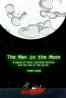
Life & Death in Paradise

Staff: Nigel Lynch and Matthew Clarke
Overview:
Miami Vice meets a gang story in a way that will rock your world.
Review:
Alright so I got a comic for you all today that you’re gonna wanna read. It’s called Life & Death in Paradise and it’s downright fantastic. I should start this off by saying that it’s definitely got a mature tag on it for a reason. Anyway…
Oh my god- this is so refreshing artistically. It looks like the 90s vomited on a comic page and it’s wonderful. I know that’s not the most professional way to put it- but I absolutely love the visuals this comic has. It’s got a kind of urban, Miami Vice, look to it. The real glory of this comic’s art is the little details they put in the background of every scene. It makes what could be a pretty boring setting (some guy’s basic apartment for example) into an expression of who the character is (he’s got a PS3, he’s watching pron, there is a sheetless mattress for a bed, a shotgun placed near him on some cinder blocks, there is an refilled Mt. Dew bottle, etc). THIS is a perfect example of how a comic’s visual element can be used to tell us things about the character without exposition. I learned more about the people in this room in two panels by the junk in their room than by the entire dialogue of other comics. I get who they are. Another fantastic thing this comic does is use non-character elements to inform us visually of what’s going on. For example, we have some guys with guns running and in the corner of the panel a frog is jumping out of their way. That little frog is a visual que for the way they are moving. They didn’t stealthily walk into this place- they flipped the corner and hammered their way down the street, not paying attention to (or maybe caring about) the frog. You’ll forgive me for the way I’m gushing about this but this is like a fine meal here- everything is working visually. I want other indie writers to go and read this comic to understand what fantastic artistic direction looks like!
The lettering is crisp and clean without being “smooshed” (yes… that’s a technical term 😉 ) or taking over the scene. There were a rare few instances when the comic had some of the lettering rather close to the edge of the dialogue box, but never enough to really threaten being unreadable. I like how the comic lets the action speak for itself a lot and only uses dialogue like real people would. One thing that was kind of hit or miss was the use of slang/accented language. While it was effective in creating a cohesive vibe and making the characters feel very real- it made it hard to decipher what was being said sometimes.
If there was one thing that wasn’t as strong as the rest of the comic it was the plot. While the story and topical choice was fine, it was the lack of a central set of characters that threw me off. We are kind of given a situation and then shown the execution and impact from a few different angles. While this is successful, I don’t know if it was the best choice. I didn’t get as invested in any particular set of characters or an individual so that kind of weakened a few scenes that could have been stronger.
Overall this comic was a goddam joy to read. The bright, complex, visuals meshed perfectly with the way this was written and the topic at hand. I haven’t come across something so competently illustrated in a long time and it’s nice to see some new ground being covered in terms of tone/subject matter. This is a must read.