“Tim and Lynne”
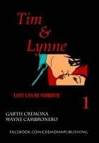
Cremona Publishing: Garth Cremona, Wayne Cambronero
Overview:
Weird art, decent premise, old twist on new thing, but ultimately falls flat.
Review:
So as we start reading this one, the first thing I note is that this is clearly an indy comic in terms of artwork. They go for a fresh approach that ultimately falls flat. The background is done in grey-scale/black and white while the character are all rendered in white. The artwork in the background is a bit sloppy at time (white artifacts, etc) while the characters are VERY clean with strong lines. There are some really sloppy mistakes (like the cups on page 7, the seat on page 13, gas can on 15) This makes it seems like they just traced pictures or something. A lot of it looks like traced stock art perhaps? The style & level of detail varies wildly as a result. Overall, this is a pretty novel approach but ultimately fails to impress.
The text boxes are gradient white->blue boxes that generally exist independent of the panels themselves. They use a thing almost comic sans san serif font which doesn’t detract or add anything to this comic. The premise is a serial killer falling in love with another one. They do a good job getting in the mind of a killer, though only superficially (like the writer watched too much CSI or Dexter). Exposition dominates the first 10 pages or so and the plot hurries along at the pace of a man fleeing the cops. The dialogue is sophomoric and I found myself saying, “No kidding” most of the time the characters use actual dialogue (a lot of it is inner monologue). The second half of the issue felt like a parallel to the first half, which basically had me sleeping by the end of it to see what happens after we get the second story (which is essentially the same as the first).
I didn’t notice any spelling mistakes but a few more editing passes would fix lines like, “Time to drop unlucky for some off”. Use of period was inconsistent
There were a few clever lines. “Which knife to bring” make me chuckle a little but a lot of it felt predictable and expected. The characters feel very similar and rather shallow developmentally. We get to see the surface of these characters but we don’t get any deeper than “they are serial killers and they keep trophies”. We get a few details, but nothing to make me empathize or even remember them beyond “the guy and the girl”. Their designs are simple and ultimately forgettable (mostly thanks to the art style).
Metrics
Art: 3/10 (Sloppy)
Lettering: 5/10 (No issues)
Plot: 4/10 (Few chuckles but mostly snores)
Novelty: 3/10 (Newish spin on old concept)
Overall: 3.75/10

Pingback: The Spirit and The Shadow | Indie Comic Review