The Ultimate Alliance

The Ultimate Alliance

Staff: Joey Haas and Megan Rosa

Overview:

I got to use the line, “The writing reminds me of a fart joke.” in this review.

Review:

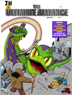
Ever sit around with your friend and make stupid jokes that only you find funny but laugh yourself silly over? That’s pretty much what we’ve got today- except someone took the time and effort to draw it out as a comic. Love it or hate it- it’ll be an interesting ride. So strap in kiddies we are jumping into “The Ultimate Alliance” by JH Publishing.

Art:

So let’s get this out of the way- this art could have been drawn by a talented 7 year old. It’s not good and I get the idea that it’s not trying to be good. This is a fun passion project and I can’t give them shit over the fact that they are not professional artists. Hell- I don’t know if having professional quality art would have improved it. If anything it kind of accents the kind of low-budget schlock-comic ascetic. Intentional or not, it kind of works. It almost approaches the level of being “so bad it’s good” but I can’t bestow that moniker to it because I’m only like 75% sure that’s really what they were going for.


One thing of note for this is that, while the artwork is not great- I’m never confused about what is going on. It’s simple, gets the point across, and ties into the written aspect of the comic. Sure the artist might have a boiling hatred for the art of correct perspective, proportions, and consistency but at least I knew what the hell was going on. Some comics, particularly more artsy ones, often have dark and confusing scenes in them.


It’s a full color comic and it’s light and cartoony and the lettering matches. The dialogue boxes are rough squares with vibrant stock colors behind them. While it never gets to the point where it’s hard to read it’s not exactly stellar. However, see the above paragraph for my thoughts on the quality of artistic elements of this comic.


Writing / Story:

The writing reminds me of a fart joke. Everyone considers it really crude, laughs in their head about it, but is too polite to laugh out loud. Is it good? Not really. Is it entertaining? Sure, why not. I mean we’ve all got that stupid idea bounding around our head that when you tell your friend about it they laugh. Does that mean it should go into a comic for widestream consumption? Probably not. The comic is filled with in-jokes you probably won’t get, simplistic (even crude) humor, and a complete detachment from the expectations you have about a good comic. It kind of reminds me of those little golden-age humor comics that were basically all about slapstick humor and bawdy jokes.  I’ll admit- I chuckled once or twice but I wouldn’t call it ‘good’ per se.


I will give it some points however. It does some things right that a lot of indie comics don’t. Obviously there is the tone- a lot of indie superhero comics straddle the line between wanting to be serious and wanting to make fun of comics. When that happens it kind of ends up in this weird middle ground where it’s not funny and it’s not really serious either. This comic commits the to “screw it- let’s just make bad puns and fly around in an ox-copter” end of the spectrum and I can respect that. However clumsily it does it, it also does something kind of brilliant with its pacing. It takes a few pages to set up the characters (in their civilian identity) than just does straight up “information” page on them once they become their alter egos. It works better than you’d think. I mean they are one note characters, but at least they introduce them right. None of this “EXPOSITION DUMP” that a lot of indie hero comics are so fond of putting in their comics. Short, sweet, and to the point- even if handled like a mad ape.


Overall:

Ultimately this is a weird, very personally motivated, in-joke of a humor comic. It’s one of those things that I couldn’t avoid reviewing- it brings me back to my roots. I LIKE to review comics with bad elements to them and shout about the good parts. This one was a perfect fit. It is REALLY dumb and has pretty solidly bad art but it was clearly a labor of love and it knew what it wanted to be. I’m not going to recommend it or give it high praise but, you know what, it’s better than you’ll think it is when you look at the first page.


Metrics:

Art: 2/10 [Let’s say it’s not great]

Lettering: 4/10 [I mean it’s legible.]

Plot: 5/10 [Honestly? Not bad for humor comic.]

Novelty: 6/10 [It’s half in jokes but at least it tried]

Overall: 4.25/10

Link to Website

A More Colorful Review – Faith

Reviewed by JustKay

Overview

“Faith” has great art, a safe but well written storyline that falls into a few too many tropes, and a handle on diversity that has some growing yet to do.

Reviewfaith_001_cover-a_djurdjevic-640x984

Hi Indie Comic Review readers, I’m Kayla one of the new writers! Most of you probably know me on the web by JustKay or some variation of that moniker. One of the things I’ll be tackling for ICR is bringing in a hard look at comics that claim some sort of title for diverse characters or story plot to let you know which ones are worth the dough and which are flops to be avoided.

The first comic for my new ‘A More Colorful Review’ column is “Faith” written by Jody Houser, art by Pere Perez and Marguerite Sauvage, published by Valiant Entertainment. Now that I’ve settled you in let’s jump right into the good stuff.

Writing

Plot wise the series has some growing to do. The definitely have the zany villains thing covered, I believe I actually said WTF out loud when the bad guy was finally named. But the story itself let things to be desired. To start off with I felt a little out of the loop not having read “The Renegades” first since they do reference the previous villain and what feel like major plot points that affect our hero’s, Faith’s, demeanor and how she tackles crime fighting. I also felt that when we finally found out what this horrible thing that happened was that it seemed to roll off of her back just a little too much. Something like that would effect a normal person, much less someone with powers, but what we see is a few panels of sad prose followed by a few more of her talking (if you can call it that) to her ex-superhero boyfriend about it. Having read comics since I was a little kid a lot of the story line will be familiar to the rest of you comic junkies out there, and easy to follow once you get into it. That said I do hope that “Faith” can use the great cast of characters they’ve set themselves up with to really grow into their own instead of remaining what now amounts to a spin-off series.

faith-1-1I do really feel like we are given a great deal of time to really come to love not only the main character but her growing, and fresh, relationships with those tied into her story. The cast is made of hacker, an archer, a movie star, the ex-boyfriend, and a rag tag group of coworkers all of which come in various races and sizes for the most part. Though both the ex-boyfriend and the archer, who is hinted at being the new love interest quite a bit, does fit the ‘white guy with blonde hair oh and is super hot’ trope which is a bit of a let down. Faith though is given just enough internet blogger goodness and super hero badass butt kicking that I believe she will become a source of inspiration for a lot of young girls out there just starting to read comics. Given how hard finding even that is sometimes I’ll take the win. But as with all good reviews the characters are all roses. Unfortunately the interactions between characters fell flat and unbelievable sometimes, and some parts of the plot felt like they were merely there to try and force some sort of awkward forced development which seemed to fail or completely be forgotten about in the next panel.
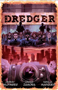
Art

The art in the series is high quality and generally very pretty. I do appreciate how the separated what was actually happening in the story vs Faith’s imaginings but slightly shifting the art style into more of an Adventure Time cartoon style. The coloring in the issues I’ve read so far (#1-4) are superbly done. I would have been greatly disappointed otherwise since this series is supported by a larger publisher, Valiant. The style really helps the plot flow together and adds that occasional wacky and funny moment to help liven up what can sometimes be a dark superhero business.images

As for lettering, it was easy to read though its in that very standard of fonts that every comic series seems to be using now a days. And the imagination scenes can get a little weird to read but you are provided with helpful built in arrows to direct you. The printing of the issues I read do in fact contain a few spelling and grammar errors, but hopefully those will get shorted out in the next round. They kept things very stylized and cohesive as far as a formatting for lettering depending on who was talking, thoughts, imaginings, and what was being spoken which helped to make the whole thing a lot less confusing to read then it had the potential to be.

(Little review nugget for those that go one to read it: On a side note WTF was the helmet on? It was nowhere and then poof she rips it off? Was it invisibly on his hat or something?)

Diversity

**NOTE THIS SECTION DOES HAVE AT LEAST ONE SPOILER PROCEED WITH CAUTION**

So what this comic has going for it in the diversity column: female lead, larger girl lead, at least some POC representation in what might be a growing team. What it has marked against it: main character and 2 out of 4 support characters (not counting coworkers) and blonde white people, a POC who is actually an alien, and another POC that you don’t really see or interact much except through text and phone calls. While this comic has a bold bigger female superhero it kind of feels like it limits itself to painting a monochromatic comic to try and ‘not be too edgy’. Though I doubt all the big girls out there in love with the idea of being able to cosplay a superhero just like them care too much about that, I challenge “Faith” to step it up a notch in the coming issues. We are watching you.

Overall

I would recommend this book, while predictable, it’s still an enjoyable read. It provides a strong female lead outside of what most of the entertainment industry considers a normal female body. The story doesn’t make it about her weight, or her dealing with the fact she is big at all. While the villains are creepy with hilarious names and mannerisms they are very much that hookie first villain the hero takes on, which hopefully means there will be some growth into villains that can match (and maybe even over power) the main character. I’d say skip the individual issues though and just stick to the volumes as that’s the only way to handle the truncated story line enough to take it even moderately seriously.

Metric Breakdown

Art: 8/10 [Pro Level]

Lettering: 8/10 [Pro Level]

Writing: 6/10 [Well Written, lacking imagination]

Diversity: 5/10 [Mediocre but there]

Overall: 6.75/10


The Dredger

dredger-coverThe Dredger

Staff: Jeremy Wilfinger, Crizam Zamora, Natalia Marques

Overview:

The Dredger is a well-written, well-illustrated, clearly-loved, comic that fails to excite with its premise.

Review:

Hey guys, ready for the next round of reviews? We’ve got two new writers (Kayla and Thomas) coming on board soon at Indie Comic Review (in addition to yours truly) so get excited for that! Anyway today we’ve got “The Dredger” so let’s jump on in!

Art:

Art looks downright professional grade, but not on like the “high art” end of the spectrum. Looks like a typical comics circa 2000-2010 in terms of style. A brighter palette and while things are not perfect- they are a cut above the rest. There are some really nice little bits of details that bring the world to life. This is particularly true when you see some of Ben’s photographs near the end and it’s a really solid use of the visual medium of comics.

Lettering, the hallmark of a professional comic, is on point. I could see a handful of instances where the text was probably too close to the edge of the balloons but only a critic would notice such things (see the lower right panel of page 25 for an example).

Writing / Story:

Linguistically I don’t know if heavy accents were the right choice. On the one hand they do add to the notion of diverse people thrown together into a common situation but, on the other hand, it makes it a little hard to read sometimes. There were a few well delivered lines that made me chuckle, which is a sign that the writer knows what they were doing.

In terms of plot it’s an authoritarian future where a weaponized virus has been released into a major population center. I gotta say- I get where they are going with a comic like this but… it’s honestly kind of boring. Like I kept finding myself waiting for the “big reveal” and it never came. It was kind of a let down. We have some really big build up and decent writing for what amounts to a “the government is kinda evil” story. I was getting a bit of a 28 days later vibe from it towards the middle but the premise just didn’t grab me. Maybe it picks up and evolves into something more interesting later but right now? I don’t think I’d read issue two to find out what it was.

Overall:

Ultimately this is a well-written, well-illustrated, clearly-loved, comic that was written as a message (see the Frederick Douglass quote up front if you somehow missed it). However, it fails to excite. It is one of those slow build comics that never really builds to anything groundbreaking. Now, never every comic needs to be high-octane action packed into every panel (I’ve liked some slow) but this one just kind of never gets anywhere. Sure things happens and the story progresses but I didn’t feel engaged by the premise. Like I said- it’s got all the right ingredients other than the premises’ engagement to me personally- so give it a read. Maybe it’ll have a profound impact on you.

Metrics:

Art: 7/10 [Pro level]

Lettering: 6/10 [Decent]

Plot: 5/10 [Solid dialogue]

Novelty: 3/10 [Just didn’t grab me at all.]

Overall: 5.25/10

Link to Website

Atomic Thunderbolt (TJ Comics)

at_covercolor_txtless-662x1024Atomic Thunderbolt

Staff: Kevin Powers, Matt Gaudio, Donna Gregory

Overview:

A golden-age revival for the ages!

Review:

Today we’re reading the Atomic Thunderbolt by TJ comic. Cover’s super gold age retro and I know exactly why! The Atomic Thunderbolt is a 1946 comic character published by the Regor Company and, unless I’m wildly off base, this comic is a revitalization of him! See, a lot of characters have fallen into the public domain (Check out the Public Domain Superhero Wiki for more on that) and creators can do their own take on them. There was a beautiful effort done by Dynamite Entertainment back in 2008 called “Project Superpowers” with gorgeous art by Alex Ross himself. I am a huge proponent of the Public Domain (and trying to solve all the issues it has) so I jumped at the chance to review this comic. The cover itself is a straight up homage to the original cover, though some with modern sensibilities. I’ll be honest- I am super jealous, I’ve wanted to do something like this for years. Let’s see how it worked out for them!

Art:

So TJ Comics kept the character design of William ‘Willy the Wharf Rat’ Burns and it’s a design HEAVILY steeped in golden aged sensibilities and I kind of dig that. Internally the art is damn impressive. It’s something I’d expect to see in a major publisher’s release. Honestly, I wasn’t expecting that. The credit page left a lot to be desired and I thought I was in for a stinker. Just a weird jump in quality. Anyway, it’s full color and beautifully rendered. There are a few times I would have chosen a different texture or something but that doesn’t detract from the art of this comic. There are some excellent uses of perspective and visual movement cues. There are occasional anatomy/scaling issues and the occasional odd facial expression, but nothing distracting (and still better than some mainstreams). See the top of page 27 for what I’m talking about.

If there is a weakness in this comic’s visuals it’s the lettering. The dialogue balloons are fine but the narration boxes occasionally are a bit crowded and the choice to go with some vibrant, stock, colors as backgrounds for them in a few scenes where most things are super desaturated while in flashback is really out of place. Otherwise it’s fine.

Writing / Story:

It was a bold choice for the comic to set itself in the late 1940s (post WWII) like the original Atomic Thunderbolt. It’s a bit of a double edge sword for this comic because it is a very fun time period/aesthetic to play with but it also means they are re-treading a lot of the original Atomic Thunderbolt material (not that anyone read it).

I thought it was a clever little detail that they brought up Archie Masters, the American Crusader, at one point- he was another golden age (now public domain) superhero. I looked into TJ comics and found that they actually had not only a modern reboot of the American Crusader but also a modern equivalent to the Atomic Thunderbolt in their “ExtraOrdinary” comic line. That, honestly, take a little of the “umph” out of this comic for me but it’s also kind of nice to know that they are really dedicated to the premise so it evens out in the end.

The comic’s laid out in a few thoughtful way- we have people talking about the Atomic Flash for a large part of the comic and, other than the cover, we don’t see him in a good clear shot for a long time. There is a lot of thinly veiled exposition dumps in the beginning but it’s actually set up in a fun enough way, even being aware of it, it didn’t detract from it. Some of the dialogue, couched in a very 1940s style, is a bit heavy on the lingo- even more so than before (like “We was workin’ a job fer the chief. Guy broke da boss’ jaw and send him up tha river.”). It’s not super distracting and if I didn’t get at least a little of that in a 1940s comic I think I’d have been disappointed but it’s something that caught my eye once or twice.

As a side note, I always find it funny when publishers of superhero comics come up with words to describe them other than “suphero” or “superhuman”. I get there are trademarks on metahuman and stuff but I’ve come across like ubermensch and whatnot. Today’s new verity of it is “extrahuman”. What, did god give them two scoops of human when they were born?

The pacing is a bit off honestly. The beginning was very fast paced but then I had to slog though a just painful stretch of dialogue between two men talking about the Atomic Lightning’s background in excruciating detail. It should have probably been summed up in about a page, but instead we get about 4 text heavy pages where we are told (rather than shown) the protagonist’s personality and background.

Once the plot gets going it’s pretty solid. I’m not in love with the Atomic Thunderbolt’s ridiculously corny, straight-out-of-a-comic-book, ultra altruistic, dialogue/personality. I get they are trying to subvert it but no one acts like that- not even in comics. That was bad writing back in the golden age and it’s bad writing here. They do kind of use it to a good end plot wise but it just seems like he is supposed to be this perfect mimicry of a golden age hero and it’s a little distracting.

As a fun aside- this comic includes two high res (or as high resolution as they could get) comics at the end; the only two actual Atomic Thunderbolt comics ever made. After reading them I realized they slipped the two bumbling doctors and their raven into the main comic as a flashback and chuckled a bit at it- pretty clever.

Overall:

Overall… I liked it. It’s a great little comic, introduced a lot of the good stuff and has some great art. It’s a fun revitalization of a golden age character and EXACTLY the sort of thing the public domain was intended for. The comic can be a little slow at time and I’m still not sold on the main character’s boy scout personality (to the point even superman would call him too altruistic and clean) but it’s damn well worth a read!

Metrics:

Art: 8/10 [Professional grade]

Lettering: 4/10 [Decent with a few minor missteps]

Plot: 6/10 [Good introduction]

Novelty: 6/10 [Great use of public domain and setting, relies too heavily on existing plot elements to be really unique]

Overall: 6/10

Link to Product

Villain

villain001_evoluzionepublishing_peepgame_page_01-500x759Villain

Staff: Joshua Metzger, Grzegorz Pawlak, Ryan Burt, E.T Dollman, Marcell Mitchell-Hicks

Overview:

A pretty middle of the road noir superhero comic.


Review:

Hey guys- sorry it’s been awhile (I’m a full time graduate student finishing up my last courses). Anyway, today I’m going to give you a brief review of Villain #1 but Evoluzione Publishing Just a quick look at the cover gives us the promise of a solid superhero noir so let’s jump on in.

Sidenote: I did not review the 10 or so pages of “Mongrel” but it looks rather more interesting visually. I may get to that in a later review but it looked so different I would have done it a disservice by combining the two into one review.


Art:

If there is a shortcoming it’s in the art. It’s really a shame too. A lot of it is really just downright fantastic- great use of texture, shadow, perspective, and the character designs of the aging characters are really nailed in all their cheesy glory. However some of the scenes feel really awkwardly empty. A skybox left devoid of detail here, a weird visual set up there, an occasional untextured element to a scene that should totally have had texture, and a few other minor things. A lot of the exterior shots look really big and empty. Maybe that was intended to match the tone of the comic but it really just feels… I don’t know. Kind of like poser 3D artwork in that they don’t detail the entire scene- just the few characters in it. I feel like there should be something on the ground in the exterior shots that we are missing. So it’s a real hit AND miss. Like 90% of it is grade A awesome and that 10% tends to kill me now and again. This is probably because of how good the rest of it is that it stands out to me.


Writing / Story:

Villain tries really hard to be dark and I don’t know if it needed to try that hard- especially in the dialogue. A lot of truncated slang and harsh language that really seems a little forced to be honest. It doesn’t feel “real” like this was something the person doing the dialogue really understands (throwing in phrases like “caper” next to “amature shit”). It seems like they were trying to mimic a style/tone rather than telling a story and letting it’s style determine the aesthetic.


Most of the characters didn’t really grab me. We had lots of stock tropes embodied but not to any end other than for familiarity. It feels like a real tone deaf move to put such two dimensional characters like Guardian in a genre like noir where investment in characterization and emotional investment are such a key.

The comic is rife with things like this. We have a guy kill a girl at one point but he does it… “because he’s evil”? Even if he’s a serial killer, that fact alone isn’t enough to explain his actions. They are motivated by something. There is pathos behind their actions. It’s like they are fishing with no (emotional) bait on the line. It feels like things happen because that’s the way they “happen like that in a noir” (or a superhero comic) not because of good writing or intended development of a theme or message.

Gil, the central character, did grow on me. In the later third of the comic we get some character development for him and it’s damn good. His background is probably the closest thing we have to a real big idea (it’s been done before but it does it well here) and the best representation of the author’s understanding of the genre’s emotional investment requirements.


Overall:

Ultimately, with me, this just failed to impress. I’ve read a dozen like this and it doesn’t do anything new with either the noir setting or the characters themselves. I found myself bored by the midpoint waiting for the big ideas to hit and was kind of sad when they didn’t. It’s pretty run of the mill. There is a real lack of understanding of the genres not in terms of appreciation but in terms of implementation. Art’s about average and, while tonally appropriate, doesn’t rise above the skill of its artist. It’s not an offensively bad comic, not by any measure, but it’s not something I’d be looking to snag further issues of.


Metrics:

Art: 3/10 [Ok, but lacking]

Lettering: 5/10 [It works well. No issues.]

Plot: 4/10 [The characterization of Gil saves it from being a wash-out]

Novelty: 3/10 [It’s all been done before]

Overall: 3.75/10

Link to Product

The Not So Golden Age

The Not So Golden Age

Staff: Phil Buck and Joseph Freistuhler

Overview:

Golden aged, public domain, goodness on a whole new level.

Review:

For those of you who don’t know- I’m a huge proponent of the public domain. Short version: creators should maintain a hold on their work for a while then be subject to the market. Forcing DC to write better Batman series (yes- he would be in the public domain were it not for Mickey Mouse and Sonny Bono) because others are writing good stories too is not a bad idea.


Anyway, the reason I bring this up is that “The Not So Golden Age” uses a number of public domain superheroes in it and shows us why it’s such a positive thing. The comic opens on a trailer park in Reno where 2 heroes and 1 villain, all retired, are living together. Honestly- that’s what got me. Love the golden age, love the setup, love the subversion.


The comic also REEKS of nostalgia- fake cheesy toy ads in the front of the book, those golden aged yellow and black narration boxes, that off-white color of the page *sniffle sniffle*, sorry but it’s just so perfect. My inner comic hipster is crying with joy.
But seriously. The tone established in this comic is top notch. I’ve never seen it does anywhere else and I wouldn’t trade it for the world. A lot of the shortcomings of this comic can be forgiven due to its total commitment to the aesthetic. Like the lettering is a little cramped… but that is kind of how they did it back in the day.


Art:

If there is a shortcoming it’s in the art. It’s really a shame too. A lot of it is really just downright fantastic- great use of texture, shadow, perspective, and the character designs of the aging characters are really nailed in all their cheesy glory. However some of the scenes feel really awkwardly empty. A skybox left devoid of detail here, a weird visual set up there, an occasional untextured element to a scene that should totally have had texture, and a few other minor things. A lot of the exterior shots look really big and empty. Maybe that was intended to match the tone of the comic but it really just feels… I don’t know. Kind of like poser 3D artwork in that they don’t detail the entire scene- just the few characters in it. I feel like there should be something on the ground in the exterior shots that we are missing. So it’s a real hit AND miss. Like 90% of it is grade A awesome and that 10% tends to kill me now and again. This is probably because of how good the rest of it is that it stands out to me.


Writing / Story:

The writing however is glorious. A lot of pop culture references you immediately get, some genuine chuckles now and then where you laugh along with the characters, etc. Wasn’t psyched at the use of some chatspeak (WTF) but there was a 4th wall breaking joke I kinda of chuckled at. The reveal at the midpoint is pretty hilarious and the writer did a great job characterizing each trailer park tenant with only a few lines or a single scene (something professional writers often fail at).

There is a second story (the first story being titled A Golden Aged Murder)called “Not Another Death in the Family” (a reference to the infamous Batman “Death in the Family” storyline). It gets a little more parody-ish than the first, which I was not a big fan of. It basically does every sidekick trope out there, does a few parodies of batman poses and lines, and a few parodies of famous covers. I honestly wasn’t as big of a fan of this one as the first. It was a bit shorter and thought I cracked a smile, I didn’t get the same joy from this one as I did the first (too reliant on comic book meta I think).


Overall:

So all and all… read the shit out of this book. It’s got charm, laughs, a brain in a robot, and a lady with 47 cats who drinks box wine. What more could you want? Honestly though, this was a lot of fun to read. As a comic fan, I really loved a lot of the throw backs and in jokes (even when they got a little too thinly veiled) and the overall presentation was nothing short of fantastic. Give it a read.


Metrics:

Art: 6/10 [Liked it, didn’t love it]

Lettering: 6/10 [Very “golden aged” but had some golden age drawbacks too]

Plot: 7/10 [Genuine laughs. Relied a bit heavily on meta at time.]

Novelty: 10/10 [I loved the premise and presentation. Read for this alone if you must.]

Overall: 7.25/10

Link to Product

Rok of the Reds

Rok of the Reds

Staff: John Wagner, Alan Grant, Dan Cornwell, Abby Bulmer, Jim Campbell


Overview:

Aliens, soccer, piss-drunk celebrities. In that order.


Review:

Today’s comic is Rok of the Reds. It’s got some pedigree behind it but I’m kind of setting that aside while I review it (I’ll talk about it at the end). I’m mostly just reviewing it because the first few pages had aliens, colliding planets, and soccer. (Note: I’m American so I’ll be calling what everyone else calls “football”, “soccer”)


Art:

Top class. This is a full color one with a lot of love put into every image. From the facial images to the color pallet it’s a gem. I won’t talk too much on this, I normally only do that when there is something wrong, but suffice it to say that it is nothing shy of professional grade. There is a lot of individual characterization put into the face of each person, giving us some real insight visually into characters. They do well with the bigger scenes too- showing a real knowledge of scope and perspective in some key shots that I really enjoyed.
There were a few things I didn’t like. Minor things. A few instances of some more deformed/cartoony proportions pop out of nowhere with human characters (it’s something with some of the eyes I think), some minor proportional issues, and the way they portray lights is a little weird. Nothing that ruins the comic by any stretch- just minor things that bothered me.


Lettering / Layout:

These guys know how to layout a page. There is good use of page space and the flow between panels is visually stimulating and befitting the scenes they are in. They had drawn in onomatopoeia, which I like (when the typesetter does it it always looks forced and out of place) and didn’t just do standard page divisions.


Writing / Story:

There is some good dialogue here and there. None of the normal nit-picky things. I’m personally not as big of a fan of the pacing. The intro picks up steam but then the next scene kind of drags on bit a bit without a solid connection to the intro. It wraps itself up nicely at the second act but until it gets there it feels rather slow. I suppose it’s meant to be there to give us some characterization for the protagonist, which it does well but I felt it kind of dawdled there. The end feels a little rushed pacing wise but sets up for a good continuing series. This is a comic I wish I had the 2nd issue of because it kind of feels like I have half of a story. It kind of introduces the characters and sets the stage but the plot doesn’t really go anywhere until the last 5 pages or so.


Overall:

Art is 1st rate, story suffers from “first issue” syndrome, but it’s saved by a very cool premise.  John Wagner and Alan Grant are the minds behind this (Judge Dredd) and their skill as writers show. They have a real solid grasp of the mechanics of the crafts and I’d like to have seen how the first narrative arc played out before I really give any criticism to the pacing of the comic (again- I only do first issues so I see this a lot and get it). Aliens, soccer, piss-drunk celebrities- it’s going to be a wild ride. Give it a read.


Metrics:

Art: 8/10 [Professional]

Lettering: 7/10 [Professional and makes creative use of some elements.]

Plot: 6/10 [Good dialogue, has “First Issue Syndrome” when it comes to pacing]

Novelty: 8/10 [Aliens, soccer, and piss-drunk celebrities. Need I say more?]

Overall: 7.25/10

Link to Product

Bram the Yacoi

Bram the Yacoi

Staff: Jose Pallares and Muguel Caceres


Overview:

So today we have some straight up barbarian porn (like… schlocky barbarian stuff, not actual porn) from Jose Pallares and Muguel Caceres in the form of “Bram the Yacoi”. This part is subtitled “The Last Eden”. This is the first issue (as I only do first issues) and it kind of stood out from the cesspool of “gritty, dark, horror comics” I keep getting (hence why there hasn’t be a review in a bit) so I’m going to give it a shot. Let’s see how it pans out.
Note: This comic is not PG-13. Probably a decent R (lots of blood, little nudity, etc). Nothing you wouldn’t see on late night TV though.

Art:

The art is nothing shy of awesome. Miguel, the artist, uses a monochromatic (black, white, and a single color) color scheme to great effect. Even on the first page of the comic we have a fantastic display of his ability to convey motion and create dynamic poses as well as establish a good use of panel structure for artist purposes. And the detail this guy puts into stuff! Hot damn! There is also the matter of him giving very distinctive character designs. In the midst of a brawl, I can tell characters apart thanks to his very easily identifiable character designs. That is to say, no two characters look the same, even at a distance. And that’s a very hard thing to do with people who you want to visually share similar elements (like a culture, team, or other group). Still, he manages to pull it off.


Writing / Story:

Jose’s writing matches Miguel’s art in tone. The narration panels are very poetic, dramatic, and grandiose while the choice of dialogue is much more guttural and concise. It reads like a good Hyborian adventure comic (Conan the Barbarian and borrows more than a little from it. It borrows a lot from it, maybe more than it should. Bram might as well be Conan and is largely interchangeable with any number of generic barbarians. I didn’t get a lot of characterization from him other than “is really good at fighting” and “will take revenge”. He uses the plot to give us set pieces however and that’s not a terrible way to use it. That having been said… Jose does a fantastic job of capturing that tone/style of character and I really enjoyed it. He is one of the few writers who I’ve run across whose mastery of languages improves upon the narrative rather than hinders it. In fact, the plot is largely pretty generic and ignorable (guy betrays guy, guy gets revenge) but his dialogue is so good you kind of don’t notice.


Layout:

As I mentioned in the art section of this book, Miguel uses the panel layout to his advantage artistically. He lets things protrude from them, chances the shape of overlay panels to accentuate the action. That is the hallmark of real skill and a creative use of them that helps create a cohesive aesthetic. There are a few times where this works against it however (see page 5 of the PDF) when artistic liberties with the panel placement makes it a little difficult to tell what action is happening first (but it looks quite sexy…).


Overall:

So I’m a sucker for 80s pulpy stuff (as you guys know). This comic scratches that itch in a big way. It is pulpy, schlocky, barbarian-flavored wonderfulness. The dialogue is great but the protagonist’s characterization and overall plot leave something to be desired. That being said- it is backed up by one of the best indy artist’s I’ve reviewed- a guy who GETS what it means to establish and maintain a cohesive aesthetic. So my verdict? If conan style stuff is your bag- buy it even if it costs you the blood from your arm to do so. If not, it is still something you should pick up for the fun it brings and the art (seriously- I would love an artbook of Miguel’s work).


Metrics:

Art: 9/10 [Marvel, DC- eat your hearts out]

Lettering/Layout: 8/10 [Creative use of layout]

Plot: 8/10 [Set piece driven plot but outstanding use of language]

Novelty: 5/10 [It’s schlock Conan stuff. Does just enough new to avoid  being stale]

Overall: 7.5/10

Link to Product

Little Black Girl (Mature)

12804830_1059802127414722_4453787998125208531_nLittle Black Girl

Staff: James McCulloch, Pedro Mendes

Overview:

So today I’m gonna look at Little Black Girl. Full disclosure- I’ve worked with the artist Pedro Mendes on one of my own comics (Good Samaritans Issue #2) and I heard about the comic through him. I have an advanced copy so the link at the bottom of this review will be to their Facebook page. My copy also has a missing cover, so I won’t be talking about that. The comic warns it is for mature readers so- yeah, keep that in mind. Anyway, let’s take a look at Little Black Girl by ComicHaus!

Art:

So, as I’ve mentioned before- I’m a little biased on the artwork. I hired Pedro so take what I say with a grain of salt. He has a very noir, crosshatch heavy style, with an emphasis on shadows. Sometimes his proportions slip a bit but he makes up for it with his use of angles. He always adds nice little elements to the background and does excellent work overall. Give him a few years more practice and he’ll be professional grade, particularly if he works on his perspective a bit more. His shadow-heavy style matches the comic’s tone excellently and he has a mastery of dynamic motion that I envy. While not Marvel or DC level- it is an asset to the comic rather than a detriment.

Layout:

I will only touch briefly on the lettering. It’s solid and that’s how it needs to be. Nothing stands out as amazingly unique but it’s legible and, for comics, that is high praise. Those people who try to reinvent the wheel with lettering fail 9/10 times. While comics are both a visual and literary medium, lettering needs to allow the words to be unobtrusive while still conveying the necessary message. This comic does just that. Kudos.

Writing / Story:

The story is a bit shocking. It is definitely for a mature audience. Without spoiling anything it’s about a businessman by day who comes home to a house full of slaves he abuses. He is, unapologetically, a monster. Unfortunately, you can see him as human but… damn. He is a piece of trash. There are a lot of subjects in here that the average reader will not be comfortable with (child abuse, implied rape, slavery, use of some very triggering words) and I’m not normally one to endorse the use of these themes… but in this case it is acceptable as it goes towards making the antagonist more monstrous. If any of the stuff I mentioned triggers you- don’t read this comic. Stay the heck away. However, it DOES set a rather profoundly disturbing psychological stage. I got the personalities of a lot of the characters (the slaves mostly) and, for a first issue, that’s really what I want. A good setup, good characterization, an establishment of motives, etc.

Overall:

In summary- this is DEFINITELY a mature comic. But, unlike some others I have reviewed, it uses the mature rating to DO something- to tell a very raw and gritty story in a way I wouldn’t have otherwise enjoyed. The main antagonist is the lowest slime on the planet- a junk yard dog so deranged he NEEDS to be put down. I just wish I reviewed the entire series so I could see him get what he is owed. However, as mentioned before, this comic has LOTS of triggers. Rape, child abuse, slavery, racial slurs galore, torture, violence towards women, etc. If these things do bother you- avoid this comic. However, I am going to recommend it for the writing and art. It goes to a dark place but does so for a reason. Give it a read when it comes out in July!

Metrics:

Art: 6/10 [Better than average]

Lettering/Layout: 6/10 [Does it’s job well]

Plot: 5/10 [Antagonist is a monster- shown by use of ]

Novelty: 5/10 [Owns its mature rating in shocking ways]

Overall: 5.5/10

Link to Facebook

RoboCatz vs ThunderDogs

RoboCatz vs ThunderDogsRoboCatz vs ThunderDogs

Staff: Justin “Spanky” Cermak, Donovan Goertzen, Fabian Cobos

Overview:

Crazy fun premise, good art, but painful dialogue.

Review:

So today I have before me “RoboCatz vs Thunder Dogs”. With a name like that- how the hell could I possibly turn it down? I mean it’s got explosion and a robot battle cat fighting a dog with guns on it’s shoulders. No way I’m missing this party.

Art:

Let’s talk art. So overall it’s competently done. It properly uses dynamic posing, has an understanding of how to draw a form in perspective (maintains proportions), has good framing and image composition, and the color pallet is professionally done. I really like some of the posing on the comic and angles the artist chose- it shows a real dedication to this comic and a love for it. I really dug the art. The style is rather cartoony and it fits with the kind of “out there” premise of this comic. I’ll note here that my promotional copy has a little bit of artifacting from compression but even if they have it in the final it’s not bad.

Layout:

Like I’ve said in previous reviews- if it’s unobtrusive and has no issues then it’s really good lettering. There is an instance on page 9 where there is a dialogue balloon almost entirely covered by another one. And, like you might have guessed, the lettering is on point. I also didn’t notice any major issues with layout either but no great risks were taken. I do like the inclusion of a particularly detailed map at one point as well.

Writing / Story:

The main premise is that dogs and cats have been fighting since the dawn of time and are fated to do so. What starts out as “oh ha-ha, a cat and dog fighting each other- look they even indicated saber tooth tigers and wolves fought” quickly turns into battle dogs with shells and cats with conical hats and spears fighting each other. I was about to write a line about “I don’t think there was much overlap between dire tigers and…” but then I realized that this is a total party comic where they kind of throw logic out the window in favor of bulldogs with giant spiny shells fighting cat warriors. Yep- it’s THAT kind of comic and I love it. Eventually this conflict results in cat vs dog mecha gladiator tournaments and it’s as awesome as that sounds. So while the premise is totally bonkers I have a feeling that it’s geared for, perhaps, a younger audience than me. I could be wrong because I was taken in too.

Let’s talk dialogue however. it is downright PAINFUL to read. he humor, or attempt at it, is rather juvenile and relies mostly on cat and dog puns. I can’t say I wasn’t expecting that, but it’s not really all that engaging. I’ve always had issues with comedy comics- they really fall flat far too often and this one doesn’t break the mold in that respect. This comic takes EVER dog and cat pun or joke out there and parades it around like it’s a lab with a big stick and NONE of them work. I would give you guys some examples but I can’t bring myself to type them out.

Pacing wise it is very competent. It sets up the premise, it establishes the characters, it gives us some highs, it shows our heroes at their worst, then gives us a clever little climax. It’s basically “the brave little corgi that could” but with giant mecha… and that’s kind cool.

Overall:

So this is a hard one. The premise is insane and fun, the art is good, the lettering is on point, the pacing and premise were well done, but the dialogue is painfully bad. Ultimately… I’d say give it a read. Just kind of accept the terrible puns and (for the most part just ignore the dialogue actually) and it’s a damn good comic.

PS: The corgi sitting with his head on my lap for the majority of this review in no way influenced my review of this comic.

Metrics:

Art: 6/10 [Better than average]

Lettering/Layout: 6/10 [Does it’s job well]

Plot: 4/10 [Decent pacing and premise but terrible dialogue]

Novelty: 8/10 [… it’s “RoboCatz vs Thunder Dogs”]

Overall: 6/10

Link to Kickstarter

(Please note that the link above goes to their Kickstarter for this comic. It will be replaced by a link to their sales venue when it goes on sale.)