 Amphoman
Staff: Mike Kaye
Overview:
The next comic on the slate of releases is Amphoman by LunchboxCollector. They shot me a copy earlier this year and I’m going to give it a look. Like all comics I am going into this blind beyond the short blurb they sent me, “Gems land on Earth. Awkward hero learns how to use his newfound gem to protect Earth. Power of the gems.” so I’ll judge it by its own merits. Let’s take a look!
Art:
So the art is very amateurish. However, it’s colored, gets the message across, and (while pretty bad) is serviceable. I can understand what’s going on, even if it’s not the prettiest thing to look at. There isn’t much to say beyond that.
Layout:
The text is a mess and it just kind of spills wherever it needs to. No thought was given to where the text would go in any given panel, or at least not much. While legible, it lacks basic things like dialogue balloons so we know who is talking. When more than once character talks (particularly the gem) it’s anyone’s guess who is talking. No attempt was made at doing anything creative with the panel layout. Just a bunch of small, cramped, sequential, boxes.
Writing / Story:
The basic premise is a bunch of souls in gem form have come to Earth and fused with people. When a specific trigger occurs it gives them power. Our hero is a dude who turns into a frog-man when wet and he’s trying to un-fuse people with gems.
We get a bunch of exposition up front and, honestly, I’m ok with that. It belongs upfront so new readers can understand what’s going on and it doesn’t chew up time in the comic or require “wall of text” exposition dumps… except then it does that anyway. The 1st page recap literally tells you everything that is going to happen in the first half of the comic.
I will say this; the premise isn’t one I’ve seen before, it’s presented simply and straightforwardly (if not a little heavy-handedly) and I get what’s going on. You wouldn’t believe how many comics I’ve read that kind of muddle through half a plot when this one is straight up about it. I could see kids enjoying this more than adults and that’s not a mark against it. There is something to be said for being straightforward. A lot of things are done for convenience; a gem with an alien frog knowing human physiology, knowing a character’s brother, characters knowing each other’s locations without prior interactions, etc. It’s a little sloppy but I can understand where they were going for.
So I think this is supposed to be a thing targeted at kids maybe? Its aforementioned simplicity kind of hints at that but then we get things like page 14 where a dude is getting buzz-sawed in the head and blood is flying while he sobs and I’m not sure that tonally matches up.
The writing could have used an extra editing pass, if for not other reason than the flow of the sentence structure.
I don’t think much thought went into the world building, or at least that’s not on display. They talk about mundane things like taking a plane to Fort Lauderdale, Florida while giving us unfamiliar things like the Buck Shop, Blue Hair Airlines, a globe that doesn’t resemble Earth’s landmasses, etc. There are also frogs, familiar political structures, humans (apparently) on alien planets and it’s never even mentioned. I don’t know if that’s nitpicky but it bothered me a bit.
There is some REALLY heavy-handed stuff that borders on cringy-worthy. The villain doesn’t like that girls pick on him then… he.. makes an army of “Womanizers” to try to put women in their place? Like the author doesn’t even try to be subtle and I kind cringed reading that. There is also a scene that looks like a dude complaining about a Jewish taxi-driver charging him a lot. I won’t harp on this too much because, because of the art, I can’t really tell if the driver was meant to be a stereotypical Jew or just poor artwork.
There are attempts at jokes in this so it might have been designed to be a comedy series… or at least semi-comedic but it doesn’t really do much for me. I think the Buck Shop thing is supposed to be funny somehow but it fell flat. They break the wall once or twice but… it doesn’t really “fit” with the character in a narrative sense other than in a kind of “lol random” way which… I don’t know. The whole comedy of this comic is kind of cringe-worthy. Like it tries, it REALLY tries, but I think it tries too hard.
Overall:
I really wanted to like this one more than I did. I saw where they were going with the art, but it was bad. I saw where they were going with the plot, but it was so straightforward and ham-fisted that it fell flat. The lettering and layout were uninspired and difficult to read. I mean you could probably get a bit out of it if you were a kid but even then it might be a bit cringe-worthy.
I can’t recommend this one guys.


 All Winner Society
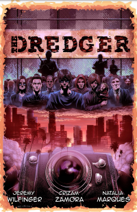 The Dredger
 Adamant
 Atomic Thunderbolt
