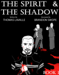
 The Spirit and The Shadow

Staff: Thomas Lavalle and Brandon Swope
Overview:
A vampire detective story with terrible art.
Review:
Ok so today I’ll be looking at “Spirit & Shadow”. It’s a vampire detective comics that promises to intrigue. “Book 1” consists of several “nights”. As I review only the first issue of things, I will be reviewing only Night #1. Let’s jump in!
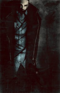
First things that grabs me is the art of this comic. It’s hard to ignore. Honestly, I haven’t seen art this bad since my Surreal Murder Mysteries review. It’s bad enough that it is offensive. Like even things like Tim & Lynne or Screw Phillips had a decent attempt at it and I Am Michael Watcher showed some promise. This is just bad. It feels like someone drew over some reference pictures poorly sometimes and other times they just wholesale crop images from other places (see the neck’s “wound” on page 10). Sometimes they just re-used illustrations from previous pages and just swap the backgrounds (see page 1 and page 22). Other than just poor overall line work, we have some disproportional body parts and odd need to MOSTLY use black, white, grey, and red (which is SUPERsaturated, like 255 red). I think this color pallet could have been pulled off (check out how The Zoo Act did it!) but it wasn’t utilized really poorly here. They also have this odd need to entirely black out people who have any shadow on them. This reduces them to black profiles with a slight gradient on that. Lighting is a large part of how you dress a scene (here is a link to some of the basics of lighting) and can drastically effect the mood of a scene.
The layout is… novel at least. It reads more like a graphic novel than a comic (which is totally fine). The layout is a white background with some legible font choice. I would have suggested something not too stiff and maybe something a little more “comicy” (free form, hand written, etc) as it is dialogue and the one they used looks more like a standard word processor font. The overall effect looks more like they didn’t want to or didn’t have the budget/time to do a “full” comic and just opted to do a simpler format. It looks really unprofessional. It should be noted that near the end of night 1 it gets close to doing something like a “comic” style but it’s too little too late.
The story saves it somewhat. It’s a pretty standard police procedural, but that doesn’t mean it’s automatically a bad story. I love cop dramas and the added vampire twist was a lot of fun. It did feel a bit shoehorned in sometimes; “it’s a cop story BUT with vampires!” was the pitch I’d imagine. However, if you ignore the art the characters are pretty identifiable and the story rather rich.
Overall, I’d skip this one. There is such a thing as perspective, as positioning, as emoting, as detail, as using visuals to tell a story! None of this is there. It feels like stock images used to technically qualify this as a “comic”. This would probably be a decent novel or short story if it was written like that but it really don’t work in the visual medium they attempted here. I can’t recommend this one.