Fruition of the Damned

tumblr_nybwh42WuB1tqzzc4o1_1280Fruition of the Damned

Staff: Keenan Carola, Jeremy MacKinnon, Nick Azevedo

Overview:

Visually competent and only misses the mark by a bit.

Review:

So today I’m reviewing a style of comic I don’t normally review. I’m taking at look at Fruition of the Damned- an online scroll comic. You can check it out here and kinda read along with me. As always, I am reading the first “issue” (called “Book 1”) and won’t be touching on stuff post that.

Layout:

Let’s talk layout first. Being a new layout for a comic reviewed on this site, I should clarify what it is. It’s essentially a long image (or series of images) that kind of scroll down an overlong page. It’s used pretty effectively here and, I’ve read a few others, this one kind of stands out as one of the better laid out ones. They kind of work best for mobile readers, but the long load time due to loading a lot of image data always kind of killed it for me on my phone. I read it on my PC for that reason and the one thing that kind of bothers me is that the panels / individual images don’t have their edges line up perfectly. Some have a white background / trim /stroke while others have no background (transparent) or black. Even then, while it DOES do some cool things with it- I could still see this working as a normal comic so I won’t knock it for using this layout format and, while cool, it won’t be getting any major bonus points from me.

Art:

One thing I do like about this is the visual world building aspects of it. We have weird birds, very original races, technology, some cool fauna, and the like. All and all it creates a very cohesive world- which is a nice touch for this comic. Honestly, this comic would have got a much lower rating if it were not for the cohesive and original art direction.

One thing that doesn’t do this comic any favors is the sheer space (I’d say pages but… you know) dedicated to fight scenes. They are fun and the scroll format is well utilized but I can’t help but feel like I’m watching filler in an anime rather than the meaty plot stuff. It DOES offer some rather aesthetically pleasing scenes and well laid out panels but comics straddle this line. They are a visual medium but, as they are a sequential style of art dedicated to conveying a story- I can’t help but feel like they focused too much on the visuals and really didn’t dedicate enough space to story. You are probably about 40-60% of the way though book 1 before you start really getting to any story elements. Now, almost at odds with that previous statement I WILL say that this comic does a great job doing visual storytelling (particularly later). This is when dialogue is either absent or superfluous to the visuals as they are conveying the story (though setting, character, and expression).

So let’s talk more technically art a bit here. It’s a very unique comic. I don’t know if this is the most polished or technically competent art that I’ve ever seen. However it is a very unique style and you quickly get use to any little quirk or issue for the sheer ambition of the style. There are some very unique almost one-point perspective panels and the use of monochromatics on a few panels are very effective (especially when they are used to convey a specific emotion). The technical issues I mentioned really come from some of the character drawings. Like there are little issues with proportions due to perspective and oversimplifications of characters in certain renderings. Again, it’s not a BIG concern but it doesn’t blow me away either. His backgrounds however are STUNNING. Just beautiful. The artist also has a very nice use of dynamic posing and can convey motion (even some of the more exotic moves) very well, knowing just where to break panels so that we still see the sequence without breaking the pacing and flow. So I guess the best description for this comic’s art is, “Ambitious, stylistic, imaginative, energetic, but not technically perfect”. Seriously though- give this guy like 5 years more and he’ll be drawing your next favorite series.

So, as I mentioned before this is a very competently established aesthetic. I love some of the character designs- even minor characters like background combatants have a very distinctive look to them that fits in with the overall artistic narrative. It definitely takes some Gendi Tartakovsky or Michael Dante DiMartino (Avatar) influence on their stuff and I couldn’t help but thinking that the Elf King could have been designed by like Ayami Kojima or something.

Writing / Story:

Plot wise, I am going to keep this kind of brief. I’m not interested in giving spoilers, but it’s pretty easy to see things coming. It’s a story of family, has some fairly stock characters, and has some war/combat elements to it. I am not going to judge it too harshly- it tells the story it wants to tell and does so competently. I have a feeling that this is pulling a bit of a Joss Whedon thing with the characters- the first bit of the narrative establishes the status quo and the remainder of the story is dedicated to their growth from that established narrative. The end hints at that. I won’t say this comic tries to tell a complex tale, it’s no Game of Thrones, but it’s a well told story.

Overall:

Overall, I have to ask myself “would I want to read the next one” and… honestly I think I would. It tells a tale I want to get into and it does so with broad, effective, compelling strokes. It’s got some good world building and I kind of want to see where it goes. It’s a pretty simple story but it’s got potential.

Metrics:

Art: 5/10 [Ambitious but lacking a polished technical touch]

Lettering/Layout: 4/10 [Does just fine. Some ups, some downs]

Plot: 3/10 [Competent but really just basic]

Novelty: 7/10 [I’ll give them points for trying something cool and new visually]

Overall: 4.75/10

Link to Product

Captain Canuck

Captain Canuck (Free Comic Book Day #0)

Staff: Kalman Andrasofszky, Ed Brisson, George Freeman, Jim Charalampidis, Rosemary Cheetham

Overview:

By the end of this awesome comic you’ll be craving putien and maple syrup.

Review:

So I’m going to look at Captain Canuck today. It’s from Chapter House comics and, from what I understand, it’s a revitalization of a golden age hero written by Richard Comely and Ron Leishman.

Before I get onto the review I gotta say that I watched one of the animated shorts online before this and… wow. It’s legit. Like well voice acted, some fluid animation, and it sets up a solid (if not a little by-the-book) universe for our hero. Here is the link.

Art:

The art for this comic is up there with the best bits of modern professional comic artwork. This is right out of a Marvel or DC comic, no doubts about it. Clean lines, gorgeous color, etc. It was a real treat after the last comic I reviewed and I can see there is some serious talent/money behind this comic. It shows in all the right places and, to be honest, there isn’t much more to say than “wow- killer artwork bro”.

At the end of the book there are characters bios and character artwork. I just wanted to point out how goddamn beautiful and thoughtful they all are. My frequent readers will no doubt know how little I like to gush about character designs unless they are THAT good but… damn. They work a lot of history and politics into certain characters costumes, add little accessories, and make everyone memorable.If there is one shortcoming it is “Mr. Gold”, the villain. He seems so… stock. His background is very generic and it seems like his motives are one-dimensional.

Lettering / Layout:

Lettering is crisp and proper. No slipups. I always say what separates a good comic from a professional one is lettering and layout. This comic proves my point- it’s damn solid lettering and layout. As a result, it LOOKS professional. If you told me this was a DC comic I’d have believed it (might have even praised the art for being better than normal).

Writing / Story:

So the titular “Captain Canuck” (aka Tom Evans) is an agent of “Equilibrium” (think SHIELD or something) is setting up to stop an oil fire. They give us a lot of backstory on everyone though little bits of dialogue in the first few page preview (keep in mind I am reading from a free preview comic for free comic book day).

The second story is a text-heavy origin story of Captain Canuck. It recounts a lot of the golden age stuff from the character’s backstory and gives us a good overview of the character. As with any “Captain [Insert Nation Here” character, he DOES have a bit of the Captain America. I don’t think that’s the writer’s issue- it’s more just a product of the times it was written in and, ultimately, doesn’t sour the story at all. There are more aliens and time travel in his background and he kinda doesn’t have the WWII soldier vibe, but the connection is still there. I think I actually like Canuck’s better to be honest.

As a guy who spent summers in Quebec and PEI when he was a kid, I did like that they had the character from Quebec correct everyone’s pronunciation to “Kebeck” which is how it is said in French (and by everyone there). I also dig that she’s never been able to gell with her teammates- a nice little bit of political commentary there 😉

Overall:

Overall… yeah. I’m a fan. This is awesome. No two ways about it. I am a sucker for schlocky, golden age-inspired, lantern-jawed, goodness and this scratched that itch and went a bit further. Loved the redesign, loved the art, and the world is rich enough that I am invested. Give it a read! Oooohh Caaaanada!

Metrics:

Art: 10/10 [Pro level.]

Lettering: 9/10 [Good lettering and layout make a good comic.]

Plot: 7/10 [Solid writing. Good characters.]

Novelty: 6/10 [While rebooting an old character they do some new stuff with it.]

Overall: 8/10

Link to Product

Apokalupsis Webcomic Anthology

Apokalupsis Webcomic Anthology

Staff: C. Meli

Overview:

Buckle up kiddies- it’s time for a train wreck.

Review:

So today we are looking at the Apokalupsis Webcomic Anthology Preview and… oh no. DEAR LORD! What is THAT!? Ladies and gentlemen! Get your combat helmets on! We’ve got POSER 3D ARTWORK! (DUN DUN DUNO) If the cover art is anything to go on- strap in, it’s going to be a rough ride!

Note: I try to keep profanity out of my reviews but… for fuck’s sake man this is that bad. Sorry.

Art:

Ok, so let’s get this out of the way. GOD THIS COVER ART IS TERRIBLE. Like “put me out of my misery, why God, why?!” sort of bad. I’m sure that there is some savant out there who can use Poser 3D to make magic happen but… I’ve never seen it happen. For those who don’t know, Poser 3D is this art program where people can pose pre made 3D models and dress them up. It’s meant to be used as reference pictures for artists but lots of lazy folks elect to use it to just do their comics or whatever.

Inside we at least start with some hand drawn stuff. Now it’s not the best art out there (far from it) but it’s at LEAST better than the soul-searing shit on the cover.

Lettering / Layout:

Lettering wise… this has a long way to go. A trick a lot of letterers use to make their text flow nicely is to use a diamond shape for their line breaks so you have a few words on top, a lot in the middle, and a few again at the bottom. This is because the word bubbles are round and it allows them to get a lot of text in the bubble in a readable fashion without taking up a lot of space. Some of these bubbles are… well let’s just say they don’t follow this rule and it shows. We have some oddly chosen left aligned (rather than center aligned) balloons, the font is inconsistent and the dialogue balloons are at just about the same height. Add to this mess that it seems like some of these balloons are pasted OVER existing one and it’s kind of a gross mess. The cherry on the cake is that 4 pages into the comic and we are still getting copyright information and ads taking up large portions of the page in generic left aligned fonts (that is what the credit page is for!).

At page 4 we get another change. Randomly two Poser 3D images are thrown in as “pinups”. Show me the person who actually printed these out and hung them up- I challenge you. The rooms are devoid of detail, parts of the model clip through each other, and the faces have these SUPER uncanny valley looks like all the images from Poser 3D I’ve reviewed in the past.

Page 5 has literally a 1 page comics that has been shrunk to fit the page or something as it is at an odd aspect ratio. It seems like this was taken from a Jesus coloring book. There are LITERALLY clipped images from what I assume is a google image search in here. God I’ve missed reviewing stinkers like this one… The text clips all over the place. It’s illegible (unless the line “We removed the sails as we might hi(t?) the sirtis” makes sense

Page 7 brings us “Rock ‘N’ Roll Kids” and has a wonderfully low rez image of Malta in the background with a big red box and with white text explaining everything.

Writing / Story:

So… I will try to touch on the “story”. As the name implies this is an anthology. The first 3 pages or so is a scifi story with lots of in-universe slang that is immediately explained in big boxes. There is no story. None we can follow. Then we have “St. Paul’s Shipwreck in Malta”. For fuck’s sake man… at this low rez tiny aspect ration one can hardly read the text- even if you blow it up. It’s about St. Paul but doesn’t really go anywhere. Then we have “Rock ‘N’ Roll Kids” a superhero team up comic. From what I can figure- this is a Christian superhero comic of sorts? It has some god awful, very angsty, backstory. It literally doesn’t go anywhere in the 3 pages it has. The character talks to her parents briefly then walks off and talks about her emotions a bit. So… yeah. None of the three stories go anywhere. I get that it’s an anthology and they should be a sample of the larger stories… but… yeah. Nothing. None of them go anywhere. None of them make me want to read more. In fact I’m pretty stoked that I’m done.

Overall:

Overall… do you really have to ask? It’s an eyesore and a failure of biblical proportions. This is the worst side of indie comics. I’m sure the author means well… but it’s a 100% total mess. I don’t know how else to say it. It’s garbage with a capital “G”. The only saving grace was that it was free and he hasn’t tried to sell anything else. This wasn’t a review- this was an exorcism and I’m done.

Amen.

Metrics:

Art: 0/10 [Give it up.]

Lettering: 1/10 [At least there were letters.]

Plot: 0/10 [Kinesis was better than this.]

Novelty: 0/10 [No points for no effort.]

Overall: 0.25/10

Link to Product

Rotten Roots

Rotten Roots

Staff: Paul Axel, Renee Majkut

Overview:

Standard mystery fare that gets by on it’s art and premise.

Review:

Today I’m taking a look at Rotten Roots. I was going to pass on it but the unique art style on the cover caught my eye and I said, “what the heck”. So let’s look at Rotten Roots by Bad Kids Press!

Art:

So Renee, we need to talk. I’m married. Please- your art is hitting on me. It’s GORGEOUS. It’s kind of a watercolor deal and I love it. It has a kind of “classic art” vibe to it and for some reason I get a Vincent van Gogh kind of feeling. I will note that there is a sequence where it gets kind dark and grimey and, if we were married, I’d want a divorce. You have such a unique style! You do yourself a disservice when you go dark. The art style has a simplicity to it and the way it contrasts with the modern world (as it seems very “classic”) is wonderful, flowing into the more appropriate colonial period segments; tying the whole thing together visually.

Lettering / Layout:

The lettering is… basic. That’s all I can say about it. It’s not bad and it’s not in the way or anything… but it’s nothing special. Legibility is the hallmark of a decent comic and it falls in that space; good enough that it’s not distracting but it kind makes me sad that it’s not as good as Renee’s art as you can really tell that it was done by a different hand. There are a few instances where it doesn’t quite work as well as it could (see page 4 where there is a single 2 letter word on a line of its own) but it saves itself later by changing up the speech bubble style. Then again, some of the words balloons that are supposed to be reminiscent of old pages looks a bit amateurish and the letters butt up against the edges sometimes. There are a few onomonopias drawn into the comic and they are far better done than the lettered ones, which are not bad but not as good by comparison.

The text also has a few grammar errors, mostly odd capitalizations (“I gained a Truth I regret learning to this day…”, “This Revelation gave me my Murderer.”, and “And that was the Day I lost my…”). There were also a few pages where the dialogue was hard to follow as the balloons were difficult to follow (see page 20). Typically you follow the highest balloon and follow it down but a few panels in this comic made this difficult to tell and forced me to read the page a few time to figured out how best to read it.

Writing / Story:

The story itself is interesting enough, but like the lettering kind of falls middle of the road. I’ve said it before and I’ll say it again; mystery rarely translates well to comics. It didn’t grab me this time but it’s a passable story. The basic premise is that there is a modern day murder that is similar to a murder that is described in an old book on the desk in front of the modern day murder victim. Clever. It’s a solid premise but the execution is kind of bland. The characters are ultimately just stock characters and the dialogue just a retreading of topes from each of the genres it dips into (modern police procedurals and colonial period drama). However, it kind of wraps up and turns into something more compelling near the end. Maybe mystery comics are not my thing but it’s still smartly written if not a little basic.

Overall:

Overall, this is one of those comics that will get a passing grade because of the art and premise. The actual writing and the lettering are middle of the road but the premise and the art are sharp. If you are into mystery comics- this is one you’ll probably did.

Metrics:

Art: 9/10 [Very stylized and unique]

Lettering: 4/10 [A few hiccups]

Plot: 5/10 [The premise works if not a little standard]

Novelty: 4/10 [The art is very interesting but everything else is kind middle of the road]

Overall: 5.5/10

Link to Product

Job Dun: Fat Assassin

Job Dun: Fat Assassin

Staff: Mark Hobby, Ben Michael Byrne, Noelle Criminova, Owen Watts, Dave Bolt-01 Evans

Overview:

A must-read story about a heavy-set assassin, some prostitutes, and evil space Mormons.

Review:

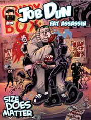
I’m gonna take a shot at Job Dun: Fat Assassin today by Spray Comics. Again, going in without much more than the cover and what the cover shows me. It’s DEFINITELY not a kid’s comic and we have a… well fat assassin. The water looks fine so I’m jumping in.

Art:

The art style kind of reminds me of some more recent Dick Tracy stuff, and in a good way. It’s got a very “cartoony” style with thick strokes and some hashing. The best thing I can compare it to are two segments from Heavy Metal (So Beautiful and So Dangerous with a bit of Harry Canyon in there for some fun sleaze). I also get a touch of like Jamie Hewlet (in a good way) and it mingles together to make something all it’s own.

There are some great and immediately memorable character designs and I had a lot of fun with them (love the “f@#k you up score” he gives weapons). I have a little test. After I’m done reading a comic I sit on it for a while. If I can remember the face of the main character- that’s good. If I can remember some of the secondary character’s- that’s better. But in this comic I could even recall some of the background characters pretty clearly.

Lettering / Layout:

The lettering and layout work. No issues there (and that means it is successful). The only real issue I had was that the digital copy I had was of a lower DPI that I would have exported it at- some of the smaller text was hard to read not because of font size but due to complication with compression (due to the export settings). In a physical print or trade this wouldn’t be an issue.

Writing / Story:

I legitimately like the humor in this comic. It’s kinda dark, though in a very self-aware way. Thus far I’ve not really run into many “humor comics” I’ve liked but this is an exception. Like it starts off with the various definitions of the word “Job” and “Dun” but in such a way as to make you think two or three times about the name “Job Dun”.

So the comic suffers a bit under the weight (pun pun pun) of it’s own universe a bit and the slang it uses. I could eventually figure everything out but it took a WHILE to figure things out. Even then Job Dun still kind waxes poetic in his own mind and it’s a little awkward. It gives his character to be sure but it’s a bit hard to follow at times.

The plot is a total whirlwind romp though the Job Dun universe. We’ve got fighters with bouncers at a brothel/strip club, dames who mess with Job’s head and hire him for job, evil space cultists, and a hell of a lot of fighting. It all mixes seamlessly and I enjoyed every second of it. It’s a very rich and unique setting and everything kind of fit together with a high degree of fluidity that I wished more comics had. It was scifi- but it’s own “kind” of scifi if you know what I mean.

Overall:

Overall, I had a bloody blast with this comic. I can’t wait to read more. I’m not normally this passionate about comics but it hit all my “buttons”. Memorable characters, a step outside the norm (well a giant leap), it was legitimately well-written, and didn’t hold anything back. The art was great, the universe better, and I can’t wait to see the next one. Definitely a must-read.

Metrics:

Art: 10/10 [I’m a sucker for this art style. It’s downright better than mainstream publishers. Memorable character designs.]

Lettering: 5/10 [Does its job. Has a bit of compression issue on the digital version.]

Plot: 7/10 [Come for the universe, stay for the humor]

Novelty: 7/10 [Nothing new design wise but takes a lot of risks artistically and character wise. Very memorable.]

Overall: 7.25/10

Link to Product

Starve the Beast

Starve the Beast

Staff: Danny Homan and Sergio Vicencio

Overview:

A dark dystopian comic that sets up a good story to come.

Review:

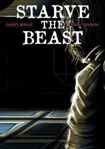
So today I am reading “Starve the Beast” by Danny Homan and Sergio Vicencio. I am going into this cold. The cover doesn’t do much for me, to be honest, it just has (what I assume will be) the protagonist with their back to the reader against a cityscape.


Art

The art style is very dark and drab with an abundance of detail. It almost feel like a neo noir with a touch of horror for some of that “ugliness” the art gives us. To be honest, this isn’t my preferred style of art. It’s very stroke heavy and some things are spot-on in terms of detail but other things just look weird. We even get some sloppier things farther away from the focal point of each panel and there is a little inconsistency between anatomy (relative or otherwise) on some panels. It’s kind of part of the style though so I can’t really harp on it too much.

One thing I will say though is that they artist really knows how to set up interesting perspectives and he uses it to great effect in this comic (see the 1st page for a good example- very dramatic). They also do a very interesting visual gimmick. When people are searching for things (visually) we get these little magnified “pop up” bubbles that have an X or a check mark on them to indicate if it is what they are looking for or not. It give the comic a very frantic sense and I really dug it.


Lettering/ Layout

They took some bold risks with the lettering and page layout. The panels are put together like a puzzle with oddly shaped pieces of varying sizes. It creates a chaotic look, which is what they were going for so- kudos. Outside the panels they have text and, after reading the comic, I still have no idea what it is supposed to be. On the first read through it confused the heck out of me. I think it might be internal dialogue from the main character but I’m not 100% on that.

The lettering is a bit chaotic, but this is intentional and well utilized to cultivate the aesthetic they are going for. It’s very dystopian and it fits with the art style and overall tone of the writing/story. There are a few places it’s hard to tell what’s going on (like who is talking) but once you kind of decipher who each of the unique text boxes belong to, it’s well executed.


Story

The dialogue is adult, telling a very dark tale about drugs, murder, violence and crime. This isn’t for kids and the plot is rather dense. I’d say “convoluted”, but it’s more nuanced and plays it close to the vest as it’s a mystery story. We are doled out information as we go along and by the end most things make sense. This is definitely a prologue because while it sets the stage, it doesn’t go too far down the rabbit hole. I had to read it a few times to get everything. Some terms don’t make sense until they are explained (and most of the explanation is given at the very end).

The characters didn’t do anything for me- and I feel like that’s due to a lack of characterization. I’m sure they develop as they grow, but I’m only reading Issue 0 so beyond the circumstances they find themselves in, I’m given very little to go on. The set-up is well and good but I wasn’t able to identify with any of the characters in a real deep way.


Overall

Now, you guys know my tastes. I am not a fan of dark comics so I am biased against this from the get-go. So, shoving that aside, yeah- it’s worth a read. It’s not the best comic of the year but you can find worse. It will take you at least 2 read throughs before you will understand everything. I get the need to preserve the mystery but in this medium it’s really important to give the reader some context upfront (particularly in an “Issue 0”). If it wasn’t my job to read through this at least once, I probably would have put it down a few pages in. Nothing really caught my attention until probably the last 5-10 pages when we started getting some information on the plot. I’m glad I read it all the way though- it was a good read and by the end I was interested to see what came next. Give it a read.


Metrics

Art: 5/10 (Good but takes form over function)

Lettering: 4/10 (Some gambles pay off well, some don’t work)

Plot: 4/10 (Not my cup of tea)

Novelty: 8/10 (Interesting visual gimmick and innovative page layout).

Overall: 5.25/10

Link to Product

Molasses

Molasses (Vol. 1)

Staff: Jason Payne, Milton Knight, Robert Wertz, Elana Pritchard, Jared Axelrod

Overview:

Good art. Not a funny comic.

Review:

So today we are looking at “Molasses”, a comic billed as “The world’s finest funny animal anthology Vol. 1”, by Syrup Pirates. I normally do just 1st issues, which means 1 story, but since this is an anthology and kind of short I will be doing quick reviews of each of the 5 shorts and then giving my overall feelings on the book at the end. Humor comics are not typically my cup of tea, but they contacted me ahead of time and asked and I told them I’d give it the old college try.

The book opens with “Blackbird Pie” by Milton Knight. It’s a wordless 6 panel short based around the children’s rhyme “Sing a Song of Sixpence” where blackbirds are baked in a pie. It makes excellent use of negative space and has some very well-drawn Tex Avery style artwork. An issue off the bat that grabbed me first was it’s font choices. The title was terribly hard to read (I misread it as “Black bind Pie”). This kind of continues on in later panels (I still am not entirely sure what one of the signs says). Overall however, this is a perfectly serviceable comic but it didn’t really make me laugh.

Art: 8/10

The second is “Oberon in The Fly. A Kitty’s Cats Cartoon” by Robert Wertz. It’s a wordless 3 page comic about an anthropomorphic cat who chases an annoying fly around his garage. The art style kind of bothers me a little. I’m not sure if I can really put my finger on it but it seems really stiff and like maybe he used some digital program to allow him to reproduce the face. Maybe it’s a stroke width thing on his cheeks, I dunno. Otherwise it’s perfectly fine. I mean if you’ve seen one Tom and Jerry cartoon, it’s nothing new and again I didn’t really laugh. It kind of ends on a non-ending and I felt like maybe I was cheated out of a punchline.

Art: 4/10

Third we have 2 small, wordless, 3 panel comics called “Don’t Let This Happen To You” by Elana Pritchard. Honestly, I am distracted by the horrible layout. Otherwise it’s pretty decent. Elana is far from the strongest artistic on this comic but it’s not bad. There is some weird error where her signature looks a little glitchy. Again, no laughs were to be had.

Art: 3/10

The fourth comic is “Give & Cake” by Jared Axelrod. It is a 2 page comic with dialogue featuring a fox and a racoon attempting to bake a cake. This one actually has some decent banter and the handdrawn art style is rather nice if not a little difficult to decipher at times. It feels like it is building up to something funny- but the ending, while cute, falls flat. This might have been a decent story for an anthology book featuring the relationship between these two characters but doesn’t really work as a humor story (though the banter is at least clever).

Art: 4/10

The fifth and final story is “Tiny Todd: Caught on a Hookie” by Jason Payne. It has a very odd artstyle- kind of reminds me of the works of John Kricfalusi (Ren & Stimpy, Ripping Friends, etc), some early Matt Groening stuff, or even some Mad Magazine shorts. We have a kid trying to skip school and go to the fair but his dad follows him. While there are some good expressions and reaction shots- I don’t know if this is really a funny comic.

Art: 6/10

Summary
This is the kind of comic I wished I liked more. It has so much passion and enthusiasm behind it that I want it to succeed despite the score I give this. This comic ultimately fails because, whatever else I have to say about it, it’s a humor comic that isn’t funny. I didn’t laugh, I didn’t crack a smile, I didn’t give a warm “hmm”. Maybe I’m not the right audience but it has a very simplistic approach to humor I’m not sure would do much for even a younger audience. Everything was fairly predictable and, though comics are a visual medium, the vaudevillian approach to humor ultimately falls flat because of a lack of visual motion and response. I feel like there is something I’m missing- but I don’t think there is. It goes for a very old-timey approach but I’m not really confident that works in a modern context. There are also some minor grammar mistakes (a few missing commas, a few odd capitalizations, and “Pritchard” is misprinted on the credits page as “Prtichard”). In its favor I’ll say that there are some really well-drawn parts of this comic. Of particular note is the work by Milton Knight and Jason Payne who have very different styles but are both very expressive in their artwork. I’ll end this with a kind of note reminding you that this isn’t a genre I normally enjoy and if this is your cup of tea- you’ll probably enjoy it.


Metrics

Art (Avg): 5/10 (Some good and some bad)

Lettering: 3/10 (Some good, some pretty bad)

Humor: 2/10 (Never laughed at this humor comic)

Novelty: 3/10 (Reworks some familiar concepts)

Overall: 3.25/10

Link to Product

Nova Zen

Nova Zen

Staff: Harrison Perry, Claudio Muñoz,  Emmanuel Ordaz, Greg Sorkin

Overview:

Monks, and gorgeous art, and cliches oh my!

Review:

Ok, let’s talk about Nova Zen today. I see this sort of comic a lot these days. It fits in this category of indie comics that have art good enough to be in a mainstream comic (or better) but the writing isn’t up to snuff.

Let’s talk about the good first. The art, particularly the cover art, is second to none. We have a realistic very vibrantly illustrated character with a compelling shaolin monk inspired character design… that we never see in issue #1. The overall style on the interior pages is downright beautiful with full color illustrations, excellent use of panel layout and overall composition. There is a ever so slight cartoonish feel (some of the monks have exaggerated facial features) but it’s merely a hint and it helps differentiate the style of the artist (in a good way). If I had to nitpick (hey… that’s why you are reading this right?) there are a few scenes where there are some oddly lumpy muscles and some variance in proportions (but nothing major).

Now let’s talk about the writing. I know this is a first issue but… man I wish it was as good as the art. It rushes through its own source material is just bland. It’s like the writer took every Kung Fu and “chosen one” storyline cliche and just tossed them in a blender. Basically a guy from “somewhere” shows up at a monastery grasping the hilt of a magic sword (I assume it’s magic) and the monks start chattering about how he is the “chosen one” because of a “prophecy”. The guy wakes up and takes it pretty well and we get some vague exposition about how he needs to save the world. See, if we had SOME (and I mean ANY) insight into what this prophecy was, who said it, what it pertained to, or what the guy (named “Nova”) is supposed to do it might have been a good plot hooke but instead we are told vaguely that he needs to “save the world”. There is no SUBSTANCE to it. We aren’t compelled to want to know more because this is so stock and we have no specifics whatsoever. We are then run through some very stock “monk things” including a martial arts demo, some meditation, and painfully simple explanation of a “cosmic energy”. Then we meet some stock bad guys whose only defining characteristic thus far is that they are bad. I mean we LITERALLY have a character say, “this is immoral” and the other one say, “Yeah I know but we are going to do it anyway”. I guess, on the whole, it just feels derivative of other works. (We also have a spelling mistake on page 14 (“he we are, don’t be worried.”) and a few awkward lines sprinkled over the whole comic.)

There is also this weird failure of logic in the comic. Like we have a guy meditating with Nova who suddenly informs him that he is late to meet with his next instructor- why! They weren’t doing anything so why does he suddenly have to rush! Or the martial arts master says Nova looks “a little scrawny” when the guy is built like a house (like one step below a Rob Liefeld character). The master also orders him into a horse stance and, despite knowing nothing at all he just drops into one (also- page 13 has a little white border on the left side).

I feel like this comic wants to mimic a lot of great martial arts stories but doesn’t know enough to actually give it any substance. We have a stock, ill-defined, prophecy about a guy with no memory who trains with some monks with an ill-defined set of mystical beliefs/powers, who will protect the world against an ill-defined threat. I mean there isn’t a lot to work with here as a reader. Like, I like the artwork. I really do but there just isn’t any substance for me to grab onto. When you have the means to tell a story it is your obligation to tell one with a purpose. However, I can tell that this team has a lot of passion and really loves their source material and I really want to see them succeed. They obviously have a much larger story to tell and I really wish they would toss in a few more proper nouns and character traits for the protagonist.

Metrics

Art: 8/10 (Move aside Marvel)

Lettering: 7/10 (Does its job and then some)

Plot: 2/10 (Lots of logic failures)

Novelty: 3/10 (Not new… but a lot of reliance on cliches)

Overall: 5/10

Link to Site

Tim Forder’s Horrific Humor

Tim Forder’s Horrific Humor

Staff: Tim Forder’s Horrific Humor

Overview:

I guess your could call it a horror-themed joke book.

Review:

Ok guys, so today I am looking at “Tim Forder’s Horrific Humor”. I’m not sure how well I can “review” this comic, but I’ll at least endeavor to use it as a learning experience for others. Seriously… this is what I opened my PDF reader to:

Let’s just take a moment to appreciate this cover. Let it sink in. I could do an entire review about just this… but I’ll try to keep it contained to a single paragraph. Good lord! He clearly just cropped some old horror wolf-man book cover and maybe tossed some color over it before slapping his title on it? I physically cringed when I saw this. Also- you don’t need your title 3 times on the same page, not to mention 2 (both PAINFULLY bad) taglines! “That Horrific Horror Humor as in terrific horror humor.” Really? We got the joke. No need to spell it out man. And a low quality export that doesn’t even fill the page? Your killing me. It’s not even an EQUAL bleed on either side of the page.

What follows is no less of a train wreck. What the cover sets up for us, the rest of the comic hammers home in the worst kind of way. Illegible text, terribly cropped public domain images (some of which I have my doubts about…), the absolute worst photoshop attempts I’ve ever had the displeasure of coming across, a few funny jokes, and… I guess it’s horror themed?

Honestly… and I say this having reviewed things like Kinesis, Surreal Murder Mysteries, High School Hijinks, and Brake, that Tim Forder’s Horrific Humor is the absolute and uncontested worst comic I’ve ever read. For a joke book, the jokes aren’t funny and from a technical perspective, I’ve legitimately seen better put together middle school class projects. Congratulations Tim- I think you have forced me to award my only ever 0/10.


Metrics

Art: 0/10 (Poorly cropped public domain art)

Lettering: 0/10 (Illegible at times)

Plot: 0/10 (Don’t get me started)

Novelty: 0/10 (No. Just no.)

Overall: 0/10

There is no link to this product. You can Google search this comic’s name and find a $7 copy of this on Amazon. I will not be party to robbery like that.

The United

The United

Staff: Melchizedek Todd

Overview:

An honest to God solid Christian multi-publisher crossover.

Review:

Ok so today I am going to do something a little different. I normally review only Issue #1s but today I am going to take a look at “The United” which, while technically a #1, is actually a mega crossover event between 10 Christian themed superheroes. I am totally in support of Indie crossovers and I was very excited to come across this one. For better or for worse- I am going to check out The United #1. Let’s give it a look.

Lettering & Layout

The layout is very reader friendly- as a 10 character crossover has to be. We have a character page with headshots and names of all the characters and when we are introduced to them we are given a small blurb about their abilities. This is helpful and not super intrusive.

The lettering is not fantastic. The introduction uses some very stock fonts in big, poorly laid out, exposition blocks. In panel the lettering is odd. Sometimes it is stretched or warped oddly but you can read it without issue.

Art

The art style is very stroke-heavy and is something I’d more expect to see in a horror comic but it is very detailed and it works. Someone obviously put a lot of love into the art for this comic and it shows. There are some anatomical oddities and inconsistencies but overall it’s fluid and is more a stylistic thing than anything. My only other real complaint is that due to the high contract and stroke-heavy nature of the art sometimes it is a little hard to follow if there is a large number of characters on the page. While not on the professional level- it isn’t a bad attempt and every scene has a plethora of “things” going on (as opposed to the empty background a lot of indie comics have).

Story

What we get out of this comic is a good old-fashioned superhero beatdown. I was skeptical of this comic until about page 7 because that page features a whole host (see what I did there? pun pun) of heroes just beating the living hell (I got a million of these) out of some robots on a beautifully done splash-page. THIS is what crossover comics are about.

In short, they have all been summoned by what is essentially the Devil (who has a rather fun and unique character design). A lot of Christian comics I have reviewed in the past were very preachy and (pardon the pun) black and white about morality. “God is good” is the only message we get and we are never introduced to the complexities of matters of morality and faith. I’m not religious and that always put me off about them. This comic doesn’t do that however. Right off the bat we are given some very valid reasons as to why God is a jerk by the antagonist. He talks about how God turns his back on the weak, punishes the innocent, and is wrathful at seemingly random times. While we (as readers) and the heroes are never going to side with the Devil on this one- this is a legitimate test of faith for the characters. We get some good back and forth from these characters and they show their devotion in their own way. Some quote biblical passages, some are silent, and some show their colors by simply quipping back but no one falters in their faith. A scumbag even calls them, “super-powered Jesus freaks” and that shows that the writer is not afraid to address the absurdity of the premise within the context of the real world. It makes it more believable and human- something a lot of superhero comics lack.

If there is a weakness to this comic- it is the overall plot. We have a bunch of kind of directionless plot threads that are just kind of thrown at us. They are fun visually but we aren’t made privy to exactly why some things are happening or what their overall goal is. Honestly- I wasn’t looking for Les Miserables from a massive crossover book but it would have been nice to see a more coherent story put together all the same.

Overall

Overall- this comic defied my expectations. I expected to get a moralizing yuppy Christian book with a bunch of, as the comic puts it, “superpowered Jesus freaks” but what I got was a lot of fun. It was a fast paced beat ‘em up with more characters than I could shake a stick at. It wasn’t overly long and while the overall direction was a bit messy it had a very good approach to the whole concept. Give it a read.


Metrics

Art: 5/10 (Stylized and decent. Not pro.)

Lettering: 3/10 (Not professional)

Plot: 5/10 (A realistic world with some interesting moral questions but lacks direction overall)

Novelty: 8/10 (A GOOD Christian comic? This is a white whale.)

Overall: 5/10 (but go read it)

Link to Product