The Dredger

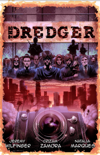
dredger-coverThe Dredger

Staff: Jeremy Wilfinger, Crizam Zamora, Natalia Marques

Overview:

The Dredger is a well-written, well-illustrated, clearly-loved, comic that fails to excite with its premise.

Review:

Hey guys, ready for the next round of reviews? We’ve got two new writers (Kayla and Thomas) coming on board soon at Indie Comic Review (in addition to yours truly) so get excited for that! Anyway today we’ve got “The Dredger” so let’s jump on in!

Art:

Art looks downright professional grade, but not on like the “high art” end of the spectrum. Looks like a typical comics circa 2000-2010 in terms of style. A brighter palette and while things are not perfect- they are a cut above the rest. There are some really nice little bits of details that bring the world to life. This is particularly true when you see some of Ben’s photographs near the end and it’s a really solid use of the visual medium of comics.

Lettering, the hallmark of a professional comic, is on point. I could see a handful of instances where the text was probably too close to the edge of the balloons but only a critic would notice such things (see the lower right panel of page 25 for an example).

Writing / Story:

Linguistically I don’t know if heavy accents were the right choice. On the one hand they do add to the notion of diverse people thrown together into a common situation but, on the other hand, it makes it a little hard to read sometimes. There were a few well delivered lines that made me chuckle, which is a sign that the writer knows what they were doing.

In terms of plot it’s an authoritarian future where a weaponized virus has been released into a major population center. I gotta say- I get where they are going with a comic like this but… it’s honestly kind of boring. Like I kept finding myself waiting for the “big reveal” and it never came. It was kind of a let down. We have some really big build up and decent writing for what amounts to a “the government is kinda evil” story. I was getting a bit of a 28 days later vibe from it towards the middle but the premise just didn’t grab me. Maybe it picks up and evolves into something more interesting later but right now? I don’t think I’d read issue two to find out what it was.

Overall:

Ultimately this is a well-written, well-illustrated, clearly-loved, comic that was written as a message (see the Frederick Douglass quote up front if you somehow missed it). However, it fails to excite. It is one of those slow build comics that never really builds to anything groundbreaking. Now, never every comic needs to be high-octane action packed into every panel (I’ve liked some slow) but this one just kind of never gets anywhere. Sure things happens and the story progresses but I didn’t feel engaged by the premise. Like I said- it’s got all the right ingredients other than the premises’ engagement to me personally- so give it a read. Maybe it’ll have a profound impact on you.

Metrics:

Art: 7/10 [Pro level]

Lettering: 6/10 [Decent]

Plot: 5/10 [Solid dialogue]

Novelty: 3/10 [Just didn’t grab me at all.]

Overall: 5.25/10

Link to Website

Adamant

7df7888f16cbde1ceca544dc734da085-_sx360_ql80_ttd_Adamant

Staff: Mike Exner III, D.C. Stuelpner, Ian Waryanto, Josh Jensen, Micah Myers

Overview:

A beautiful, hilarious, superhero comic that does it all right.

Review:

The next course on our indie comic buffet is “Adamant”, a comic from Loophole Comics. The author described it to me as his love letter to the superhero comics he grew up with as a kid. Cover caught my eye- real bizarre and had some interesting color choice so I’m going to give it a read.

Art:

First things first the art top notch art- seriously best in the business. Something that didn’t sit super well with me off the bat was that there was an artist listed for page 1-7 and an entirely separate one listed for 8-20. I wasn’t really sure what to make of that but seems hinky at first. After reading it however- it’s apparent why they did this and it’s actually pretty clever. I only bring this up because it means I have to review the art twice.

The first 7 pages or so are they very stylized, thick-stroked, cartoonish, style that bring to mind some Disney stuff. Post page 8 we have a more 80s influenced comic style that keeps a similar color pallet. Both are just beautiful. This is straight up some of the best artwork I’ve come across as of late and that’ saying something. Very polished and a very good use of color across the entire thing. I wish the big publisher would put this much love into their products.

Other than that, the lettering is a little weird- the dialogue balloons are fine but some of the font choices for the narration/information boxes are a little weird. The robot dialogue font is a little hard to read at times. Overall it was readable and did it’s job.

Writing / Story:

So- this review contains a minor spoiler (it’s kind of the premise) so you’ve been warned. A few pages in the main character, a superhero named Adamant, gets thrown through time into the future (hence the artist switch). It goes from a very super-cheesy, stock, campy, superhero story (complete with a monocled evil genius villain) to a comedy set in the future. It’s kind of great and I absolutely love it. The campy hero is faced with lingo and situations commonplace in the future but it’s world he’s comically lost in. I laughed more than once reading it and I think Pogo is bloody hilarious (he’s a frog man who has all sorts of froggy lingo- kind of genius). The plot is accented nicely with some great line delivery, courtesy of a skilled writer.

Overall:

Overall… I liked it. It’s a great little comic, introduced a lot of the good stuff and has some great art. It’s a fun revitalization of a golden age character and EXACTLY the sort of thing the public domain was intended for. The comic can be a little slow at time and I’m still not sold on the main character’s boy scout personality (to the point even superman would call him too altruistic and clean) but it’s damn well worth a read!

Metrics:

Art: 10/10 [Best in the business- TWICE]

Lettering: 4/10 [Decent with a few minor missteps]

Plot: 7/10 [Damn good. Great dialogue/premise.]

Novelty: 7/10 [Uses cliches to make a very new and interesting plot.]

Overall: 7/10

Link to Product

Atomic Thunderbolt (TJ Comics)

at_covercolor_txtless-662x1024Atomic Thunderbolt

Staff: Kevin Powers, Matt Gaudio, Donna Gregory

Overview:

A golden-age revival for the ages!

Review:

Today we’re reading the Atomic Thunderbolt by TJ comic. Cover’s super gold age retro and I know exactly why! The Atomic Thunderbolt is a 1946 comic character published by the Regor Company and, unless I’m wildly off base, this comic is a revitalization of him! See, a lot of characters have fallen into the public domain (Check out the Public Domain Superhero Wiki for more on that) and creators can do their own take on them. There was a beautiful effort done by Dynamite Entertainment back in 2008 called “Project Superpowers” with gorgeous art by Alex Ross himself. I am a huge proponent of the Public Domain (and trying to solve all the issues it has) so I jumped at the chance to review this comic. The cover itself is a straight up homage to the original cover, though some with modern sensibilities. I’ll be honest- I am super jealous, I’ve wanted to do something like this for years. Let’s see how it worked out for them!

Art:

So TJ Comics kept the character design of William ‘Willy the Wharf Rat’ Burns and it’s a design HEAVILY steeped in golden aged sensibilities and I kind of dig that. Internally the art is damn impressive. It’s something I’d expect to see in a major publisher’s release. Honestly, I wasn’t expecting that. The credit page left a lot to be desired and I thought I was in for a stinker. Just a weird jump in quality. Anyway, it’s full color and beautifully rendered. There are a few times I would have chosen a different texture or something but that doesn’t detract from the art of this comic. There are some excellent uses of perspective and visual movement cues. There are occasional anatomy/scaling issues and the occasional odd facial expression, but nothing distracting (and still better than some mainstreams). See the top of page 27 for what I’m talking about.

If there is a weakness in this comic’s visuals it’s the lettering. The dialogue balloons are fine but the narration boxes occasionally are a bit crowded and the choice to go with some vibrant, stock, colors as backgrounds for them in a few scenes where most things are super desaturated while in flashback is really out of place. Otherwise it’s fine.

Writing / Story:

It was a bold choice for the comic to set itself in the late 1940s (post WWII) like the original Atomic Thunderbolt. It’s a bit of a double edge sword for this comic because it is a very fun time period/aesthetic to play with but it also means they are re-treading a lot of the original Atomic Thunderbolt material (not that anyone read it).

I thought it was a clever little detail that they brought up Archie Masters, the American Crusader, at one point- he was another golden age (now public domain) superhero. I looked into TJ comics and found that they actually had not only a modern reboot of the American Crusader but also a modern equivalent to the Atomic Thunderbolt in their “ExtraOrdinary” comic line. That, honestly, take a little of the “umph” out of this comic for me but it’s also kind of nice to know that they are really dedicated to the premise so it evens out in the end.

The comic’s laid out in a few thoughtful way- we have people talking about the Atomic Flash for a large part of the comic and, other than the cover, we don’t see him in a good clear shot for a long time. There is a lot of thinly veiled exposition dumps in the beginning but it’s actually set up in a fun enough way, even being aware of it, it didn’t detract from it. Some of the dialogue, couched in a very 1940s style, is a bit heavy on the lingo- even more so than before (like “We was workin’ a job fer the chief. Guy broke da boss’ jaw and send him up tha river.”). It’s not super distracting and if I didn’t get at least a little of that in a 1940s comic I think I’d have been disappointed but it’s something that caught my eye once or twice.

As a side note, I always find it funny when publishers of superhero comics come up with words to describe them other than “suphero” or “superhuman”. I get there are trademarks on metahuman and stuff but I’ve come across like ubermensch and whatnot. Today’s new verity of it is “extrahuman”. What, did god give them two scoops of human when they were born?

The pacing is a bit off honestly. The beginning was very fast paced but then I had to slog though a just painful stretch of dialogue between two men talking about the Atomic Lightning’s background in excruciating detail. It should have probably been summed up in about a page, but instead we get about 4 text heavy pages where we are told (rather than shown) the protagonist’s personality and background.

Once the plot gets going it’s pretty solid. I’m not in love with the Atomic Thunderbolt’s ridiculously corny, straight-out-of-a-comic-book, ultra altruistic, dialogue/personality. I get they are trying to subvert it but no one acts like that- not even in comics. That was bad writing back in the golden age and it’s bad writing here. They do kind of use it to a good end plot wise but it just seems like he is supposed to be this perfect mimicry of a golden age hero and it’s a little distracting.

As a fun aside- this comic includes two high res (or as high resolution as they could get) comics at the end; the only two actual Atomic Thunderbolt comics ever made. After reading them I realized they slipped the two bumbling doctors and their raven into the main comic as a flashback and chuckled a bit at it- pretty clever.

Overall:

Overall… I liked it. It’s a great little comic, introduced a lot of the good stuff and has some great art. It’s a fun revitalization of a golden age character and EXACTLY the sort of thing the public domain was intended for. The comic can be a little slow at time and I’m still not sold on the main character’s boy scout personality (to the point even superman would call him too altruistic and clean) but it’s damn well worth a read!

Metrics:

Art: 8/10 [Professional grade]

Lettering: 4/10 [Decent with a few minor missteps]

Plot: 6/10 [Good introduction]

Novelty: 6/10 [Great use of public domain and setting, relies too heavily on existing plot elements to be really unique]

Overall: 6/10

Link to Product

Bram the Yacoi

Bram the Yacoi

Staff: Jose Pallares and Muguel Caceres


Overview:

So today we have some straight up barbarian porn (like… schlocky barbarian stuff, not actual porn) from Jose Pallares and Muguel Caceres in the form of “Bram the Yacoi”. This part is subtitled “The Last Eden”. This is the first issue (as I only do first issues) and it kind of stood out from the cesspool of “gritty, dark, horror comics” I keep getting (hence why there hasn’t be a review in a bit) so I’m going to give it a shot. Let’s see how it pans out.
Note: This comic is not PG-13. Probably a decent R (lots of blood, little nudity, etc). Nothing you wouldn’t see on late night TV though.

Art:

The art is nothing shy of awesome. Miguel, the artist, uses a monochromatic (black, white, and a single color) color scheme to great effect. Even on the first page of the comic we have a fantastic display of his ability to convey motion and create dynamic poses as well as establish a good use of panel structure for artist purposes. And the detail this guy puts into stuff! Hot damn! There is also the matter of him giving very distinctive character designs. In the midst of a brawl, I can tell characters apart thanks to his very easily identifiable character designs. That is to say, no two characters look the same, even at a distance. And that’s a very hard thing to do with people who you want to visually share similar elements (like a culture, team, or other group). Still, he manages to pull it off.


Writing / Story:

Jose’s writing matches Miguel’s art in tone. The narration panels are very poetic, dramatic, and grandiose while the choice of dialogue is much more guttural and concise. It reads like a good Hyborian adventure comic (Conan the Barbarian and borrows more than a little from it. It borrows a lot from it, maybe more than it should. Bram might as well be Conan and is largely interchangeable with any number of generic barbarians. I didn’t get a lot of characterization from him other than “is really good at fighting” and “will take revenge”. He uses the plot to give us set pieces however and that’s not a terrible way to use it. That having been said… Jose does a fantastic job of capturing that tone/style of character and I really enjoyed it. He is one of the few writers who I’ve run across whose mastery of languages improves upon the narrative rather than hinders it. In fact, the plot is largely pretty generic and ignorable (guy betrays guy, guy gets revenge) but his dialogue is so good you kind of don’t notice.


Layout:

As I mentioned in the art section of this book, Miguel uses the panel layout to his advantage artistically. He lets things protrude from them, chances the shape of overlay panels to accentuate the action. That is the hallmark of real skill and a creative use of them that helps create a cohesive aesthetic. There are a few times where this works against it however (see page 5 of the PDF) when artistic liberties with the panel placement makes it a little difficult to tell what action is happening first (but it looks quite sexy…).


Overall:

So I’m a sucker for 80s pulpy stuff (as you guys know). This comic scratches that itch in a big way. It is pulpy, schlocky, barbarian-flavored wonderfulness. The dialogue is great but the protagonist’s characterization and overall plot leave something to be desired. That being said- it is backed up by one of the best indy artist’s I’ve reviewed- a guy who GETS what it means to establish and maintain a cohesive aesthetic. So my verdict? If conan style stuff is your bag- buy it even if it costs you the blood from your arm to do so. If not, it is still something you should pick up for the fun it brings and the art (seriously- I would love an artbook of Miguel’s work).


Metrics:

Art: 9/10 [Marvel, DC- eat your hearts out]

Lettering/Layout: 8/10 [Creative use of layout]

Plot: 8/10 [Set piece driven plot but outstanding use of language]

Novelty: 5/10 [It’s schlock Conan stuff. Does just enough new to avoid  being stale]

Overall: 7.5/10

Link to Product

Little Black Girl (Mature)

12804830_1059802127414722_4453787998125208531_nLittle Black Girl

Staff: James McCulloch, Pedro Mendes

Overview:

So today I’m gonna look at Little Black Girl. Full disclosure- I’ve worked with the artist Pedro Mendes on one of my own comics (Good Samaritans Issue #2) and I heard about the comic through him. I have an advanced copy so the link at the bottom of this review will be to their Facebook page. My copy also has a missing cover, so I won’t be talking about that. The comic warns it is for mature readers so- yeah, keep that in mind. Anyway, let’s take a look at Little Black Girl by ComicHaus!

Art:

So, as I’ve mentioned before- I’m a little biased on the artwork. I hired Pedro so take what I say with a grain of salt. He has a very noir, crosshatch heavy style, with an emphasis on shadows. Sometimes his proportions slip a bit but he makes up for it with his use of angles. He always adds nice little elements to the background and does excellent work overall. Give him a few years more practice and he’ll be professional grade, particularly if he works on his perspective a bit more. His shadow-heavy style matches the comic’s tone excellently and he has a mastery of dynamic motion that I envy. While not Marvel or DC level- it is an asset to the comic rather than a detriment.

Layout:

I will only touch briefly on the lettering. It’s solid and that’s how it needs to be. Nothing stands out as amazingly unique but it’s legible and, for comics, that is high praise. Those people who try to reinvent the wheel with lettering fail 9/10 times. While comics are both a visual and literary medium, lettering needs to allow the words to be unobtrusive while still conveying the necessary message. This comic does just that. Kudos.

Writing / Story:

The story is a bit shocking. It is definitely for a mature audience. Without spoiling anything it’s about a businessman by day who comes home to a house full of slaves he abuses. He is, unapologetically, a monster. Unfortunately, you can see him as human but… damn. He is a piece of trash. There are a lot of subjects in here that the average reader will not be comfortable with (child abuse, implied rape, slavery, use of some very triggering words) and I’m not normally one to endorse the use of these themes… but in this case it is acceptable as it goes towards making the antagonist more monstrous. If any of the stuff I mentioned triggers you- don’t read this comic. Stay the heck away. However, it DOES set a rather profoundly disturbing psychological stage. I got the personalities of a lot of the characters (the slaves mostly) and, for a first issue, that’s really what I want. A good setup, good characterization, an establishment of motives, etc.

Overall:

In summary- this is DEFINITELY a mature comic. But, unlike some others I have reviewed, it uses the mature rating to DO something- to tell a very raw and gritty story in a way I wouldn’t have otherwise enjoyed. The main antagonist is the lowest slime on the planet- a junk yard dog so deranged he NEEDS to be put down. I just wish I reviewed the entire series so I could see him get what he is owed. However, as mentioned before, this comic has LOTS of triggers. Rape, child abuse, slavery, racial slurs galore, torture, violence towards women, etc. If these things do bother you- avoid this comic. However, I am going to recommend it for the writing and art. It goes to a dark place but does so for a reason. Give it a read when it comes out in July!

Metrics:

Art: 6/10 [Better than average]

Lettering/Layout: 6/10 [Does it’s job well]

Plot: 5/10 [Antagonist is a monster- shown by use of ]

Novelty: 5/10 [Owns its mature rating in shocking ways]

Overall: 5.5/10

Link to Facebook

RoboCatz vs ThunderDogs

RoboCatz vs ThunderDogsRoboCatz vs ThunderDogs

Staff: Justin “Spanky” Cermak, Donovan Goertzen, Fabian Cobos

Overview:

Crazy fun premise, good art, but painful dialogue.

Review:

So today I have before me “RoboCatz vs Thunder Dogs”. With a name like that- how the hell could I possibly turn it down? I mean it’s got explosion and a robot battle cat fighting a dog with guns on it’s shoulders. No way I’m missing this party.

Art:

Let’s talk art. So overall it’s competently done. It properly uses dynamic posing, has an understanding of how to draw a form in perspective (maintains proportions), has good framing and image composition, and the color pallet is professionally done. I really like some of the posing on the comic and angles the artist chose- it shows a real dedication to this comic and a love for it. I really dug the art. The style is rather cartoony and it fits with the kind of “out there” premise of this comic. I’ll note here that my promotional copy has a little bit of artifacting from compression but even if they have it in the final it’s not bad.

Layout:

Like I’ve said in previous reviews- if it’s unobtrusive and has no issues then it’s really good lettering. There is an instance on page 9 where there is a dialogue balloon almost entirely covered by another one. And, like you might have guessed, the lettering is on point. I also didn’t notice any major issues with layout either but no great risks were taken. I do like the inclusion of a particularly detailed map at one point as well.

Writing / Story:

The main premise is that dogs and cats have been fighting since the dawn of time and are fated to do so. What starts out as “oh ha-ha, a cat and dog fighting each other- look they even indicated saber tooth tigers and wolves fought” quickly turns into battle dogs with shells and cats with conical hats and spears fighting each other. I was about to write a line about “I don’t think there was much overlap between dire tigers and…” but then I realized that this is a total party comic where they kind of throw logic out the window in favor of bulldogs with giant spiny shells fighting cat warriors. Yep- it’s THAT kind of comic and I love it. Eventually this conflict results in cat vs dog mecha gladiator tournaments and it’s as awesome as that sounds. So while the premise is totally bonkers I have a feeling that it’s geared for, perhaps, a younger audience than me. I could be wrong because I was taken in too.

Let’s talk dialogue however. it is downright PAINFUL to read. he humor, or attempt at it, is rather juvenile and relies mostly on cat and dog puns. I can’t say I wasn’t expecting that, but it’s not really all that engaging. I’ve always had issues with comedy comics- they really fall flat far too often and this one doesn’t break the mold in that respect. This comic takes EVER dog and cat pun or joke out there and parades it around like it’s a lab with a big stick and NONE of them work. I would give you guys some examples but I can’t bring myself to type them out.

Pacing wise it is very competent. It sets up the premise, it establishes the characters, it gives us some highs, it shows our heroes at their worst, then gives us a clever little climax. It’s basically “the brave little corgi that could” but with giant mecha… and that’s kind cool.

Overall:

So this is a hard one. The premise is insane and fun, the art is good, the lettering is on point, the pacing and premise were well done, but the dialogue is painfully bad. Ultimately… I’d say give it a read. Just kind of accept the terrible puns and (for the most part just ignore the dialogue actually) and it’s a damn good comic.

PS: The corgi sitting with his head on my lap for the majority of this review in no way influenced my review of this comic.

Metrics:

Art: 6/10 [Better than average]

Lettering/Layout: 6/10 [Does it’s job well]

Plot: 4/10 [Decent pacing and premise but terrible dialogue]

Novelty: 8/10 [… it’s “RoboCatz vs Thunder Dogs”]

Overall: 6/10

Link to Kickstarter

(Please note that the link above goes to their Kickstarter for this comic. It will be replaced by a link to their sales venue when it goes on sale.)

Edison Thomas Saves the World

123477-thumb140Edison Thomas Saves the World

Staff: Kevin Hill

Overview:

A fun, if not flawed, pulpy super-genius comic.

Review:

Today I have “Edison Thomas Saves the World” from Hyperactive Comics. It’s presented as a one-shot comic about a 19 year old super genius battling a inter-dimensional being. Without saying any more about it, let’s jump in!

Art:

So this is actually done by a trained hand… I think. It’s definitely not high enough quality to call it “professional” but you are not left visually guessing at what’s going on. It really harkens back to the old pulp style comics that were popular in the golden and silver age and I love it. Very clean lines, thick strokes, etc. There are the occasionally poorly drawn panel, facial expression, or the like but on the whole it’s decent.

Now there are some serious technical issues that a little experience will fix. For example, a lot of this looks scanned in or drawn by hand. When you have something like that in a digital format, you need to clean it up. For example, if on page 3 of the PDF you look at the bottom right panel you can see the strokes from where it was filled in. This can be easily fixed by doing something like selecting black’s color range in a program like Photoshop, then doing an auto-fill to replace it with digital black (same can be done for white too).

Layout:

In addition to that this comic suffers from a lack of professional layout standards. For example- the edges of the bounding boxes of each panel doesn’t quite line-up with each other. If you are going to offset panels- do it for a reason. This is just sloppy work that something like a ruler could have fixed.

The dialogue balloons are passable, if not a little cramped at time (never let your text touch the edges). Text within dialogue balloons should be done in a vaguely “diamond” shape so it best fits in the shape of the balloon. They remember to do that on occasion but just as often seem to forget and cram words into the balloons.

There are also a few odd capitalization errors (example: page 6 of the PDF has this line, “My Patented “Steel Jacket Restrainer” should keep him out of Trouble!!”) as well as some grammar errors (“one of his arch nemesis…” should be “one of his arch nemeses” for example).

Now one thing I want to talk about are the onomonopias. They are a mess. So, in comics, an onomatopoeia is unbounded text which is rendered in such a way that it is reflective of the sound being made (having a burning noise illustrated as if it were burning, having a “pew pew” of a laser gun look scifi, etc). It should be drawn into the comic by the artist (inker) rather than added in later by the person doing the layout. They can use the shape of the words to indicate the kind of sound, it’s direction, and where it is originating from. We get some REALLY poorly done ones in this comic (like the “Balooey!!” on page 1). They are able to produce a good one later on (page 16 of the PDF) so it confuses me why they are so poor at other times.

Writing / Story:

The dialogue is stilted. My frequent readers will note that I have a special, soft, spot for campy or pulpy comics but this doesn’t fall into that category. It’s just bad. They lay out the plot in dialogue- a major sin in comics. Remember- comics are both a visual and literary medium. You can use one or the other as a substitute for its counterpart. When a hero punches out the villain you don’t need him to say, “Wow! I knocked him out with one punch!” at the same time as showing it and that’s exactly what this comic does. It’s just panels of expository dialogue explaining what is going on in the panel.

The plot itself serves to set up Edison Thomas and his supporting cast. The first part of the comic does a good job establishing the rules of his universe. Shakespeare this is not, but it tells a coherent story and as a one-shot whose goal was to establish the character for use in a larger cross-over initiative it does it’s job. Edison Thomas (not to be confused with Thomas Edison or anything) fits snuggly into the super-genius archetype ala Reed Richards, Dr. Quest, Hank Pym, etc and has a gadget for everything.

The second part is more concerned with dimensional obliteration. They do a fun bit with an alien world and their culture. I will say that they do some pretty big logic leaps and treat Edison’s intelligence as something of a omni-solution, pushing him awfully close to Gary Stu territory. See, the danger with that is that one could fall into the “a wizard did it”/ ”techno-jargon” kind of story telling. The reason we like to read “smart” characters (like Holmes) is because we get inside their heads and at the end they reveal how it was done. Without that pay off, the protagonist might as well have just said “abracadabra” and the problem was resolved. Like we are never told what a “buffer zone field” was and why it resulted in an “impenetrable sphere of solidified matter” or even what the enemy’s power really was (other than that it “drew power from the atmosphere”).

The second part is far better than the first- really telling a very “big” story in just 20ish pages, even if the story is told with just the broad strokes. To be honest- I kind of liked how it was told. If we got too much into the details it might have bogged it down. There were some parts I wished they’d explained a bit more (as mentioned above) but overall it worked.

Overall:

Ultimately… if this wasn’t free I wouldn’t recommend it. However, as a free little comic, you could do worse. It gives you a big story in a small bite. It’s not going to change the world but it’s got heart if nothing else. Give it a read if pulpy super-genius stuff is your thing.

Post Review Note: So I noticed after I had finished this review that I had already reviewed something from Hyperactive Comics (Crunch) and it’s actually set in the same universe. I normally don’t review stuff from the same publisher but it’s not a hard and fast rule. Sorry about that!

Metrics:

Art: 4/10 [Not pro but you can get by with it]

Lettering/Layout: 3/10 [Some issues, but nothing that makes it unreadable]

Plot: 4/10 [Interesting enough for a one-shot]

Novelty: 3/10 [It’s all been done before]

Overall: 3.5/10

Link to Product
Fruition of the Damned

tumblr_nybwh42WuB1tqzzc4o1_1280Fruition of the Damned

Staff: Keenan Carola, Jeremy MacKinnon, Nick Azevedo

Overview:

Visually competent and only misses the mark by a bit.

Review:

So today I’m reviewing a style of comic I don’t normally review. I’m taking at look at Fruition of the Damned- an online scroll comic. You can check it out here and kinda read along with me. As always, I am reading the first “issue” (called “Book 1”) and won’t be touching on stuff post that.

Layout:

Let’s talk layout first. Being a new layout for a comic reviewed on this site, I should clarify what it is. It’s essentially a long image (or series of images) that kind of scroll down an overlong page. It’s used pretty effectively here and, I’ve read a few others, this one kind of stands out as one of the better laid out ones. They kind of work best for mobile readers, but the long load time due to loading a lot of image data always kind of killed it for me on my phone. I read it on my PC for that reason and the one thing that kind of bothers me is that the panels / individual images don’t have their edges line up perfectly. Some have a white background / trim /stroke while others have no background (transparent) or black. Even then, while it DOES do some cool things with it- I could still see this working as a normal comic so I won’t knock it for using this layout format and, while cool, it won’t be getting any major bonus points from me.

Art:

One thing I do like about this is the visual world building aspects of it. We have weird birds, very original races, technology, some cool fauna, and the like. All and all it creates a very cohesive world- which is a nice touch for this comic. Honestly, this comic would have got a much lower rating if it were not for the cohesive and original art direction.

One thing that doesn’t do this comic any favors is the sheer space (I’d say pages but… you know) dedicated to fight scenes. They are fun and the scroll format is well utilized but I can’t help but feel like I’m watching filler in an anime rather than the meaty plot stuff. It DOES offer some rather aesthetically pleasing scenes and well laid out panels but comics straddle this line. They are a visual medium but, as they are a sequential style of art dedicated to conveying a story- I can’t help but feel like they focused too much on the visuals and really didn’t dedicate enough space to story. You are probably about 40-60% of the way though book 1 before you start really getting to any story elements. Now, almost at odds with that previous statement I WILL say that this comic does a great job doing visual storytelling (particularly later). This is when dialogue is either absent or superfluous to the visuals as they are conveying the story (though setting, character, and expression).

So let’s talk more technically art a bit here. It’s a very unique comic. I don’t know if this is the most polished or technically competent art that I’ve ever seen. However it is a very unique style and you quickly get use to any little quirk or issue for the sheer ambition of the style. There are some very unique almost one-point perspective panels and the use of monochromatics on a few panels are very effective (especially when they are used to convey a specific emotion). The technical issues I mentioned really come from some of the character drawings. Like there are little issues with proportions due to perspective and oversimplifications of characters in certain renderings. Again, it’s not a BIG concern but it doesn’t blow me away either. His backgrounds however are STUNNING. Just beautiful. The artist also has a very nice use of dynamic posing and can convey motion (even some of the more exotic moves) very well, knowing just where to break panels so that we still see the sequence without breaking the pacing and flow. So I guess the best description for this comic’s art is, “Ambitious, stylistic, imaginative, energetic, but not technically perfect”. Seriously though- give this guy like 5 years more and he’ll be drawing your next favorite series.

So, as I mentioned before this is a very competently established aesthetic. I love some of the character designs- even minor characters like background combatants have a very distinctive look to them that fits in with the overall artistic narrative. It definitely takes some Gendi Tartakovsky or Michael Dante DiMartino (Avatar) influence on their stuff and I couldn’t help but thinking that the Elf King could have been designed by like Ayami Kojima or something.

Writing / Story:

Plot wise, I am going to keep this kind of brief. I’m not interested in giving spoilers, but it’s pretty easy to see things coming. It’s a story of family, has some fairly stock characters, and has some war/combat elements to it. I am not going to judge it too harshly- it tells the story it wants to tell and does so competently. I have a feeling that this is pulling a bit of a Joss Whedon thing with the characters- the first bit of the narrative establishes the status quo and the remainder of the story is dedicated to their growth from that established narrative. The end hints at that. I won’t say this comic tries to tell a complex tale, it’s no Game of Thrones, but it’s a well told story.

Overall:

Overall, I have to ask myself “would I want to read the next one” and… honestly I think I would. It tells a tale I want to get into and it does so with broad, effective, compelling strokes. It’s got some good world building and I kind of want to see where it goes. It’s a pretty simple story but it’s got potential.

Metrics:

Art: 5/10 [Ambitious but lacking a polished technical touch]

Lettering/Layout: 4/10 [Does just fine. Some ups, some downs]

Plot: 3/10 [Competent but really just basic]

Novelty: 7/10 [I’ll give them points for trying something cool and new visually]

Overall: 4.75/10

Link to Product

Rotten Roots

Rotten Roots

Staff: Paul Axel, Renee Majkut

Overview:

Standard mystery fare that gets by on it’s art and premise.

Review:

Today I’m taking a look at Rotten Roots. I was going to pass on it but the unique art style on the cover caught my eye and I said, “what the heck”. So let’s look at Rotten Roots by Bad Kids Press!

Art:

So Renee, we need to talk. I’m married. Please- your art is hitting on me. It’s GORGEOUS. It’s kind of a watercolor deal and I love it. It has a kind of “classic art” vibe to it and for some reason I get a Vincent van Gogh kind of feeling. I will note that there is a sequence where it gets kind dark and grimey and, if we were married, I’d want a divorce. You have such a unique style! You do yourself a disservice when you go dark. The art style has a simplicity to it and the way it contrasts with the modern world (as it seems very “classic”) is wonderful, flowing into the more appropriate colonial period segments; tying the whole thing together visually.

Lettering / Layout:

The lettering is… basic. That’s all I can say about it. It’s not bad and it’s not in the way or anything… but it’s nothing special. Legibility is the hallmark of a decent comic and it falls in that space; good enough that it’s not distracting but it kind makes me sad that it’s not as good as Renee’s art as you can really tell that it was done by a different hand. There are a few instances where it doesn’t quite work as well as it could (see page 4 where there is a single 2 letter word on a line of its own) but it saves itself later by changing up the speech bubble style. Then again, some of the words balloons that are supposed to be reminiscent of old pages looks a bit amateurish and the letters butt up against the edges sometimes. There are a few onomonopias drawn into the comic and they are far better done than the lettered ones, which are not bad but not as good by comparison.

The text also has a few grammar errors, mostly odd capitalizations (“I gained a Truth I regret learning to this day…”, “This Revelation gave me my Murderer.”, and “And that was the Day I lost my…”). There were also a few pages where the dialogue was hard to follow as the balloons were difficult to follow (see page 20). Typically you follow the highest balloon and follow it down but a few panels in this comic made this difficult to tell and forced me to read the page a few time to figured out how best to read it.

Writing / Story:

The story itself is interesting enough, but like the lettering kind of falls middle of the road. I’ve said it before and I’ll say it again; mystery rarely translates well to comics. It didn’t grab me this time but it’s a passable story. The basic premise is that there is a modern day murder that is similar to a murder that is described in an old book on the desk in front of the modern day murder victim. Clever. It’s a solid premise but the execution is kind of bland. The characters are ultimately just stock characters and the dialogue just a retreading of topes from each of the genres it dips into (modern police procedurals and colonial period drama). However, it kind of wraps up and turns into something more compelling near the end. Maybe mystery comics are not my thing but it’s still smartly written if not a little basic.

Overall:

Overall, this is one of those comics that will get a passing grade because of the art and premise. The actual writing and the lettering are middle of the road but the premise and the art are sharp. If you are into mystery comics- this is one you’ll probably did.

Metrics:

Art: 9/10 [Very stylized and unique]

Lettering: 4/10 [A few hiccups]

Plot: 5/10 [The premise works if not a little standard]

Novelty: 4/10 [The art is very interesting but everything else is kind middle of the road]

Overall: 5.5/10

Link to Product

Job Dun: Fat Assassin

Job Dun: Fat Assassin

Staff: Mark Hobby, Ben Michael Byrne, Noelle Criminova, Owen Watts, Dave Bolt-01 Evans

Overview:

A must-read story about a heavy-set assassin, some prostitutes, and evil space Mormons.

Review:

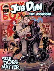
I’m gonna take a shot at Job Dun: Fat Assassin today by Spray Comics. Again, going in without much more than the cover and what the cover shows me. It’s DEFINITELY not a kid’s comic and we have a… well fat assassin. The water looks fine so I’m jumping in.

Art:

The art style kind of reminds me of some more recent Dick Tracy stuff, and in a good way. It’s got a very “cartoony” style with thick strokes and some hashing. The best thing I can compare it to are two segments from Heavy Metal (So Beautiful and So Dangerous with a bit of Harry Canyon in there for some fun sleaze). I also get a touch of like Jamie Hewlet (in a good way) and it mingles together to make something all it’s own.

There are some great and immediately memorable character designs and I had a lot of fun with them (love the “f@#k you up score” he gives weapons). I have a little test. After I’m done reading a comic I sit on it for a while. If I can remember the face of the main character- that’s good. If I can remember some of the secondary character’s- that’s better. But in this comic I could even recall some of the background characters pretty clearly.

Lettering / Layout:

The lettering and layout work. No issues there (and that means it is successful). The only real issue I had was that the digital copy I had was of a lower DPI that I would have exported it at- some of the smaller text was hard to read not because of font size but due to complication with compression (due to the export settings). In a physical print or trade this wouldn’t be an issue.

Writing / Story:

I legitimately like the humor in this comic. It’s kinda dark, though in a very self-aware way. Thus far I’ve not really run into many “humor comics” I’ve liked but this is an exception. Like it starts off with the various definitions of the word “Job” and “Dun” but in such a way as to make you think two or three times about the name “Job Dun”.

So the comic suffers a bit under the weight (pun pun pun) of it’s own universe a bit and the slang it uses. I could eventually figure everything out but it took a WHILE to figure things out. Even then Job Dun still kind waxes poetic in his own mind and it’s a little awkward. It gives his character to be sure but it’s a bit hard to follow at times.

The plot is a total whirlwind romp though the Job Dun universe. We’ve got fighters with bouncers at a brothel/strip club, dames who mess with Job’s head and hire him for job, evil space cultists, and a hell of a lot of fighting. It all mixes seamlessly and I enjoyed every second of it. It’s a very rich and unique setting and everything kind of fit together with a high degree of fluidity that I wished more comics had. It was scifi- but it’s own “kind” of scifi if you know what I mean.

Overall:

Overall, I had a bloody blast with this comic. I can’t wait to read more. I’m not normally this passionate about comics but it hit all my “buttons”. Memorable characters, a step outside the norm (well a giant leap), it was legitimately well-written, and didn’t hold anything back. The art was great, the universe better, and I can’t wait to see the next one. Definitely a must-read.

Metrics:

Art: 10/10 [I’m a sucker for this art style. It’s downright better than mainstream publishers. Memorable character designs.]

Lettering: 5/10 [Does its job. Has a bit of compression issue on the digital version.]

Plot: 7/10 [Come for the universe, stay for the humor]

Novelty: 7/10 [Nothing new design wise but takes a lot of risks artistically and character wise. Very memorable.]

Overall: 7.25/10

Link to Product