Starve the Beast

Starve the Beast

Staff: Danny Homan and Sergio Vicencio

Overview:

A dark dystopian comic that sets up a good story to come.

Review:

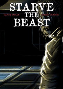
So today I am reading “Starve the Beast” by Danny Homan and Sergio Vicencio. I am going into this cold. The cover doesn’t do much for me, to be honest, it just has (what I assume will be) the protagonist with their back to the reader against a cityscape.


Art

The art style is very dark and drab with an abundance of detail. It almost feel like a neo noir with a touch of horror for some of that “ugliness” the art gives us. To be honest, this isn’t my preferred style of art. It’s very stroke heavy and some things are spot-on in terms of detail but other things just look weird. We even get some sloppier things farther away from the focal point of each panel and there is a little inconsistency between anatomy (relative or otherwise) on some panels. It’s kind of part of the style though so I can’t really harp on it too much.

One thing I will say though is that they artist really knows how to set up interesting perspectives and he uses it to great effect in this comic (see the 1st page for a good example- very dramatic). They also do a very interesting visual gimmick. When people are searching for things (visually) we get these little magnified “pop up” bubbles that have an X or a check mark on them to indicate if it is what they are looking for or not. It give the comic a very frantic sense and I really dug it.


Lettering/ Layout

They took some bold risks with the lettering and page layout. The panels are put together like a puzzle with oddly shaped pieces of varying sizes. It creates a chaotic look, which is what they were going for so- kudos. Outside the panels they have text and, after reading the comic, I still have no idea what it is supposed to be. On the first read through it confused the heck out of me. I think it might be internal dialogue from the main character but I’m not 100% on that.

The lettering is a bit chaotic, but this is intentional and well utilized to cultivate the aesthetic they are going for. It’s very dystopian and it fits with the art style and overall tone of the writing/story. There are a few places it’s hard to tell what’s going on (like who is talking) but once you kind of decipher who each of the unique text boxes belong to, it’s well executed.


Story

The dialogue is adult, telling a very dark tale about drugs, murder, violence and crime. This isn’t for kids and the plot is rather dense. I’d say “convoluted”, but it’s more nuanced and plays it close to the vest as it’s a mystery story. We are doled out information as we go along and by the end most things make sense. This is definitely a prologue because while it sets the stage, it doesn’t go too far down the rabbit hole. I had to read it a few times to get everything. Some terms don’t make sense until they are explained (and most of the explanation is given at the very end).

The characters didn’t do anything for me- and I feel like that’s due to a lack of characterization. I’m sure they develop as they grow, but I’m only reading Issue 0 so beyond the circumstances they find themselves in, I’m given very little to go on. The set-up is well and good but I wasn’t able to identify with any of the characters in a real deep way.


Overall

Now, you guys know my tastes. I am not a fan of dark comics so I am biased against this from the get-go. So, shoving that aside, yeah- it’s worth a read. It’s not the best comic of the year but you can find worse. It will take you at least 2 read throughs before you will understand everything. I get the need to preserve the mystery but in this medium it’s really important to give the reader some context upfront (particularly in an “Issue 0”). If it wasn’t my job to read through this at least once, I probably would have put it down a few pages in. Nothing really caught my attention until probably the last 5-10 pages when we started getting some information on the plot. I’m glad I read it all the way though- it was a good read and by the end I was interested to see what came next. Give it a read.


Metrics

Art: 5/10 (Good but takes form over function)

Lettering: 4/10 (Some gambles pay off well, some don’t work)

Plot: 4/10 (Not my cup of tea)

Novelty: 8/10 (Interesting visual gimmick and innovative page layout).

Overall: 5.25/10

Link to Product

Molasses

Molasses (Vol. 1)

Staff: Jason Payne, Milton Knight, Robert Wertz, Elana Pritchard, Jared Axelrod

Overview:

Good art. Not a funny comic.

Review:

So today we are looking at “Molasses”, a comic billed as “The world’s finest funny animal anthology Vol. 1”, by Syrup Pirates. I normally do just 1st issues, which means 1 story, but since this is an anthology and kind of short I will be doing quick reviews of each of the 5 shorts and then giving my overall feelings on the book at the end. Humor comics are not typically my cup of tea, but they contacted me ahead of time and asked and I told them I’d give it the old college try.

The book opens with “Blackbird Pie” by Milton Knight. It’s a wordless 6 panel short based around the children’s rhyme “Sing a Song of Sixpence” where blackbirds are baked in a pie. It makes excellent use of negative space and has some very well-drawn Tex Avery style artwork. An issue off the bat that grabbed me first was it’s font choices. The title was terribly hard to read (I misread it as “Black bind Pie”). This kind of continues on in later panels (I still am not entirely sure what one of the signs says). Overall however, this is a perfectly serviceable comic but it didn’t really make me laugh.

Art: 8/10

The second is “Oberon in The Fly. A Kitty’s Cats Cartoon” by Robert Wertz. It’s a wordless 3 page comic about an anthropomorphic cat who chases an annoying fly around his garage. The art style kind of bothers me a little. I’m not sure if I can really put my finger on it but it seems really stiff and like maybe he used some digital program to allow him to reproduce the face. Maybe it’s a stroke width thing on his cheeks, I dunno. Otherwise it’s perfectly fine. I mean if you’ve seen one Tom and Jerry cartoon, it’s nothing new and again I didn’t really laugh. It kind of ends on a non-ending and I felt like maybe I was cheated out of a punchline.

Art: 4/10

Third we have 2 small, wordless, 3 panel comics called “Don’t Let This Happen To You” by Elana Pritchard. Honestly, I am distracted by the horrible layout. Otherwise it’s pretty decent. Elana is far from the strongest artistic on this comic but it’s not bad. There is some weird error where her signature looks a little glitchy. Again, no laughs were to be had.

Art: 3/10

The fourth comic is “Give & Cake” by Jared Axelrod. It is a 2 page comic with dialogue featuring a fox and a racoon attempting to bake a cake. This one actually has some decent banter and the handdrawn art style is rather nice if not a little difficult to decipher at times. It feels like it is building up to something funny- but the ending, while cute, falls flat. This might have been a decent story for an anthology book featuring the relationship between these two characters but doesn’t really work as a humor story (though the banter is at least clever).

Art: 4/10

The fifth and final story is “Tiny Todd: Caught on a Hookie” by Jason Payne. It has a very odd artstyle- kind of reminds me of the works of John Kricfalusi (Ren & Stimpy, Ripping Friends, etc), some early Matt Groening stuff, or even some Mad Magazine shorts. We have a kid trying to skip school and go to the fair but his dad follows him. While there are some good expressions and reaction shots- I don’t know if this is really a funny comic.

Art: 6/10

Summary
This is the kind of comic I wished I liked more. It has so much passion and enthusiasm behind it that I want it to succeed despite the score I give this. This comic ultimately fails because, whatever else I have to say about it, it’s a humor comic that isn’t funny. I didn’t laugh, I didn’t crack a smile, I didn’t give a warm “hmm”. Maybe I’m not the right audience but it has a very simplistic approach to humor I’m not sure would do much for even a younger audience. Everything was fairly predictable and, though comics are a visual medium, the vaudevillian approach to humor ultimately falls flat because of a lack of visual motion and response. I feel like there is something I’m missing- but I don’t think there is. It goes for a very old-timey approach but I’m not really confident that works in a modern context. There are also some minor grammar mistakes (a few missing commas, a few odd capitalizations, and “Pritchard” is misprinted on the credits page as “Prtichard”). In its favor I’ll say that there are some really well-drawn parts of this comic. Of particular note is the work by Milton Knight and Jason Payne who have very different styles but are both very expressive in their artwork. I’ll end this with a kind of note reminding you that this isn’t a genre I normally enjoy and if this is your cup of tea- you’ll probably enjoy it.


Metrics

Art (Avg): 5/10 (Some good and some bad)

Lettering: 3/10 (Some good, some pretty bad)

Humor: 2/10 (Never laughed at this humor comic)

Novelty: 3/10 (Reworks some familiar concepts)

Overall: 3.25/10

Link to Product

Nova Zen

Nova Zen

Staff: Harrison Perry, Claudio Muñoz,  Emmanuel Ordaz, Greg Sorkin

Overview:

Monks, and gorgeous art, and cliches oh my!

Review:

Ok, let’s talk about Nova Zen today. I see this sort of comic a lot these days. It fits in this category of indie comics that have art good enough to be in a mainstream comic (or better) but the writing isn’t up to snuff.

Let’s talk about the good first. The art, particularly the cover art, is second to none. We have a realistic very vibrantly illustrated character with a compelling shaolin monk inspired character design… that we never see in issue #1. The overall style on the interior pages is downright beautiful with full color illustrations, excellent use of panel layout and overall composition. There is a ever so slight cartoonish feel (some of the monks have exaggerated facial features) but it’s merely a hint and it helps differentiate the style of the artist (in a good way). If I had to nitpick (hey… that’s why you are reading this right?) there are a few scenes where there are some oddly lumpy muscles and some variance in proportions (but nothing major).

Now let’s talk about the writing. I know this is a first issue but… man I wish it was as good as the art. It rushes through its own source material is just bland. It’s like the writer took every Kung Fu and “chosen one” storyline cliche and just tossed them in a blender. Basically a guy from “somewhere” shows up at a monastery grasping the hilt of a magic sword (I assume it’s magic) and the monks start chattering about how he is the “chosen one” because of a “prophecy”. The guy wakes up and takes it pretty well and we get some vague exposition about how he needs to save the world. See, if we had SOME (and I mean ANY) insight into what this prophecy was, who said it, what it pertained to, or what the guy (named “Nova”) is supposed to do it might have been a good plot hooke but instead we are told vaguely that he needs to “save the world”. There is no SUBSTANCE to it. We aren’t compelled to want to know more because this is so stock and we have no specifics whatsoever. We are then run through some very stock “monk things” including a martial arts demo, some meditation, and painfully simple explanation of a “cosmic energy”. Then we meet some stock bad guys whose only defining characteristic thus far is that they are bad. I mean we LITERALLY have a character say, “this is immoral” and the other one say, “Yeah I know but we are going to do it anyway”. I guess, on the whole, it just feels derivative of other works. (We also have a spelling mistake on page 14 (“he we are, don’t be worried.”) and a few awkward lines sprinkled over the whole comic.)

There is also this weird failure of logic in the comic. Like we have a guy meditating with Nova who suddenly informs him that he is late to meet with his next instructor- why! They weren’t doing anything so why does he suddenly have to rush! Or the martial arts master says Nova looks “a little scrawny” when the guy is built like a house (like one step below a Rob Liefeld character). The master also orders him into a horse stance and, despite knowing nothing at all he just drops into one (also- page 13 has a little white border on the left side).

I feel like this comic wants to mimic a lot of great martial arts stories but doesn’t know enough to actually give it any substance. We have a stock, ill-defined, prophecy about a guy with no memory who trains with some monks with an ill-defined set of mystical beliefs/powers, who will protect the world against an ill-defined threat. I mean there isn’t a lot to work with here as a reader. Like, I like the artwork. I really do but there just isn’t any substance for me to grab onto. When you have the means to tell a story it is your obligation to tell one with a purpose. However, I can tell that this team has a lot of passion and really loves their source material and I really want to see them succeed. They obviously have a much larger story to tell and I really wish they would toss in a few more proper nouns and character traits for the protagonist.

Metrics

Art: 8/10 (Move aside Marvel)

Lettering: 7/10 (Does its job and then some)

Plot: 2/10 (Lots of logic failures)

Novelty: 3/10 (Not new… but a lot of reliance on cliches)

Overall: 5/10

Link to Site

Tim Forder’s Horrific Humor

Tim Forder’s Horrific Humor

Staff: Tim Forder’s Horrific Humor

Overview:

I guess your could call it a horror-themed joke book.

Review:

Ok guys, so today I am looking at “Tim Forder’s Horrific Humor”. I’m not sure how well I can “review” this comic, but I’ll at least endeavor to use it as a learning experience for others. Seriously… this is what I opened my PDF reader to:

Let’s just take a moment to appreciate this cover. Let it sink in. I could do an entire review about just this… but I’ll try to keep it contained to a single paragraph. Good lord! He clearly just cropped some old horror wolf-man book cover and maybe tossed some color over it before slapping his title on it? I physically cringed when I saw this. Also- you don’t need your title 3 times on the same page, not to mention 2 (both PAINFULLY bad) taglines! “That Horrific Horror Humor as in terrific horror humor.” Really? We got the joke. No need to spell it out man. And a low quality export that doesn’t even fill the page? Your killing me. It’s not even an EQUAL bleed on either side of the page.

What follows is no less of a train wreck. What the cover sets up for us, the rest of the comic hammers home in the worst kind of way. Illegible text, terribly cropped public domain images (some of which I have my doubts about…), the absolute worst photoshop attempts I’ve ever had the displeasure of coming across, a few funny jokes, and… I guess it’s horror themed?

Honestly… and I say this having reviewed things like Kinesis, Surreal Murder Mysteries, High School Hijinks, and Brake, that Tim Forder’s Horrific Humor is the absolute and uncontested worst comic I’ve ever read. For a joke book, the jokes aren’t funny and from a technical perspective, I’ve legitimately seen better put together middle school class projects. Congratulations Tim- I think you have forced me to award my only ever 0/10.


Metrics

Art: 0/10 (Poorly cropped public domain art)

Lettering: 0/10 (Illegible at times)

Plot: 0/10 (Don’t get me started)

Novelty: 0/10 (No. Just no.)

Overall: 0/10

There is no link to this product. You can Google search this comic’s name and find a $7 copy of this on Amazon. I will not be party to robbery like that.

The United

The United

Staff: Melchizedek Todd

Overview:

An honest to God solid Christian multi-publisher crossover.

Review:

Ok so today I am going to do something a little different. I normally review only Issue #1s but today I am going to take a look at “The United” which, while technically a #1, is actually a mega crossover event between 10 Christian themed superheroes. I am totally in support of Indie crossovers and I was very excited to come across this one. For better or for worse- I am going to check out The United #1. Let’s give it a look.

Lettering & Layout

The layout is very reader friendly- as a 10 character crossover has to be. We have a character page with headshots and names of all the characters and when we are introduced to them we are given a small blurb about their abilities. This is helpful and not super intrusive.

The lettering is not fantastic. The introduction uses some very stock fonts in big, poorly laid out, exposition blocks. In panel the lettering is odd. Sometimes it is stretched or warped oddly but you can read it without issue.

Art

The art style is very stroke-heavy and is something I’d more expect to see in a horror comic but it is very detailed and it works. Someone obviously put a lot of love into the art for this comic and it shows. There are some anatomical oddities and inconsistencies but overall it’s fluid and is more a stylistic thing than anything. My only other real complaint is that due to the high contract and stroke-heavy nature of the art sometimes it is a little hard to follow if there is a large number of characters on the page. While not on the professional level- it isn’t a bad attempt and every scene has a plethora of “things” going on (as opposed to the empty background a lot of indie comics have).

Story

What we get out of this comic is a good old-fashioned superhero beatdown. I was skeptical of this comic until about page 7 because that page features a whole host (see what I did there? pun pun) of heroes just beating the living hell (I got a million of these) out of some robots on a beautifully done splash-page. THIS is what crossover comics are about.

In short, they have all been summoned by what is essentially the Devil (who has a rather fun and unique character design). A lot of Christian comics I have reviewed in the past were very preachy and (pardon the pun) black and white about morality. “God is good” is the only message we get and we are never introduced to the complexities of matters of morality and faith. I’m not religious and that always put me off about them. This comic doesn’t do that however. Right off the bat we are given some very valid reasons as to why God is a jerk by the antagonist. He talks about how God turns his back on the weak, punishes the innocent, and is wrathful at seemingly random times. While we (as readers) and the heroes are never going to side with the Devil on this one- this is a legitimate test of faith for the characters. We get some good back and forth from these characters and they show their devotion in their own way. Some quote biblical passages, some are silent, and some show their colors by simply quipping back but no one falters in their faith. A scumbag even calls them, “super-powered Jesus freaks” and that shows that the writer is not afraid to address the absurdity of the premise within the context of the real world. It makes it more believable and human- something a lot of superhero comics lack.

If there is a weakness to this comic- it is the overall plot. We have a bunch of kind of directionless plot threads that are just kind of thrown at us. They are fun visually but we aren’t made privy to exactly why some things are happening or what their overall goal is. Honestly- I wasn’t looking for Les Miserables from a massive crossover book but it would have been nice to see a more coherent story put together all the same.

Overall

Overall- this comic defied my expectations. I expected to get a moralizing yuppy Christian book with a bunch of, as the comic puts it, “superpowered Jesus freaks” but what I got was a lot of fun. It was a fast paced beat ‘em up with more characters than I could shake a stick at. It wasn’t overly long and while the overall direction was a bit messy it had a very good approach to the whole concept. Give it a read.


Metrics

Art: 5/10 (Stylized and decent. Not pro.)

Lettering: 3/10 (Not professional)

Plot: 5/10 (A realistic world with some interesting moral questions but lacks direction overall)

Novelty: 8/10 (A GOOD Christian comic? This is a white whale.)

Overall: 5/10 (but go read it)

Link to Product

Project Chrysalis

Project Chrysalis

Staff: Amit Chauhan

Overview:

A train wreck with clipped photography for art.

Review:

The cover of “Project Chrysalis” tells me this comic is about “A corporation with a history of evil and atrocities” and that “A girl stumbles upon her new superhuman abilities” and features some terraced photography with a filter on it. Well… that doesn’t fill me with confidence that this will be a good book. However, I’ll take it at face value and give it a fair shot. Let’s jump into Project Chrysalis.

Art

Oh lord. The art. The ART. Yep- this is another trace/filter comic where everything is done from stock images and it is beautifully bad. I’ve missed this sort of artwork. It’s bad and there is really nothing worse. I suppose that it does, in fact, get the point across without hiring an actual artist. It isn’t until page 7 that the full impact of just how bad this art is hits us. We have our protagonist superimposed over stock backgrounds. She is clearly cropped out of the photos that were taken of her (or maybe of stock images?), run though a gain filter and plopped right there onto a layer above stock images. Her perspectives are all off, her expressions laughably exaggerated for a real person, and the next effect is something akin to looking at the collage of a 13 year old girl.

Lettering

The lettering was done by someone with a copy of Adobe Illustrator who just up and decided they wanted to try their hand at lettering one day. We have a very thick text for the first third of the book while we get an exposition dump and some rather basis lettering done in the second half. It’s all legible but feels very “basis” and amateurish.

Story

Plotwise we are using the (shakes magic mysterious historical event 8 Ball) Nazi Tibet expedition as the basis for some superhero hijinks. There is something about a husk-god and Nazis but we cut away from that in favor of meeting our protagonist. We get a whole montage of her groaning in pain and get some tell-don’t-show narration telling us what’s going on. The premise is that the Nazis retrieved a husk from Tibet and now in modern day due to some science-fu the husk is alive (and apparently an attractive young girl). She has superpowers and starts to fight the evil organization that is trying to catch her (for those playing along at home- that is trope #23 on the “Generic Superhero” plot list).

Let’s talk about the narration for a second. It is pretentious and almost as bad as the art. It talks about how a chrysalis (you know- the cocoon thing that hatches into a butterfly) is a catalyst for change, a new beginning then goes on to say how it is devoid of any imperfection, and that the word itself is derived from the greek word for gold. What?! The word “catalyst” is misused because it’s not the cause of the change- it’s the result. It is certainly not devoid of imperfections as many caterpillars don’t emerge due to defects. Finally… what does gold have to do with any of this (other than linking it to the next like “all that glitters is not gold”). The dialogue in this comic is just painfully pretentious (please turn on a Park song of your choice at this point for full effect) with lines like “tears from someone in despair are the kind of thing that pierces even the coldest of souls” and “Then you have to go through the humiliation of being spanked on the rear end….” (couldn’t say butt there?). I wish I was making this stuff up.

Overall

Overall, this is a joke. The cover set us up exactly for what was on the inside. It’s a pretentious mess that tries to hide how bland and samey it is. The art is the cherry on top- probably having been made with the aid of a bunch of very excited friends of the staff. This is apparently part of the Tiber Saga and if the rest of the comics in it (the other 2) and I’m glad I caught this one first so I know not to read the rest. Hey- at least it is a free comic… so at least you don’t have to ask for your money back if you bought it.


Metrics

Art: 1/10 (Cropped photos with a filter over some stock art)

Lettering: 4/10 (A little basic but it works)

Plot: 2/10 (Pretentious and unfocused)

Novelty: 1/10 (Derivative)

Overall: 2/10

Link to Product

Brake

Brake

Staff: Shane Will, Nicholas Garza

Overview:

A ham-fisted attempt to make a Muslim superhero.

Review:

Today we are looking at “Brake”, a short, 7-page, superhero comic about a Muslim superhero (I don’t normally read the sales blurb, but I happened to catch it). This is apparently the origin story for a member of a comic universe (known collectively as the “Tomorrowverse”) by CK Comics and Scattered Comics. Let’s jump on into “Brake”.

Art

The art is not great. it gets the point across but there are some wonky angles, bizarre and inconsistent anatomy, and it all looks very low grade. The scenes are empty sometimes and the poses pretty exaggerated even by comic standards. The shadows, though done in the standard high-contrast fashion, are more or less random. There was a point on page 5 & 6 (of the PDF) that I thought his costume had an odd fan-shaped pattern on his forehead as it is in 5 panels it is there but later on we see that it was just intended to be shadow- despite him moving and us getting several angles on him.

Lettering

The lettering is not bad, but it was clearly done by someone new to the art. Sometimes the way the balloons are placed makes it difficult to tell who is talking in what order. A minor issue is that, since the site I got the comic from watermarks things, the bottom of the pages look like a jumbled mess because they place white text on the black bleed. Not a big deal, but most comics avoid putting things into the bleed for reasons like this.

Story

So I give this comic props- it tackles a very difficult topic. The opening narration talks about how the teachings if Islam are bad being perverted by an group of extremists few and not all Muslims are evil. This is a very bold stance to take in the current climate but one I happen to agree with. If I can soapbox here for a moment, every belief (be it religious, national, cultural, and even philosophical) has their extremists and we shouldn’t judge the group as a whole for their more radical parts. Radicalism has little to do with the nature or teachings of the group and more just serves as the glue that binds them- it could literally be anything that meets a few criteria. However, this comic handles this delicate topic about as subtly as a toddler with a hammer.

The first page sets up the universe with a exposition dump delivered ala the news. The world is full of superheroes, the war in the middle east is ongoing, anti-muslim sentiments are running hot and there is a superhero named “Tomorrow” who is from the future that our protagonist is inspired by. Oddly enough for an origin story, we just get a few lines of narration to explain his backstory. He was in a car accident and suddenly he was invulnerable.

The dialogue is pretty heavy in this comic- a lot of “tell” rather than “show”. Honestly, a lot of the first few pages could have been shown visually rather than exposited about in narration (show some images of Tomorrow on the news, some anti-muslim rallies, give us 2 panels giving him his origin and power, and finally show the protagonist making the costume like we get). This is a problem with a lot of indie comics and indie superhero comics in particular. We are told everything rather than shown anything. For example, we get a panel where a villain pulls a gun and one guy yells, “Look out!!!” and another guy screams, “He’s got a gun!” but their poses and expressions already convey that.

Overall the plot is about as generic as it could be, relying on a lot of tropes of the genre. The protagonist, Bahir Azeem, got superpowers and was inspired by another hero to action. He is Muslim and I mean SUPER and stereotypically Muslim. Every scene he is either praying, talking about something related to his faith, or giving exposition. It’s like when a female character is in the cast and it is painfully obvious that she is “the girl” and that about sums her entire character up, except in this case Bahir is 100% defined by his religion. I can respect this comic for trying to give us a Muslim hero- but a cardboard cutout with the word “Allah” would have had more depth.

The comic ends with some sickeningly derivative scenes of the hero punching the villain and then being locked in jail 2 panels later and is followed by the generic scene of the hero shaking hands with the political leader while looking at the crowd waving one hand. This seems like something out of a 80s TV show, but it falls really flat and feels super stale. I’ve read PSAs and propaganda pieces that were more subtle than this. In fact- that’s exactly what this feels like; a propaganda comic. I mean I know it’s really just ham-fisted writing, the best intentions gone wrong, and an over-reliance on superhero tropes but that is what it feels like. Like a PSA or propaganda piece in that they rely on high moralizing and dramatics over any sort of substance. We are TOLD that the Muslims are being treated ill but we never see Bahir experience this sort of prejudice. The villain’s motives might as well be “to ruin Christmas” because it ultimately amount to “Because I’m evil!”.

Overall

In conclusion- don’t read this comic if you want a good story about a Muslim superhero. Go check out G. Willow Wilson’s fantastic run on Ms. Marvel featuring Kamala Khan or the New 52 Nightrunner comic. Both feature much more developed Muslim characters than this one dimensional schlock.


Metrics

Art: 3/10 (Low quality but gets the point across more or less.)

Lettering: 4/10 (Armature but readable.)

Plot: 1/10 (One-dimensional and formulaic.)

Novelty: 1/10 (Derivative.)

Overall: 2.25/10

Link to Product

Spring Heeled Jack

Spring Heeled Jack

Staff: Tony Deans, Martha Laverick, Joshua Cozine

Overview:

Something is just not right about this horror comic.

Review:

Today we’ve got another horror comic. This time rather than some generic monster we have Spring-Heeled Jack. For those not familiar with the myth Jack is a character out of victorian England and was something of an urban legend. He has some connections to devil (eyes of fire, clawed hands, etc) and some “gentlemanly” aspects to his appears. He has appeared in a lot of media and has been adapted into many comics over the years. That being said, let’s jump into Spring-Heeled Jack and see if this is “just another Spring-Heeled Jack comic” of if it is something special!

Art & Lettering

The art isn’t my favorite style but it’s well done and fits the comic’s tone. It’s done in a style that shows a lot of the brushstrokes and uses a very flat pallet. It’s a good mood setter and it’s well-drawn with a lot of use of shadow and contrast. When we finally see Jack a few pages in he matches his description though have a very “vampiric” quality about him. The lettering is clean and legible however- exactly how it needs to be and it matches the feel well enough.

The second act totally changes everything. While the same art style is used, without the heavy shadow and dark colors to hide it- there is some sloppy art. There are a few instances of odd and inconsistent proportions, some panels lacked background that should probably have them, and the character designs are not as novel in this sort of light. It takes on some vaguely manga inspired aspects later and it kind of clashes a little (though one could argue that there is a pervasive influence that is just more highlighted more later on).

Story

There is not a lot of dialogue but that shows an understanding of the medium. I’d be surprised if the first act of the book had more than 100 words of dialogue- but it doesn’t need it. This is a good example of how to “show” not “tell”. It starts with a chase and we are not inundated with exposition about the situation. It just “happens” and we are given enough context clues to figure out the rest.

I gotta say- I was not a big fan of making this a Sherlock Holmes story. Half way through we are introduced to “Mr. Arthur Doyle”, a not-so-subtle Holmes pastiche (Sir Arthur Conan Doyle wrote the Holmes stories). I’ll give them credit- the character looks like the real life Doyle a bit so that’s a nice little touch. I am not sure if they meant it to BE him or to be someone LIKE him. We also have his Lestrad stand in “O’Brien” and his Wattson stand in “Joe” (though he is a fair bit more astute and active than his literary counterpart). Joe is based on Joseph Bell, a forensic surgeon who Holmes was based on in part. I’m 90% sure they are posing this as some sort of historical fiction with supernatural elements but it just kind of feels like they are using it for the sake of name recognition.

We see Jack do some supernatural things (breath fire, take bullet hits without issue, and some claws) and the “law” of Holmes is that while something may seem supernatural- it never is. Science and deductive witt always shines light on it and it is revealed to be a sham. Part of me really hopes the story ends in that fashion but I get this feel like it would be a bit of a let down at the same time. We have the titular character seemingly possessed of supernatural abilities and this is one of the only aspect of the comic left in questions really so if it was all some stage magic or something I feel like that might take some of the “umph” out of the excellent first scene.

Overall

Overall, despite my gripes about it, this is not a bad comic. It’s not a godsend but it’s pretty inoffensive next to things like HellOhGirl or Kinesis or whatnot. If this is your kind of thing you are going to enjoy it. I wasn’t particularly thrilled. It started off good and the art is interesting but the rest kind of falls flat. For something 23 pages long not much happens and it doesn’t quite resolve itself. That is not to say that it needs to in the 1st issue, but I can’t say I’m terribly interested to see where Mr. Doyle goes. All and all, Spring Heeled Jack is your basic boogie-man despite his name.

Metrics

Art: 4/10 (Great at times but other times it is unsuccessful.)

Lettering: 5/10 (It works well.)

Plot: 4/10 (Nothing special and some odd historical choices.)

Novelty: 5/10 (Hey- it takes a shot at doing something new, I’ll give it credit for that.)

Overall: 4.5/10

Link to Product

Parallel Man

Parallel Man

Staff: Jeffrey Morris, Fredrick Haugen, Christopher Jones, and Dylan Hansen

Overview:

Professional with a great premise.

Review:

So Parallel Man relies on the concept of the “multiverse”- a series of infinite (or near infinite) interconnected alternate universes just next door to each other. This is a concept very much steeped in the lore of American comics as this is the universal logic employed by most major publishers to tie their stories together. The premise of this comic is original- in the vastness of the multiverse one version of America developed the ability to jump to different realities and conquer them because they destroyed their own world. I’m sold on the premise and the cover art looks gorgeous so let’s jump in and see if it delivers!


Art

The art is top notch. It is done in a style similar to that of most major publishers and doesn’t fail to impress. You guys know I’m something of an art snob- but this is done with a deep understanding of the medium. It’s in full color, uses dynamic angles, and it’s expressive. They have some very invocative imagery- a shattered Lincoln memorial implies a loss of freedom, Air Force One, and an alternatively colored american flag. Hey- they even got Obama in there for a bit and did a fair likeness of him.

I gotta say though, for all the high praise I am laying on this thing, when we finally get to see the universe-jumping military their appearance fails to impress. The big intro on page 9 just kind of looks like a line of very cookie cutter soldiers in generic “space soldier” style armor of the same height and build. Given the details on earlier pages, I was ready for some realistically diverse and very imaginative soldiers- not something that bland. However- that is about the only misstep in the creativity department (see the story section for more on that).


Lettering

The lettering makes me envious. They do more than just your standard boxes and onomatopoeia. The text is legible, the onomatopoeia is creatively applied, and non-interruptive to the beautiful art. They use a variety of balloon and font styles, when appropriate, and it just adds to the already very professional appearance of the comic. Honestly- if I didn’t know better, I would assume that this was something produced by Marvel, DC, or Image.


Story

There are some kind of over the top names for things like “hellfighters” and a lot of techno jargon that is meant to sound scientific, but overall the writing is a solid B+ or A-. It does its job and does its word building without giving us too bad of an exposition bomb (aided by the first page’s short introduction). The dialogue comes off as natural and does a great job handling such a weird premise.

When compared to the overall direction thus far- the worldbuilding is the shining gem. The premise works and is used to great effect. We are immersed in the world of the reality-hopping Nick Morgan and his sidekick, a computer program named Atlas.The various universes we get to see showcase the powerful imagination (both in an artistic and worldbuilding sense) that this team can bring. We see megalithic vehicles, crazy alien designs, mushroom forests, . They do rely on “science as magic” a bit heavily and kind of ham-handedly in the narrative sense (a “nanopatches fix everything” kind of setup) but I think it was done to keep the focus of the comic on the premise rather than the minor details. We get a slow-ish start with the real plot kicking in about half way through the first issue and don’t really get a full understanding of it until about 10 pages before the end. That’s not to say there is a pacing issue, more that they handle it pretty well. There is a bit of tonal shift near the end that I wasn’t so fond of, but it looks like it will set up some interesting character dynamics in later issues.


Overall

Overall, I dig it. It’s a solid premise with a lot of mileage in its premise. The first issue does a great job of setting up a lot of issues to come. This comic is about as professional as indies get- great art and some solid writing. I’m on-board with this one.


Metrics

Art: 8/10 (Downright professional)

Lettering: 8/10 (Above and beyond)

Plot: 6/10 (Solid across the board)

Novelty: 10/10 (Gotta love this premise and the way they handle it!)

Overall: 8/10

Link to Product

(They also have some other Parallel Man media like games and stuff on the site- totally worth a look.)

Theodicy

Theodicy

Staff: Chad Handley, Fernando Brazuna, Ryan Boltz, Minan Ghibliest, Kel Nuttall

Overview:

A heavy handed comic about Jesus themed superheroes in cartel-run Mexico that is way better than how I am describing it.

Review:

Next on the agenda is “Theodicy”. You can actually follow along with this review HERE. I was promised blasphemy and, in honor of the holiday encroaching on Thanksgiving- I’m all for it (Seriously? Why is there Christmas music in the middle of November).

In terms of lettering, we have a few times when the letters could be larger but it’s all legible so no complaints here.
The art isn’t bad but it’s not professional either. It’s about 75% of the way to being professional but there are still some odd expressions and odd rendering of the contours of human faces (sometimes really flat, sometimes really detailed). Some of the rendering of the clothes they wear are draw in a fashion that doesn’t reflect the nature of the material (leather jackets seem to work just like cotton does) and there is some minor continuity errors artistically.

To say the plot is heavy handed is a grievous understatement. The good guys are TOO good and the bad guys are puppy-kickingly evil. It’s about a subtle as an episode of blue clues. Exposition is pretty doled out by the spoonful on page 6 but even with that generous helping of plot details I am still left awestruck by the randomly unexplained man with giant black wings that no one seems to notice/care. The names of the characters on the pinups are all very generic (seriously… the Chinese dude is named “Wushu” and the other one is “Wuxia”?)

Despite all the flaws of this comic… yeah I liked it. It has charm and personality. The religious aspect of comics like this which normally kind of bothers me… didn’t. I dug these priests and after I saw the pin ups I was like, “Holy shit*! Super-priests in cartel run Mexico dishing out the hurt to Evil McEvilson? Sign me up!” It’s just rough and dark enough to take the “sunday school” aspect out of it and almost parody that sort of “Jesus is my best friend!” comic. I REALLY hope they go farther with that and the preview of issue #2 really showed that they are. Call me crazy but I’m interested.
*Pun pun pun


Metrics

Art: 4/10 (Not bad, not good)

Lettering: 5/10 (Average)

Plot: 3/10 (Issue #1 is slow and the writing is a little heavy handed but it has character and a good set up for the future)

Novelty: 8/10 (I dig the premise!)

Overall: 5/10

Link to Product