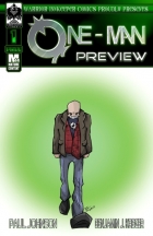
RATO (Plug)

page to edit - Copy103612RATO (Plug)

Staff: Brian S Logan, Stefano Cardoselli (P/I), M R Dodson/Azurek Studios (Color), Bram Meehan (Letters)

Overview:

So the 80’s called, they want their scifi back.

Review:

I have to admit, I love the 80s (see my black salt review for more on that). Let’s start this review by saying that the art style is downright tantalizing. Kind of reminds me of Jamie Hewlett (Tank Girl), Heavy Metal,  Peter Chung  (Æon Flux, Phantom 2040), and the like.

It seems like for every ounce of love put into the artwork, an equal amount was taken out of the lettering.

The comic preview is short (only 5 pages including the cover). It tells a story mostly though a visual medium, which is rare and interesting. I wish more people could accomplish telling a story purely though art.  I would have bought and reviewed the entire comic (rather than a preview) except there isn’t any more and it was added in July of 2012. Sadly this means that that’s all we get to see of this one. Oh well, c‘est la vie.

Metrics

Art: 9/10 (80s called. They want to give you a metal)

Lettering: 4/10 (Poor but not distracting)

Plot: 8/10 (For a visual story with little text- excellent.)

Novelty: 8/10 (Novel)

Overall: 8.5/10

~Link to Product~

Pink Pandas

90842-thumb140Pink Pandas

Staff: Dave Farmer

Overview:

Dave… we need to talk.

Review:

So this is from author/artist Dave Farmer. Which… confuses me. It seems like it is written by and for girls. I mean it’s called “Pink Pandas” and is covered in more sticky sweep pinkness than a 5 year old girl’s room. I’m not judging, but somewhere between impressed and confused. Let’s dive in and see what this has to offer!

So right off the bad my heart sinks. The artwork is grainy, low resolution, stock images or something with text superimposed over it. Letting is solid and readable, but the stock photography is… atrocious. When Brian Vaughan and Tony Harris did their award winning Ex Machina comic, they used staged pictures for the basis of their images and drew over them. No such inspiration here. Just low rez images put into panels.

Once we get to the ACTUAL art, it’s slightly styalized but mostly just bad. They look very realistic but often times the backgrounds suffer immensely from a lack of attention. Then there are some REALLY terrible gun effects on page 9 that make me just want to cry. This guy honestly has some talent burred under there, but he takes the lazy way out and just uses what look like MS paint effects to show us some gunshots. I… I really don’t know what was going though his head at that moment. “Man, I have this gorgeously detailed piece, Better throw some low transparency grey over it and some black blobs.” Come on Dave!

It’s pretty clear off the bat that I am not the intended demographic. I’m not going to judge the plot harshly because it does what it sets out to do. It creates the image of two idealized rock star teenagers (or early 20s?) who are doing the girly girl thing. Then the main characters start swearing (“Crap!”) and start pulling out shotguns and pumping bad guys full of led. Disconnect much? Who is this comic being written for? The little girl appeal of the premise is destroyed by the few swears and blood and gore that comes later. Anyone who would be able to enjoy the violent aspects of this comic would be totally turned off by the kid friendly premise.

At first I gave this book 6/10 for lettering… but then I got to page 5. From then on non-dialogue text starts showing up and I cringed. It’s pretty bad. Red stroked black text in some san-serif stock font really just manages to hurt the eyes rather than impress.

Metrics

Art: 1/10 (Stock photos and sloppy backgrounds)

Lettering: 3/10 (Good until you get to the onomatopoeia)

Plot: 3/10 (WHO ARE YOU WRITING FOR DAVE?)

Novelty: 1/10 (What novelty)

Overall: 2/10

~Link to Product~

Fracture

95846-thumb140Fracture

Staff: Shawn Gabborin, Chad Cicconi, Dave Dwonch

Overview:

Good premise that is a bit squandered

Review:

The premise is a nice twist on the secret identity trope. The protagonist is also the villain and has a mundane persona too. Lets see if they actually follow through on this.

Lettering is fine and the art, while not major publisher grade, is not outright bad. There are some weird expressions and over simplified actions that show a lack of dedication to dynamic posing, but overall it’s ok. There are a few notable onomatopoeias that are actually pretty decent.

So the story does follow though a bit, but it is all cliches. You can kind of guess most of the plot. How is he all three? You guessed it, split personality disorder. It feels like a squandered premise a bit. Dialogue like, “Yesterday I was foiled again!” fall really flat and almost make me groan.  Every trapping of a mad scientist villain is there and it almost feels like it’s being lamp-shaded but they really play it to straight for me to believe that. There is a LOT of convince written into the plot. Like, “Oh, he never looked there so this whole story could happen”. A lot of it feels forced.

There is a fun little bit at the end that gives an excerpt from the all important journal. Kind of a nice touch.

That being said, despite my let down that this would be an amazing use of a good premise, it’s not a bad read. It’s engaging, the premise is able to carry a lot of the story, and even though it’s predictable it’s never boring.

Metrics

Art: 5/10 (Not major publisher grade. Does ok.)

Lettering: 6/10 (Decent)

Plot: 3/10 (Simplistic and predictable)

Novelty: 7/10 (Good enough to carry the story)

Overall: 5.25/10

~Link to Product~

C.U.P.I.D.S

117333-thumb140C.U.P.I.D.S

Staff: Charlie McCarrick, Carlos Gomez, Francisco Perez, and Albert Deschesne

Overview:

I’m in love.

Review:

So first off, the art on this book is amazing. It is very much in opposition to the more traditional Jack Kirby of art we see so frequently in modern comics. It’s very sleek and very digital. They used the space of their panels very well and the artist has a GREAT sense of color. The characters are expressive, utilize dynamic poses, and make good use of their motion.

Another thing worthy of note is that even though we have a LOT of female characters, they don’t look like Barbie doll. Their proportions are deformed, but not into some crazy unrealistic standard of beauty. They are still attractive and confident. Way to go!

The story is novel, involving greek epics, a big of scifi, and war. It’s a big thing to expect from a story with a cheesy name like C.U.P.I.D.S. I don’t think I’ve laughed thus far at a comic and this one was really the first time I did. It’s got a quirky, modern, sense of humor that appeals to the Joss Whedon fan in me. It takes the concept of cupid shooting arrows into lovers and blows it up into a James Bond/Kim Possible-esque adventures for a more mature audience (a few swears were dropped into it).

I dug the characters. They had personalities, they had flaws, they had quirks, they had little details in their personality. Finally! Someone who can write a decent character I can emotionally invest in! I actually enjoyed the villain and the first issue left me wanting more. I know my rule is “one and done” for comic series, but I might have to read more of this.

One of my only gripes is that the lettering is really small. I had to blow it up to read it correctly. But that’s a single sour drop in an ocean of wonderful, so don’t let that detract from it.

Metrics

Art: 10/10 (Come for the art, stay for the story)

Lettering: 5/10 (A little small. Otherwise good.)

Plot: 8/10 (I said stay for the story right?)

Novelty: 9/10 (Finally something NEW and not based on “So there are these superheroes…”)

Overall: 8/10

~Link to Product~

One-Man Preview


116043-thumb140
One-Man Preview

Staff: Paul Johnson and Benjamin J. Kreger

Overview:

Thought it would suck. Totally wrong.

Review:

I gotta admit that I totally went into this book saying, “Oh man… a good stinker I can rip apart!” and well… I was wrong. The art style is quirky and bizarre, but it works. We’re quickly dropped into an alien society filled with rich details, races, conflict, and humor. The lettering worked and was very legible. There are a few cliches played for humor, but they are more lamp-shaded then used in earnest. I am not entirely sure of the connection between the aliens and our bearded protagonist, but it was a short little preview. From what I saw- I liked. I don’t know if it’s my style, but it defiantly has that je ne sais quoi that a lot of indy comics today are missing.

Metrics

Art: 9/10 (Quirky but expressive and a lot of fun)

Lettering: 6/10 (I can read it and it was good)

Plot: 7/10 (Nothing new, but the universe is rich)

Novelty: 7/10 (The art style speaks a lot to this)

Overall: 7.25/10

~Link to Product~

True North

113833-thumb140True North

Staff: Greg Boucher and Guillermo Hansz

Overview:

Tired concept, luke-warm execution, but still worth a read.

Review:

So I’m gonna start this with the art. It’s never outright bad, but it gets real close sometimes. An awkward perspective here, a bad shadow there, and little things are in this comic. It’s styalized I suppose, so I won’t harp on it to much but sometimes the characters are drawn a little weirdly. The lettering is pretty uninspired. It doesn’t do anything for me but it’s legible and I suppose, so it does what it needs to. It should be noted that Guillermo Hansz, the artist, has a fantastic grap of dynamic posing and frames his motion very well. You can see the understanding of anatomy in every shot he draws, despite some of the awkward posses and facial expressions (which can be really creepy…). There are also a few reused panels which I though was in poor taste (see page 21).

The story really leaves me kind of confused. Like I get the idea behind it (which has been done to death), but it all feels like someone’s attempt to cram as many “cool” characters into a story. Sure they all have personalities and whatnot, but it feels less like that is a result of genuine good writing and more because they all fit their stock superhero archetypes. You have the outsider protagonist, the tough vixen cat girl, the suave lancer, future love interest, etc. The plot is basically superheroes are outlawed and people hate them. A bar is home to a group of them and after a run in with some thugs, he joins them.

There is some real thought behind this, however it’s execution often falls flat. There is a scene where a bunch of anti-superhero skinheads are picking on a superhero and their allusion to being like Nazis is handled with all the subtlety of a brick going though a window during Kristallnacht. Some of the dialogue is handled about as well. It seems a lot like the characters are instantly familiar with each other of the get-go with some minor stock conflict to bog it down.

A kind of interesting feature is that the comic gives you music suggestions for different scenes. It’s very scream-o and, while it fits with the comic, isn’t really my flavor. You can see a lot of inspiration came from that sort of music in this comic (heck, the main character looks like he might open for one of those bands mentioned). At least their is some novelty in that.

I won’t say it’s not worth your time, it is, but sometimes I wish they had opted to go for a more polished approach. There are two blank pages at the end of the PDF which I assume are meant to be filled because the scene just kind of runs into a wall and stops. Hey… it’s free. Give it a look.

Metrics

Art: 7/10 (Sytalized, but never outright bad)

Lettering: 5/10 (No innovation but you can read it)

Plot: 4/10 (Nothing new but a decent set up)

Novelty: 5/10 (Plot is tired but at least they had that song gimmick)

Overall: 6/10

~Link to Product~

Update

After my review the publisher added the last two pages into the comic. Check it out!

Division M

Division M

Staff: Joe de Lima and Rafa Lee

Overview:

Same old anti-superhero agency. Only this time they speak in psudo-English!

Review:

This only thing I can imagine is that this comic was written by someone who doesn’t speak English as their primary language. The very first text bubble doesn’t make much sense. It’s quickly followed by psudo-English for the remainder of the comic. Words are simply missing from sentences (“It seems star wars’ stuff.”) I think I was able to get the jist of it.

In terms of lettering, things are fine until they get sloppy and cut off a word or two.

As near as I can tell, someone outlawed superheroes and the two main characters work for Division M.

The art goes from pretty cool to total junk. Inconsistencies in the physical characteristics of the characters does little to help this (example: One of the meta humans has blue eyes which turn to light green ones). Some pages (like page 10) clearly have a few hand drawn pieces superimposed on a digital matte background and have the basic drop shadow effect on it. It gives the impression that everything is floating and the perspective is always a bit off. It’s the mix of digital and hand drawn elements that clash so angrily that make the artwork look sloppy. There is some real potential here, but it’s a vision only halfway realized. A lot of it looks like some concept art or maybe a storyboard that someone tossed some color on.

In terms of the premise, it’s sadly been done before. SHIELD, STAR Labs, Task Force X, Checkmate, SWORD, Bureau for Paranormal Research and Defense, MIB, etc. I dare say it’s been done to death. This is nothing new and has nothing unique about it down to the types of superpowers they encounter.

Metrics

Art: 3/10 (Not offensively bad)

Lettering: 5/10 (Nothing special. A few slip ups)

Plot: 3/10 (Couldn’t understand most of it due to grammar)

Novelty: 1/10 (Nothing new under the sun)

Overall: 3/10


~Link to Product~

Mid-Night Detectives

Mid-Night Detectives

Staff: Scott W. Coons, Idris Yusuf, Richard Wilson, Rachel Lemke, and Chris Ellis

Overview:

Harmless kids stuff.

Review:

I don’t know why I downloaded this comic… I mean it’s really not my style. The whole “talking animals” thing never really did it for me… but it had a zebra on the cover and he looked like he meant business so I went for it… I’m gonna regret this one aren’t I?

So let’s get into the train-wreck part. I’m pretty sure they did their cover & credits lettering in Microsoft Word (and not a new version). However, that’s the worst of it. In-panel it’s pretty decent and it’s actually readable.

The art is half way decent. Not professional grade, but close…ish. For an indy comic that didn’t look like it had a lot of funding behind it that’s just fine. I mean there were a few scenes where it was clear the artist fell asleep or something, but it’s acceptable.

The plot is formulaic, but when lines like “Let’s rob and trick them!” are uttered by a ripped, naked dog with a spiked collar- that kind of flys out the window. To call it heavy handed would be a bit subtle. Then again, I gotta keep in mind that this is probably not meant for my demographic. For kids… yeah, it’s just fine. Plot is easy to understand, characters are identifiable, and everything runs like a train on train tracks. No points for novelty though. I think I saw this plot in Rescue Rangers or something.

I just love how at some points there are just random zebra and bald eagles trouncing around the city.

However, even for a kids comic there are some pretty hefty flaws. Some poor grammar choices stick out to me, everything is SUPER convenient, and names just get thrown out every 10 seconds. The writing (again, even for a kids comic) is really weak and basic on a level that some kids might find insulting. The staff seems to overlook things plot wise. Like on page 23 it’s randomly mentioned, “I have a smart wife” (referring to another character). You have seen these characters for a while and it’s suddenly mentioned in passing that they are married.

Anyway, it’s ultimately harmless. Kids will probably enjoy it. Kind of a throwback to like the early 90s tv shows.

Metrics

Art: 4/10 (Sloppy… but good effort)

Lettering: 4/10 (Decent except for the cover and credits)

Plot: 6/10 (Kids stuff. Did what it set out to do.)

Novelty: 1/10 (Tiny Toon Adventures wants its plot back)

Overall: 3.75/10

Black Salt

Black Salt

Staff: Chad Boudreau, J.C. Grande, and Santosh Kumar Rath

Overview:

The 80’s called, they want their kung fu movie back… in a good way.

Review:

So apparently Black Salt is adapted from a screenplay for a movie so that sets some precedence as to why it looks so professionally done. Looks like there is a bit of a budget behind the comic (if not- good job! You fooled me!).

Typesetting and layout wise it looks like something you’d see from one of the big publishers so full points for that. There is some weird pixelation with the PDF version so what would have been a flawless review kind of gets the wind taken out of it but it’s not very distracting.

The title of “black salt” didn’t exactly SCREAM 1980s china shaolin kung fu action movie, but hey- it’s not a bad genre choice. They almost lampshade 80s kung fu action movies. The dialogue is sufficiently campy, the expressions and poses are exaggerated, and some cliche lines actually just add to what is ultimately a homage to this sort of thing. Not sure if this is what they are going for, but that’s how I took it.

When we flash forward to present day I can almost SMELL the 80s & 90s on some of these character designs, though they are a more modern twist. On occasion we get some weird body proportions, but what comic isn’t rife with those right? Seriously, this reads like a more modern episode of like a mash up of GI Joe and Ninja Turtles or whatever cookie action show you watched when you were a kid (if you are in your 20s now…). This is complete with contrived acronyms, cops pulling out ridiculous swords and fighting scuzzy looking villains. And believe it or not, I am not hating on this- it’s actually a lot of fun. I’m totally down with the whole “80s action movie” thing. Hell, I could see a young Steven Seagal in this comic’s movie adaptation because his machismo would be right at home.

Now I can’t say the story leapt off the page and grabbed me. I’m not super enthralled. I’m more excited about the dose of nostalgia I got reading this. I’m sure there is more to this than is just here and it’s kinda cool they are going headlong into some kind of movie, collectible line, and all that. I don’t know if there is a premise here to really warrant all that, but I’d be willing to see what they come out with before passing judgement.

Metrics

Art: 7/10 (Professional)

Lettering: 8/10 (Professional)

Plot: 5/10 (80s/90s Nostalgia classes)

Novelty: 3/10 (Nothing new, lot of old)

Overall: 5.75/10


~Link to Product~

Kinesis

“Kinesis”

Zephaniah Comics: William Council

Overview:

Some hilariously horrifying artwork and some massive writing faux pas

Review:

Oh god. Let’s get into this. So first off this comic uses Poser artwork. Not like, “Oh man, you’re such a poser” but this. While it looks good on that site, what you normally get some weird uncanny valley 3d models. This comic suffers for poser-syndrome in the worst possible way. The character’s faces are as expressive as some of those robots you’ve seen walking around. The teeth and lips come out as weird, the scenes all looks extremely empty (containing ONLY the characters so it looks like a ghost town), and most the characters are the exact same height.

Also… the face of that baby will haunt my dreams forever. It’s like something out of a horror movie.

The lettering is passable. You can read it and it doesn’t bother me. At times it can become hard to read due to the slant on the font. Then again some of the onomatopoeias in this comic are just downright unimaginative (“CLANG”). The text bubbles are bizarre at times and seem to switch up whenever the team remembered to add them. Overall, it’s readable though.

The plot is downright schizophrenic and juvenile. The first few pages jump from talking about how they are the “fastest flyers” to crashing to a flying vehicle and almost killing person before the cop.. wags a finger at them? Then jump cut to some girl? Then jump cut to 22 years ago? This continues pretty much until the end.

The author also violates one of the cardinal rules of writing. Maybe this is the limit of his poser artwork but he tells us things rather than showing it. We get these text boxes explaining what the characters are doing rather than using the visual medium he is working in. The ends up producing lines like  “Once again Cassiopeia reaches into her pouch and selects a creature”. This happens again and again rather than the artist actually showing us what happens. It’s really distracting.

This problem is compounded by dialogue that serves only to speak to the reader. This is like if I went to the kitchen and said out loud, “I am hungry. What sort of sandwich should I make? I don’t like rye bread, nor do I like wheat. Perhaps white.” If I’m the character, I know this and I don’t have to articulate this to the reader. This goes back to showing, not explaining.

Exposition is tossed in willy-nilly on the bottom of the panel on occasion to give us some background information whenever the writer remembers to fill us in on something. Characters gain powers willy nilly and limits seem to be arbitrary and ill-defined. This causes me to not understand what “danger” is. As a reader I can’t empathize or identify with these characters.

Hell, if you’re still with me at this point I’ll say buy this comic just to look at some of the fascinatingly creepy faces that end up on the pages for some reason. Some of the best are on: page 6, bottom of page 12, and the top of page 14.

Metrics

Art: 1/10 (Horrific faces are bad to the point of it being funny)

Lettering: 3/10 (Readable but not “good”)

Plot: 1/10 (schizophrenic and juvenile)

Novelty: 1/10 (What novelty?)

Overall: 1.5/10

~Link to Product~